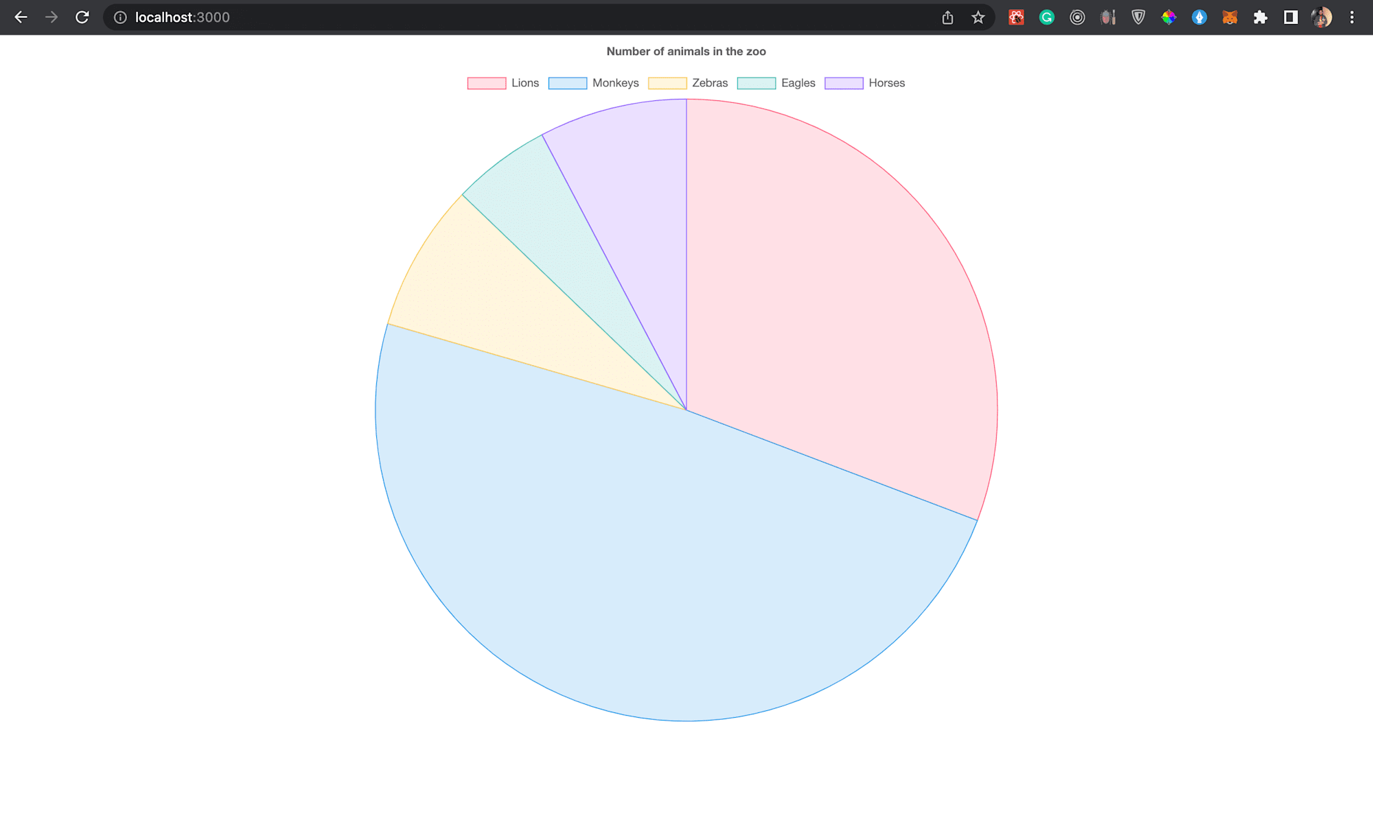
The pie chart is one of the most effective ways of illustrating data and they have been around since the 1800s. A pie chart is a circular graph showing statistical information in numerical proportion. Pie charts are used widely in analyzing business and media data.
At the end of the article, you will have understood how to implement a pie chart into your Next.js application.
A basic understanding of Next.js is needed to follow along with this article.
You can find the complete code used in this article on GitHub:
https://github.com/folucode/nextjs-pie-chart
The completed project is on CodeSandbox. Fork it and run the code.
Node has to be installed on your computer to set up the Next.js application. To install Node, go to the Nodejs website and follow the instructions to install the software compatible with your operating system.
You can verify the Node.js installation by running the command below:
node -v
v16.10.0 //node version installed
To create the Next.js app, run the command below. It will automatically set up a boilerplate Next.js app.
npx stands for Node Package Execute. It executes any package from the npm registry without installing it.
npx create-next-app@latest <app-name>
# or
yarn create next-app <app-name>
After the installation is complete, change the directory into the app you just created:
cd <app-name>
Run npm run dev or yarn dev to start the development server on http://localhost:3000.

You’ll be using an npm package called [Chart.js](https://www.npmjs.com/package/chart.js) to create the pie chart in this application. Install it using the command below:
$ npm i chart.js
After installation is complete, open the index.js file in the pages folder and replace the boilerplate code with the code below:
import Chart from 'chart.js/auto';
import { useRef, useEffect } from 'react';

export default function Home() {
  const canvas = useRef();

  useEffect(() => {}, [])

  return (
    <div className='container'>
      <canvas ref={canvas}></canvas>
    </div>
  );
}
In the code above, the Chart.js package is first imported. useRef and useEffect hooks are both imported from the react package. The useRef hook creates a reference, and it is then assigned to the ref property on the canvas element. Subsequently, all the canvas element’s available properties and methods will be on the .current property of the ref.
In the useEffect hook, between the curly braces of the arrow function, paste the following code, which will take in a set of configurations and create the pie chart:
import Chart from 'chart.js/auto';
import { useRef, useEffect } from 'react';
export default function Home() {
  ...
  useEffect(() => {
    const ctx = canvas.current;

    let chartStatus = Chart.getChart('myChart');
      if (chartStatus != undefined) {
        chartStatus.destroy();
    }

    const chart = new Chart(ctx, {
      type: 'pie',
      data: {
        labels: ['Lions', 'Monkeys', 'Zebras', 'Eagles', 'Horses'],
        datasets: [
          {
            label: 'Dataset 1',
            data: [12, 19, 3, 2, 3],
            backgroundColor: [
              'rgba(255, 99, 132, 0.2)',
              'rgba(54, 162, 235, 0.2)',
              'rgba(255, 206, 86, 0.2)',
              'rgba(75, 192, 192, 0.2)',
              'rgba(153, 102, 255, 0.2)',
              'rgba(255, 159, 64, 0.2)',
            ],
            borderColor: [
              'rgba(255, 99, 132, 1)',
              'rgba(54, 162, 235, 1)',
              'rgba(255, 206, 86, 1)',
              'rgba(75, 192, 192, 1)',
              'rgba(153, 102, 255, 1)',
              'rgba(255, 159, 64, 1)',
            ],
            borderWidth: 1,
          },
        ],
      },
      options: {
        responsive: true,
        plugins: {
          legend: {
            position: 'top',
          },
          title: {
            display: true,
            text: 'Number of animals in the zoo',
          },
        },
      },
    });
  }, []);
  ...
}
- The
canvaselement is assigned to a variable calledctx. A check is done to ensure a Chart hasn’t been created already. If a Chart already exists, it is then destroyed to create a new Chart. If the previous one isn’t destroyed, it will prevent the initialization and creation of a new Chart object. - A new Chart object is then initialized, which takes in two parameters, the canvas element you want to render the chart on and a set of configurations for how the pie chart will display. The chart type is set to ‘pie’ in the configuration object.
- There is a
dataproperty where several other configs are set, including labels for the chart, datasets used to define the specific data to be shown, and the background color to distinguish one dataset from another. It also contains a border-color property and border width to set the border’s thickness. - There is an
optionsobject to define the responsiveness of the chart, it’s positioning, and title.
In the globals.css file in the styles folder, replace the boilerplate code with the code below:
html,
body {
  padding: 0;
  margin: 0;
  font-family: -apple-system, BlinkMacSystemFont, Segoe UI, Roboto, Oxygen,
    Ubuntu, Cantarell, Fira Sans, Droid Sans, Helvetica Neue, sans-serif;
}

.container {
  position: relative;
  margin: auto;
  height: 50vh;
  width: 50vw;
}
This code above aligns the parent container of the canvas element to the center of the page.
After successfully following the steps above, run the command below in your terminal:
$ npm run dev
The above command will spin up a development server on http://localhost:3000, which you can use to view the application. Check the image below to see the outcome:

You can hover over the pie sections to get more information about each section.
This article showed you how to create pie charts in Next.js applications using chart.js.
You may find these resources helpful:
