
When rendering images on the web, aspect ratios are important and can be pretty confusing because there’s no one-size-fits-all. Aspect ratio here refers to the width of an image or screen in relation to its height. Making media display consistently on your site can be a pain because different cameras shoot in various aspect ratios, so the aspect ratios of images vary.
Imagine building an e-commerce site and having a content management system that enables your site user to upload product images. You might want all images occupying the same space on a page without being distorted when someone uploads an image that isn’t the correct size.
What if you’re trying to build a simple gallery that displays images of different animals. You want all your images to conform to a specific width and height, and you want a solution where the ones with different aspect ratios magically fit inside the same area.
In this article, we will build a simple Image Gallery with React that displays a list of images of characters from the TV series, Game of Thrones. We’ll learn three ways we can use Cloudinary to ensure our images maintain the aspect ratio specified.
Here is a link to the demo CodeSandbox.
Open your terminal and run the following command to bootstrap a React app in a folder called got-image-gallery.
    npx create-react-app got-image-gallery
    cd got-image-gallery
If you don’t have a Cloudinary account, you can sign up for a free account. Log in after creating your account, and on your dashboard page, you should see all your credentials (cloud name, etc.) We are only interested in the cloud name since that’s what we will need in our React application.
In your terminal, run the following command to install the Cloudinary’s React SDK we’ll be using for this project.
npm install cloudinary-react --save
Open your App.js file and add the following to it.
import "./App.css";
import { useState, useEffect } from "react";
import { Image, Transformation } from "cloudinary-react";
function App() {
  const [characters, setCharacters] = useState([]);
  useEffect(() => {
    async function requestCharacters() {
      const res = await fetch("https://thronesapi.com/api/v2/Characters");
      const characters = await res.json();
      setCharacters(characters);
    }
    requestCharacters();
  });
  return (
    <div className="container">
      <h1>Game of Thrones</h1>
      <main className="wrapper">
        {characters.map((character) => {
          const { id, imageUrl, fullName, title, family } = character;
          return (
            <div key={id} className="post">
              <div className="imageWrapper">
                <Image cloudName="ifeomaimoh" publicId={imageUrl} type="fetch">
                </Image>
              </div>
              <div className="characterDetails">
                <h2>{fullName}</h2>
                <h4>{title}</h4>
                <h4>{family}</h4>
              </div>
            </div>
          );
        })}
      </main>
    </div>
  );
}
export default App;
Code language: JavaScript (javascript)
In the code above, we’re importing useState() and useEffect() hooks. We’re also importing the Image and Transformation components from the Cloudinary React library, which will be used to display and add transformations to our images.
We’re using the useEffect() hook to fetch our data from this external API endpoint and mapping over the characters array to display our images using the Image component we imported. The Image component accepts our cloud name, copied from our Cloudinary dashboard, the image URL, and fetch.
Run this command to start your development server and head over to http://localhost:3000/ in your browser.
Here is what your app should look like.
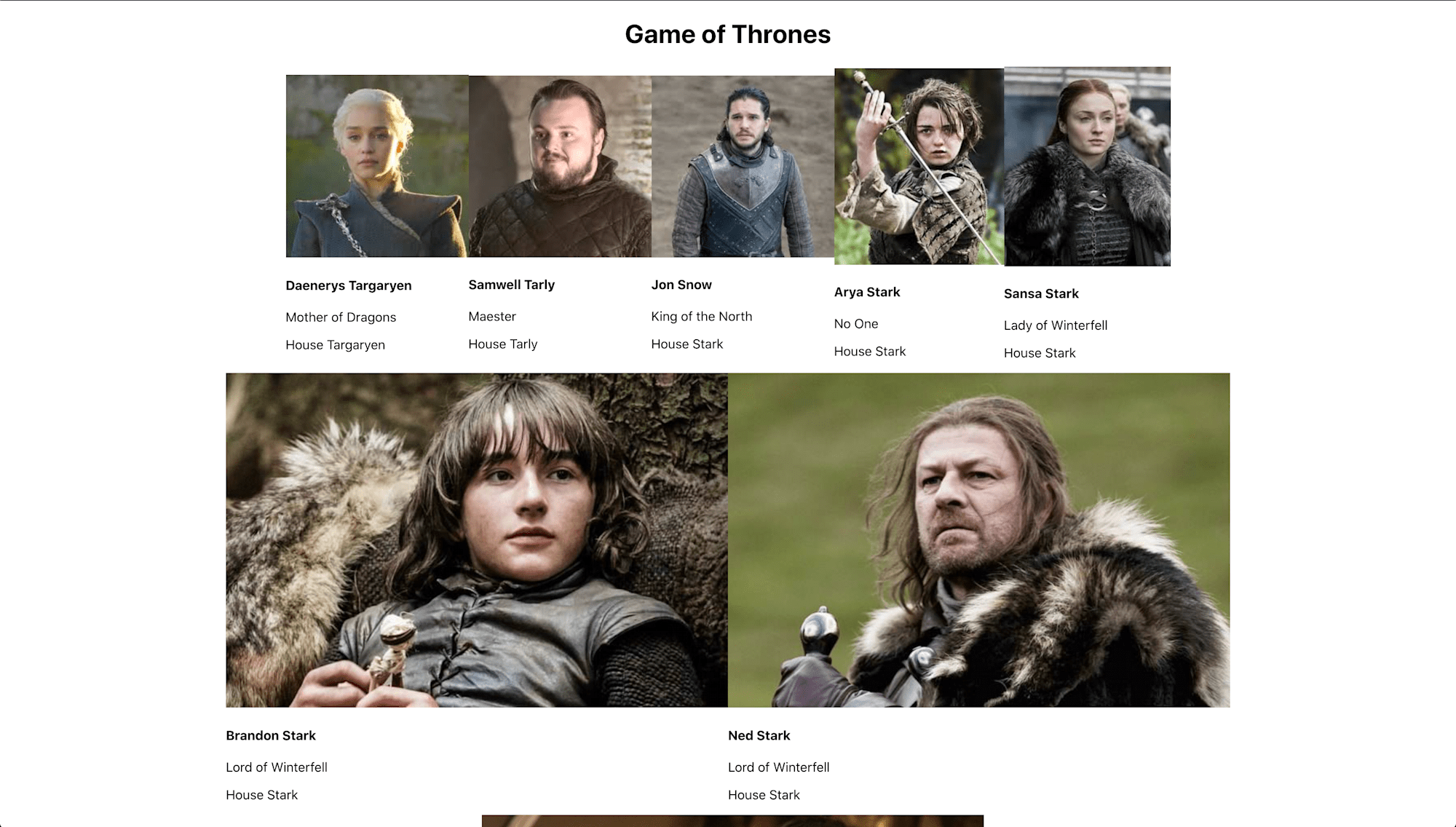
Let’s look at three ways to make our images fit a predefined size using different cropping methods Cloudinary provides.
We can use Cloudinary’s pad crop mode crop = "pad" to resize our images to fill the required width and height we specified. This will retain the aspect ratio of the images, but padding will be applied if the aspect ratio of the images doesn’t match the width and height we specified.
Add this Transformation component to your image component.
    return (
      ...
        <Image
          cloudName="ifeomaimoh"
          publicId={imageUrl}
          type="fetch"
        >
          <Transformation background="auto" height="300" width="300" crop="pad" />
        </Image>
       ...
    );
Code language: HTML, XML (xml)
In the code above, we are combining the pad cropping option with the background parameter. Our images will be resized to fill the specified width and height while maintaining their original aspect ratios. If an image doesn’t fit in the specified width and height, padding is applied to fill the required dimensions.
By setting the background parameter to auto, we specify that we want to match the background for each image to its content, and Cloudinary would handle this automatically. See here for more on pad crop mode.
Head over to your browser to see what the images look like after cropping and padding.
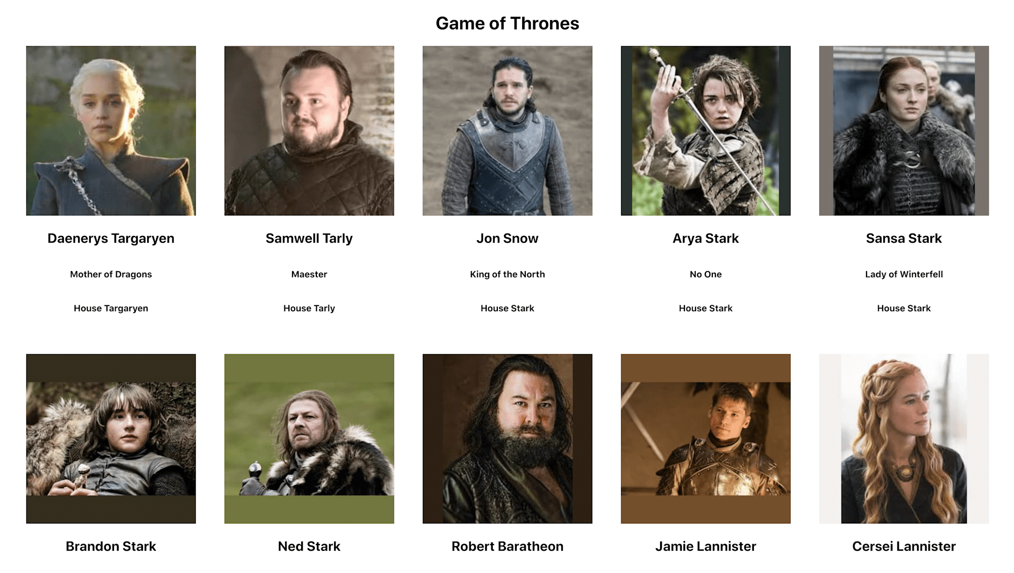
To add padding in a specific or uniform color, just set the background parameter to the color you want. There are also options to blur or match the image’s background to its content.
We can use the fill crop mode crop"= "fill" to resize our images to fill the exact width and height specified while retaining their original aspect ratios.
Replace the previous Transformation component in your image component with this.
return (
...
<Image
cloudName="ifeomaimoh"
publicId={imageUrl}
type="fetch"
>
<Transformation height="300" width="300" crop="fill" gravity="face" />
</Image>
...
);
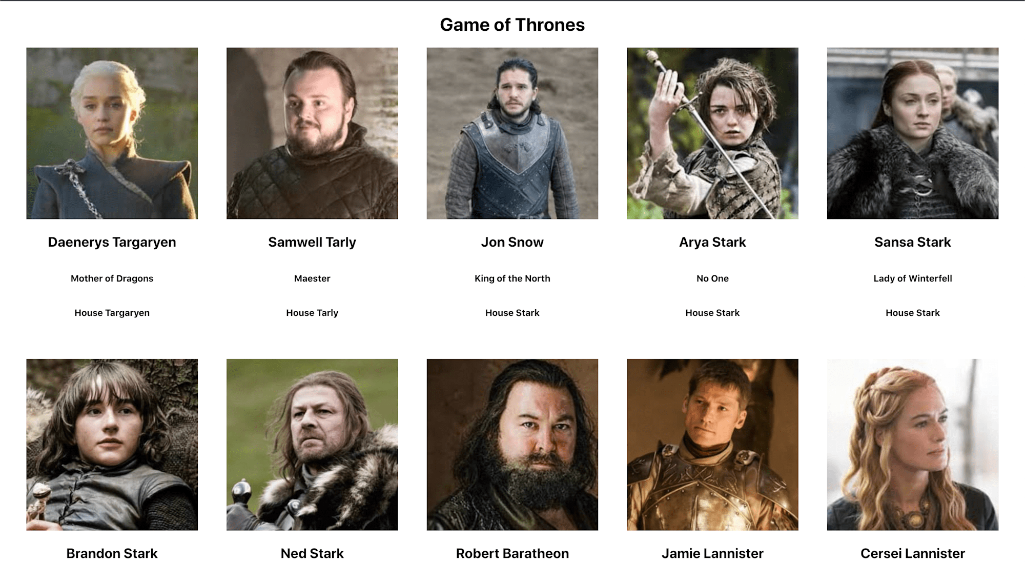
Code language: HTML, XML (xml)We are using the fill cropping option with the gravity parameter. This cropping mode will generate images resized to the exact dimensions we specified, so all the images on our site will have the same aspect ratio. Images whose dimensions exceed our specified aspect ratio will be cropped to fill the dimensions we specified. As seen in the code above, we use the gravity parameter g_face, a built-in face detection feature, to specify that we want the detected face to be the center of the cropped image.
You can also check out the documentation on [fill_pad](https://cloudinary.com/documentation/resizing_and_cropping#fill_pad) crop mode, which combines the beauty of the fill and pad crop modes to avoid cropping out important areas of an image and apply just enough padding when necessary.
Cloudinary also supports conditional transformations, one of which is conditional cropping. Conditional cropping can be used by writing conditional expressions that transform our images depending on their aspect ratios if the given condition is met. If an image is in landscape format, we can say that we want it cropped differently than in portrait format.
Replace the previous Transformation component in your Image component with these.
    return (
      ...
        <Image
          cloudName="ifeomaimoh"
          publicId={imageUrl}
          type="fetch"
        >
          <Transformation if="ar_gt_1:1" />
          <Transformation width="300" height="300" crop="fill" />
          <Transformation if="else" width="200" height="300" crop="fill" />
          <Transformation if="end" />
          <Transformation radius="10" />
        </Image>
       ...
    );
Code language: HTML, XML (xml)
The if parameter is used in the transformation above to specify an initial condition to be met. Using the if_else parameter, we provide a fallback transformation that will be applied if the initial condition is not met.
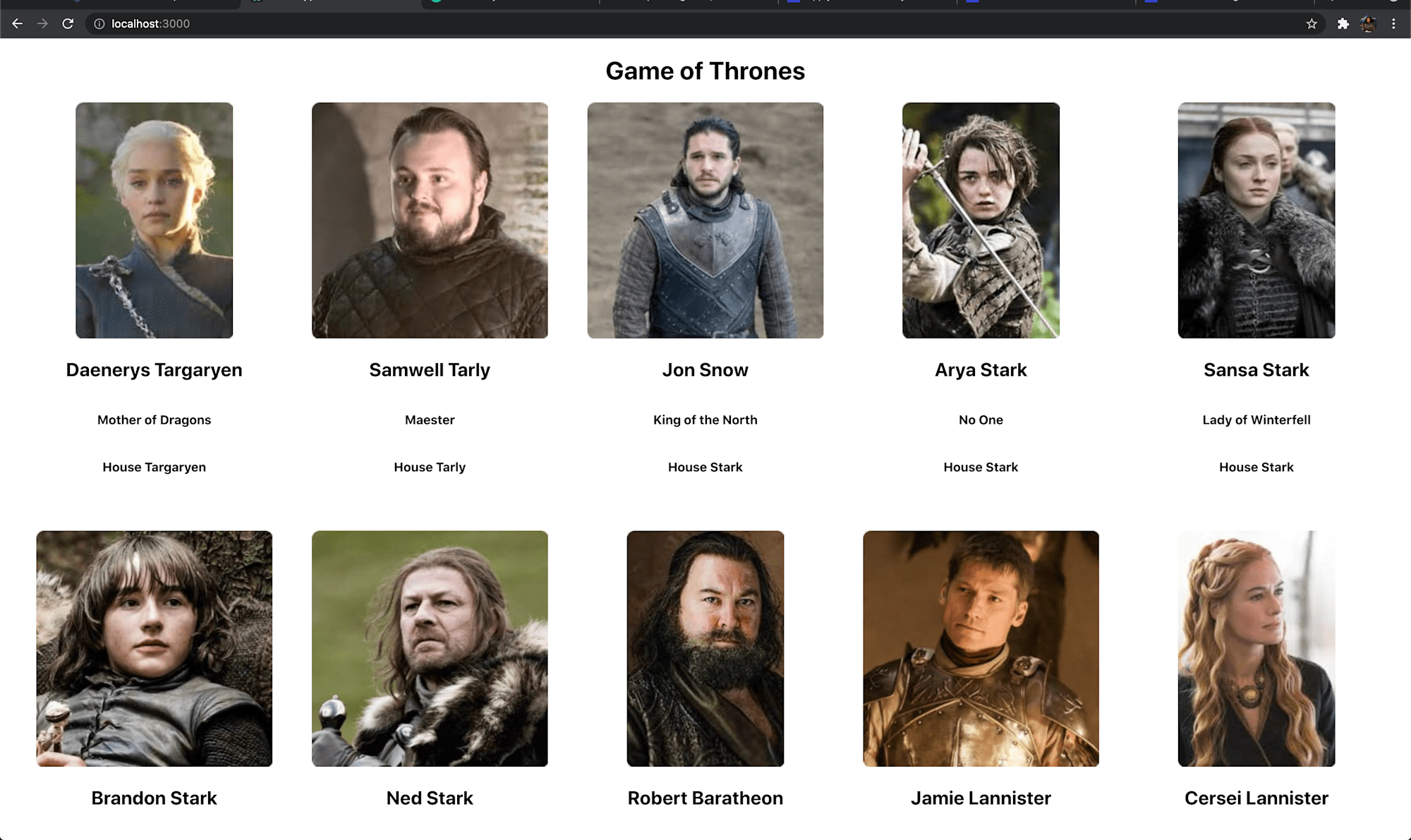
We’re checking to see if the aspect ratio of an image is greater than 1:1 (landscape). If so, we’d want the image to have a width of 300 pixels and a height of 300. However, if the aspect ratio is less than 1:1 (portrait), we want the image to have a width of 200px and a height of 300px.
Here’s what our result looks like.
For more details, see the documentation on conditional image transformation.
Find the source code here on Github.
This tutorial has showcased a few ways Cloudinary enables us to resize and crop images to ensure they take up the specified width and height allocated using different smart cropping techniques and simply changing a few lines of code.
Additional resources that can be helpful: