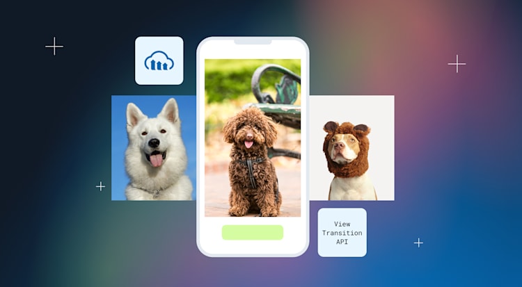
Creating a smooth, responsive user experience in modern single-page applications (SPAs) requires more than just fast loading times, it demands visual continuity. The View Transition API, a new feature in modern browsers, provides a powerful yet simple way to animate changes between DOM states, helping users stay grounded in the flow of an app.
In this blog post, we’ll explore how to pair this emerging web API with Cloudinary, a media platform that delivers optimized and responsive images, to create seamless transitions when swapping images in a SPA. Building a photo gallery, a product showcase, or any interface that dynamically updates visual content? This combination enhances user engagement while keeping implementation clean and performant.
Before we dive into the implementation details, here’s a live example of what we’re building. Click the button to cycle through Cloudinary-hosted images with smooth, animated transitions handled by the View Transition API:
Now that you’ve seen the result, let’s unpack how this works under the hood. We’re combining two modern tools:
-
Cloudinary handles image hosting, optimization, and transformation.
-
The View Transition API provides built-in browser support for animating transitions between DOM states, reducing the need for complex manual animation logic.
Together, they allow us to seamlessly update images with animated transitions in just a few lines of code.
To keep things simple and organized, create the following structure:
/view-transition-demo
├── index.html
├── styles.css
└── script.js
Each file will handle a specific concern: markup, styles, and behavior.
In index.html, we lay out a heading, an image loaded from Cloudinary, and a button for triggering the transition. The most important part is the view-transition-name attribute:
<img
  id="main-image"
  src="https://res.cloudinary.com/demo/image/upload/w_600/sample.jpg"
  view-transition-name="cloudinary-image"
/>

Code language: HTML, XML (xml)
This tells the browser to track this image element across updates, enabling smooth visual transitions.
We also include a simple button:
<button id="next-btn">Next Image</button>
Code language: HTML, XML (xml)
And don’t forget to link the CSS and JS files:
<link rel="stylesheet" href="styles.css" />
<script src="script.js"></script>
Code language: HTML, XML (xml)Cloudinary allows us to serve responsive, optimized images via URL. We can dynamically change images using a consistent URL pattern:
https://res.cloudinary.com/demo/image/upload/w_600/{image-name}.jpg
In JavaScript, we’ll maintain an array of image filenames and construct new URLs on the fly when users click the button.
In script.js, we handle the core logic:
First, keep track of which image is currently displayed:
const images = ["sample.jpg", "dog.jpg", "balloons.jpg"];
let currentIndex = 0;
Code language: JavaScript (javascript)
Then, set up a function to update the image:
function updateImage() {
  const next = (currentIndex + 1) % images.length;
  const newSrc = `https://res.cloudinary.com/demo/image/upload/w_600/${images[next]}`;
  document.getElementById("main-image").src = newSrc;
  currentIndex = next;
}

Code language: JavaScript (javascript)
To apply the transition, we wrap that update in startViewTransition:
document.getElementById("next-btn").addEventListener("click", () => {
  if (document.startViewTransition) {
    document.startViewTransition(() => updateImage());
  } else {
    updateImage(); // fallback if unsupported
  }
});

Code language: JavaScript (javascript)
This is all you need to get animated DOM updates — no manual animation logic or extra libraries required.
In styles.css, we first style the image and assign the same view-transition-name that we used in the HTML:
img {
  view-transition-name: cloudinary-image;
  width: 100%;
  border-radius: 12px;
  box-shadow: 0 4px 12px rgba(0, 0, 0, 0.2);
}

Code language: CSS (css)
To control the animation itself, we define styles for the “old” and “new” visual states of the image:
::view-transition-old(cloudinary-image) {
  animation: fadeOut 0.4s ease forwards;
}

::view-transition-new(cloudinary-image) {
  animation: fadeIn 0.4s ease forwards;
}

Code language: CSS (css)
And here are the keyframes that make it work:
@keyframes fadeIn {
  from { opacity: 0; transform: scale(0.98); }
  to   { opacity: 1; transform: scale(1); }
}

@keyframes fadeOut {
  from { opacity: 1; transform: scale(1); }
  to   { opacity: 0; transform: scale(1.02); }
}

Code language: CSS (css)
This results in a subtle, polished transition where the old image fades and scales out while the new one fades and scales in.
The View Transition API is currently only supported in Chrome 111+, Edge, and other Chromium-based browsers. That’s why we check for support before using it.
if (document.startViewTransition) {
  // use animated transition
} else {
  // fallback update
}

Code language: JavaScript (javascript)
This keeps the core functionality working across all browsers, even if some don’t support the transition animations yet.
Using the View Transition API alongside Cloudinary, we’ve built a lightweight, performant way to animate image changes in a single-page app with just a few lines of code.
We:
-
Loaded optimized images from Cloudinary.
-
Used
view-transition-nameto track elements. -
Animated DOM updates with
startViewTransition(). -
Customized transitions with CSS pseudo-elements.
It’s simple, efficient, and feels great in action, especially in supported browsers like Chrome and Edge.
-
Transition multiple elements. Assign unique
view-transition-names to text, cards, or other components. -
Try multi-page transitions. Add
@view-transition { navigation: auto; }to animate full-page navigation. -
Use real Cloudinary features. Add transformations like cropping or overlays during image swaps. Sign up for a free Cloudinary account to try it for yourself.