
With Cloudinary’s current client-side SDKs, such as React, Vue, and Angular, you can manage images in numerous amazing ways, for example, making use of media from Cloudinary for your project, transforming media, and enhancing the responsiveness of your site. A new and exciting feature in our Angular SDK, called the Advanced Image component, takes image management to the next level by handling many common front-end (FE) tasks, such as lazy loading, placeholding, accessibility, and, coming soon, zooming. Just ask the component to perform any of those tasks by adding the appropriate attributes and it’ll do the rest.
Feel free to watch this accompanying video if you’d prefer or read on for the details.
Lazy-loading an image means that you download and display the image only if necessary, such as when the viewer scrolls down and the image is about to enter the viewport, hence economizing load time.
All you need to do is add the attribute loading=“lazy” to your image’s cl-image tag, for example:
<cl-image loading=”lazy” public-id=”kit” width=”500”></cl-image>
Afterwards, that image loads only when it is in the viewport.
For Google Chrome, native lazy-loading, which has been available since Chrome 76, applies. For other browsers, we implemented lazy loading with the Intersection Observer API.
Image size affects website content’s load-time the most. To boost viewer experience, ensure that your images are of the smallest possible size.
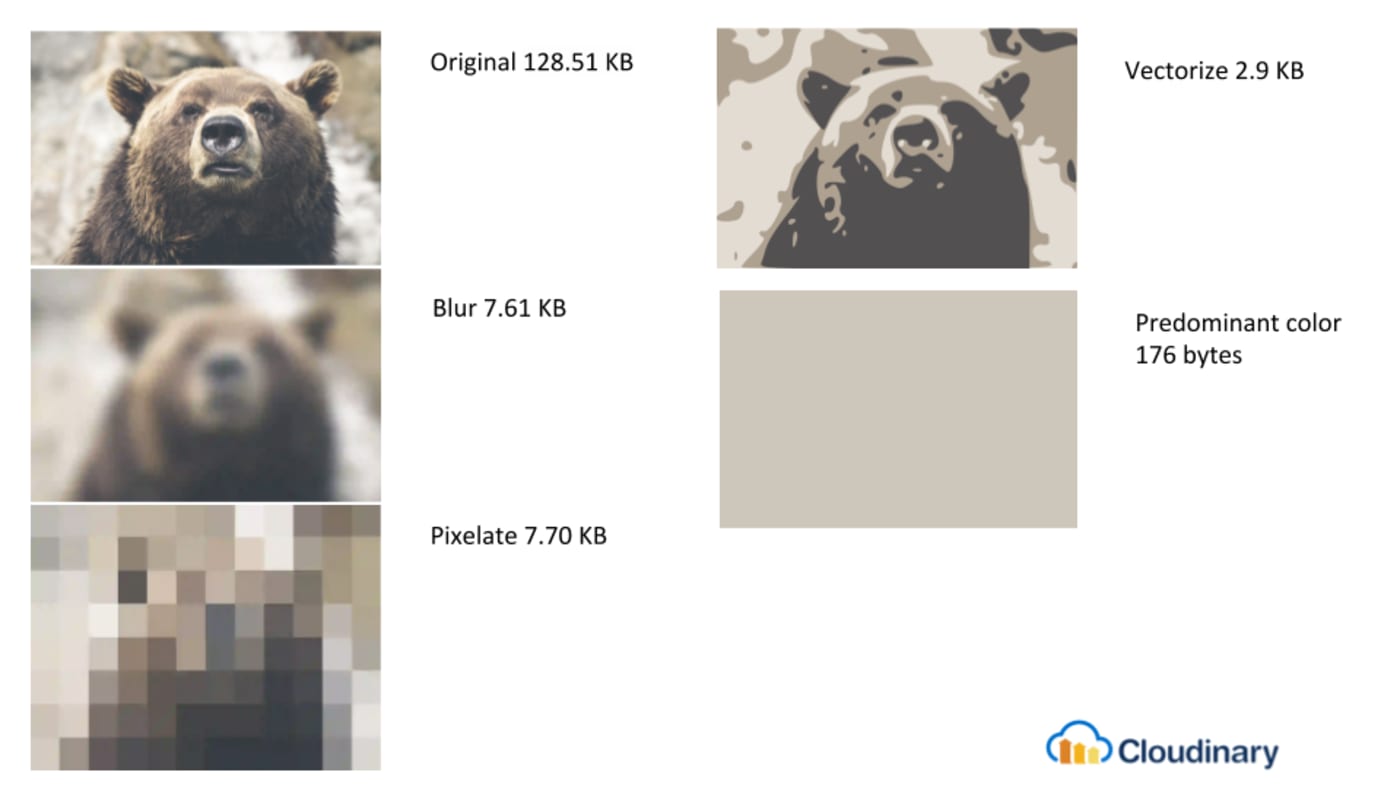
An image’s placeholder is a much smaller, lower-quality version of the image to be displayed. A smart way to accelerate page loading is to first load a tiny, low-quality image as a placeholder, followed by the real image itself.
To make that happen, add placeholder as a nested attribute to your cl-image tag, as in this example:
<cl-image loading=”lazy” public-id=”bear” width=”500”>
   <cl-placeholder type=”pixelate”></cl-placeholder>
<cl-image>
Several placeholder types are available, with the default being a lower-quality, blurred image. Here are the options along with their file sizes as compared to the original:
We recommend that you adopt both placeholding and lazy loading for your images to ensure that the originals are downloaded only when necessary.
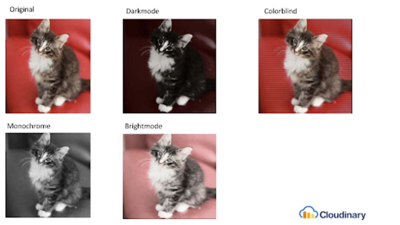
All modern apps must support accessibility for the visually impaired, who can make use of widgets that enable them to customize apps to accommodate their viewing needs. How your app reacts to the customization is up to you, however.
A common approach is to change the app’s theme to dark mode by tweaking the CSS. Nonetheless,
that strategy misses an important aspect of the app: the images. To fully support accessibility, ensure that, when asked to change a page to dark mode, the related images also transform to a darker version. Simply add the attribute accessibility=“darkmode” to the cl-image tag.
You have four options to choose from: darkmode, colorblind, monochrome, and brightmode. The diagram below illustrates the differences.
We’ll soon add the zooming capability to the Advanced Image component, which will also be available for our React and Vue SDKs in the near future. In addition, we’ll keep improving the component and adding other features. Watch this space for the announcements and be sure to give Cloudinary a try for free!
Cloudinary’s Advanced Image Component’s automated capabilities for common FE tasks spell significant time savings and peace of mind for developers. High on our priority list is the component’s availability for the React JavaScript SDK and the Vue.js JavaScript SDK. Additionally, we’ll continue to stay alert to front-end needs and to enhance our image components with features geared toward easing the life of FE developers. That’s a promise. Be sure to give Cloudinary a try!