
Delivering an optimal image experience tailored to each user’s device and screen size is crucial. Responsive images are a key technique ensuring images load quickly, maintain crisp quality, and adapt seamlessly across various viewports. This blog post explores what responsive images are, how to implement them in a framework such as Next.js, and how Cloudinary’s CldImage component built for Next.js simplifies the process.
Responsive images enable the delivery of high-quality images that adapt to the user’s device characteristics, such as screen size, resolution, and network conditions. Instead of serving a single, large image to all devices, responsive images provide different versions of the same image tailored to each device’s capabilities. This approach ensures that users on mobile devices or slower networks receive optimized, smaller images, thus improving performance and reducing data usage. Even pixel density is considered; devices with retina displays, like modern MacBooks, can receive images of higher pixel density if supported by the website.
HTML provides basic tools to facilitate responsive images through the srcset and sizes attributes on the img element. They can be used on the img element as on the following example:
<img
  srcset="
    image-320w.jpg 320w,
    image-480w.jpg 480w,
    image-800w.jpg 800w
  "
  sizes="(max-width: 320px) 280px, (max-width: 480px) 440px, 800px"
  src="image-800w.jpg"
  alt="Responsive Image"
/>
Code language: HTML, XML (xml)
The srcset attribute contains the image’s different variations, where each variation is separated by a comma and provides the image’s filename and the image’s intrinsic size. In the above example, image-320w.jpg has a size of 320w, meaning it has an intrinsic width of 320 pixels. Alternatively, we could also use the image’s pixel density descriptor instead of the size (e.g., 2x) if we wanted to provide images of different pixel densities (e.g., standard and retina, which has more pixels).
The sizes property, on the other hand, is a comma-separated list of media conditions and slot sizes that are used when the media condition is evaluated to be true. The last value in the list is sometimes without any media conditions, meaning it is the fallback slot size when no media condition is matched. But how does the browser use this list?
With srcset and sizes in place, the browser will look at characteristics of the user’s device such as screen size and pixel density, find the first matching media query that matches the user’s device, look at the slot size given to that media query, and load the image referenced in the srcset list that has the same size as the slot or, if there isn’t one, the first image that is bigger than the chosen slot size.
Now, with the above example in mind, this means that:
- For devices up to 320px wide, the browser will pick the first image from the
srcsetthat is equal to or larger than 280px, and that isimage-320w.jpg. - For devices up to 480px wide, the browser will pick the first image from the
srcsetthat is equal to or larger than 440px, and that isimage-480w.jpg. - For devices larger than 480px wide, the browser will pick the first image from the
srcsetthat is equal to or larger than 800px (the fallback value), and that isimage-800w.jpg.
How is src used when srcset exists? It depends on whether the browser supports srcset. If the browser doesn’t support srcset, or if there’s an error parsing the srcset attribute, it will fall back to using the image source specified in the src attribute.
One relatively newer feature worth mentioning is Client Hints. While an image’s srcset is used on the client side by the browser to choose between different image resources based on device capabilities, Client Hints complement this by allowing the server to make more informed decisions about which images to serve based on additional information about the client’s device, leading to potentially even more optimized content delivery. This is accomplished through the browser sending special headers to the server that contain information about the client device capabilities, such as Sec-CH-DPR (which represents the browser window’s device pixel ratio). Client Hints still have limited browser support, however, the Cloudinary API already supports them.
Layout shift in the context of an image loading occurs when the browser initially renders a web page without knowing the actual dimensions of an image. As a result, the image’s placeholder takes up minimal space on the page, causing other elements to position themselves accordingly. However, once the image has fully loaded and the browser recognizes its actual dimensions, it may need to reflow the content, shifting surrounding elements to accommodate the image’s true size.
This effect can be seen below:
To prevent this layout shift before an image has loaded, it’s recommended to provide the width and height attributes on the img element. By specifying these attributes, the browser can reserve the appropriate amount of space for the image based on its aspect ratio, preventing surrounding content from shifting when the image loads. This technique is known as “reserving space” and helps maintain a stable layout, improving the overall user experience. Therefore, to provide a good user experience for responsive images, we should not only rely on srcset and sizes, but provide width and height as well.
It’s important to note that while the width and height attributes define the intrinsic dimensions, the actual rendered size of the image can be different based on the applied CSS styles, such as max-width or object-fit.
If your website features a multitude of images, manually adding different variations in srcset can be a daunting task. Fortunately, there are tools like the Responsive Image Breakpoints Generator that help you alleviate this issue. Furthermore, modern frameworks such as Next.js come equipped with built-in functionality to generate a set of responsive images with no additional effort required by the developer. All that is required from you is to provide the image source, and Next.js will leverage its Image Optimization API to generate a set of images along with the accompanying srcset. This is achieved through the use of an Image Loader, essentially a function that creates multiple URLs to request the image at different sizes. These multiple URLs facilitate the automatic generation of srcset, ensuring that visitors to your site are served an image that is the perfect size for their viewport.
The default loader for Next.js applications is capable of optimizing images not only hosted locally but also those from anywhere on the web, and then serving them directly from the Next.js web server.
The Next.js Image component acts as a wrapper around the standard img element. By utilizing the Image component in the following manner, you can take advantage of Next.js’s image optimization capabilities. For an Image component used like this:
import Image from 'next/image'

const MyComponent = () => (
  <Image
    src="/assets/nature-mountains.jpg"
    width={800}
    height={600}
    alt="Example Image"
  />
)
Code language: JavaScript (javascript)
Next.js will generate an img element like this:
<img alt="Example Image" loading="lazy" width="800" height="600" decoding="async" data-nimg="1" style="color:transparent" srcset="/_next/image?url=%2Fassets%2Fnature-mountains.jpg&w=828&q=75 1x,/_next/image?url=%2Fassets%2Fnature-mountains.jpg&w=1920&q=75 2x" src="/_next/image?url=%2Fassets%2Fnature-mountains.jpg&w=1920&q=75">
Code language: HTML, XML (xml)If Next.js’s Image component is a wrapper around the HTML img element, then Cloudinary’s CldImage is a wrapper around Next.js’s Image. The CldImage component accepts similar props as the Image component from Next.js but automatically handles image optimization, responsive delivery, and various image transformations through Cloudinary’s powerful API. This gives you access to advanced features like dynamic cropping, background removal, overlays, and other Cloudinary transformations.
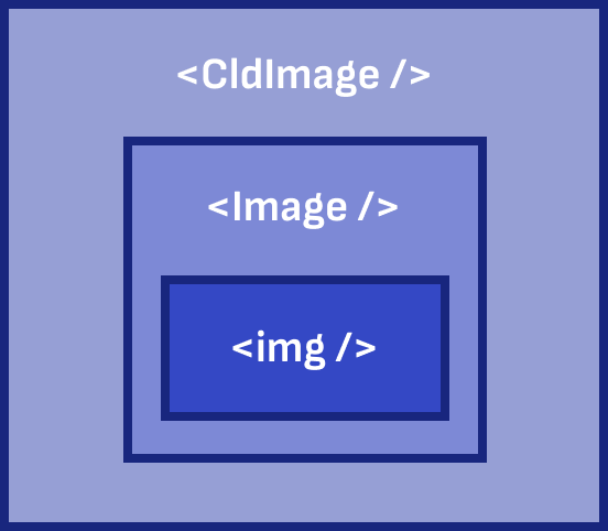
CldImage can be used almost as a drop-in replacement for the Next.js image component, as shown below. We only changed the element name from Image to CldImage and updated the source to match the location of the image on Cloudinary.
import { CldImage } from "next-cloudinary";

const MyComponent = () => (
  <CldImage
    src="samples/landscapes/nature-mountains"
    width={800}
    height={600}
    alt="Example Image"
  />
)
Code language: JavaScript (javascript)
The resulting img element is this:
<img alt="Example Image" loading="lazy" width="800" height="600" decoding="async" data-nimg="1" style="color:transparent" srcset="https://res.cloudinary.com/daa2k5bgw/image/upload/c_limit,w_828/f_auto/q_auto/v1/samples/landscapes/nature-mountains?_a=BAVAEyBy0 1x, https://res.cloudinary.com/daa2k5bgw/image/upload/c_limit,w_1920/f_auto/q_auto/v1/samples/landscapes/nature-mountains?_a=BAVAEyBy0 2x" src="https://res.cloudinary.com/daa2k5bgw/image/upload/c_limit,w_1920/f_auto/q_auto/v1/samples/landscapes/nature-mountains?_a=BAVAEyBy0">
Code language: HTML, XML (xml)
As you can see, the srcset now uses Cloudinary URLs for each image in the srcset. In the following sections, we will see how we can utilize CldImage in some common UI patterns.
Responsive images can be used in various scenarios across web applications, but they are particularly prevalent in hero sections and card elements, where visual appeal and optimal presentation are crucial. In this context, we will demonstrate how to model these components effectively by leveraging the powerful combination of React, Tailwind CSS, and Cloudinary’s CldImage component.
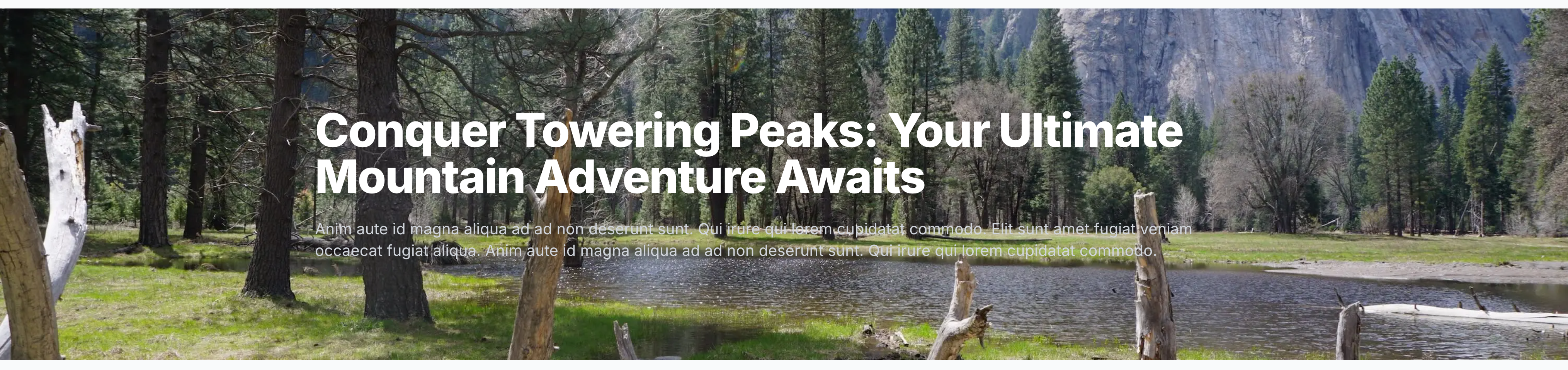
A hero section on a website typically refers to the prominent, eye-catching area at the top of a web page. The hero section often occupies a significant portion of the initial viewport and can include various elements. Commonly, it features a large image in the background that stretches to fill the entire width.
To achieve this, we will use CldImage with the sizes property set to 100vw. This means the image will always be full-width, allowing the browser to calculate the width of the rendered image depending on the user’s device and select the appropriate image from the auto-generated srcset based on that.
In a hero section like this, layout shift isn’t a concern because the image is used as a background image, and we don’t need to specify the width and height of CldImage. Instead, we need to use fill, which causes the image to fill the parent element. This is the resulting code:
function ResponsiveHero() {
  return (
    <div className="relative">
      <div className="absolute inset-0">
        <CldImage
          fill
          src="samples/landscapes/nature-mountains"
          sizes="100vw"
          alt="Lake with mountains in the background, blue sky and green trees along the shore"
        />
        <div className="absolute inset-0 bg-gray-800 opacity-50"></div>
      </div>
      <div className="relative max-w-7xl mx-auto py-24 px-4 sm:py-32 sm:px-6 lg:px-8">
        <h1 className="text-4xl font-extrabold tracking-tight text-white sm:text-5xl lg:text-6xl">
          Conquer Towering Peaks: Your Ultimate Mountain Adventure Awaits
        </h1>
        <p className="mt-6 text-xl text-gray-300">
          Anim aute id magna aliqua ad ad non deserunt sunt. Qui irure qui lorem
          cupidatat commodo. Elit sunt amet fugiat veniam occaecat fugiat
          aliqua. Anim aute id magna aliqua ad ad non deserunt sunt. Qui irure
          qui lorem cupidatat commodo.
        </p>
      </div>
    </div>
  );
}
Code language: JavaScript (javascript)
When rendered, the hero section will appear as:
The result of the above code is that CldImage generated a total of eight srcset images (part of the URL is omitted for simplicity).
1. https://res.cloudinary.com/daa2k5bgw/image/upload/c_limit,w_640/[...]/nature-mountains?_a=BAVAEyBy0 640w
2. https://res.cloudinary.com/daa2k5bgw/image/upload/c_limit,w_750/[...]/nature-mountains?_a=BAVAEyBy0 750w
3. https://res.cloudinary.com/daa2k5bgw/image/upload/c_limit,w_828/[...]/nature-mountains?_a=BAVAEyBy0 828w
4. https://res.cloudinary.com/daa2k5bgw/image/upload/c_limit,w_1080/[...]/nature-mountains?_a=BAVAEyBy0 1080w
5. https://res.cloudinary.com/daa2k5bgw/image/upload/c_limit,w_1200/[...]/nature-mountains?_a=BAVAEyBy0 1200w
6. https://res.cloudinary.com/daa2k5bgw/image/upload/c_limit,w_1920/[...]nature-mountains?_a=BAVAEyBy0 1920w
7. https://res.cloudinary.com/daa2k5bgw/image/upload/c_limit,w_2048/[...]/nature-mountains?_a=BAVAEyBy0 2048w
8. https://res.cloudinary.com/daa2k5bgw/image/upload/c_limit,w_3840/[...]/nature-mountains?_a=BAVAEyBy0 3840w
As you can see from the URLs, they contain parameters that determine the size and quality of the image you would receive if you made a GET request. The parameter starting with w_ specifically indicates the width of the image. This means that you, as a developer, no longer need to manually generate the images — Cloudinary, with its CldImage, will do all the heavy lifting for you.
Now, for someone using a 1080p monitor, the width of the viewport will be roughly 1920 pixels, and the browser will choose picture number 6 from the srcset, which is an image optimally sized for that resolution.
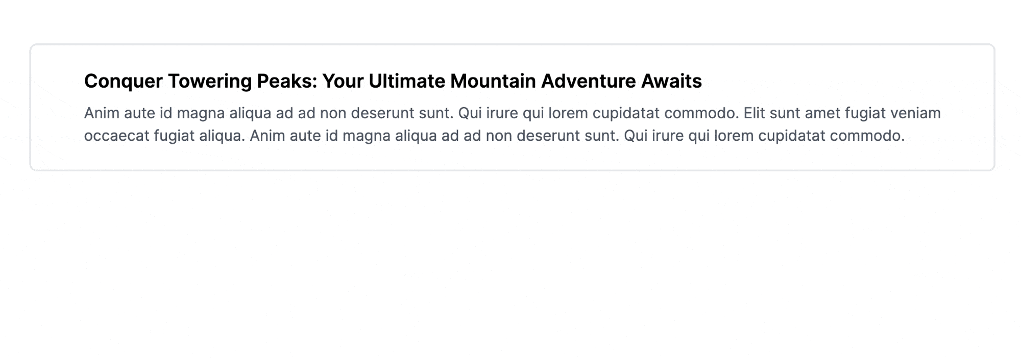
Card components are a popular UI pattern used in modern web design, often featuring a visually appealing layout with images, text, and other content elements. Images play a crucial role in card components, frequently appearing on the left or right side, serving as an eye-catching thumbnail or visual representation of the card’s content. Because images no longer appear in the background, we need to take a slightly different approach. This time, we need to be wary of possible layout shifts while the image is loading.
For that reason, we need to reserve some space for the image by specifying both width and height. We’ll also specify multiple sizes, because we want the image to be full-width when on mobile, while on larger screens, it will appear in the left section and be roughly 640px in width.
The resulting code is:
function ResponsiveCard() {
  return (
    <div className="bg-white rounded-lg border-2 overflow-hidden grid grid-cols-1 sm:grid-cols-2 max-w-screen-lg mx-auto my-32">
      <div className="flex justify-center p-4">
        <CldImage
          className="w-full lg:w-auto object-cover"
          width={478}
          height={319}
          src="samples/landscapes/nature-mountains"
          sizes="(max-width: 640px) 100vw, 750px"
          alt="Lake with mountains in the background, blue sky and green trees along the shore"
        />
      </div>
      <div className="p-6">
        <h3 className="text-xl font-semibold mb-2">Conquer Towering Peaks: Your Ultimate Mountain Adventure Awaits</h3>
        <p className="text-gray-600">Anim aute id magna aliqua ad ad non deserunt sunt. Qui irure qui lorem
          cupidatat commodo. Elit sunt amet fugiat veniam occaecat fugiat
          aliqua. Anim aute id magna aliqua ad ad non deserunt sunt. Qui irure
          qui lorem cupidatat commodo.</p>
      </div>
    </div>
  );
}
Code language: JavaScript (javascript)
When rendered, the card section will appear as:
Responsive images are crucial for delivering an exceptional user experience across multiple devices. While Next.js provides built-in tools for implementing responsive images, Cloudinary’s CldImage component offers a powerful and flexible solution for handling complex image optimization and transformation scenarios. Combine Next.js and Cloudinary to deliver high-quality, responsive images that enhance your application’s performance and user experience. Contact us today to learn more.


