
A video blog (also referred to as a vlog) is a type of blog whose primary content is in video form. Video blogs provide a fun and interactive way to share tutorials, ideas, events, etc. In this article, you will learn how to create a video blog using NextJS and MDX.
NextJS is a React framework that offers functionalities such as server-side rendering, static site generation, and smart-bundling out of the box. These enable you to build static or dynamic apps and websites very quickly. It also comes with styled-jsx, a component-friendly CSS support for JSX.
MDX is a document format that lets you write JSX in markdown. With this, you can import React components for use in your markdown document.
We will store and deliver videos using Cloudinary, a cloud-based service used for managing images and videos. Cloudinary provides a rich media experience on websites and apps.
You can find a complete version of the demo on Codesandbox. Fork the Sandbox to get started
You can also check it out on [GitHub](https://github.com/dpkreativ/nextjs-video-blog).

https://github.com/dpkreativ/nextjs-video-blog

## Prerequisites

To get started, you need the following:

- Experience with React. Also, having some knowledge of NextJS would help you understand and follow this tutorial quicker, but it is not compulsory.
- A Cloudinary account. Cloudinary provides a free plan that is sufficient for all our development efforts. You can sign up [here](https://cloudinary.com/users/register/free).
- `npm` to handle node packages in your project. It comes pre-packaged with Node, and you can get it [here](https://nodejs.org/en/). Verify your installation through your terminal by running the commands: `npm -v` for npm and `node -v` for node.
    If you prefer to use `yarn` to handle your packages, you need to install it first. You can do that [here](https://classic.yarnpkg.com/en/docs/install/). To verify that you have yarn installed, open your terminal and run the command: `yarn -v`


## Set up your NextJS App

The recommended way to set up your NextJS app is to open your terminal, navigate to the folder you wish to set up your project, and run the command:

```bash
    npx create-next-app
or using yarn
yarn create next-app
After you have successfully initialized the project, use this custom structure for your app. It includes all the files and folders we would be using in this article. Feel free to customize the .mdx filenames in pages/blogposts to fit your needs.
    (project's root directory)
    ├── components
    |  └── Video.js
    ├── layouts
    |  └── PostLayout.js
    ├── pages
    |  ├── blogposts
    |  |  ├── hello-world.mdx
    |  |  ├── one-shot.mdx
    |  |  ├── perfection.mdx
    |  |  └── vulnerable.mdx
    |  ├── _app.js
    |  └── index.js
    ├── styles
    |  ├── Home.module.css
    |  └── globals.css
    ├── next.config.js
    ├── package.json
    ├── README.md
    └── yarn.lock
To use MDX with NextJS in your project, install next-mdx-enhanced. This plugin, created and maintained by Hashicorp, enables MDX pages, layouts, and frontmatter in NextJS. In your project’s root directory, run the command:
npm install next-mdx-enhanced --save
or using yarn
yarn add next-mdx-enhanced
In your pages/blogposts folder, create your blog post as a .mdx file. In this example, We will add the content below to our hello-world.mdx file:
    ---
    title: "Hello World"
    description: "A computer's first song"
    layout: "PostLayout"
    dateTime: "2021-06-13"
    published: "Jun 13, 2021"
    author: "Divine Orji"
    ---

    ## Hello, welcome to my first post.
    This is a song from a virtual singer software.
Code language: PHP (php)
Frontmatter is the content in-between the triple dashes (---). Frontmatter is a markdown addon used to store metadata relevant to specific pages in key-value pairs.
Go ahead and create extra blog posts as needed in your project.
Don’t leave any of the
.mdxfiles empty, as this could throw anundefinederror when usinggetStaticPropsto fetch the blog posts later on. You can delete any.mdxfiles you don’t need at the moment to avoid this too.
In your layouts folder, open PostLayout.js and create a template that you will use to display each of your blog posts. First import required dependencies and return then JSX component:
import Head from "next/head";
import Link from "next/link";
const PostLayout = ({ children, frontMatter }) => {
const { title, author, published, dateTime } = frontMatter;
return (
<>
<Head>
<title>{title}</title>
</Head>
<main>
<article>
<h1>{title}</h1>
<p>
Posted on <time dateTime={dateTime}>{published}</time> by {author}
</p>
<section className="content">{children}</section>
</article>
<nav className="go-home">
<Link href="/">← Go Home</Link>
</nav>
</main>
{\*Style goes in here*\}
</>
);
};
export default PostLayout;
Code language: JavaScript (javascript)Next add the styles
    import Head from "next/head";
    import Link from "next/link";

    const PostLayout = ({ children, frontMatter }) => {
      const { title, author, published, dateTime } = frontMatter;

      return (
        <>
          {\*Component body*\}

          <style jsx>
            {`
              main {
                max-width: 800px;
                margin: 2rem auto;
                padding: 0 1rem;
              }
              main h1 {
                font-size: 2.5rem;
              }
              main time {
                font-style: italic;
              }
              main .content {
                margin: 2rem 0;
              }
              main .go-home {
                text-decoration: underline;
                text-underline-offset: 0.3rem;
                margin: 5rem 0;
              }
            `}
          </style>
        </>
      );
    };

    export default PostLayout;
Code language: JavaScript (javascript)
The component will take children and frontMatter as props, de-structure the frontmatter to get title, author, published, dateTime from the metadata. Then display them and children where we want in the blog post. We also added some styles using styled-jsx. The dateTime attribute translates the date into a machine-readable format, which is great for accessibility and search engine optimization.
We use the next.config.js file to add some customizations to the default behaviour of NextJS. For this project, you will instantiate next-mdx-enhanced as a NextJS plugin.
Configure your next.config.js file in the root directory of your project to include:
    const withMdxEnhanced = require("next-mdx-enhanced");

    module.exports = withMdxEnhanced({
      layoutPath: "./layouts",
      defaultLayout: true,
      fileExtensions: ["mdx"],
      usesSrc: false,
    })({webpack5: false});
Code language: JavaScript (javascript)
layoutPath points to the folder where you are storing the layout templates for your blog site. Remember, we created our template component in the layouts folder. So we add the path to that folder. We also set webpack5: false to ensure NextJS uses webpack 4 to prevent TypeError: Cannot convert undefined or null to object. This error comes up sometimes when using webpack 5 in NextJS.
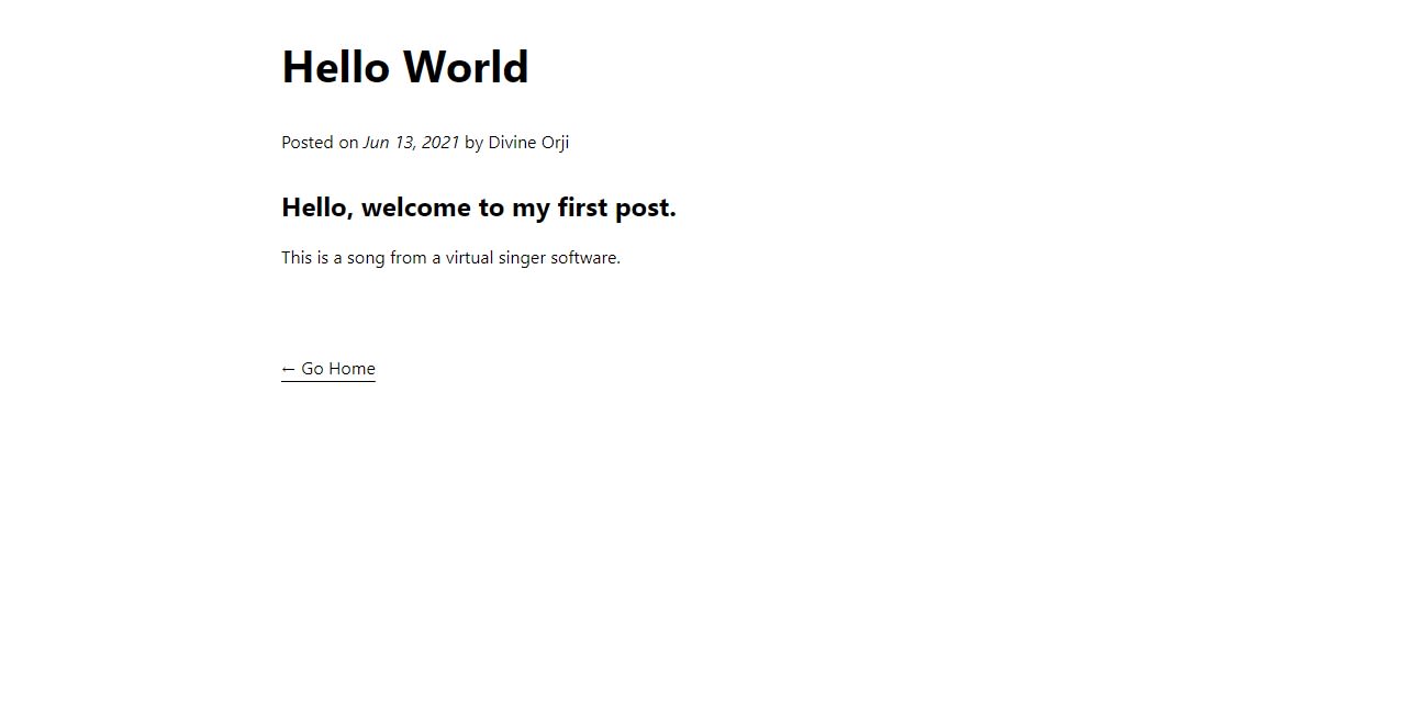
After editing and saving your next.config.js file, start the local server by running the command npm dev or yarn dev in your terminal. Then go to your browser and type localhost:3000/blogposts/hello-world to view your blog page.
It would look like this:
There are two ways to embed a video player from Cloudinary:
- A self-hosted player by including the Cloudinary video player JavaScript Library
- A cloud-hosted player using an
iframe.
For this tutorial, we use a cloud-hosted player.
In /components/Video.js, create a Video component that will contain your iframe and its attributes:
    const Video = ({ src }) => {
      return (
        <div className="iframe-container">
          <iframe
            title="blog video"
            src={src}
            allow="autoplay; fullscreen; encrypted-media; picture-in-picture"
            allowFullScreen
            frameBorder="0"
          ></iframe>
        </div>
      );
    };
    export default Video;
Code language: JavaScript (javascript)
Go to your Cloudinary account on your browser and take note of your “Cloud name”. You can find your Cloud name on your Dashboard. It should look like this:

Open “Media Library”, create a folder for your blog videos, then upload the videos you want to add to your blog. In this tutorial, we create a folder named next-mdx-video-blog and upload our videos to that specific folder.
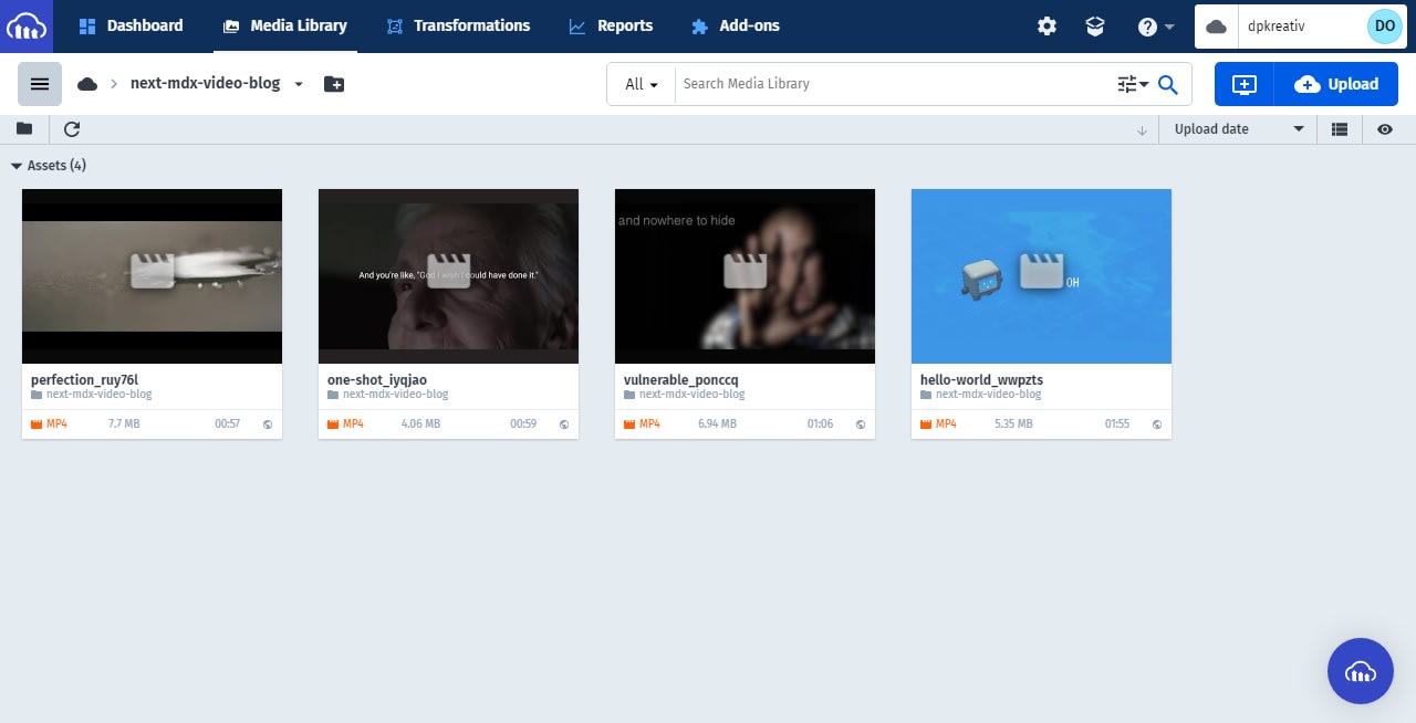
Get the public ID of the video you want to embed in your blog. To do this, copy out the URL of the video, paste it somewhere, and select all the text between upload/ and the extension of the video.
For example, to get the public ID of the “hello world” video we uploaded to Cloudinary, we first copy out the URL of the video
https://res.cloudinary.com/dpkreativ/video/upload/v1624176389/next-mdx-video-blog/hello-world_wwpzts.mp4
then select its public ID
v1624176389/next-mdx-video-blog/hello-world_wwpzts
Go to Cloudinary Studio on your browser, and in the “Video Source” section, select “My Cloudinary Video”. Next, fill in the input fields for your Cloud name and your video’s public ID and click “Apply”. If you followed the steps above correctly, you should see something like this:
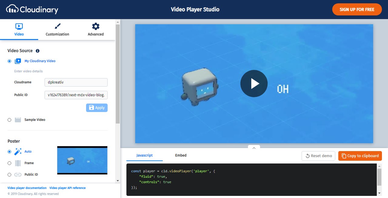
Click on “Embed” to view the iframe code generated for your video, then select and copy the src and its content. You don’t need to copy the entire iframe code because we had already taken care of that in the Video component you created earlier.
In your project, open the .mdx blog file you want to embed your cloud-hosted video. Next, import your Video component, then paste the src content you copied in the previous step. It should look like this:
    ---
    title: "Hello World"
    description: "A computer's first song"
    layout: "PostLayout"
    dateTime: "2021-06-13"
    published: "Jun 13, 2021"
    author: "Divine Orji"
    ---

    import Video from "../../components/Video.js";

    ## Hello, welcome to my first post.

    <Video src="https://player.cloudinary.com/embed/?public_id=v1624176389%2Fnext-mdx-video-blog%2Fhello-world_wwpzts&cloud_name=dpkreativ&player%5Bfluid%5D=true&player%5Bcontrols%5D=true&source%5Bsource_types%5D%5B0%5D=mp4" />

    This is a song from a virtual singer software.
Code language: PHP (php)You might have noticed at this point that your embedded video looks a bit out of shape. To fix that, you need to make your iframe responsive.
The traditional way of making an element responsive is to set the width to 100%. Then set the max-width to the maximum size you would like the element to reach, then the height adjusts accordingly. However, it doesn’t work the same way with iframes (there’s the [intrinsicSize](https://googlechrome.github.io/samples/intrinsic-size/) attribute, still in its experimental stage, which might bring native responsiveness to iframes).
To make your iframe responsive, you need to determine which aspect ratio you would like your videos to display (for this tutorial, we use a 16:9 aspect ratio). You will then use custom CSS to make the iframe responsive for that particular aspect ratio.
Navigate to your Video.js file and use styled-jsx to add the CSS code:
    const Video = ({ src }) => {
      return (
        <div className="iframe-container">
          <iframe
            title="blog video"
            src={src}
            allow="autoplay; fullscreen; encrypted-media; picture-in-picture"
            allowFullScreen
            frameBorder="0"
          ></iframe>
          <style jsx>
            {`
              .iframe-container {
                overflow: hidden;
                padding-top: 56.25%;
                position: relative;
              }
              .iframe-container iframe {
                height: 100%;
                width: 100%;
                left: 0;
                position: absolute;
                top: 0;
              }
            `}
          </style>
        </div>
      );
    };
    export default Video;
Code language: JavaScript (javascript)
For other aspect ratios, check out this responsive iframe generator by Ben Marshall.
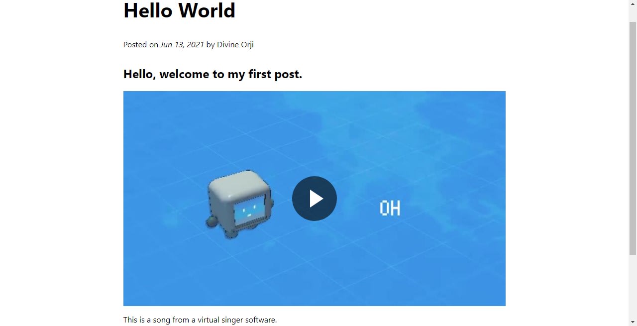
At this point, our blog post would look like this:
We have created content for our blog posts, and we need to give our visitors a way to see all the posts and easily navigate them.
getStaticProps is a NextJS method that allows you to do some work on your page at build time before it gets deployed. In this project, we will use getStaticProps to find all our blog posts and store them in an array, which we can then map through and display on the home page.
Let us install some packages that will help us do that. We are going to install gray-matter, fs, and path
-
gray-matterparses frontmatter from a string or file -
fsis Node’s file system module -
pathworks with files and paths in Node.
Open your terminal and run the command:
npm install gray-matter fs path --save
or using yarn
yarn add gray-matter fs path
Navigate to your pages/index.js file, clear it out, and import the dependencies
    import { promises as fs } from "fs";
    import path from "path";
    import grayMatter from "gray-matter";
Code language: JavaScript (javascript)
You are importing { promises as fs } which enable you to use the API as an async function.
Still in your pages/index.js file, add the following snippet:
    export async function getStaticProps() {
      const postDirectory = path.join(process.cwd(), "pages/blogposts");
      const filenames = await fs.readdir(postDirectory);
      const files = await Promise.all(
        filenames.map(async (filename) => {
          const filePath = path.join(postDirectory, filename);
          const content = await fs.readFile(filePath, "utf8");
          const matter = grayMatter(content);
          return { filename, matter };
        })
      );
      const posts = files.map((file) => {
        return {
          path: `/blogposts/${file.filename.replace(".mdx", "")}`,
          title: file.matter.data.title,
          author: file.matter.data.author,
          date: file.matter.data.published,
          description: file.matter.data.description,
        };
      });
      return {
        props: {
          posts,
        },
      };
    }
Code language: JavaScript (javascript)
In the code snippet above, you first defined the post directory using the path, then use fs to read the directory and get filenames. You then map through the filenames, created a filePath, read the file, and use gray-matter to parse the string and get the frontmatter. Finally, we store the mapped data as an array in files.
Next, you looped through the files array, constructed a page path, and set the frontmatter data (title, author, date, description) for each file. We store this data as an array in the posts variable. Then finally, you returned posts as props.
In your pages/index.js file, import Head and Link tags from NextJS and CSS styles from Home.module.css:
    import Head from "next/head";
    import Link from "next/link";
    import styles from "../styles/Home.module.css"
Code language: JavaScript (javascript)
Create and export a Home component as default. It will take in your posts variable as props. Loop through posts and de-structure each post to access the metadata that will be displayed on each post’s preview. Above your getStaticProps function, type:
export default function Home({ posts }) {
return (
<div>
<Head>
<title>Video Blog</title>
<meta name="description" content="A Simple video blog" />
<link rel="icon" href="/favicon.ico" />
</Head>
<main className={styles.main}>
<h1 className={styles.title}>A Video Blog</h1>
<section className={styles.grid}>
{posts.map((post) => {
const { title, path, author, date, description } = post;
return (
<Link key={path} href={path}>
<a>
<div className={styles.card}>
<h2>{title}</h2>
<p>{description}</p>
<p>
{author} | <span>{date}</span>
</p>
<Link href={path}>
<a>See more →</a>
</Link>
</div>
</a>
</Link>
);
})}
</section>
</main>
</div>
);
}
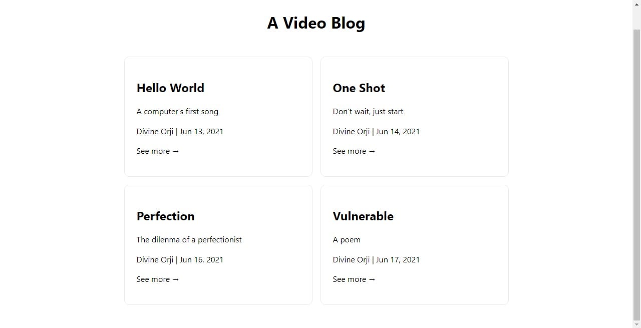
Code language: JavaScript (javascript)Navigate to styles/Home.module.css, add your CSS styles as desired, and then reload the page and see your changes. Depending on the style you decide to use, it could look somewhat like this:
This tutorial taught us how to create a video blog using NextJS, MDX, and video content from Cloudinary. Now you can quickly create SEO-friendly video blogs for your websites/apps, enabling more visitors to see your content easily.
Check out these valuable resources as well