How and why to serve Cloudinary assets with Hugo and the cloudinary-core-shrinkwrap.js library.
This is a continuation of my previous blog post, “Editor-Friendly Image Transformation and Optimized Delivery With Cloudinary and Decap CMS”, where we showed how to set up simple yet powerful ways for editors to define assets with Decap CMS and Cloudinary. This blog post also assumes you’ve set up the project with Hugo, Decap, and Cloudinary. If you haven’t, follow the steps in the first blog post.
Hugo actually has its way of processing images, which is pretty powerful. However, storing images in a git repository isn’t scalable. GitHub and other providers limit the size of files allowed in repositories. We can work around that by using Git Large File Storage (LFS), but it doesn’t provide the best developer experience. Instead, I recommend using a digital asset manager (DAM) like Cloudinary to store, transform, and deliver such assets.
In this blog post you’ll learn how to:
- Set up Hugo Layouts.
- Use Cloudinary’s URLs.
- Create Responsive Images with Cloudinary.
Let’s set up Hugo minimally, just to render our blog posts. The focus will be on the image partial.
Create a dummy single layout and a blog post with a title, image partial, and markdown content. I included some basic styles for readability.
layouts/_default/single.html

<!DOCTYPE html>

<html lang="en">

<head>

 <meta charset="UTF-8">

 <meta name="viewport" content="width=device-width, initial-scale=1.0">

 <title>{{ .Title }}</title>

 <style>

   main {

     margin: 0 auto;

     max-width: 840px;

     font-family: sans-serif;

   }

   img {

     max-width: 100%;

   }

 </style>

</head>

<body>

 <main>

   <h1>{{ .Title }}</h1>

   {{ partial "image" (dict "src" .Params.image "alt" .Title) }}

   {{ .Content }}

 </main>

</body>

</html>Code language: HTML, XML (xml)
Add the image partial. We’ll improve on this later.
layouts/partials/image.html
<img src="{{ .src }}" alt="{{ .alt }}">Code language: HTML, XML (xml)content/blog/post.md
---
title: Post
image: https://res.cloudinary.com/poslovnimediji/image/upload/sample.jpg
---
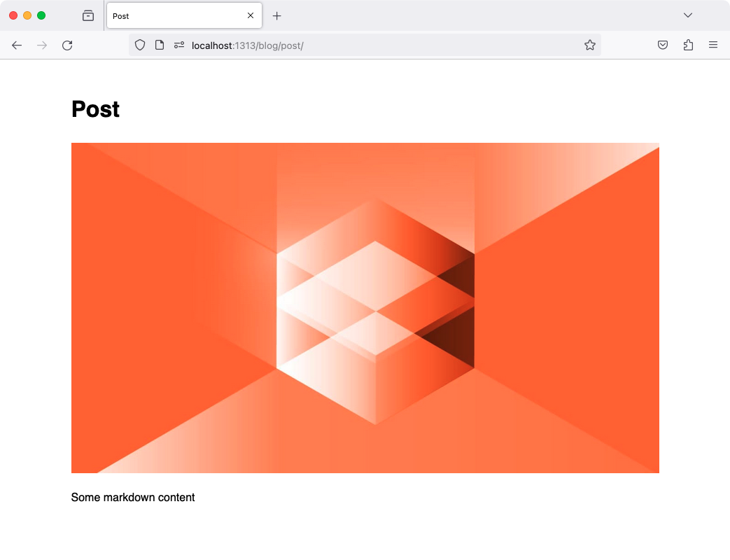
Some markdown contentCode language: JavaScript (javascript)Run hugo server
You should access this on http://localhost:1313/blog/post/ and see a simple page with your title, image, and content:
We’ve seen that we can get different URLs from the Cloudinary Media Library widget. It can be just a filename, a URL without transformations, or a URL with transformations. Let’s look at delivery options for the first two. If we get a URL with transformations, we can just use it directly.
We get only the asset ID from our frontmatter, so we must store the domain and some default transformations elsewhere. We can do this in the hugo.toml file, so it’s accessible under site.
hugo.toml

[params]

[params.cld]

url = "https://res.cloudinary.com/poslovnimediji/image/upload/"

transform = "c_fill,w_auto,g_auto,q_auto,dpr_auto/f_auto"Code language: JavaScript (javascript)
We can now use this in our partial.
layouts/partials/image.html
<img src="{{ print site.Params.cld.url site.Params.cld.transform .src }}" alt="{{ .alt }}">

<!-- src: https://res.cloudinary.com/poslovnimediji/image/upload/c_fill,w_auto,g_auto,q_auto,dpr_auto/f_auto/sample.jpg -->Code language: HTML, XML (xml)
Unfortunately, the filename option won’t supply us with the subfolder, so we have to hardcode it. However, an editor can easily include an asset from another folder.
This option will supply us with the subfolder to use directly, but we still need to add the default transformations from hugo.toml. To achieve this, let’s take apart the URL, add the transformations, and reconstruct the URL.
layouts/partials/image.html
<!-- get Cloudinary base url and common transformations from hugo.toml -->

{{ $cldUrl := site.Params.cld.url }}

{{ $cldTransform := site.Params.cld.transform }}

{{ $src := .src }}

<!-- check if image is hosted on Cloudinary -->

{{ if hasPrefix $src $cldUrl  }}

 <!-- get asset id from the url -->

 {{ $assetId := replace $src $cldUrl "" }}

 <!-- construct image url again with transformations -->

 {{ $src = print $cldUrl $cldTransform "/" $assetId }}

 <!-- src: https://res.cloudinary.com/poslovnimediji/image/upload/c_fill,w_auto,g_auto,q_auto,dpr_auto/f_auto/sample.jpg -->

{{ end }}

<img src="{{ $src }}" alt="{{ .alt }}">Code language: HTML, XML (xml)
A different approach for the same result would be to use default_transformations in the Decap config. This will add transformations to all URLs of the selected assets. If you decide to change the default transformations, you’ll have to update all existing URLs. In the example above, you can just change the hugo.toml file.
If you go with any of the two approaches, I recommend setting use_transformations: false in Decap. This way, any unwanted transformations set by the editor will be ignored. If you want to allow the editor to set transformations, you can set use_transformations: true and chain it on top of default transformations.
Cloudinary’s JS library cloudinary-core-shrinkwrap.js is an excellent tool for setting the width transformation on the client side. It will set the image’s src attribute to the URL with the width transformation that fits the container. This way, we can have a single image in the content and let Cloudinary handle the rest.
Add these scripts to your template before the closing body tag to add the library to the project.
layouts/_default/single.html
<script src="https://cdn.jsdelivr.net/npm/cloudinary-core@2.11.3/cloudinary-core-shrinkwrap.min.js" defer></script>

<script>

 const cl = cloudinary.Cloudinary.new({ cloud_name: 'poslovnimediji' });

 cl.responsive();

</script>

<!-- CDN is used here, but you can also serve it from your static folder -->Code language: HTML, XML (xml)
Now add the cld-responsive class to the image and change the src attribute to data-src.
layouts/partials/image.html
<img data-src="{{ $src }}" class="cld-responsive" alt="{{ .alt }}">Code language: JavaScript (javascript)More information on responsive images can be found in the Cloudinary documentation using the cloudinary-core JS library.
A common use case is to have a different image for mobile and desktop, and editors should be able to set both in the CMS. This is an easy way to render both images.
layouts/partials/image.html
<!-- get Cloudinary base url and common transformations from hugo.toml -->

{{ $cldUrl := site.Params.cld.url }}

{{ $cldTransform := site.Params.cld.transform }}

{{ $src := .src }}

{{ $srcDesktop := .srcDesktop }}

{{ if hasPrefix $src $cldUrl }}

 {{ $assetId := replace $src $cldUrl "" }}

 {{ $src = print $cldUrl $cldTransform "/" $assetId }}

{{ end }}

{{ if hasPrefix $srcDesktop $cldUrl }}

 {{ $assetIdDesktop := replace $srcDesktop $cldUrl "" }}

 {{ $srcDesktop = print $cldUrl $cldTransform "/" $assetIdDesktop }}

{{ end }}

<picture>

 {{ if $srcDesktop }} <!-- check this if field is optional -->

   <source media="(min-width: 768px)" srcset="{{ $srcDesktop }}">

 {{ end }}

 <img src="{{ $src }}" alt="{{ .alt }}">

</picture>Code language: PHP (php)We’ve seen some options to deliver Cloudinary assets with Hugo. You can use some of them together to get the best results. For example, you can use the mobile plus desktop image and add the cld-responsive class to deliver the best image for the container.
Elevate your web design and create stunning, responsive websites with images that adapt to any framework. Cloudinary streamlines your image management, ensuring optimal display across devices. Sign up for free today.