
At the end of 2014, activity on smartphones and tablets accounted for 60% of the time Americans spent online, according to comScore. Given the fast migration to mobile, these figures have been growing every year, and this trend in migration is not limited to the US market alone. According to a recent IDC report, the leading mobile vendors shipped a total of 334.4 million smartphones worldwide in the first quarter of 2015 (1Q15), up 16% from 288.3 million units in 1Q14. With this rise in mobile adoption, it seems like more users are turning to their mobile devices to perform online activities rather than their desktop computers.
One of Cloudinary’s customers, Myntra, is the largest fashion retailer in India with over 4 million customers. According to Times of India, this year, the online fashion giant has moved to a mobile app only and shut down its website, focusing on a mobile-only solution. This may be the first move of this kind by a large eCommerce player across the globe. Myntra launched their mobile app in May 2014 and within a few months has had more than 6 million app downloads. With 90% of its traffic and 70% of its sales coming from the mobile platform, Myntra’s management believe that the company will be able to serve its consumers better by becoming exclusively mobile.

Today, developers don’t get to decide which devices are used to access websites and applications, but as users, we are well aware of the convenience of using our smartphones rather than traditional desktop computers or even laptops. Nonetheless, it’s the application developer’s responsibility to deliver a consistent experience across all devices.
While prices of data plans rapidly decrease, and mobile device prices are expected to further drop over the next decade, mobile phones are becoming more accessible to the public, and smartphones are the way for an additional billion people to access the internet. The future of the internet is mobile, and the opportunities for website and web application developers are endless.
Another sign of the rapid development of mobile friendly applications is the recent changes that were made to the Google search engine. In April this year, Google’s search algorithm changed to give a higher ranking to mobile-optimized sites. Google’s spokeswoman announced:
“As people increasingly search on their mobile devices we want to make sure they can find content that’s not only relevant and timely, but also easy to read and interact with on smaller mobile screens” as reported by NPR.
In addition, Google recently announced their Accelerated Mobile Pages (AMP) initiative, but it still remains to see whether publishers will adopt it en masse.
As we saw with Myntra, it is a fact that online retailers are changing their focus to mobile-first, but they’re not the only ones. Mobile has become the biggest opportunity for online gaming as well. At the end of 2014, Global Games Market Update, from Newzoo, pinned the total estimated value of mobile games at $25 billion for the year, a 42% leap from 2013. Recently, the gaming giant, Nintendo, announced that it will enter the mobile market as well. The gaming leader will have to deal with the challenges that smart devices have introduced, including shorter play sessions, and different user experiences that include touch screens and monetization methods that are totally different from “ordinary” gaming consoles.
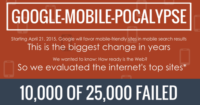
Meeting the needs of mobile-only users doesn’t mean sending them to desktop websites that require them to pinch and zoom their way through websites designed for a screen that’s five times larger than their smartphone’s. According to the NPR article mentioned above, websites are not ready to become mobile-only. Out of the 25K sites examined, only 15K were mobile optimized. The assumption that an organization has a native mobile app no longer means that their online website shouldn’t be mobile-ready as well.
source:NPR
Some companies argue that their customers “don’t care” what their mobile websites look like, but obviously an unorganized UI/UX and badly managed images and videos affect the overall user experience. Particular audiences may have even higher rates of mobile users, so it’s important to learn what types of devices a specific audience uses.
Rich websites or web applications contain a large amount of high quality images and videos. Management and optimization of these rich media assets are a major challenge when creating an ultimate mobile user experience. As a mobile user, you can relate to the painstakingly long wait for an image or video to load, and you might not have the patience or time to wait more than a few seconds. Today, developers are still using images meant for desktop viewers on their mobile apps or sites. Retina display images worsen the problem—you don’t want to send a large image to a device that isn’t capable of displaying it. Learn how to automate image creation to fit a responsive design.
Dynamically selecting, resizing, cropping and optimizing the right images properly is critical for high performance and a consistent user experience across multiple platforms and different screen resolutions. Learn how-to programmatically generate and deliver different sized image versions on-the-fly
Online user experiences are changing rapidly, and these days, almost everything is about mobile users. Smart mobile devices are becoming a commodity and by browsing through endless data in the cloud, the end user experience is richer than ever. As we saw in the Myntra case, mobile is no longer the second option, but the first that users go to. Browsing through mobile sites and apps is second nature for users today, and needs to be adapted by companies as the first natural step when creating an online user experience.