
As mobile developers, we want to build successful applications, rich applications, and visual applications, this requires our application to have a lot of assets (just text won’t do it, it’s not the 90s anymore).
In an ideal world, we would want to keep all assets on the application, but that doesn’t make sense.
- Those assets change from time to time, so we can’t keep them locally on our application.
- If we hold many assets on our application it’ll be a large file and no one will want to download it.
The solution to having many assets in our application but not holding them locally is to get those assets remotely, from the internet, using network calls.
Sounds simple, but pulling assets remotely can have many issues which I’ll describe next.
- Roaming — since we’re talking about mobile devices there’s no guarantee that the user will have a stable connection, he could be traveling or just at a spot with a bad signal, and getting assets remotely with a bad connection can be really challenging.
- Performance issues — Loading an asset requires resources from the device, and fitting a large asset into a small container will require some processing on the device, so think of doing that for 10 images at the same time, as we can see in the screenshot we might get blanks, holes or just long progress loading till the image finally shows.
- Responsive issues — Some application support both orientations (portrait and landscape), when a container changes between orientations change what do we do with the asset? do we stretch it? fit it? crop it? it might look bad…
- Screen sizes — There are many screen sizes, It does not matter if it’s iOS(the problem is less severe there) or Android, we have many screen sizes, the asset size between a small phone and a tablet is very different, do we need to create and pull an asset for each use-case? What about DPR (device pixel ratio) for each phone size? How to handle all of this? The problem only starts here cause soon we’ll have expandable and foldable screens.

- Increased data usage — If the assets are not optimized their file size is larger, this means we’re pulling more bytes from the internet, which means our device’s modem will work more, which means more battery usage.
Moreover, if the user is not connected via WIFI it might charge him extra costs. - Misused caching — We surely want to use some kind of cache mechanism where we keep the assets we already got locally (we do not want to pull the same asset over and over again), if the asset uses a lot in terms of bytes that means that app is getting oversized, and might get deleted since it uses too much space on the device.

- Memory usage — Rendering big assets requires memory, there’s only so much memory that a device has, and if we try to render a lot of assets with a big size we might run into memory issues, while some devices have more memory and might handle this, others may crash due to this issue.
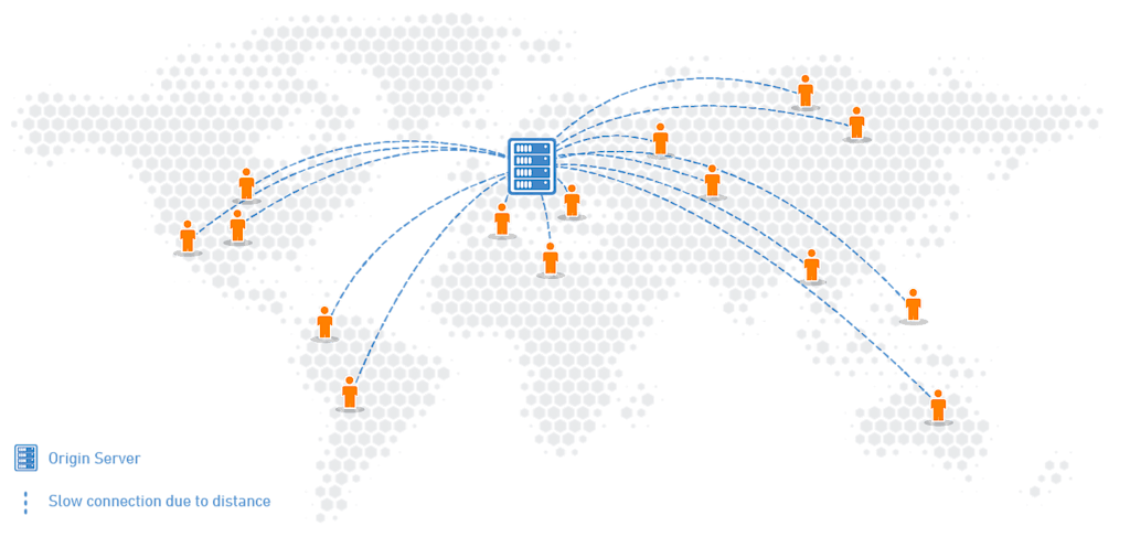
- Dependency on Server Location — Since we’re pulling assets remotely we’re dependent on how far we are from the server, the closer the server the faster we’ll get the asset.
Loading many assets without optimization can cause delays in loading page speed, it can cause performance issues, or even crashes.
But why all that is important? Does the loading speed of a landing page really that important?
The answer to that is definitely.
- 100ms delay will cause a 7% conversion reduction (when we say conversion we mean a user puts something into his cart or turns into a paying user, or subscribed user)
Multiply this by 10, you get a 70% conversion reduction for a 1-second delay
*According to a study by Akamai. - A 1-second delay can cause a 20% drop in traffic.
- A 1-second delay decreases page views by 11%.
- A 1-second delay can lead to a 16% decrease in customer satisfaction.
Now that we stated the problem and why is it important to optimize your media I want to show you how you can achieve this.
- Improve Loading Speed — So the first thing we want to do is improve the page loading speed, we want our page to load fast and in an optimized way, this will improve the user experience for our app.
- Reduce asset size — To do that we can start with the following: reduce the size of the asset by resizing.
Reduce width and height (we don’t need 4k assets when presenting images feed, or thumbnails).
Reduce image quality, if we don’t show the image full size we can compress the image and decrease quality but still get a good-looking image,
We can also deliver a specific format HEIC for iOS(11+), and AVIF(12+)/WebP(4.2.1+) for Android (depending on the Android version).
All the things I just mentioned, dimensions, format, and quality will lead to lighter assets and more optimized assets that will use less space. - Caching — So we download an image, presented it to the user, and he decides to move to another screen, or send the app to the background and open it again, do we download the image all over again?
Of course not, we’ll use a cache mechanism so once we download an asset, it’s saved on our device and we can load it locally the next time we want to use it, of course, we want the asset to be optimized so it will use as little space as possible on the device. - Responsive — we want to be able to get the same asset in different sizes (for different orientations for example, or different containers), we want to get that same asset in the most optimized way. Small in size for better bandwidth usage, device storage, and device performance.
- Content delivery network — or CDN for short is an extremely important mechanism, .this means that there is a grid of servers all around the world that we cache our delivered assets on once they get there for the first time.
- That means that if the second user asks for the same asset it’ll be delivered fast since the distance between the user and that specific CDN server is shorter than the main endpoint.
- Desktop vs Mobile Assets — Some of us might have a website that presents the same assets as our mobile application, but the desktop design is very different from the application, the size of the assets may vary depending on the platform, and we need the same image, but in different size, keeping multiple instances with different sizes for the same asset is a good solution even better if each device will get the right asset for it.
Now that we’ve seen what challenges we’re facing, what are the implications and how can we handle them, let’s get practical, and see some code and how can we achieve better performance.
For this demonstration, I’ll be using Cloudinary’s Flutter SDK, feel free to use it, it’ll require you to register on Cloudinary’s website.
Cloudinary cloudinary = Cloudinary.fromCloudName(cloudName: '<YOUR_CLOUD_NAME');Code language: JavaScript (javascript)The first thing I need to do is initiate my Cloudinary object with my cloud name.
cloudinary.image('sample').toString()Code language: JavaScript (javascript)The following code will generate a URL for the image sample you can find it here.
Now that we can create and pull a remote asset, let’s perform optimization on it.
Transformation transformation = Transformation()
..delivery(Quality(Quality.auto()))
..delivery(Format(Format.avif))
..resize(Resize.thumbnail()..width(500))
..delivery(Dpr(Dpr.auto));
I’m creating the following Transformation and I’m adding to it the following:
Quality.auto()— I’m asking Cloudinary to compress the image automatically for me, for a lighter asset but still with good quality.Fomrat.avif— Since I’m using Android API level 33(Android 13)Resize.thumbnail()..width(500)— I’m reducing the size of the asset, in my case I’m presenting it as a thumbnail and I don’t need a full size, so I’m reducing the width to 500, important to mention, I did not specify a height, I’m telling Cloudinary to keep the aspect ratio of the image according to the width I gave it.Dpr.auto— DPR — device pixel ratio, I’m asking Cloudinary to calculate and give me the image with the DPR fit for the device automatically.
Once the Transformation is ready I’m injecting it into my image creation:
cloudinary.image('sample').transformation(transformation).toString()Code language: JavaScript (javascript)This will create the following URL.
In order to perform optimization on the image we did the following:
- We reduced the size of the asset (width and height).
- We set quality compression to auto.
- We set DPR to auto.
- We set the right format for this use case,
AVIF.

The following screenshot shows an example from a demo application I built.
In the left column, you can see the original image with its size underneath.
In the right column, we have the transformed image (the image with the transformation from above).
We can see that we managed to cut the size of each image by up to 10 times.
This optimization will make it easier for the device to pull the assets remotely, render and decode them into their container and will give us better application performance overall.
We just talked about why we even develop mobile applications. What is the challenge? Why does it matter? And what is the solution? I gave you practical tools, on how to optimize your media and with that your application’s performance.
The important thing to remember is media optimization done right can improve your application’s conversion rate, traffic, and customer satisfaction.
Important to add, in this article we showed an example using the Cloudinary Flutter SDK, this SDK is written in more than 15 other languages/frameworks such as:


