What is Device Pixel Ratio?
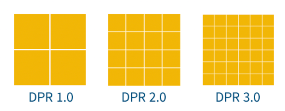
Device Pixel Ratio (DPR) is the ratio between the physical pixel density of a device and its logical pixel density. The physical pixels can be seen on your screen, while logical pixels measure how many can fit into each inch or cm (depending on your settings).
Calculating your device pixel ratio isn’t easy–and it’s mostly been simplified by HTML’s devicePixelRatio property. The formula for calculating device pixel ratio is:
physical linear resolution ÷ logical linear resolution
However, this isn’t always an accurate (or easy to calculate) ratio. Instead, web browsers rely on the devicePixelRatio from the Window, which returns a value based on the size of a CSS pixel and one of the device’s physical pixels.

Why Does Device Pixel Ratio Matter?
Device Pixel Ratio plays a crucial role in ensuring that what you see on your screen is as vibrant and sharp as possible. Higher DPR packs more pixels into the same space, leading to crisper, more detailed visuals.
Imagine looking at an old TV versus a modern smartphone screen; the smartphone’s higher DPR provides a much sharper and more pleasant viewing experience. This is why websites and apps designed with higher DPRs in mind look so much better on high-resolution displays.
Screens vary widely in resolution, ranging from high-resolution laptops to standard-definition tablets. To ensure consistency and high quality, developers should create designs that work well on different screens.
By using responsive design techniques and serving images that are the right size for each device, they can make sure their websites and apps look great regardless of whether the DPR is low or high. So, while DPR might seem like a small thing, it has a big impact on the overall user experience in our digital world.
How Can I Use Device Pixel Ratio in My Design Process?
You can use device pixel ratio to design your website. By using the right size image for the right device, you can ensure that it looks good on all devices. You also have to make sure that your media queries change the layout and CSS changes the font size or background color of elements in different breakpoints.
You can also use Cloudinary to help your site dynamically set DPR for images on your site with a dpr_auto parameter allowing you to set images at different resolutions as needed across your pages. Don’t have a Cloudinary account? Get started today, it’s free!
Additional Resources You May Find Useful:
