In Part 1 our series on building a winning mobile strategy, we discussed the importance of measuring, monitoring, and optimizing your users’ mobile experience.
In Part 2, we’ll walk through how Cloudinary can help you improve your application performance.
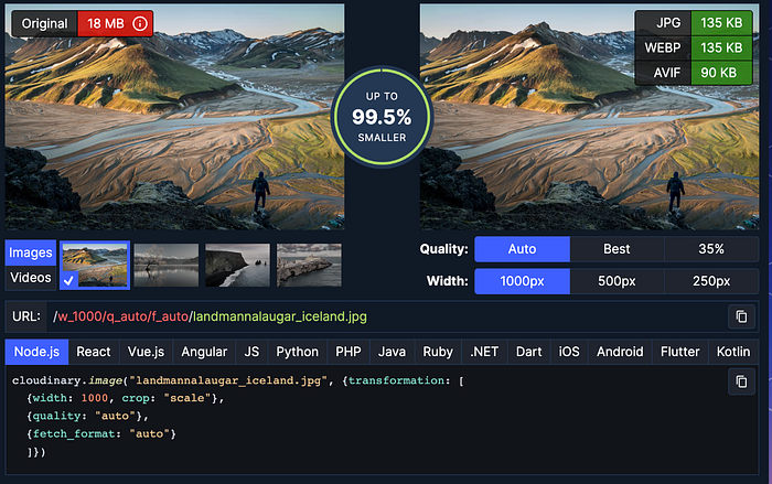
Previously, we touched upon the topic of poor connection when your website or app needs to load a lot of media, which is a common issue with using mobile devices. One solution is to reduce asset size in terms of bytes.
To do that, we can:
- Reduce the width and height of the asset. We don’t need 4K assets when presenting an image feed or thumbnails.
- Reduce the image quality. If we don’t show the image at full size, we can compress it and decrease its quality while still loading a good-quality image.
- Deliver a specific format. HEIC for iOS and AVIF/WebP for Android, depending on the Android version.
In addition, the dimensions, format, and quality will lead to lighter, more optimized assets that will weigh less and consume less bandwidth. They’ll be much easier to receive even with a poor connection.
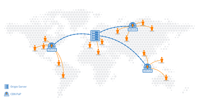
A content delivery network (CDN) is an important solution that Cloudinary offers. A CDN is a geographically distributed group of servers that makes copies of frequently requested media in order to serve that media to more customers faster.
That means that another user who asks for the same asset will get it much faster since the distance between the user and that specific CDN server is shorter than the main endpoint.
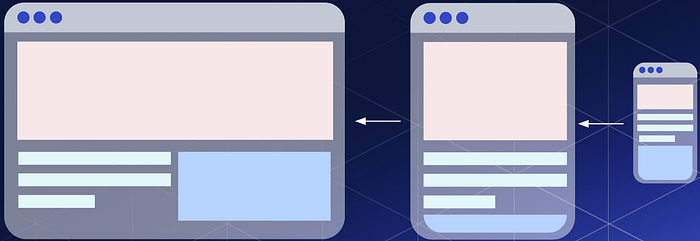
Some of you might have a website that presents the same assets as our mobile application, but the desktop design is different from the application. The size of the assets may vary depending on the platform. For example, if we need the same image but in different sizes, Cloudinary will create dedicated optimized assets through URLs for each platform in terms of format, resolution, quality, DPR, and more.
Next, I’ll share a list of practical tools you can implement to improve your application’s mobile experience.
In Part 1, we discussed a list of metrics that you should document and improve upon, and it’s important to reiterate: Measure! Measure what you can, where your app/web fails, where you fall, where you lose users, conversion rate, how many users subscribed or paid, how many actually download your application, how many opened the app for the first time, how many completed a desired process in your app, and performance and retention. Be sure to measure so you can understand your customers’ needs and where you can improve.
Set your goals, and be sure to stay consistent. Give them time, don’t rush to conclusions, and you’ll be surprised how time can change what you think.
Since we can’t measure everything at once, make sure to set realistic goals, such as: “Improve conversion rate by 10%” or “Improve retention by 15% to 20% in a week.” Then ask yourself what you need to do to achieve it, where you fall short, and what measurements you’re missing.
Understand your target audience and their mobile behavior, preferences, and needs. This can help you tailor your mobile strategy to meet their specific expectations and requirements. Make sure to approach your customers in the right way, too. For example, if your target audience is from an older demographic, your application should fit their needs. Large fonts is a good way to start. If you’re developing a mobile game for a younger population, your application’s content, ads, screenshots, language, and font should be kid-friendly.
Decide which mobile platforms you’ll target, such as iOS, Android, or both. Consider the features and capabilities of each platform, as well as the demographic of your target audience.
Keep different countries’ specifications in mind and check which OS is dominant there. With that said, we’ve seen that the majority of revenue comes from iOS, so this is another factor to consider when choosing a platform.
Also, consider using a cross-platform framework such as Flutter or React Native to use one code base for both platforms and lower the development costs. This, of course, depends on your application needs, but it might be a good way to deliver an app for both platforms quickly.

Prioritize performance optimization, including techniques such as code optimization, caching, and CDN. With Cloudinary, you can ensure a fast and responsive mobile experience, even on slower networks or older devices. As we’ve said before, users expect the best experience from your mobile app/web.
Create a mobile-first design that’s optimized for small screens, touch interactions, and limited bandwidth. Consider factors such as load times, navigation, content hierarchy, and visual appeal. Today, companies still insist on developing desktop first and then migrating to mobile, but that’s not the way to go anymore in a mobile-first world.
It’s worth mentioning that we’re about to enter a whole new world of responsiveness on mobile devices, with foldable and extendable devices knocking on our doors.
And another thing I want to mention is to be sure that your customers are able to do things that are mobile-related, such as sharing on social networks, which will generate exposure for your business.
Continuously test and optimize your mobile experience: your purchase screen, images, font sizes, and pricing. If you’re using a subscription, test different durations such as weekly, monthly, and yearly, and where your funnels drop. Test the UI, different phrasing, icons, and regularly conduct A/B tests on areas where there’s poor or neutral performance. Different designs can lead to increased engagement.
Use push notifications to engage with users and keep them informed about new content, offers, or other updates. Use segmentation and personalization to deliver relevant notifications that drive engagement and retention.
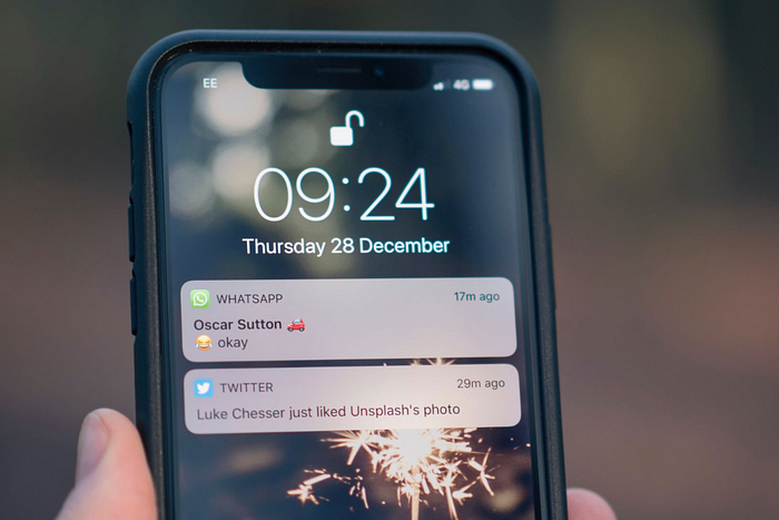
Push notifications are an art form. They require a lot of trial and error, and even figuring out the right time to send the push notification is crucial for people to actually engage with it. We’re not talking about notifications such as WhatsApp when you receive a message. We’re talking about informing users of a new feature, or that something has changed in your app. Don’t forget to personalize your push notifications instead of sending a generic message; localization can also be helpful.
Make sure you include an eye-catching description with the right keywords for your app in either Google Play or App Store. A great description makes it easier for users to find your application while searching. Add visually compelling screenshots that showcase your application’s benefits, and create an app preview in the App Store, because users prefer video over static images.
If your application is supported on tablets, make sure there are screenshots for those as well and that they represent the tablet experience.
You should always aim to discover new audiences and increase your application traffic. One contributing factor to that is localization.
Translate your application and store page to those countries, as not everyone is a native English speaker. Monitor where your current users are coming from and be sure to give them translations in their native language for a better user experience, which helps increase engagement.

It’s not always a sunny day. Unexpected things can and will happen, so communicate that with your customers. For example, if a customer loses internet connection, provide them with a helpful error message as to why their media won’t load or why the next screen won’t come up.
We discussed how to improve your application performance, in terms of dimensions, quality format, and more. We also walked through a list of practical tools that you can implement in your application to improve your mobile experience.
Cloudinary offers an extensive range of image optimization and management capabilities, such as automation of compression accompanied by a high level of quality. Get started for free today.


