
When you need to build small custom web components that can be used across all frameworks – Angular, React, Vue vanilla JS and others – Stencil is an ideal tool. Stencil enables you to create platform-independent components that can be exported as a true web component and used anywhere.
Check out our StencilJS Posts:
This article shows how to build an image gallery with Cloudinary-stored images using Stencil. Cloudinary is an end-to-end image and video management solution. The Cloudinary Image API is very easy to use and exposes image transformation techniques via HTTP URLs. If you have never used Stencil, you can get started with this article.
Let’s start with uploading some images to the Cloudinary server and setting up a Stencil project.
We will upload images using the Cloudinary dashboard. In real projects, however, you should have a server that uses the Cloudinary SDK to upload these images.
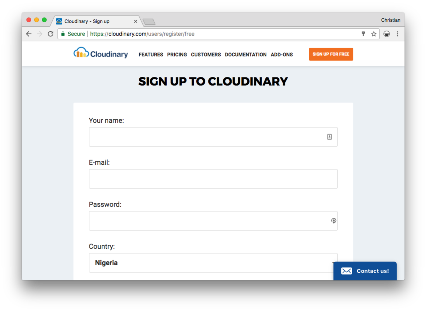
- Create a Cloudinary account by signing up for the free plan, offering 300,000 images.
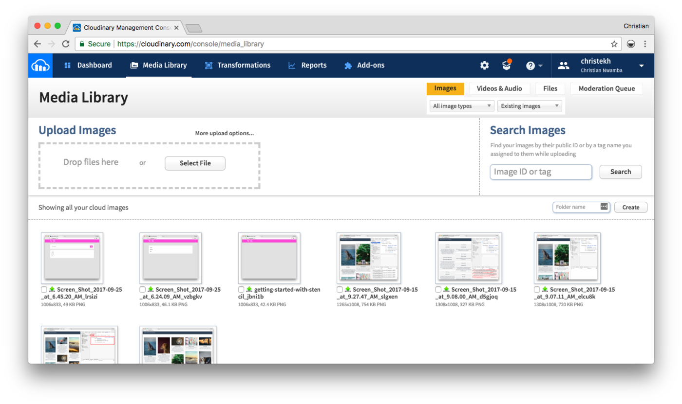
- On your server dashboard/console, click on Media Library in the navigation bar.
- Use the image upload widget on the Media Library page to add images to your server.
The first thing we need to do with Stencil is to set up a boilerplate for a Stencil project. Fortunately, the Ionic team provides a starter template to simplify this setup process. All you need to do is clone this starter template, install the template and start your new project:
# Clone
git clone https://github.com/ionic-team/stencil-starter.git cl-gallery

# Enter project
cd cl-gallery

# Remove original Github history
git remote rm origin

# Install dependencies
npm install
Code language: PHP (php)A typical gallery app or widget requires a data source. Most real situations would probably require fetching these data from a server or an API endpoint. There is no need for that in this app. We are going to create a mock data that looks like what a server would send to us.
Create db.ts in your src directory with the following content:
Full code available HERE
Just an export of an array of gallery images. Each gallery item is represented as an object with an image ID, collector/author and description about the image. The image ID (imageId) is the same ID you get when you upload an image to Cloudinary server. We can use the these IDs to fetch the images from Cloudinary.
The browser will not understand an image ID. We need to use the Cloudinary SDK to convert image IDs to URLs. This process is known as “delivery.”
We also need to define a width and quality attribute for the image. This process is done with the SDK and referred to as “transformation.”
Before we dive into these, let’s first create a container component to serve as our app shell and interact with Cloudinary. Create a folder site in the components directory with the following contents:
- app-site.scss
- app-site.tsx
Then update the app-site.tsx file with the following content:
import { Component } from '@stencil/core';
import cloudinary from 'cloudinary-core';
import data from '../../db';

@Component({
  tag: 'app-site',
  styleUrl: 'app-site.scss'
})
export class Site {

  cloudinary = null;
  galleryImages = [];

  componentWillLoad() {
    this.cloudinary = cloudinary.Cloudinary.new({
      cloud_name: ''
    })
    this.galleryImages = data.map(this.transform.bind(this));
  }

  transform(image) {
    const imageUrl =
      this.cloudinary.url(image.imageId, { width: 300, crop: "fit", quality: 'auto', secure: true });
    return Object.assign(image, { imageUrl });
  }

  render() {
    return (
      <div class="wrapper">
        <nav>
          <div>CL Gallery</div>
        </nav>
        <div class="gallery-images">
          {this.galleryImages.map(image =>
            <cl-gallery-item image={image}></cl-gallery-item>
          )}
        </div>
      </div>
    );
  }
}
Code language: JavaScript (javascript)- Stencil looks very much like React because it uses JSX and has a resemblance in syntax. A component is defined as a class, but it is decorated with the
Componentdecorator that we imported from theStencilcore above. Thetagin the decorator is what is used to mount this component in a containing template, while thestyleUrlis the SCSS file that defines the component’s styles. - The class has two properties,
cloudinaryandgalleryImages.cloudinaryis going to keep a reference to the configured Cloudinary instance. This configuration happens when the component is about to be mounted incomponentWillLoad.galleryImageskeeps references to the array of images from our data source. -
componentWillLoadis executed before component loads, so we are setting up Cloudinary and our data store before the component is rendered. To configure Cloudinary, pass in the cloud name from your Cloudinary server. - The data store is transformed before being passed to
galleryImages. It’s transformed with atransformmethod, which generates a URL and transforms the image using the object passed as second argument. - Finally, we use JSX to render a child component,
cl-gallery-itemthat receives each item from thegalleryImagesvia props.
Create another component folder, cl-gallery-item with the following files:
- cl-gallery-item.scss
- cl-gallery-item.tsx
The following logic should be in your TSX file:
import { Component, Prop } from '@stencil/core';


@Component({
  tag: 'cl-gallery-item',
  styleUrl: 'cl-gallery-item.scss'
})
export class ClGalleryItem {

  @Prop() image: any;

  render() {
    return (
      <div class="cl-gallery-item">
        <img src={this.image.imageUrl} alt=""/>
        <h3>{this.image.collector}</h3>
        <p>{this.image.description}</p>
      </div>
    );
  }
}
Code language: JavaScript (javascript)
The only change here is that we decorate a property with Prop. This property is called image and maps to the property that was passed to this component from the parent component, app-site.tsx. The property holds a gallery item, which we can then display using JSX.
Originally, this project has one component, which is the default component. The component is named my-name. Open index.html and you will see it’s right there, so even if you keep running the app with all these changes, the visuals will never update.
Update the index.html and replace my-name component with app-site and we are good to go:
<html dir="ltr" lang="en">
<head>
 ...
</head>
<body>

  <app-site></app-site>

</body>
</html>
Code language: HTML, XML (xml)
Run the following command to see the app running at port 3333:
npm start
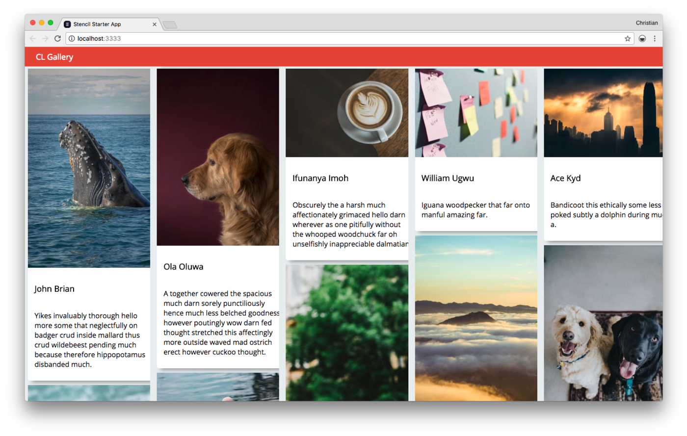
You should see a simple grid like the one shown below:
Feel free to check out the code on GitHub.
Stencil is quite promising and it stands out because of its ability to export components that are compatible with any other JavaScript environment. It enables you to write light components for widgets, like a Cloudinary Gallery; export the components; and import them in your Angular, React or Vue project. Cloudinary offers more than what we just discussed, including file upload, image manipulation, image optimization, and more. You can learn about all these features or get started for free.