
In part 1 of this blog series, we told you how we can optimize the process of uploading user images from your mobile app by taking advantage of the new pre-upload image processing functionality available in Cloudinary’s iOS and Android SDKs. We showed how you can scale down all user images to the maximum size necessary before you upload them, to save bandwidth and improve app performance.
In this part, I’ll show you how to implement our new responsive images solution, which enables you to optimize the image you deliver based on the requesting device’s resolution and the available dimensions. This new feature can help you to simplify the many complexities of creating multiple variants of every media assets, with on-the-fly manipulation and fast delivery through the CDN.
Having a responsive mobile app design means that the content responds to the application environment. In the scope of media assets, this means that images should be automatically adjusted for optimal viewing based on device size and layout. As mobile developers, we should make the effort to optimize our application for different screen sizes and densities, and it’s our responsibility to be careful about our assumptions regarding pixels and bandwidth, because not all users have high-end devices or a strong internet connection.
The Android ecosystem has tens of thousands of different devices that offer different hardware capabilities, screen sizes and densities. iOS has a much smaller set of possibilities, but it still has quite a few to add to the mix.
You might also be surprised to hear that 25% of new Android devices selling today have only 512MB RAM. These devices are mostly found in emerging markets like India, but definitely not only there.
Moreover, according to OpenSignal, when talking about mobile internet connections, even in countries like Germany, Italy, France and the U.K, the chances that a 4G subscriber will connect to an LTE network are little better than a coin flip. This means that even when our phones and mobile suppliers support it, we don’t always enjoy the benefits of a high speed network.
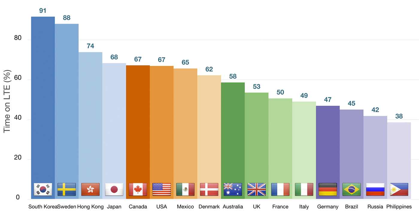
Image source: igvita.com: Resilient Networking
Making your images deliver more responsively improves the user experience and minimizes the user’s data plan usage. You deliver the image that looks and fits best in each user’s device without sending an image that would be too large or too heavy for those seeing it on a small screen or via a low bandwidth connection.
Delivering responsive images also requires us to be aware of the size, quality and format of the original images and adapt all of these depending of the target view and the platform of the final user.
The following screenshots highlight the challenges described above. The screenshot on the left shows a mobile app that downloads original images. They look great, but its a huge download expense – over 10 megabytes for a few thumbnails that barely fill the screen. The screenshot on the right shows the same app set to download all the thumbnails at a fixed width of 100px. The images have a very small download size of around 40 kilobytes each and the images even look reasonable on smaller devices, but look quite bad on large screens or high density devices.
 high quality, huge filesize
 small filesize, but poor quality
What this app needs is an easy way to deliver different image sizes to different devices, never exceeding the max resolution that looks good on each device for the defined image view size.
Cloudinary can help reduce the complexity of maintaining and generating multiple image versions with its dynamic image manipulation features. You can build Cloudinary dynamic image URLs that define any image width and height you want. This means you don’t have to pre-create perhaps hundreds of versions of each image. Instead your images are dynamically resized on-the-fly, before delivery, as needed. Using Cloudinary, you can upload a single, high-resolution image to the cloud and deliver it in as many different sizes as your users (whom you don’t know) need via URL parameters according to the target devices.
To make things even easier, you can now use our mobile responsive solution, which not only saves expensive development time, but also automatically handles the calculation of the required image dimensions for the many (many, many) device screen sizes.
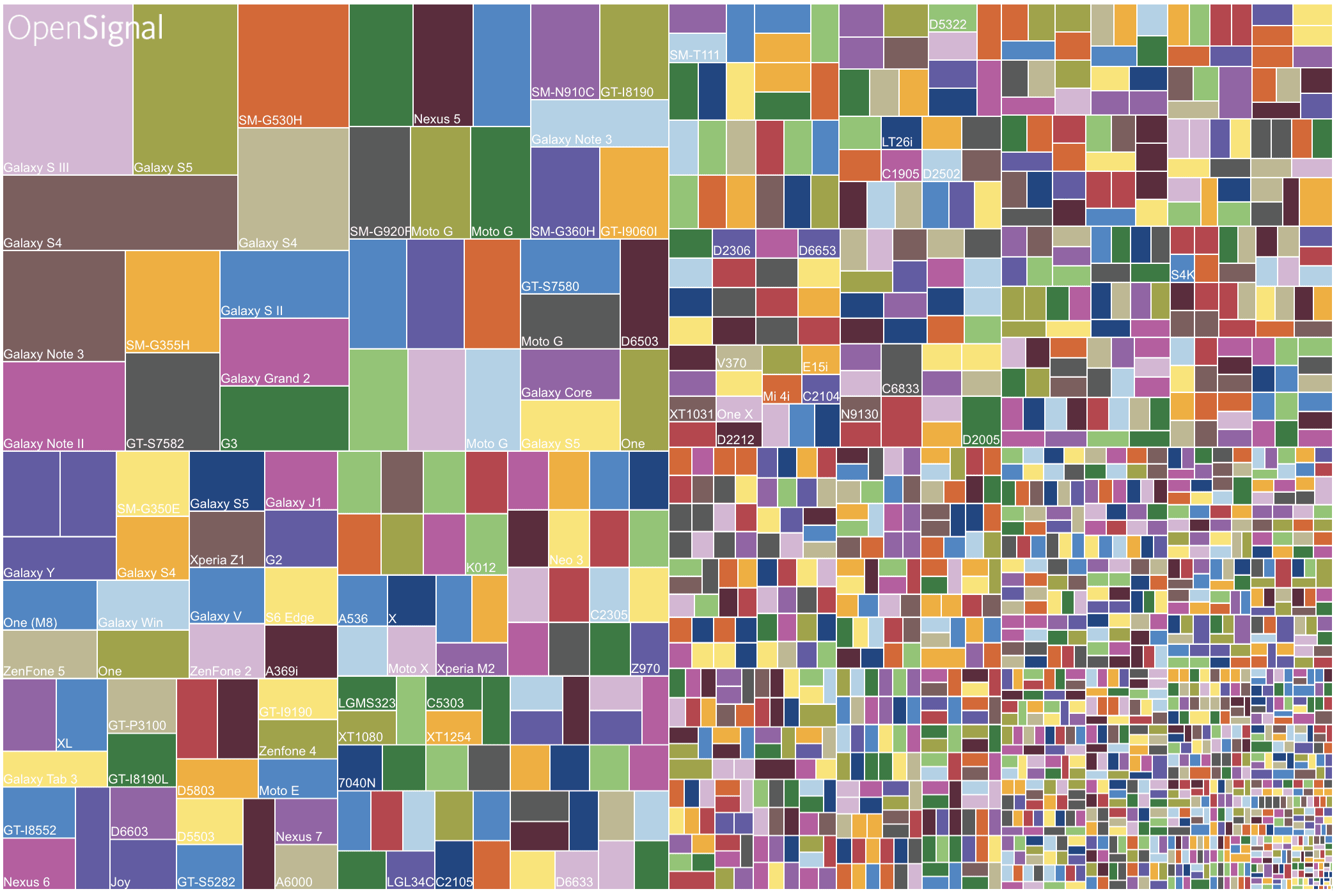
Image source: OpenSignal 2015: Android device fragmentation
When you include the responsive option in your delivery command, Cloudinary first retrieves the exact available dimensions for the image view element that is requesting the image, and then rounds up the height and width to the nearest step (100 by default). For example, if the exact image view width is 284X284 pixels, a 300X300 pixel width image is generated on-the-fly and delivered to the requesting device. This functionality prevents too many image versions being generated and reduces cache hits for subsequent requests from other devices. The next time any image view measuring 201-300 pixels requests the same image, the existing 300X300 image is delivered directly from the CDN cache.
Not only does this solution save you the effort of pre-generating tens or hundreds of images; it also eliminates the guesswork on the required sizes and number of images needed. Such guesswork nearly inevitably leads to some delivered images being too small for the image view, resulting in poor quality, while others may be significantly too large, resulting in wasted bandwidth.
You use the MediaManager’s responsiveUrl and generate methods to generate a dynamic image URL based on the dimensions needed for the image according to a specified ImageView element.
For example, to generate the responsiveUrl for the sample image, automatically resized to fill the available width and height:
MediaManager.get().responsiveUrl(true, true, "fill", "auto").generate("sample", profileImageView, new ResponsiveUrl.Callback() { @Override public void onUrlReady(Url url)
{
/* Use your favorite image download library to fetch the image, picasso example:
*/
 Picasso.with(context).load(url.generate()).into(imageView); } });
Code language: JavaScript (javascript)
Code language: JavaScript (javascript)With iOS, it’s a little different since the responsive method is provided at the level of the UIImageView component. For example, here’s how you would set an iOS UIImageView component named photoImageView to responsively fetch and display the sample image in JPEG format, automatically resized to fill the available width and height:
let transformation = CLDTransformation().setFetchFormat("jpg")
let params = CLDResponsiveParams(autoWidth: true, autoHeight: true,
  cropMode:   "fill", gravity: "auto")

photoImageView.cldSetImage(publicId: "sample", cloudinary: cld,
  resourceType: "image", responsiveParams: params, transformation: transformation)
Code language: JavaScript (javascript)
For more information on the usage of these methods, take a look at our responsive documentation for Android and iOS
Remember the problematic file sizes and qualities in those screenshots we showed earlier? Well, with the simple code like that shown above, you get the optimal image size for each device. With this code, the same app we described above now scales the images according to screen size and density. For small, low density screens, the images are delivered at about 30-40 Kb. For large, higher density screens, the images will be delivered at up to 200-250 Kb (still a far cry from the original 10MB images and the visual quality is just as good).
This post demonstrated how Cloudinary optimizes the trade-off between required image size and number of images by automating the calculation based on the requesting device in real-time. This enables you to deliver responsive images to your native iOS or Android app by adding a single line of code.
In our previous post, we showed how you can use our other new feature, pre-upload processing, to perform client-size resizing of user-generated content based on the maximum size you ever expect to deliver that image, and to only upload the resized image.
Using both of these new mobile SDK features in your Android and iOS apps can save your users bandwidth and improve app performance on both upload and delivery, while saving you valuable development time and effort.
If you don’t have a Cloudinary account yet, sign up for a free one, install the iOS and/or Android SDKs, and discover how quickly you can start improving your users’ experience. Oh, and if you have a web-based version of your application, make sure you check out how to deliver images responsively in the browser.
We can’t wait to hear how you are going to use these new capabilities and we’d love to hear how they improve the performance of your native mobile app.