
Having the highest image quality possible is critical for modern websites. A responsive image adjusts to the features or dimensions of the device. You can approach responsive photos from two perspectives: offering the same image in various sizes or serving multiple images based on the display parameters. You can use srcset or <picture>. These two choices handle responsive images differently, but they both display one image from a collection of alternatives based on the rules.
This article explains how to use srcset and the <picture> element to produce responsive images in pure HTML.
- Basic knowledge of HTML
- An IDE installed on your machine (e.g., VS Code)
The completed project is on CodeSandbox. Fork it to get started quickly.
The source code can be found on GitHub
You can specify only one image file using the standard <img> HTML tag. You can use srcset to display a different picture based on the device’s dimensions.
Firstly, you create the standard <img> tag and specify the src and alt attributes like so:
<img src="" alt="">
You can use srcset to specify other source files, and the browser will select the image that appears to be the best fit for the screen size. You specify this like so:
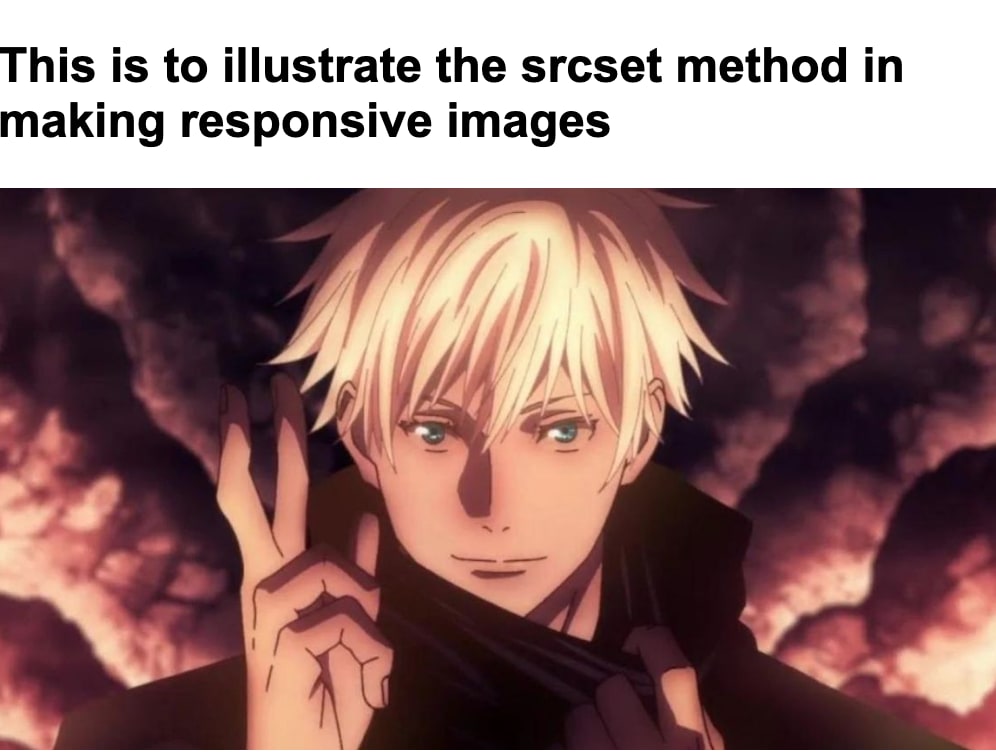
<img srcset="Gojo-satoru.jpg 1200w, Gojo-satoru.jpg 500w"
   src="Gojo-satoru.jpg" alt="Gojo-satoru from jujutsu kaisen">
As seen above, the image filename, which defines the path to the source image, a space, and the intrinsic or actual width of the image, comprises the srcset.
You should also provide src, which serves the image as a fallback for browsers that do not support srcset.
The HTML element <picture> encloses many <source> elements holding multiple source files and an <img> element. Whereas <img srcset="" alt=""> serves several sizes of the same image to make images responsive, <picture> allows you to directly change the image shown. You write your <picture> element like so:
 <picture>
   <source media="(max-width: 1200px)" srcset="Gojo-satoru-portrait.jpg" />
   <source media="(min-width: 541px)" srcset="Gojo-satoru.jpg"/>
   <img src="Gojo-satoru.jpg" alt="Gojo-satoru domain expansion image"/>
 </picture>
The <source> element has a media property that you use to specify the media condition. If the viewport width is 1200px or smaller (as in the code above), the browser will display Gojo-Satoru-portrait.jpg, and likewise Gojo-satoru.jpg if the viewport is 541px or smaller. Finally, the srcset defines the image file directory to display, whereas the src defines the default image.
Another aspect in which <picture> excels is providing a fallback for contemporary image formats such as WebP. WebP images are rich and high-quality, yet they are lower in size than PNGs or JPEGs. It combines and enhances the most important characteristics of the JPEG and PNG formats by offering excellent lossy and lossless compression. One issue is that not all browsers accept WebP pictures. This is not an issue with <picture> because your browser can load an alternate image if it does not support.
<picture>
  <source type="image/webp" srcset="Gojo-satoru.jpg">
  <img src="Gojo-satoru.jpg" alt="Gojo-satoru domain expansion image"/>
</picture>
The WebP fallback is specified by first providing a type property in the <source> element; if the browser accepts WebP images, then it picks this image. The srcset defines the WebP image file directory, whereas the src defines the default image.
In this article, you learned how to make responsive images in HTML by using <picture> and srcset. Serving responsive pictures generally entails taking into account the image size and resolution in relation to the display size. Image quality might degrade if done incorrectly. Choose a picture that provides maximum usefulness while utilizing the fewest resources.