When a customer browses an online store, every image influences their first impression of your brand and the product. A report from Retail Technology Review shared 75% of online shoppers rely on product photos to make purchasing decisions, and high-quality product photos had a 94% higher conversion rate than low-quality photos. That’s a lot of potential revenue you’re missing out on if your images aren’t up to snuff. But serving the same image size to all users, whether on a mobile phone, tablet, or desktop, negatively impacts performance.
Here’s why:
- If a mobile user loads a large, high-resolution image meant for desktops, it can slow down page speed and increase bounce rates.
- If a desktop user receives a small, compressed image, it might look pixelated or stretched.
- Delivering large images to all devices increases bandwidth usage, leading to slower performance and higher costs.
That’s why you need to optimize your images and deliver the best version suited to each customer’s device and network. And, instead of manually resizing and uploading multiple image versions, leverage responsive image breakpoints to help deliver appropriate product images for your devices with optimized file sizes that reduce bandwidth usage.
To follow along, set up a free Cloudinary account.
A single image size doesn’t work well across different devices. Mobile users need smaller images that load quickly, while desktop users need higher-resolution images that look sharp on large screens.
Cloudinary’s responsive breakpoints automatically generates multiple image versions of different sizes so that each device gets the most suitable image without manual resizing.
There are two ways to generate breakpoints. You can use the Responsive Image Breakpoints Generator, a UI-based tool, or Cloudinary’s API, which allows you to request breakpoints when uploading images programmatically.
Cloudinary’s Responsive Image Breakpoint Generator is an interactive tool that allows you to upload an image and define its settings. As seen in the screenshot below, you can define settings like:
- Minimum and maximum image widths.
- File size step for optimization.
- The number of breakpoints to generate.
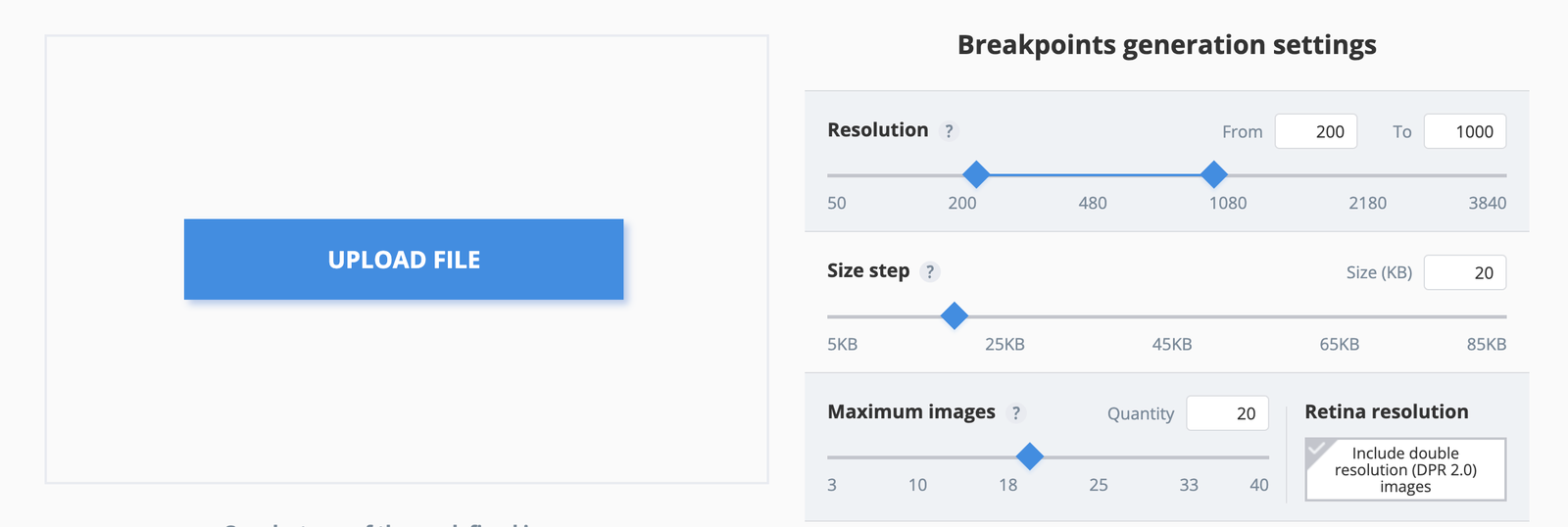
Once the image is uploaded and processed, the generator provides a downloadable ZIP file containing all the optimized image versions and a visual table showing the generated breakpoints.
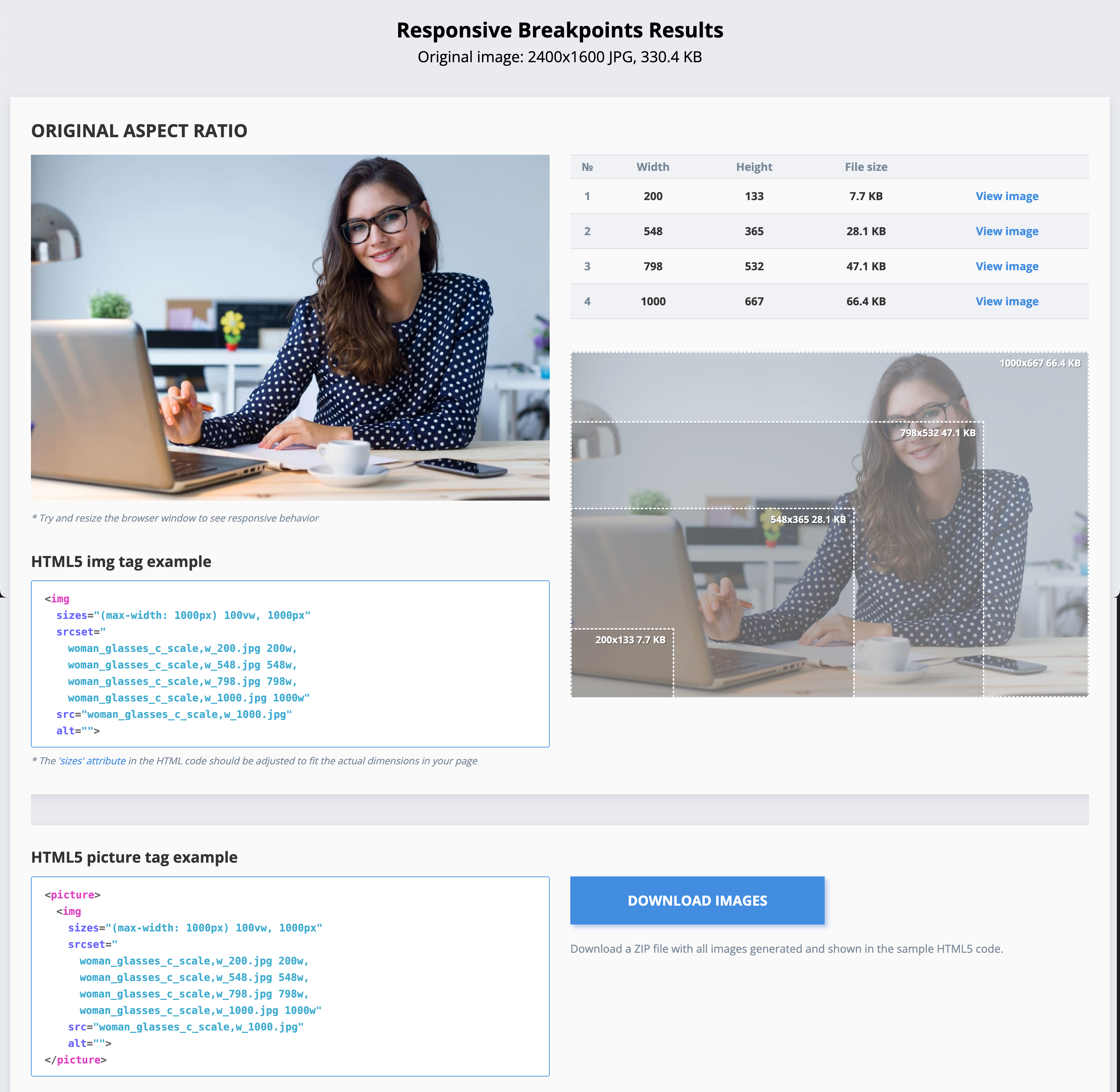
The generator tool also creates an HTML5 <img> tag with srcset, allowing browsers to choose the best image version according to the available space of the image in your responsive web layout.
<img

  sizes="(max-width: 1400px) 100vw, 1400px"

  srcset="

    woman_glasses_c_scale,w_200.jpg 200w,

    woman_glasses_c_scale,w_556.jpg 556w,

    woman_glasses_c_scale,w_819.jpg 819w,

    woman_glasses_c_scale,w_1019.jpg 1019w,

    woman_glasses_c_scale,w_1227.jpg 1227w,

    woman_glasses_c_scale,w_1345.jpg 1345w,

    woman_glasses_c_scale,w_1400.jpg 1400w"

  src="woman_glasses_c_scale,w_1400.jpg"

  alt="">Code language: HTML, XML (xml)
This tool is an ideal quick solution for static images, but if your website has dynamically uploaded images, you will need to use Cloudinary’s API.
Cloudinary’s API allows you to programmatically request the breakpoints for newly uploaded images or existing ones. You can use any of Cloudinary’s open-source SDKs, such as Node.js, which will be used in this tutorial.
To get started, create a project folder and spin up a basic Node project with npm init -y. Once this is done, install the Cloudinary Node.js SDK:
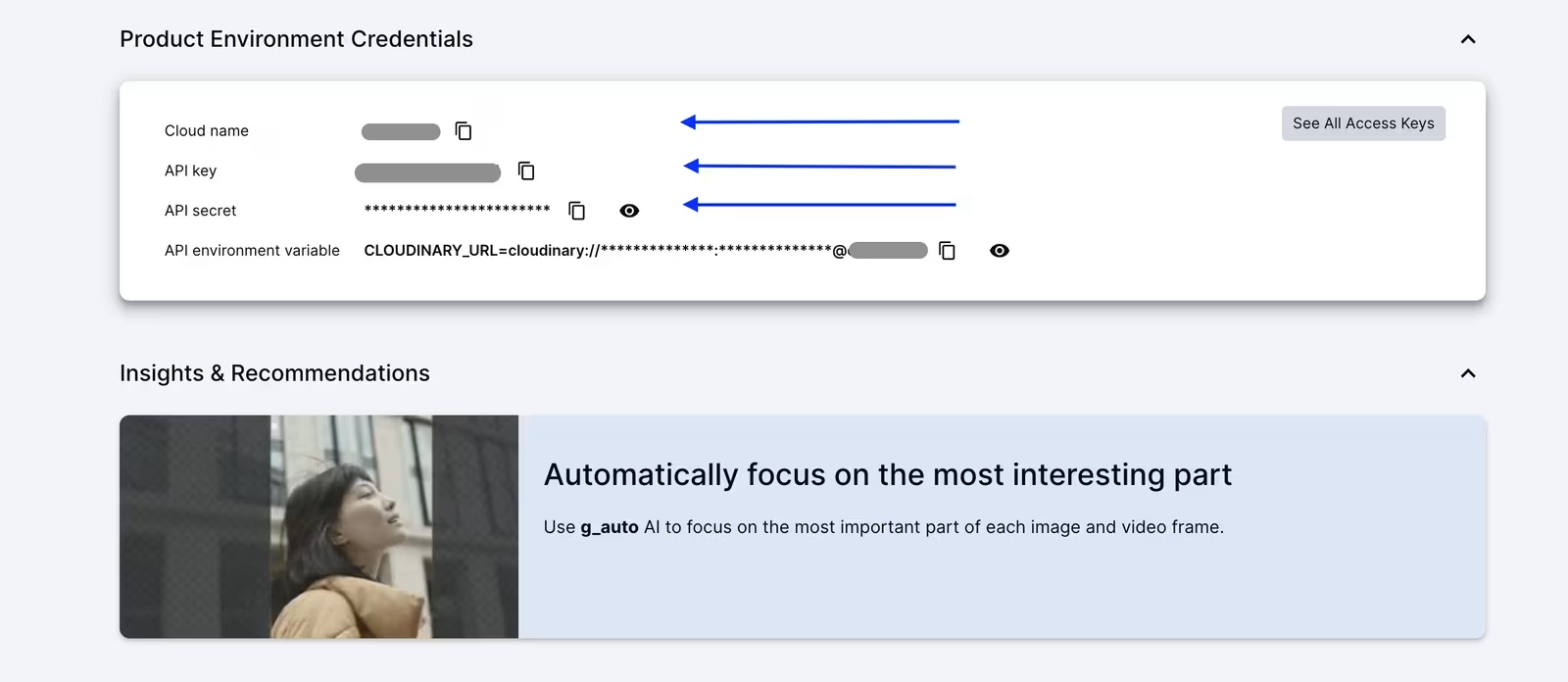
<code>npm install cloudinary</code>Code language: HTML, XML (xml)Next, copy your API credentials from your Cloudinary dashboard, as shown in the image below:
Once you have the API credentials, create a new file named upload.js in your project folder and configure Cloudinary:
const cloudinary = require('cloudinary').v2;

cloudinary.config({

  cloud_name: 'your_cloud_name',

  api_key: 'your_api_key',

  api_secret: 'your_api_secret'

});Code language: JavaScript (javascript)
Now, create a folder named assets inside your project directory and place an image inside it. For this example, an image named smiling-lady.jpg will be used, but you can replace it with any image from your account. Then, add the following code to the upload.js file to upload and generate breakpoints:
cloudinary.uploader.upload("./assets/smiling-lady.jpg", {

  public_id: "smiling-lady",

  responsive_breakpoints: [

    {

      create_derived: true,

      bytes_step: 20000,

      min_width: 200,

      max_width: 1000,

      transformation: {

        crop: 'fill',

        aspect_ratio: '16:9',

        gravity: 'auto'

      }

    }

  ]

}).then(result => console.log(result))

  .catch(error => console.error(error));

Run the script with:

node upload.jsCode language: JavaScript (javascript)
Once the script runs, the image will upload to Cloudinary and generate multiple breakpoints dynamically as an Array with URLs for the different image sizes:
{

  "public_id": "smiling-lady",

  "responsive_breakpoints": [

    {

      "breakpoints": [

        {

          "width": 1000,

          "height": 563,

          "bytes": 69741,

          "url": "https://res.cloudinary.com/demo/image/upload/ar_16:9,c_fill,g_auto/c_scale,w_1000/v1738430393/smiling-lady.jpg",

          "secure_url": "https://res.cloudinary.com/demo/image/upload/ar_16:9,c_fill,g_auto/c_scale,w_1000/v1738430393/smiling-lady.jpg"

        },

        {

          "width": 977,

          "height": 550,

          "bytes": 64449,

          "url": "https://res.cloudinary.com/demo/image/upload/ar_16:9,c_fill,g_auto/c_scale,w_977/v1738430393/smiling-lady.jpg",

          "secure_url": "https://res.cloudinary.com/demo/image/upload/ar_16:9,c_fill,g_auto/c_scale,w_977/v1738430393/smiling-lady.jpg"

        },

        {

          "width": 769,

          "height": 433,

          "bytes": 45553,

          "url": "https://res.cloudinary.com/demo/image/upload/ar_16:9,c_fill,g_auto/c_scale,w_769/v1738430393/smiling-lady.jpg",

          "secure_url": "https://res.cloudinary.com/demo/image/upload/ar_16:9,c_fill,g_auto/c_scale,w_769/v1738430393/smiling-lady.jpg"

        },

        {

          "width": 535,

          "height": 301,

          "bytes": 25960,

          "url": "https://res.cloudinary.com/demo/image/upload/ar_16:9,c_fill,g_auto/c_scale,w_535/v1738430393/smiling-lady.jpg",

          "secure_url": "https://res.cloudinary.com/demo/image/upload/ar_16:9,c_fill,g_auto/c_scale,w_535/v1738430393/smiling-lady.jpg"

        },

        {

          "width": 200,

          "height": 113,

          "bytes": 6083,

          "url": "https://res.cloudinary.com/demo/image/upload/ar_16:9,c_fill,g_auto/c_scale,w_200/v1738430393/smiling-lady.jpg",

          "secure_url": "https://res.cloudinary.com/demo/image/upload/ar_16:9,c_fill,g_auto/c_scale,w_200/v1738430393/smiling-lady.jpg"

        }

      ],

      "transformation": "ar_16:9,c_fill,g_auto"

    }

  ]

}Code language: JSON / JSON with Comments (json)
Now, you can use these URLs in your frontend or CMS to serve responsive images dynamically.
After generating responsive images, the next step is to test if they are correctly delivered based on the screen size. Chrome DevTools provides a simple way to check which image version is loading and how fast it loads on different devices.
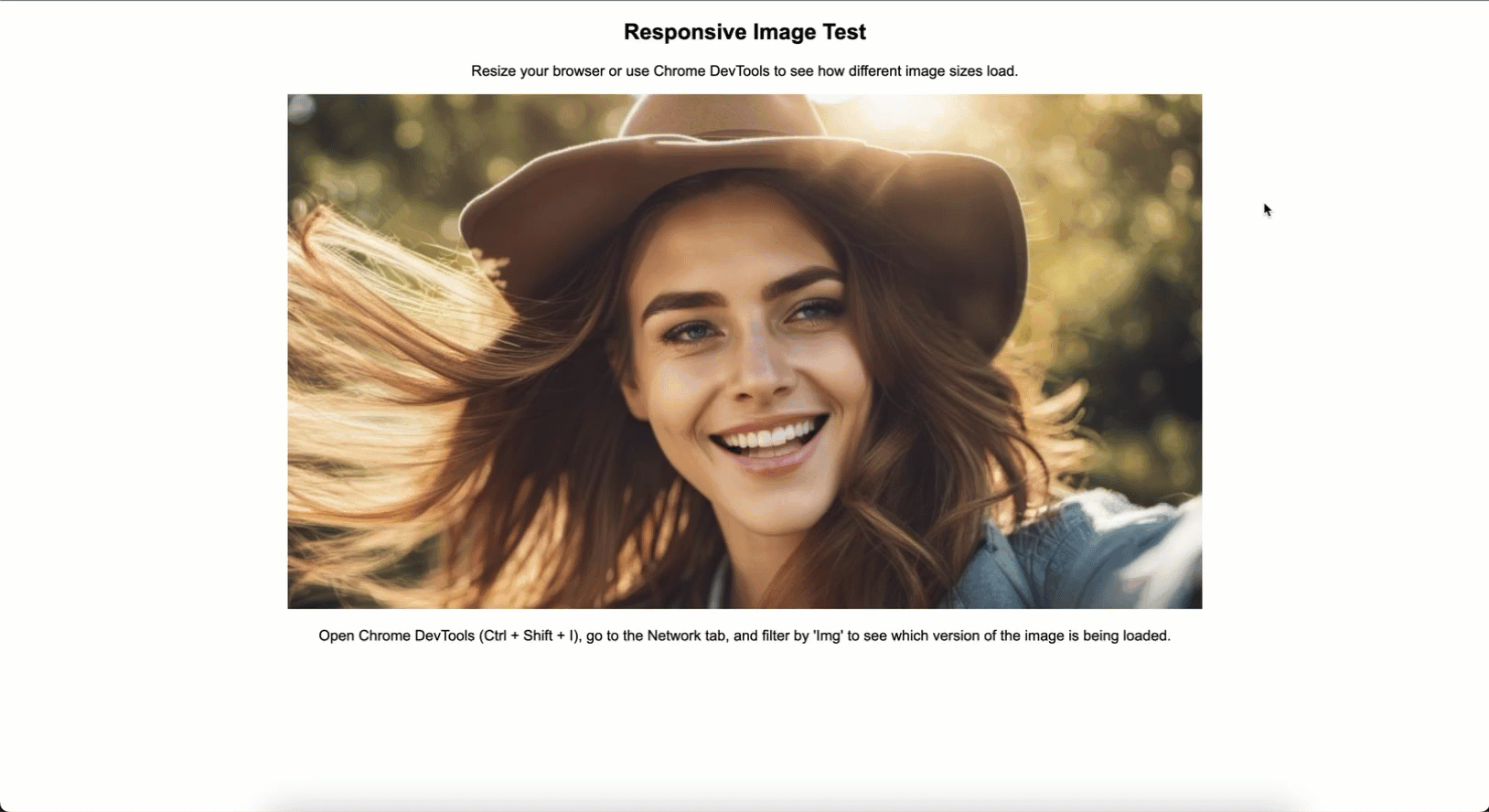
To test how images are loaded across different screen sizes, create a simple HTML page that includes a Cloudinary image with breakpoints.
<!DOCTYPE html>

<html lang="en">

  <head>

    <meta charset="UTF-8" />

    <meta name="viewport" content="width=device-width, initial-scale=1" />

    <title>Responsive Image Test</title>

    <style>

      body {

        text-align: center;

        font-family: Arial, sans-serif;

      }

    </style>

  </head>

  <body>

    <h2>Responsive Image Test</h2>

    <p>

      Resize your browser or use Chrome DevTools to see how different image

      sizes load.

    </p>

    <img

      src="https://res.cloudinary.com/demo/image/upload/v1738430393/smiling-lady.jpg"

      srcset="

        https://res.cloudinary.com/demo/image/upload/ar_16:9,c_fill,g_auto/c_scale,w_200/v1738430393/smiling-lady.jpg   200w,

        https://res.cloudinary.com/demo/image/upload/ar_16:9,c_fill,g_auto/c_scale,w_535/v1738430393/smiling-lady.jpg   535w,

        https://res.cloudinary.com/demo/image/upload/ar_16:9,c_fill,g_auto/c_scale,w_769/v1738430393/smiling-lady.jpg   769w,

        https://res.cloudinary.com/demo/image/upload/ar_16:9,c_fill,g_auto/c_scale,w_977/v1738430393/smiling-lady.jpg   977w,

        https://res.cloudinary.com/demo/image/upload/ar_16:9,c_fill,g_auto/c_scale,w_1000/v1738430393/smiling-lady.jpg 1000w

      "

      sizes="(max-width: 480px) 100vw,

           (max-width: 768px) 80vw,

           (max-width: 1024px) 60vw,

           1000px"

      alt="Responsive Test Image"

    />

    <p>

      Open Chrome DevTools (Ctrl + Shift + I), go to the Network tab, and filter

      by 'Img' to see which version of the image is being loaded.

    </p>

  </body>

</html>Code language: HTML, XML (xml)
This code uses Cloudinary’s responsive breakpoints to deliver different image sizes via the srcset attribute. The sizes attribute makes sure that the appropriate image size is loaded based on the screen width.
To test, open Google Chrome or your preferred browser and load the test HTML file. Press Ctrl + Shift + I (Windows/Linux) or Cmd + Option + I (Mac) to open DevTools, then click the Network tab at the top. In the filter options, click Img to display only images, as shown in the GIF below.
In the GIF above, you can see that as the screen is resized and the page is reloaded, a different image is loaded based on the screen width. You can also see how long each image takes to load.
Here are the loading times recorded for each image size:
| Image Size(Width) | File Size | Load Time(ms) |
| w_200 | 6083 bytes (5.94 KB) | 5ms |
| w_535 | 25960 bytes (25.35 KB) | 8ms |
| w_769 | 45553 bytes (44.49 KB) | 4ms |
| w_977 | 64449 bytes (62.94 KB) | 3ms |
| w_1000 | 69741 bytes (68.11 KB) | 45ms |
The larger the image, the longer it takes to load. However, after an image is loaded once, the next request for the same size loads much faster due to caching.
After optimizing and testing responsive images, the next step is to automate the entire process using Cloudinary MediaFlows. This makes sure every uploaded image is automatically processed and optimized for different devices without manual intervention.
Cloudinary’s MediaFlows helps automate image transformations, resizing, and optimization by creating workflows that handle these tasks automatically. It offers two types of workflows:
- EasyFlows. A simple, no-code automation tool for predefined actions.
- PowerFlows. A more advanced, flexible workflow builder that allows for custom automation and logic.
To access Cloudinary’s MediaFlows, open the Cloudinary console and click the MediaFlows logo as shown below:
The MediaFlows dashboard will open, where you can create workflows. Since you need a workflow that dynamically triggers image processing upon upload, you’ll use PowerFlows. Click the + Create New button, select PowerFlow, and the UI will open, where you can drag and configure blocks for your workflow.
For this guide, two blocks will be used: Cloudinary Upload and Apply Actions.
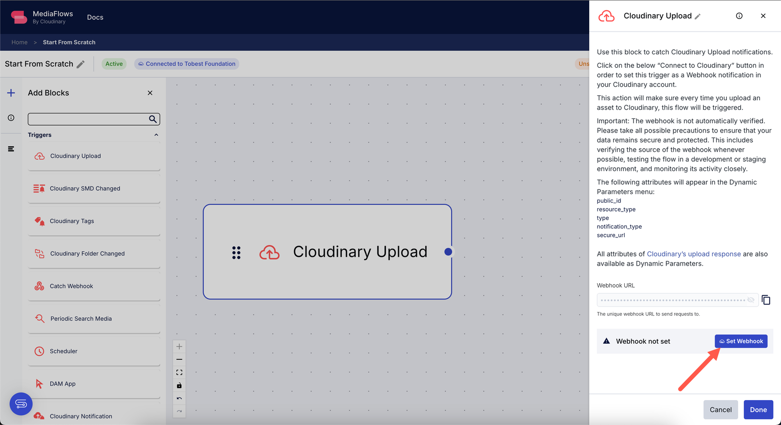
First, drag the Cloudinary Upload block to the workspace. This block will detect when an image is uploaded to Cloudinary.
For the workflow to trigger correctly, you need to set up a webhook by clicking the Set Webhook button. Once enabled, the webhook will send a notification whenever an image is uploaded, activating the workflow.
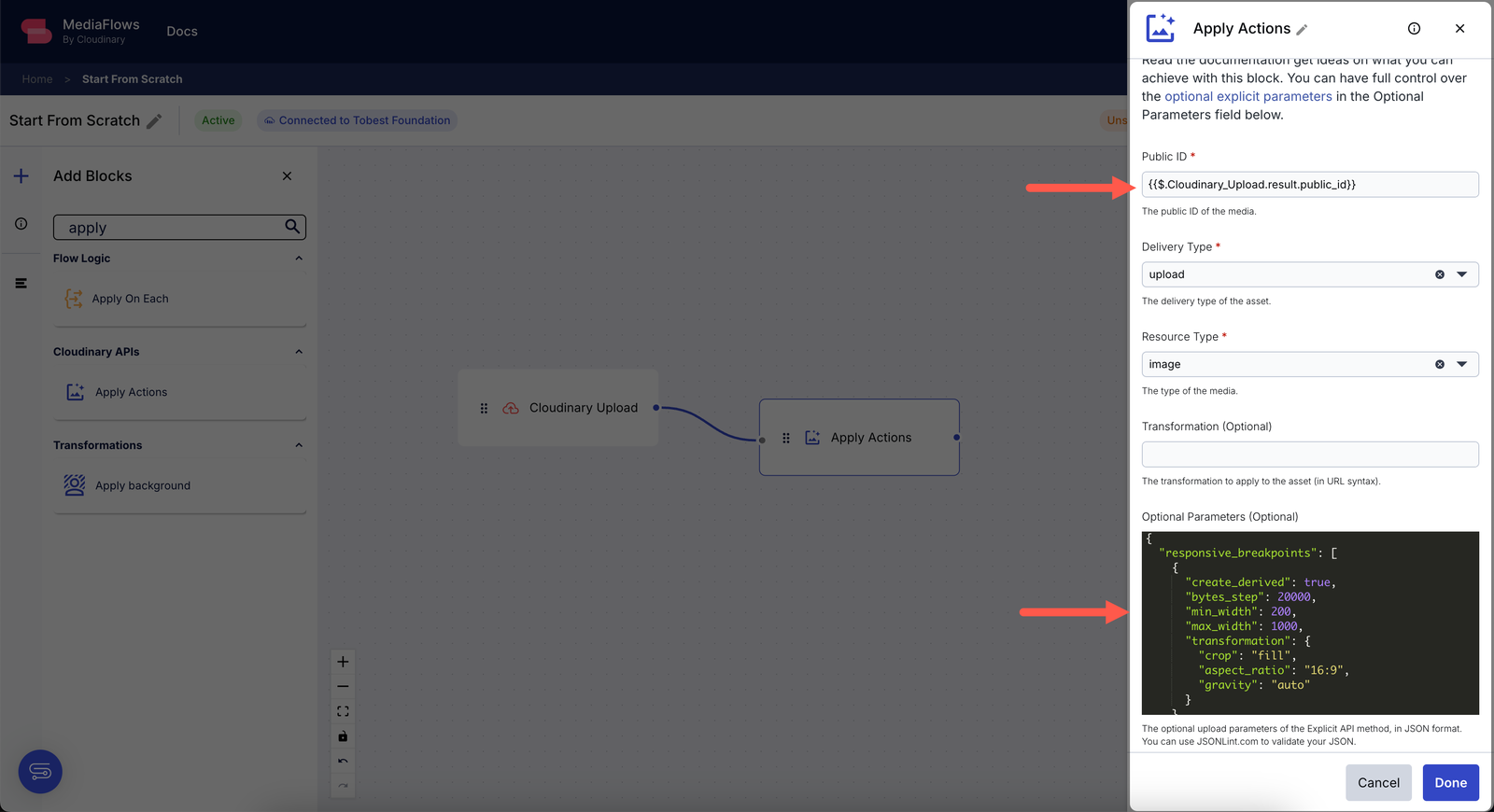
Next, drag the Apply Actions block to the workspace and connect it to the Cloudinary Upload block.
Click the Apply Actions block to see the various options to be configured. Since you need to generate responsive breakpoints, you must extract the Public ID from the uploaded image.
Click the {} icon at the top of the field to select {{$.Cloudinary_Upload.result.public_id}} from the suggested data, which only appears when both blocks are connected. Then, in the Optional Parameters field, paste the following configuration:
{

  "responsive_breakpoints": [

    {

      "create_derived": true,

      "bytes_step": 20000,

      "min_width": 200,

      "max_width": 1000,

      "transformation": {

        "crop": "fill",

        "aspect_ratio": "16:9",

        "gravity": "auto"

      }

    }

  ]

}Code language: JSON / JSON with Comments (json)
Once you fill all the fields correctly, the block settings should look like this:
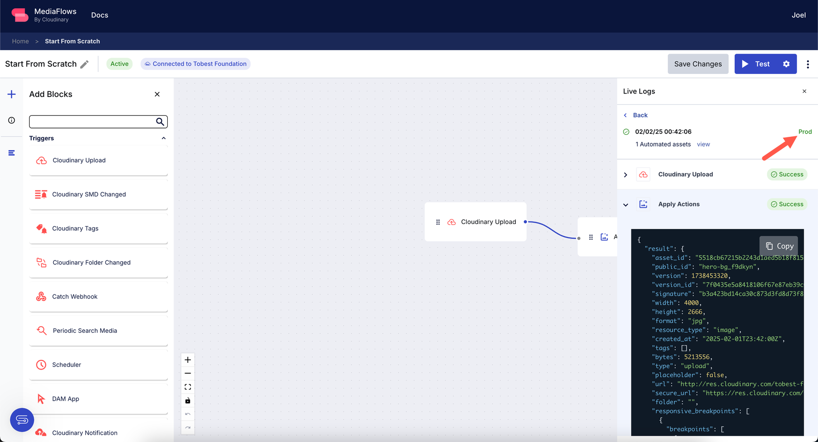
With the workflow set up, you can now test it by clicking the Test button. This will send a sample image to your Cloudinary account, and the specified actions will be applied.
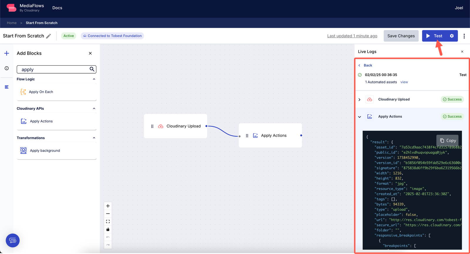
Once the test is successful, you can verify if the workflow triggers correctly when a new image is uploaded to Cloudinary. Upload an image either manually via the UI or programmatically through the API, then check your MediaFlows dashboard for a production log confirming that the process was executed.
With this setup, you have successfully automated responsive image generation. Every uploaded image will now be processed with breakpoints dynamically so that optimized images are delivered for different devices.
Now that you’ve automated responsive image generation, the final step is to analyze how well these images are performing.
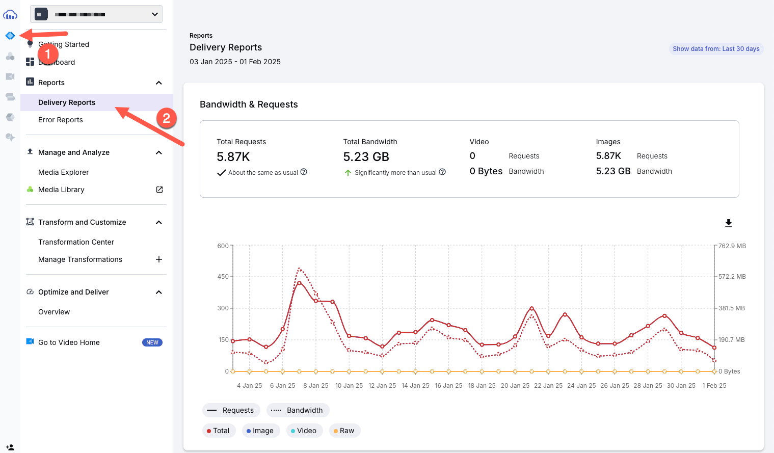
Cloudinary provides a built-in usage analytics dashboard that helps you track which image formats, sizes, and transformations are being used the most. This allows you to see which versions are frequently requested, which ones are consuming the most bandwidth, and whether any image breakpoints are unnecessary.
To access this dashboard, navigate to Programmable Media > Delivery Reports, as shown in the image below:
One of the most important sections here is the Transformations Breakdown, which lists all the different variations of images that have been requested, as shown below.
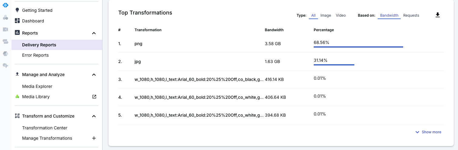
If, after checking the analytics, you notice that certain breakpoints or transformations are rarely accessed, that means they may not be necessary. You can then adjust your workflow in MediaFlows to stop generating those versions, saving both processing time and storage.
It’s important to know that the analytics page provides more information, such as bandwidth usage per resource type. All of this information helps you understand how images are being used across different devices and formats, allowing you to refine your workflow for better efficiency.
With this setup, every image you upload is automatically optimized for mobile and desktop users without extra manual work. Whether you’re a marketer or developer, this makes sure your images loads fast, looks great, and performs well across all screen sizes.
Sign up for Cloudinary to test and optimize responsive media assets today!