
In Part 1 of this series, I discussed (rather abstractly) what it means for an image to be “responsive.” In short, a responsive image is a variable image that adapts to fit variable contexts, in order to provide a great experience to users no matter what their screen, browser, network connection, or device may be.
That adaptive variability can take many forms; the most common and impactful of these is adaptive, variable, image resolution.
Bitmap images have a fixed resolution: they contain a fixed number of pixels. Images on the web, however, are fluid, and the number of pixels that they occupy in layouts and on screens can vary.
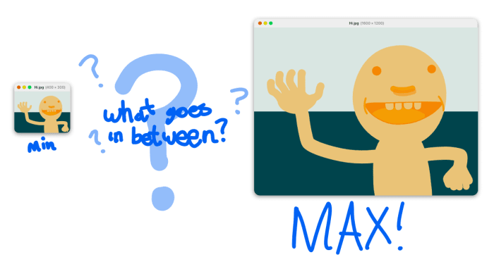
Here’s an example. Let’s say we have an image—
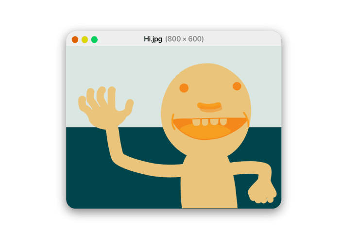
—and we want to share it with the world. We put it on a website, and load that site on our phone:

It looks pretty sharp! Proud of our work, we send the URL to a friend, who just so happens to have a brand new 5K display:
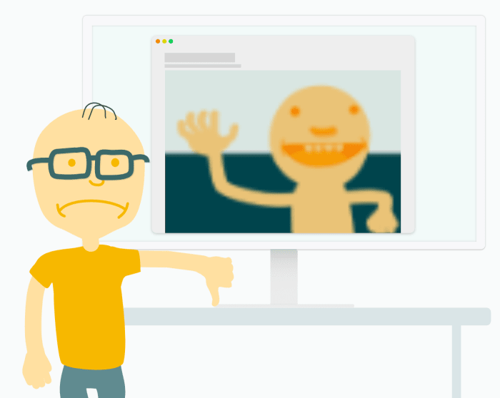
He’s, well, less than impressed. The problem? Our original image has a resolution of 800 × 600 — so while it looks sharp-as-a-tack on our 750 × 1334 iPhone 7 screen, it looks horribly blurry when scaled to fit our friend’s 5120 × 2880 monster.
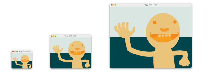
Crispness in this (extreme!) context requires a (much!) bigger image:
| resolution | # of pixels | # of bytes |
|---|---|---|
| 800 × 600 | 0.48 MP | 66 kB |
| 5000 × 3750 | 18.75 MP | 2.2 MB |
To fill our friend’s 5K screen, our image would need almost 40 times more data. This super-sized file would, all by itself, outweigh the average webpage and take forever to load over anything but the fastest internet connections. Worst of all, on smaller (and far more common) screens, our giant image would ultimately be downscaled to fit, and all of those extra pixels would be useless.
So – should we use high-resolution images in order to take advantage of high-resolution hardware? Or should we use small images, which will load fast in low-resolution environments?
The answer, of course, is an emphatic “yes” to both, and everything in-between! We can and should include multiple, alternate versions of our images –
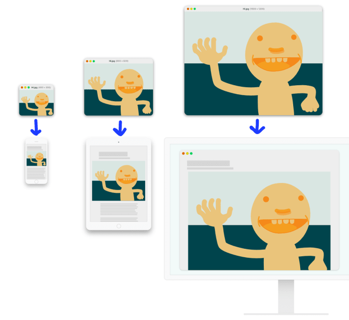
— and make sure that we only send high-resolution versions to users who need them, while still sending low-resolution versions to everyone else.
This concept is simple enough, and the the HTML feature that allows developers to supply those multiple alternates is straightforward, too; it’s called srcset.
But the devil is in the details, and figuring out—
- how many different versions you actually need
- what their resolutions should be
- and how to intelligently pick and load one of them from the set
—is surprisingly tricky! We’ll tackle each of those problems in turn.
In order to serve users in varying contexts well, we need to supply our image in multiple, alternate resolutions. But how many versions do we need, and what should their resolutions be?
This is a hard question, so let’s break it into smaller pieces. We can start by thinking about the limits: what are the largest and smallest resolutions that we’ll need? In order to figure that out, we need to consider: what are the largest and smallest sizes that our image can grow/shrink to on our layout? And what display sizes and densities do we actually care about supporting?
Once we’ve established the limits of our range, we need to figure out how to fill it in.
For web devs, more resources means more to manage.
For users, more resources means less waste. But also, more HTML to download, and fewer cache hits, resulting in, paradoxically, slower loads.
How should we navigate these conflicting priorities? Initially, most developers threw up their hands and picked a more-or-less arbitrary step size, in pixels. Jason Grigsby pioneered the idea that we can be smarter about this by using file-size-based steps, instead. So rather than having versions that were, say, 600, 800, and 1000 pixels-wide, we would generate versions that weighed 60 kB, 80 kB, and 100 kB.
Why? Because different images can have surprisingly different compression characteristics, and we care much more about the wasted bytes when we load an over-sized image, than we do wasted pixels.
Cloudinary thought that this file-size-based “responsive image breakpoint” strategy was pretty smart, and built the Responsive Images Breakpoints Generator in order to help developers implement it. The Generator allows you to input a high-res original image and pick a maximum resolution, minimum resolution, and step-size in kilobytes; it then generates a full set of alternate resources and provides a convenient download link along with the markup you need to include them all in your HTML. Neat!
Now that we’ve marked up a set of multiple, alternate resources – how should browsers pick and load the most appropriate resource out of the set?
In order to choose, browsers need to know how many pixels are in this box:
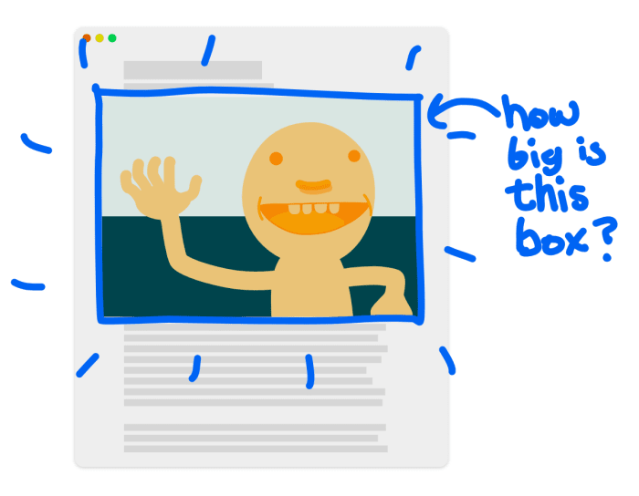
Once they know that, they can pick the version that best fills the box. But! That box-size is determined by a number of things:
- the viewport size
- the screen density
- the page layout
The viewport size and screen density are always known to the browser. Page layout, however, is where things get sticky.
When loading a webpage and parsing its HTML, browsers begin loading external resources (like CSS and images) as soon as they see their URLs in the markup. This is good for performance – image bytes account for 68% of the web, and we want to start moving those bytes across the network as soon as possible. But it’s bad for layout-aware image loading, as it means that browsers don’t, won’t, and can’t wait for layout before kicking off image loads. The load-it-as-soon-as-you-see-it strategy means that we, as web developers, must choose between:
- intentionally delaying image loads and waiting for page layout to complete so that we know how many pixels of resolution we actually need, before loading a given image
- kicking off image loads as soon as we possibly can (without knowing how many pixels we’ll actually need)
In other words: do we want our images to be resolution-responsive, or loaded without delay? Because – without adding something else to this equation – we can’t have both.
In some contexts, delayed, resolution-adaptive-sizing isn’t a problem. If an image is lazy-loaded (or even just below-the-fold), we can afford to wait for layout. The Cloudinary Javascript library and libraries like Alexander Farkas’ lazy-sizes circumvent the browser’s normal image loading mechanisms and responsively load images – after layout – with Javascript.
But if we want our resolution-responsive images fast, we need to short-circuit the normal flow of information. We need to tell the browser the layout size of the image directly in markup.
This is what the sizes attribute is for. sizes declarations have a reputation for being difficult to read and I know from bitter experience that they can be tricky to write. Because the attribute was explicitly designed to break the separation of concerns and duplicate a little bit of layout information right there in markup, the most challenging thing about sizes might be maintenance; sites whose layout is subject to frequent tweaking will especially suffer.
The reason that I love sizes despite its difficulties, is that it addresses the how-do-we-know-about-the-layout-before-we-know-about-the-layout problem head on, directly giving browsers the minimum amount of information that they need to start loading resolution-responsive images as soon as possible.
As such, sizes is required when using the srcset attribute with w descriptors – which is the standard (and universally supported!) pattern for implementing resolution-adaptive responsive images.
Fast, resolution-responsive images can be a bit tricky to implement, but the the payoff is enormous. By supplying multiple versions of each image, and using either Javascript or srcset and sizes to pick amongst them, we can ensure that every user – whether they’re on a phone, 5K display, or anything in between – gets a version of our image with just enough resolution to look great on their display.
Join us next time, when we’ll talk about another, vital, way that images can vary: variable image encoding.
- Cloudinary’s official responsive images documentation
-
An in-depth tutorial on using
srcset,sizes, and Cloudinary. - An introduction to Cloudinary’s Javascript-based responsive images solution.
- Yoav Weiss on variable-width images
- The srcset,
sizes, and responsive image breakpoints sections of Jason Grigsby’s 10-part Responsive Images 101 series (already linked above, but down here again, for good measure!) - A three part interview with Jason, about the history and future of responsive images.
- Cloudinary’s introduction and update to the Responsive Images Breakpoint Generator.
- Finally, as a bit of advanced-topics extra credit: yours truly on making the complexity of
srcsetthe server’s problem usingw_autoand Client Hints. - Responsive images with Cloudinary
- Auto-Crop Images for Responsive Designs and Improved Image Quality
- Make All Images on Your Website Responsive in 3 Easy Steps
- Best Practices for Responsive Web Design