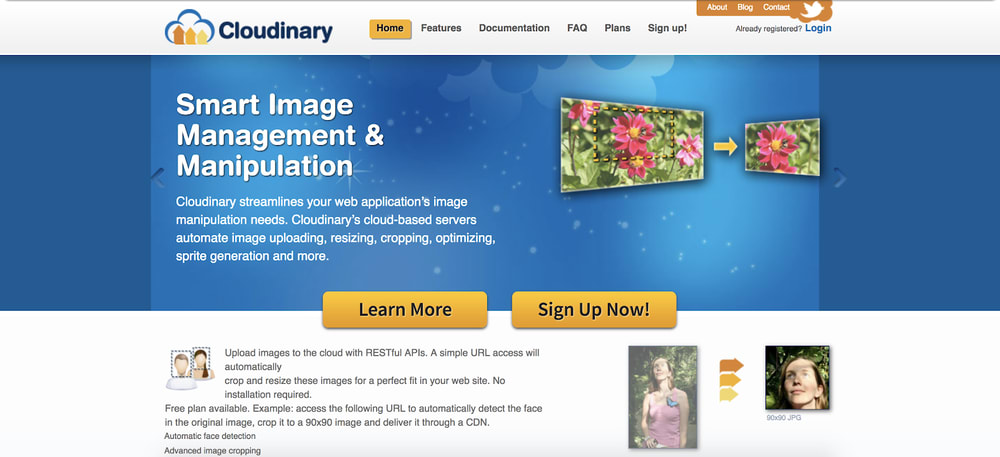
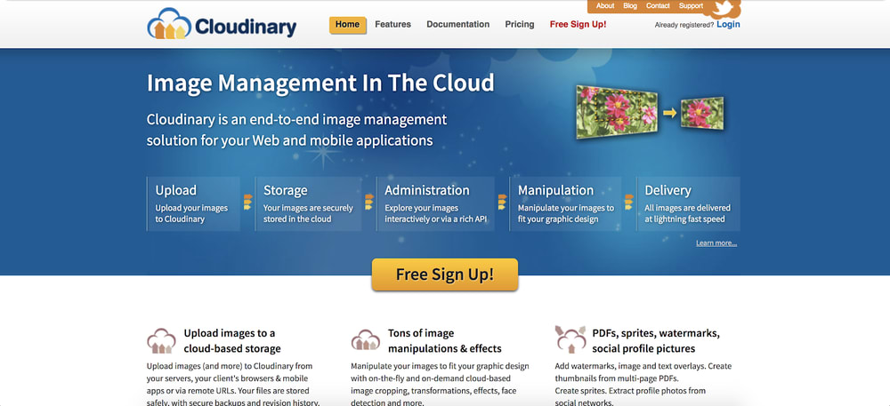
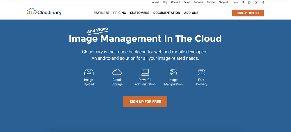
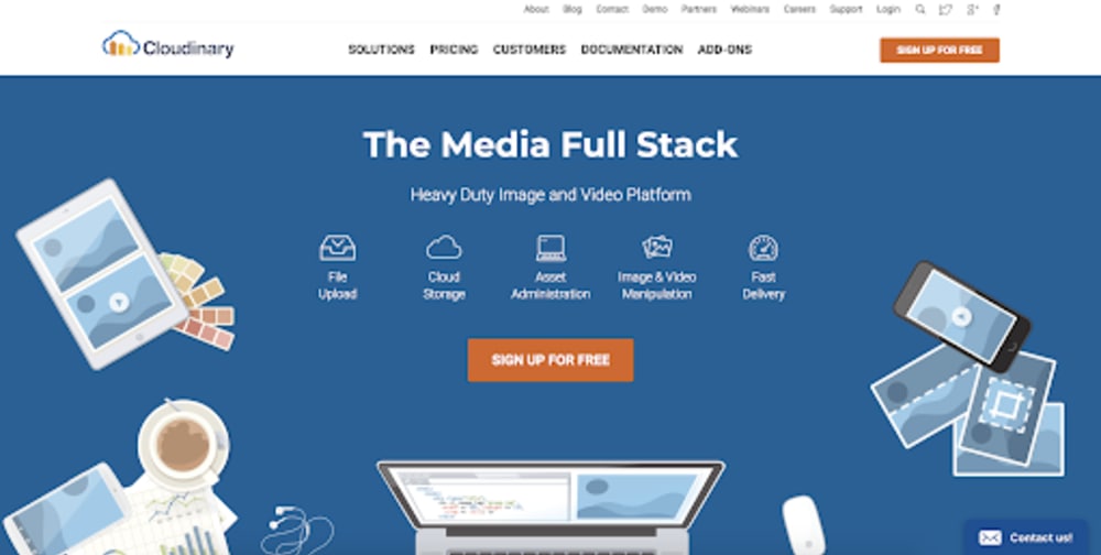
Last month we unveiled a refresh of our website. As with all redesigns, there were numerous drivers behind the rollout. First and foremost, we’re a company that understands the power of visual storytelling, and the ways in which a website must beautifully and clearly convey a brand’s story and offerings. Our website needed to better reflect our brand and our solutions. This post highlights some of the thinking behind our changes.
At the beginning of 2018, we held a series of conversations to examine and update, if necessary, our core positioning. This structured process helped us identify and confirm a few “truths”:
- We are an ideal platform for companies whose rich media is pivotal to their business success.
- Specifically, companies choose Cloudinary because of 1) our ability to support an immensely broad set of customer product and design requirements; and 2) our ability to significantly enhance developer productivity.
- We are an API-first, developer-centric platform, with solutions for multiple use-cases, including our recently introduced digital asset management product.
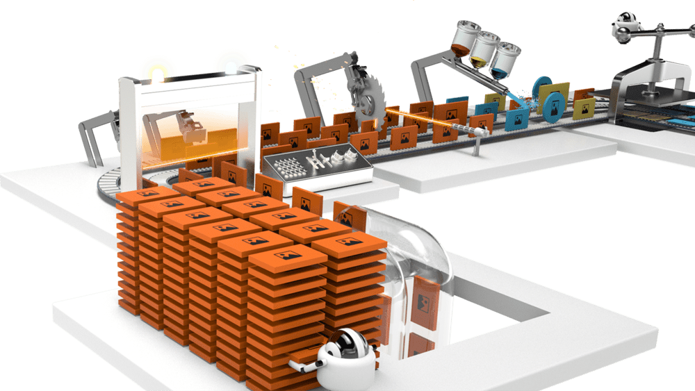
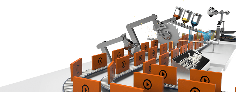
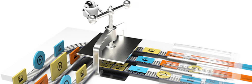
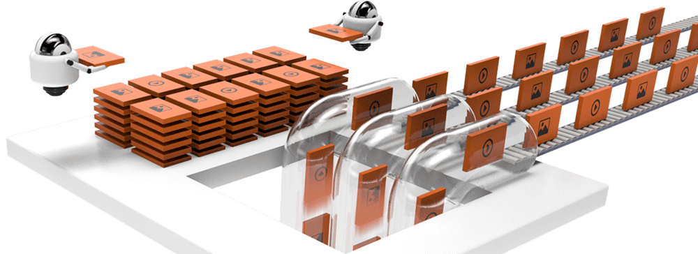
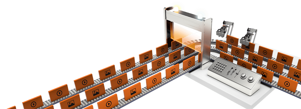
Once we moved from positioning to website design, our choices had to reflect the aforementioned principles while ensuring that our users could still easily find information relevant to them. After reviewing multiple options, we chose a “factory” theme that we believe is an apt analogy for our platform capabilities, while still showcasing the end-to-end sequencing of how images, videos, and other rich media are managed through Cloudinary.
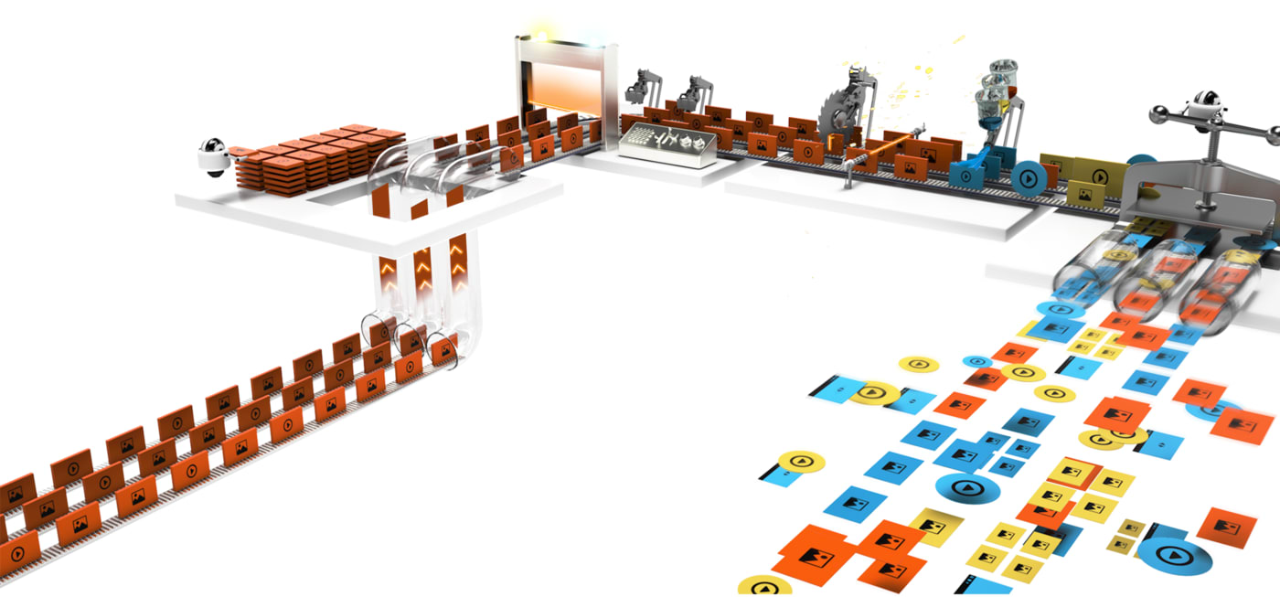
Our specific thematic choice reflects the key platform architecture principles of being dynamic, flexible, and efficient. What’s more, the nature of the factory design enables us to showcase specific capabilities within each part of the “factory floor”. We know that each company has different needs and prioritizes different aspects of Cloudinary’s offerings, so we wanted visitors to be able to drill down into those areas that were most relevant to them.
Websites aren’t static; the best ones are always changing, always evolving. And the process of updating a site, whether on the design or content side, is never fully complete in the first round. While we made a number of design choices, we chose to defer some decisions around our information architecture and updates to major content buckets. These two items as well as additional design upgrades are part of our next set of updates and we’re excited to share those with you early next year..
Meantime, what do you think? If you have additional thoughts on what you’d like to see from our website, please reach out and drop us a line. We look forward to hearing from you.
Start Using Cloudinary
Sign up for our free plan and start creating stunning visual experiences in minutes.
Sign Up for Free
