
Text wrapping is the practice of surrounding a picture or diagram with text. Including images in your text is an excellent way to display essential information. HTML and CSS are the two primary methods for achieving this, as they both account for inconsistent image dimensions.
This tutorial will walk you through the two significant ways to wrap text around images — using HTML and CSS.
To follow the steps in this post, you’ll need a basic knowledge of HTML, and if you’re using a CSS, a basic understanding of that, as well. With that fundamental working knowledge, I’ll provide step-by-step instructions that will get you up and running fast. For developers looking to get a deeper knowledge, it will help if you have An Integrated Development Environment (IDE) installed on your machine (e.g., VS Code) so you can play around a bit in your own environment.
The completed project is on CodeSandbox. Fork it to get started quickly.
The source code is on GitHub.
To follow the steps in this article, you’ll need:
- Basic knowledge of HTML and CSS
- An IDE installed on your machine (e.g., VS Code)
This HTML method is significant when considering that text may not need to float around the image on various devices and layouts. A responsive website’s style may require that the text align below the picture and that the image span the entire width of the screen for smaller displays.
Firstly, in the HTML file, you need to create a container: it can be a table or div that stores a paragraph of text. The picture markup will be just above this content. For instance,
<!--Image container start-->
<div class="box">
<img src="fam.png" alt="The Forger family picture">
</div>
<!--Image container end-->
<!--Text container start-->
<div>
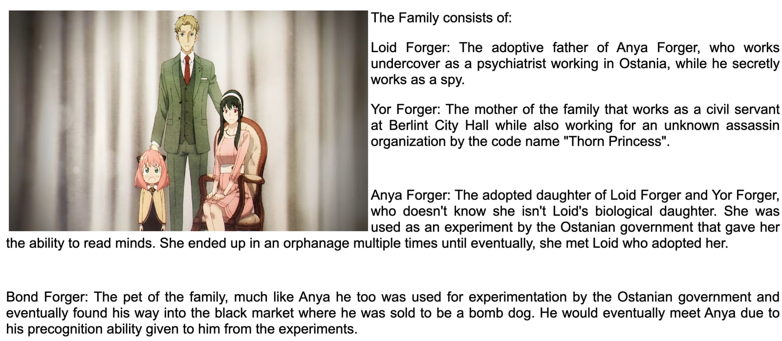
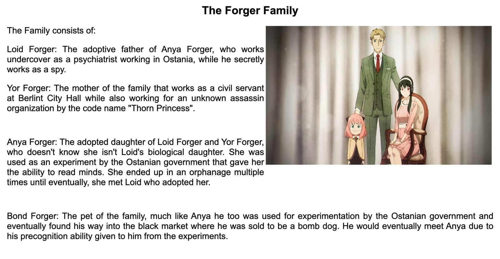
<p> The family consists of... </p>
</div>
<!--Text container end->
The code above displays the picture fam.png just above the text. You would want to position it on the left side of the paragraph to sit within the text. This is accomplished by including a float value within the <img> element. This means you will use inline HTML styling, like so:
<div>
  img src="fam.png" alt="The Forger family picture" style="float: left;
  margin: 5px;">
</div>
And now the image will appear in the text like this:
Additionally, to control the text flow around images, you can utilize the markup <BR CLEAR=”left” /> which can help you wrap text around images on opposite sides of your web pages. For example, if you have images aligned to both left and right on a page, this markup will help in managing the text wrapping around them in a clean manner. This is a handy HTML feature to manage text wrapping, especially on web pages with multiple images aligned differently.
And, while aligning images to the left or right, you may also consider center alignment for certain design aesthetics. This can be achieved using CSS properties alongside the float property. Here’s how you could do it:
<style>
.center { display: block;
 margin-left: auto;
 margin-right: auto;
 width: 50%;
 } </style>
<img src="fam.png" alt="The Forger family picture" class="center">
In this snippet, the image will be centered on the page, with text wrapping around it.
The completed project showing an example of a text wrap around image has been set up on CodeSandbox for you to explore (link in the tool here). This is an open source project, so feel free to fork it to get started quickly. The source code is on GitHub (you can find it here), but I encourage you to continue exploring here to get the most context, especially if you’re looking to wrap text around an image in html or wrap text around image in CSS.
This approach is a little more effective for individuals who understand CSS. It provides fine-grained control over element placement and is more compatible with current coding standards. The implementation is similar to the HTML technique, except it uses the <style> tags in the HTML file’s <head> tag.
You will need to define a style class for images; you should name your class something simple. How about “wrap”?
<div class="wrap">
   <img src="fam.png" alt="The forger family picture">
</div>
Now, give it the float property with the value “right” within the style tag at the head. This change aligns the image to the right while your text wraps around it.
<style>
 .wrap {
   float: right;
   margin: 5px;
  }
</style>
The image in this example below floats to the right side of the screen, and the text wraps around it. This solution is more dependable since you can always reuse your class elsewhere in your code, saving you time.
The HTML technique of wrapping text is still dependable, but the CSS method is more adaptable for style-related formatting on your website. Using the CSS method, if you modify the style of the text wrap, all the CSS code will change simultaneously.
Are you a developer? Check out how Cloudinary makes it easier to deliver rich web and app experiences.


