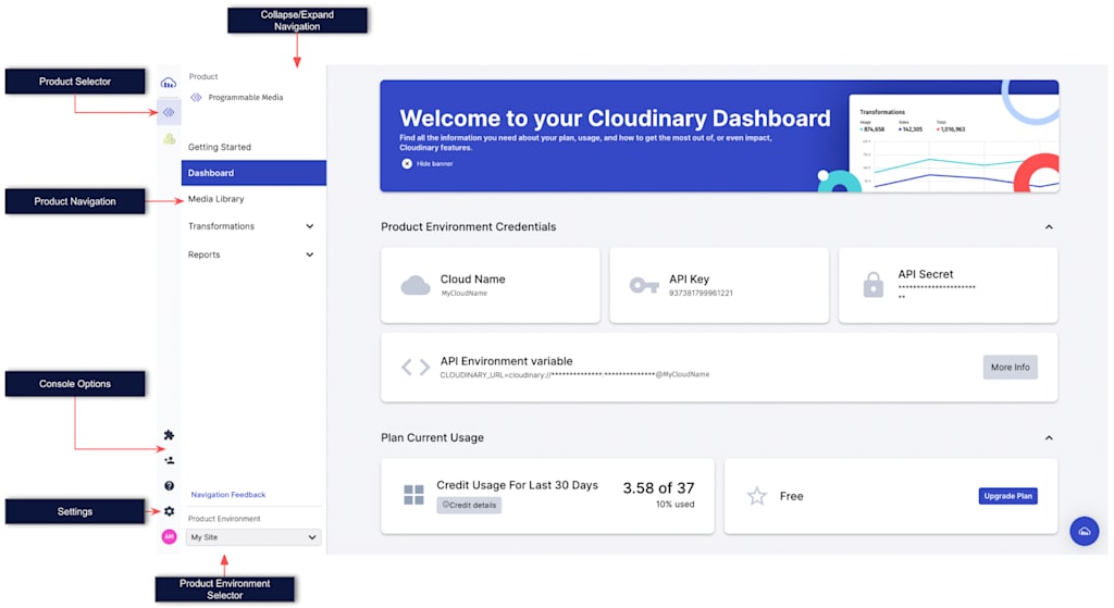
We’re upgrading our Cloudinary Console interface and navigation to make switching between application workspaces easier. With a gradual rollout beginning in late-March and completing in April, all customers will enjoy a new console navigation experience.
New features include:
- Easily select and switch between workspaces for your subscribed products
- Quickly browse and choose between multiple Product Environments (formerly called ‘Sub-Accounts’)
- Completely collapse the navigation menu for a tidy workspace-focused view

You’ll still find all the icons, settings, and navigation features you’ve grown used to in our new navigation experiences—we’ve only updated and tuned for easier use.
Firsty, you’ll notice the navigation bar has moved to a vertical orientation to the left of the workspace window. The navigation column offers two menus: Console Options and a Product Navigation section which can be collapsed.
The Product Selector only shows the products you have an active trial or subscription to. This allows for easy switching between products.
The Product Environment Selector (previously located in the top right corner) lists all environments and allows for easy selection as you move between environments (staging/production, websites, and properties, etc.).
The Console Options menu provides the following options:
- Add-Ons. Easily review, sign up and active add-on features
- User Management. Easily add new users and tune roles and permissions
- Knowledge Resource. Quickly find relevant documentation content.
- Settings. One-click access to all console settings.
- Avatar Icon. Access user details, logout and more.
We’d love to hear what you think about the new navigation experience, Simply click the Navigation Feedback option in the Product Navigation menu.


