
Back in 2013, Cloudinary published a blog post entitled “Top 10 Mistakes in Handling Website Images”. Though these top 10 mistakes still hold true, we’ve come up with a few additional points that we thought you’d find of interest.
As the number of images and videos on a website continue to grow, slower load times and thus a negative user experience are both growing concerns for any company. An article this summer in The Fiscal Times, citing Internet data measurement company HTTP Archive, noted that the average website is now 2.1 MB in size, compared to 1.5 MB two years ago. And one of the biggest reasons for this growth is the addition of content such as videos and engaging images designed to drive more traffic to the site.
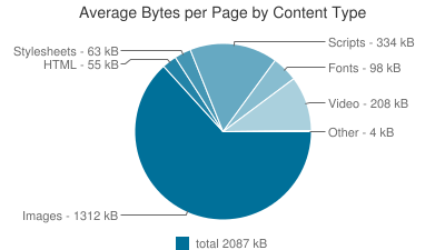
The article illustrated that images account for almost 63 percent of the bytes (1,312 KB of the total 2,087 KB) of the average page by content type. Video came in a distant second at 10 percent (208 KB).
The impact of images on a website can be dramatic, eating costly bandwidth and increasing the time website visitors spend waiting for images to load. When every passing second reduces your website’s overall conversion rate and ultimately revenues, it makes perfect sense to want to optimize your images and their delivery as much as possible.
If you’re having problems, it’s possible you’re making one – or more – key mistakes with images, which prevent you from improving your website’s performance and user experience. Here’s a look at some of the most common mistakes, and how to avoid them:
Even though Google has added support for its WebP image format to Chrome browsers, and Microsoft has done the same for JPEG-XR in most of their Internet Explorer and Edge browsers, developers have still not embraced them. Perhaps developers aren’t aware of these formats, or maybe it’s too difficult for them to deliver different image formats to various browsers and devices. As a result, they’re sticking with the same JPG and PNG formats, and not taking advantage of how the modern formats can optimize their sites.
How to fix: Convert images to the WebP and JPEG-XL modern formats, while also adjusting compression quality to balance between the formats. Also by detecting the specific browser that accesses each image and delivering a different version of the image to the respective browser, you can ensure users receive the best images possible, in terms of visual quality and file size optimization.


Most developers rely on the GIF image format to display short video clips on news sites, media sites and social sharing sites. While the GIF format is easy to use for embedding video clips using a simple HTML image tag, it is not efficient for captured movies because the files are huge and slow to load, especially on mobile devices, resulting in high bandwidth costs and high CPU utilization.
How to fix: There are several ways to deliver and embed the same clips and animations using modern file formats, such as Animated WebP for Chrome browser users. Another approach is to apply lossy compression of the GIF File, which results in a slight visual quality reduction but significantly decreases the file size. GIF files can also be converted to MP4 or WebM video formats, embedding the clips and HTML5 video tags instead of the image tag. In most modern browsers, this works smoothly and the site looks exactly the same but loads much faster. By taking one of these steps, you will be able to reduce the file size dramatically, saving page load time, improving user experience and cutting bandwidth costs.

Modern mobile devices and laptops have high device pixel ratios (DPR). Because site owners and developers want their sites to look great on these devices, they embed double resolution images. While this is a good practice, many developers tend to deliver the same size images to all users. As a result, users with regular displays (e.g., non-Retina displays) must download the hi-res images while their displays only benefit from half the resolution. This results in wasted time waiting for pages to load and increases bandwidth costs unnecessarily.
How to fix: Create different resolutions for each DPR value (e.g., regular images and double resolution images) and automatically detect the DPR value of the web page in the current user’s browser. This will enable you to deliver regular images to users with regular displays and 2x resolution images to users with Retina display devices.


DPR 1.0 – 100×100 – 4.6KB DPR 2.0 – 200×200 – 12.1KB
- Wasteful browser-side resizing
- Unnecessarily high quality JPEGs
- Incorrect image file types
- Delivering non-optimized images
- Forgetting to strip image meta-data
- Delivering images straight from your servers
- Delivering static icons one by one
- Using images when CSS3 can be used
- Incorrect image cache settings
- Using a single image size across all delivery mediums
Do you find yourself making at least one – if not more – of these mistakes, and could benefit by re-evaluating your processes and optimizing the way you handle images?
Cloudinary can help. We’ve got you covered from upload through storage, transformation, optimization and delivery. Sign up for free and discover how we can help you avoid these problems.
- Website image optimization and fast delivery with Cloudinary
- The complete guide to PHP image compression and optimization
- Python Image Optimization and Transformation
- Image Optimization in Ruby
- Image Optimization for WordPress
- Learn about the pros and cons of JPEG 2000
- Adopting the WebP Image Format for Android on Websites Or Native Apps
- 10 Website Image Mistakes that Slow Load Times
- Automatically Reduce Image Size Without Losing Quality
- Automate Placeholder Generation and Accelerate Page Loads
- 3 Ways to Do Progressive JPEG Encoding