
“Data beats opinion.” – That one friend who always wins arguments because they brought the sources.
As your team and digital asset collection grow, staying organized becomes challenging. Who’s using which assets? How often are they accessing them? Are your storage and bandwidth resources going to the right places? Cloudinary’s Digital Asset Management (DAM) Admin Usage provides clear metrics, so you don’t have to guess.
As a DAM admin, you need real visibility into user behavior. With Cloudinary’s DAM usage data tools, tracking how your team interacts with your Media Library just got easier. Now, you can manage users, check permissions, and streamline your workflows based on actual data and not just assumptions.
In this blog post, we’ll explore the Assets Admin Dashboard. Only accessible to Master admins, this single screen is updated daily with the essentials. You only need a minute to understand what’s going on in your workflow. It delivers up-to-date metrics so you can quickly identify issues, spot trends, and take early actions to optimize asset management and team productivity.
Please note that this dashboard is a premium offering for the Assets product, and its availability depends on your account setup. It’s not included with the Assets Free plan but is available with the Assets Enterprise plan. Please visit our pricing page for more details.
If some features aren’t yet enabled for your account and you’d like to activate them, please contact your Customer Success Manager. For upgrade options or more information, contact us.
In this dashboard, we can find the following sections that display the metrics we care about:
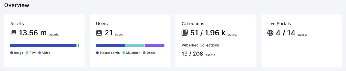
The Overview section provides us with the essentials, allowing us to see important information about our Assets at a glance. At a quick glance, we can see the following: The total number of assets by their type (images, videos, or other files). The number of users we have and their respective roles. The number of internal collections we’ve created, and how many of these collections are published, with how many assets are inside them. The number of live portals we currently have.
You could leverage these metrics in different ways. Here are some examples:
- Assets. Total counts of images, videos, and raw files. These metrics help understand what assets are likely being underutilized. Do I have a lot of images? Could I leverage videos to reduce the number of images I need to meet customer needs?
- Users. Understand your user base by roles. Seen a lot of admins? Scale back to cut “oops‑I‑deleted‑production” risk.
- Collections & Published Collections. If there aren’t many published collections, we may be missing opportunities to enhance brand visibility or connect with clients.
- Live Portals. The number of live portals can give you a good sense of how actively your organization is connecting with people outside the company. If there aren’t many live portals, it may be a sign that this feature isn’t being fully utilized for purposes such as marketing or sharing information.
Ever wondered what content your team or clients find most useful? In this section, you can view your most popular collections within a specific time period and product environment.
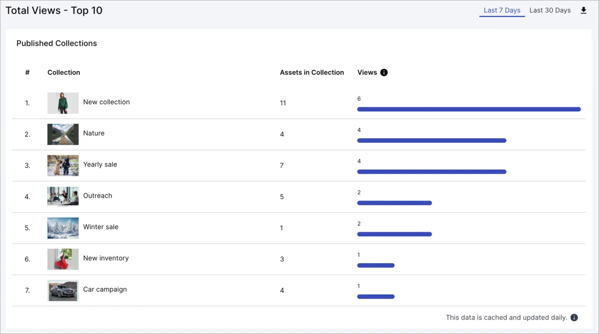
Understanding your most popular collections helps you replicate successes and detect any unusual patterns that shouldn’t be happening.
You can see which assets are successful and try to replicate the formula. High views mean that the content is gold in most cases. What about trying to allocate more budget to these types of assets and trying to gain more views?
You may also notice an asset that shouldn’t appear there, possibly because it originated from an old campaign or because you implemented a new redesign that has converted it into a legacy asset. Whatever the case, if an asset like that happens to be here, maybe there’s something wrong, like someone linking the wrong graphics! Understanding this will help you quickly identify and fix the source.
Here, we can see our uploads by asset type (images, videos, raw files) and method (manual via console or automated via API).
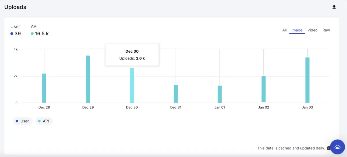
You can leverage the filters to have a specific view of what’s happening. For example, you could filter your uploads to see how many images were uploaded last week using the console. A high number of manual uploads might indicate it’s time to streamline processes and utilize the API more effectively. Distinguishing upload methods reveals workflow efficiencies and gaps.
For instance, knowing what type of content is frequently uploaded provides a wealth of information. Why is there an increase in the number of images on Thursdays? And what’s that “tbt” thing they put in them?
Understanding trends like these can provide valuable insights that you can use to your advantage when promoting your content!
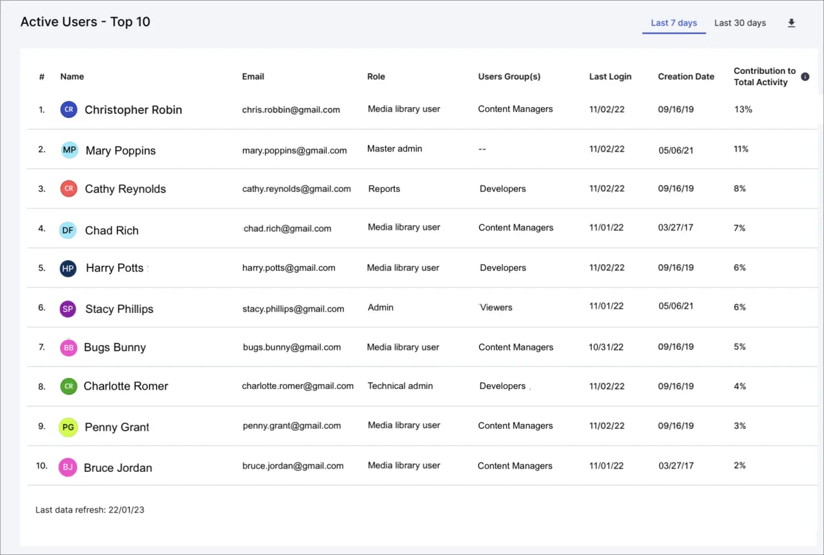
This section helps us identify our top 10 most active users based on their interactions, including uploads, edits, and downloads.
You can utilize this data in various ways; for example, you can view workload distribution and prevent assigning excessive loads to specific users or identify your team’s top contributors and recognize them accordingly.
Seeing low contribution? Perhaps they’re not overly familiar with the tools — maybe a bit of training could help!
You can also download all this info, which will show all users (not just the top 10), ordered from least to most active.
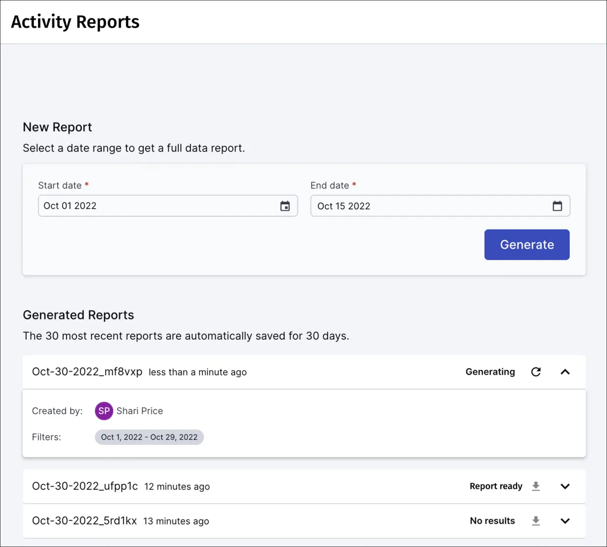
The Asset Activity Reports section can be used to generate reports that track all activities in your media library. Whether someone uploads a new version of a photo, deletes an outdated video, downloads a document, or just tweaks the metadata, it’s all recorded along with who did it and when.
Why does that matter? These reports are especially helpful for staying compliant when meeting audit requirements or data handling rules.
They also come in handy when troubleshooting. Imagine trying to figure out why a key image disappeared from a campaign folder. Without this report, you’d be guessing. With it, you check the log, and boom — you see why and by whom it was deleted so that you can gather information on the reason.
Assets uploaded three years ago, never viewed? Archive or delete to free space. Frequently cropped but never color‑graded images? Maybe you need better original quality.
By regularly checking these reports, you can also catch suspicious or unexpected behavior early, such as someone accessing a large number of files at unusual hours.
As you can see, there are numerous ways to leverage this feature; it’s really up to you to determine how you want to use the data to your advantage.
To generate one of these reports, you’ll need to select Activity Reports from the navigation panel, select a date range and then select Generate. It’s just that simple.
With Cloudinary’s DAM Admin Usage Data, you’re no longer managing digital assets blindly; you’ll be making informed decisions based on real data. Whether it’s keeping track of your most popular content, identifying performance issues, or avoiding unexpected expenses, this data makes your life easier.
So, take advantage of these metrics. Spend less time guessing and more time optimizing your team’s workflow. You’ll quickly see improvements in productivity, asset management, and overall, making your workday smoother and your strategies stronger.
If you haven’t created a Cloudinary account yet, it’s free to sign up — give the DAM Usage data a try for yourself!


