Search ranking algorithms utilize various signals to determine how websites rank against each other on the internet either via desktop or mobile searches. One such signal is Site speed. In 2010, Google introduced Site speed as a signal in their search ranking algorithms. However, this only applied to web search ranking. Starting in July 2018, site speed will be a ranking factor of mobile searches. This change is another signal that developers must wake up and focus on improving the performance of their applications, since speed and load time affects a user’s experience of your page.
According to HTTPArchive, around 64 percent of a website’s average weight is images. Furthermore, surveys from akamai.com and Gomez reveal that 73 percent of mobile internet users have experienced problems with page load times on their devices. A one-second delay in page load time can decrease visitor satisfaction by 16 percent and can lead to a drop in conversion of 7 percent or more.
In this article, I’ll cover why a little discipline in image optimization can go a long way in helping your site load quickly on mobile devices and ultimately improve your mobile search ranking.
Before making a decision, you need to identify the problem. In this case it focuses on which images on the site needs optimization, and on what part of the site are they concentrated? It’s really not that hard.
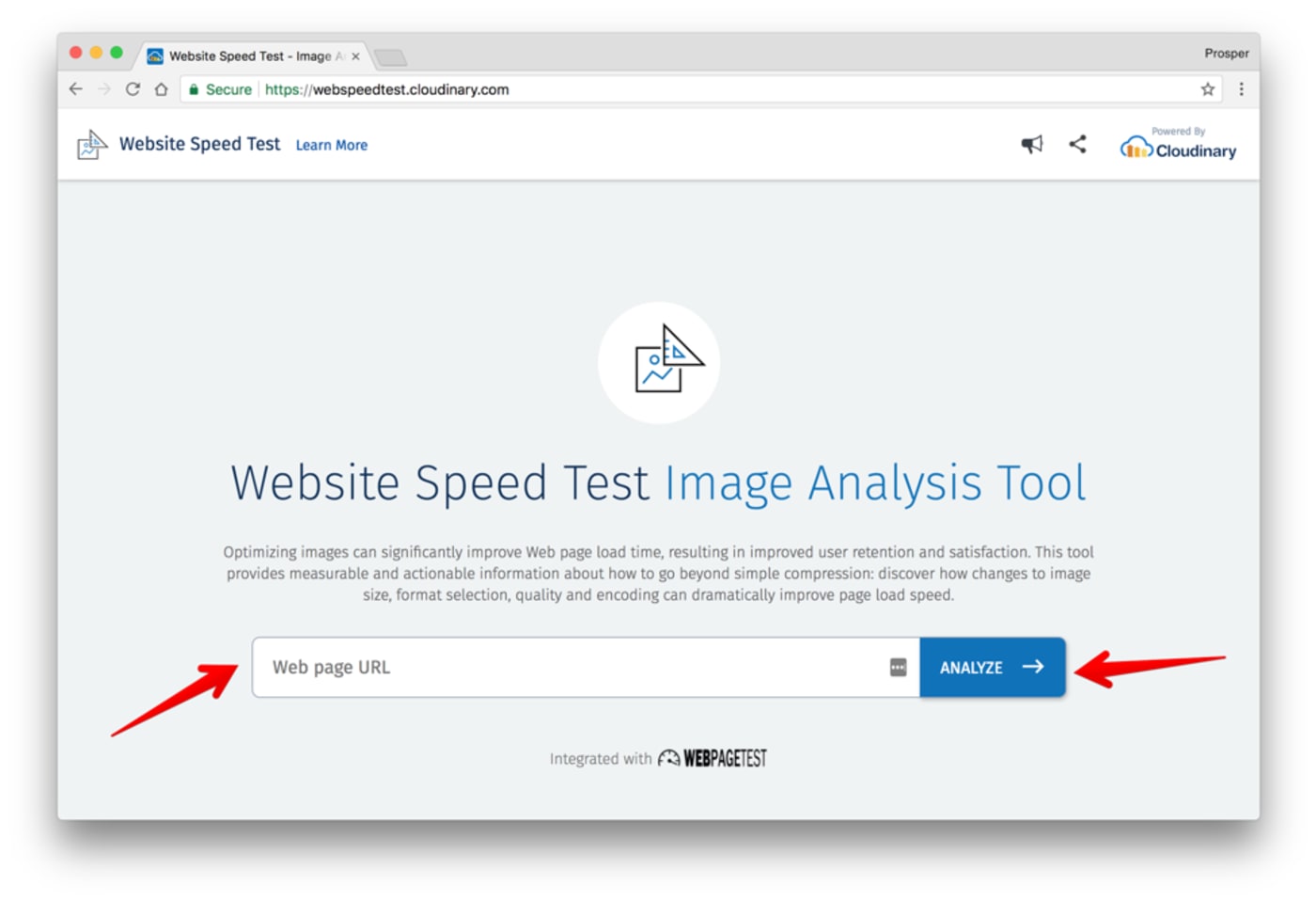
Perform a detailed image analysis audit with the powerful Website Speed Test Image Analysis Tool. This tool provides information about the size, formats, quality and encoding of images on your site. Furthermore, it provides actionable tips on how to improve the page load speed.

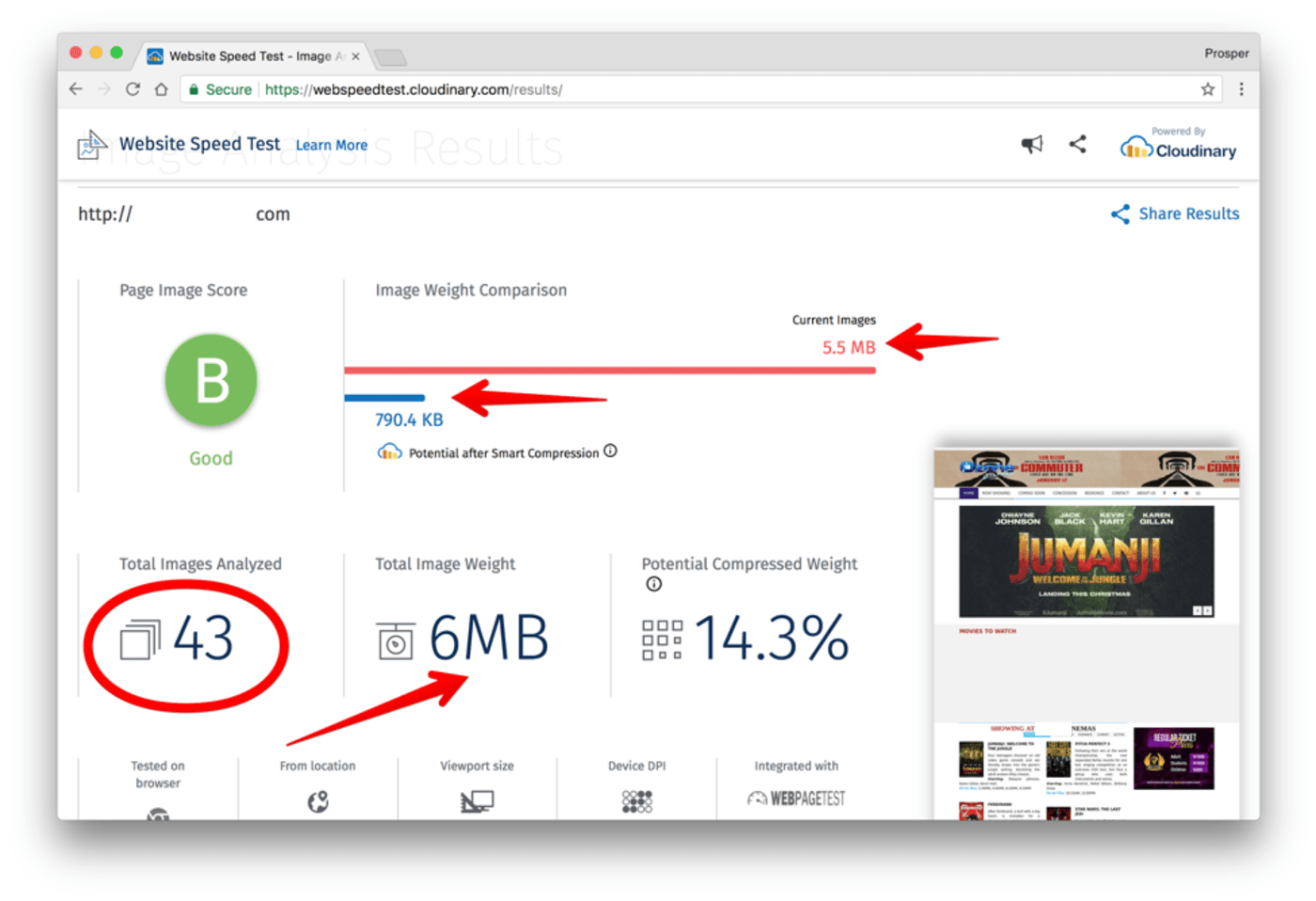
Let’s analyze a mobile site. Check the snapshots of the analysis below:
 Summary of Page Analysis: 43 Images, Page Image Weight: 6MB
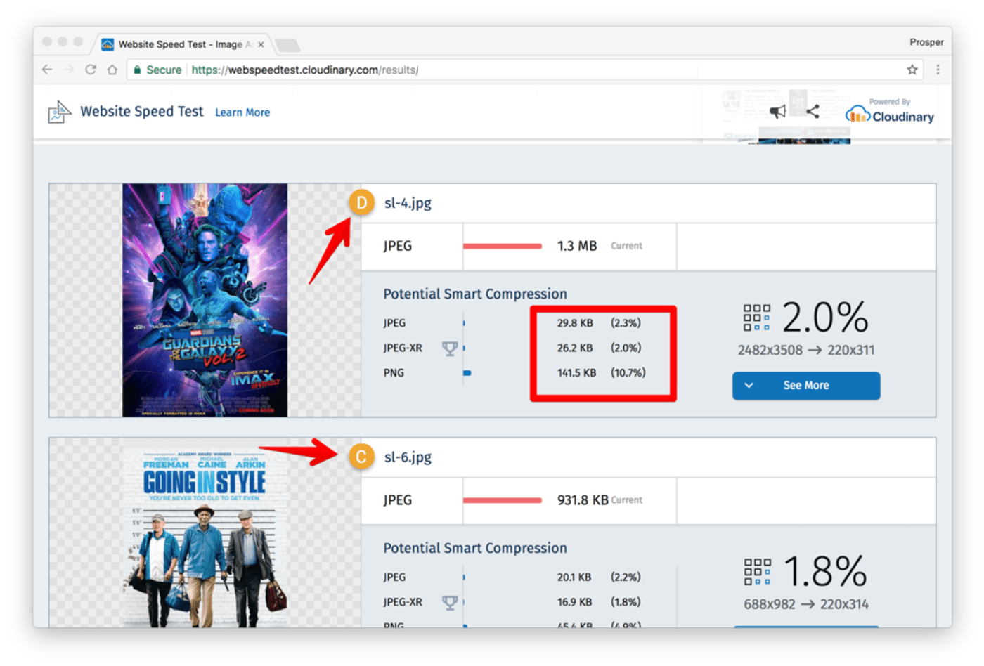
 First image is too heavy. It can be optimized to be served as JPEG (28 KB), JPEG-XR (26.2KB), and PNG (141.5KB).
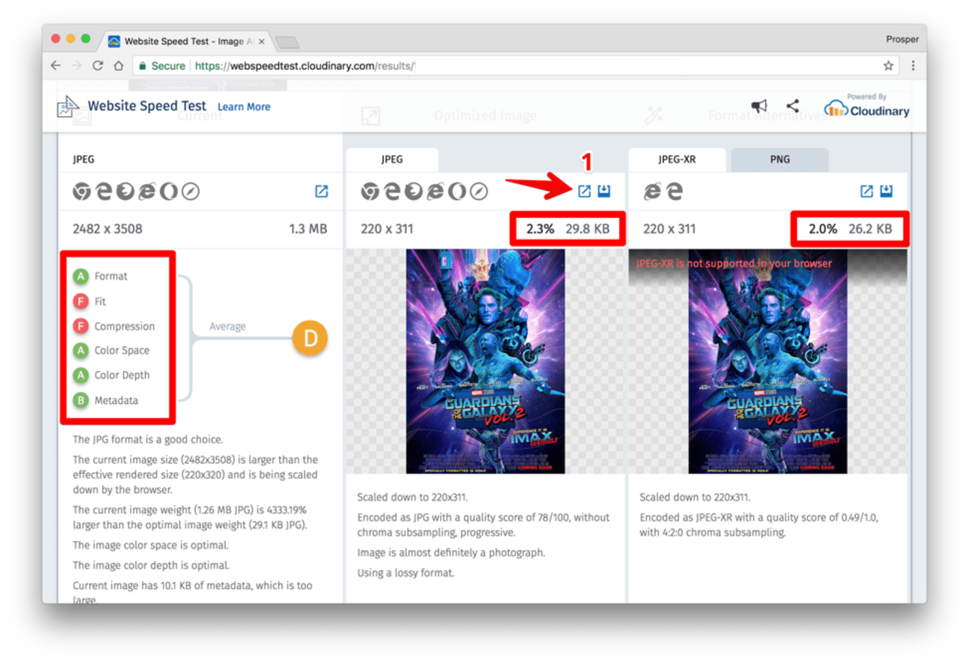
Check out more details about the first image and a fix for optimizing the weight problem below:
 Grade Analysis by the left. Optimization by the right. JPEG is supported in the various browsers shown just above the size. JPEG-XR is only supported in Internet Explorer and Microsoft Edge. No. 1 is a link that leads to the fix, which is the optimized image!
Eric Portis has done a great job of writing an in-depth article focusing on how the Website Speed Test image analysis tool works.
Let’s quickly go through a few image optimization techniques, all of which can be achieved easily with Cloudinary.
Optimize Image Quality with q_auto:
Using the q_auto parameter, the optimal quality compression level and optimal encoding settings are selected based on the specific image content, format and the viewing browser. The result is an image with good visual quality and a reduced file size. For example:

Other options are q_auto:best, q_auto:low, q_auto:good or q_auto:eco to ensure higher-than-average quality.
You can manually set the quality with the q_ parameter. Check out the example below:

The q_60 parameter above decreases the delivered file size from 118KB to 73KB.
Optimize Image Format with f_auto:
Choosing the right format to deliver each image can result in significant file size savings without sacrificing quality. The f_auto parameter enables Cloudinary to analyze the image content and select the best format to deliver. For example, it can automatically deliver images as WebP to Chrome browsers or JPEG-XR to Internet Explorer browsers, while using the original format for all other browsers. Using both f_auto and q_auto, Cloudinary will still generally deliver WebP and JPEG-XR to the relevant browsers, but might deliver selected images as PNG-8 or PNG-24 if the quality algorithm determines that as optimal.
Optimize Image Sizing with dpr_auto and w_auto:
If you deliver full size images and rely on browser-side resizing (using CSS or HTML width and height attributes), users are forced to unnecessarily download large images. Therefore, images should always be delivered from the server at their final size. Cloudinary performs resizing on the server, thus enabling the image to be delivered to the browser at the requested size.
You can ensure that large or high-resolution images will only be delivered to users whose device resolution or browser size requires it by using dpr_auto and w_auto. Check out this example:

The above example will yield a 318KB file on a DPR 2.0 device and 115KB on a DPR 1.0 device. It will be automatically scaled to the width available for the image in the responsive layout, and with a DPR value suitable for the user’s device.
Web developers build their sites using a variety of programming languages. I recommend checking out the following resources on image optimization in these languages and also in WordPress:
- Image Optimization in PHP.
- Image Optimization in Ruby.
- Image Optimization in Python.
- Image Optimization in WordPress.
For additional reading on image optimization, you can review these articles:
- 10 mistakes in handling website images and how to solve them
- Essential Image Optimization
- The holy grail of image optimization or balancing visual quality and file size
One of the best ways to increase page performance is via image optimization. The faster your page loads, the higher the chances of achieving a better mobile search ranking. Don’t leave performance and mobile search ranking gains on the table, optimize your images today with Cloudinary!
- Website image optimization and fast delivery with Cloudinary
- The complete guide to PHP image compression and optimization
- Vue.js Tutorial: Images Optimization for Web Apps
- Python Image Optimization and Manipulation
- Image Optimization in Ruby
- Image Optimization for WordPress
- Learn about the pros and cons of JPEG 2000
- Adopting the WebP Image Format for Android on Websites Or Native Apps
- 10 Website Image Mistakes that Slow Load Times
- Automatically Reduce Image Size Without Losing Quality
- Automate Placeholder Generation and Accelerate Page Loads
- 3 Ways to Do Progressive JPEG Encoding
