Here at Cloudinary, we always strive to develop the best possible product, answer as many of our customers’ needs and offer a superb support. Since launching 3 years ago we worked tirelessly to build the technology that empowers the Cloudinary product and supports our customers. While doing so, we haven’t really given a lot of love to our website design.
Our customers have always expressed their happiness with our product, but quite a few have (rightly) pointed out that our website design is a bit outdated and does not do justice to what Cloudinary is all about. After all, how can such a beneficial, cutting edge solution, hide behind a 3-year old website design?
We’re happy to say that we finally got around to change this.
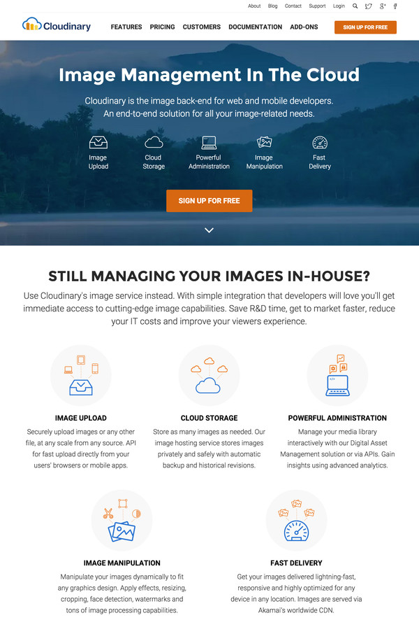
This week, we proudly launch our new website with a more modern design and updated content that better reflects all of Cloudinary’s newest capabilities. We also added a new Customers page listing some of the amazing customers using Cloudinary and the cool feedback many of you shared with us.

Our logo also got a minor facelift. We love our logo, which is already recognizable in the developers community, so we decided to keep the same color scheme and imagery guidelines and elements, but modernize it a little. Same concept, just cleaner.

And obviously, all the images on our new website are powered by Cloudinary, with Retina resolution, responsive layout and dynamic transformations, delivered optimized, super fast from our CDN.
The new website is a work in progress. We’ve got around to updating many parts of our website, but still have a lot of work ahead of us. We hope to address quite a few additional design enhancements and updates in the coming weeks.
We hope you like it!
