
Previously, we saw how to mark up performant, adaptable <img>s using srcset and sizes in conjunction with Cloudinary’s image transformations.
How far can we push that notion of “adaptability”? Last time, we learned how to offer up an image at a range of different resolutions. This allowed us to send large resources to large screens and small resources to small ones. We used srcset and sizes to adapt for performance. But visually, our images remained fixed.
What if we could go a step further and adapt our image’s visual characteristics at breakpoints, just like we adapt our pages’ layouts? The term for this sort of adaptation is art direction. In this article, we’ll create an art-directed front page for our example site:
https://ericportis.com/etc/cloudinary/
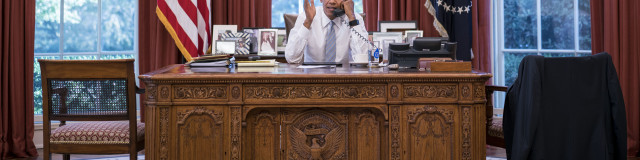
The lead article’s preview image on this front page is huge, spanning the entire width of the page. On wide screens, in order to keep it from pushing the rest of the content “below the fold”, we need to crop it. Like this:
The rest of the image previews? They have the opposite problem. Left to simply shrink along with a narrowing viewport, they’d become too small to really make out. So on small screens, we want to “zoom in” on their subjects.
How can we achieve these things in markup? With a new element:
The <picture> element was added to the HTML specification last year and has been implemented in every major desktop browser except for Safari (Safari support is right around the corner). <picture> gives us a way to supply alternate, visually distinct versions of an image, and switch them out at breakpoints.
The first thing to know about <picture> is that it’s a wrapper for <img>; think of <picture> as a kind of invisible, magical <span> which can feed its <img> alternate sources.
The second thing to know about it is that its markup pattern was adapted from <audio> and <video>. So alongside our <img>, we’ll pack our <picture> full of <source> elements.
Each <source> represents a visually distinct version of the image. We tell the browser which <source> to use and when, using media attributes.
<picture>
  <source media="(min-width: 800px)"
      sizes="100vw"
      srcset="cropped-for-wide-screens--large.jpg 1600w,
              cropped-for-wide-screens--small.jpg 800w" />
  <source media="(min-width: 600px)"
      sizes="100vw"
      srcset="full-image-for-standard-screens--large.jpg 1200w,
              full-image-for-standard-screens--small.jpg  600w" />
  <img
    src="zoomed-in-for-small-screens--small.jpg"
    srcset="zoomed-in-for-small-screens--large.jpg 800w,
            zoomed-in-for-small-screens--small.jpg 400w"
    alt />
</picture>
Code language: HTML, XML (xml)
The first <source> element whose media attribute matches the current environment wins. The browser picks a resource out of that <source>’s srcset/sizes pair and feeds the picked resource to the <img>.
Et voila! An image that can change its appearance at breakpoints, as you can see in the examples above.
But dog-gone-it, we’ve done it again — by adding a new dimension of adaptability, we’ve multiplied the number of image resources we need to create and manage, making something that was once simple and static, dynamic and complex.
Cloudinary provides us with tools to manage that complexity.
A few months ago, I sat on on a stage at SmashingConf Freiburg, and Christian Heilmann asked me how, or if, one could automate the process of cropping in on the most important parts of an image. Stumped, I replied, “I don’t know, uh, something something neural networks?”
Right after my talk, Guy Podjarmy whisked me aside and showed me a few of Cloudinary’s auto-cropping features. I was amazed; now I get to show them to you!
First things first: in order to crop using Cloudinary, you need to specify a “crop mode”. We’ll start out by using the fill crop mode (c_fill in URLs), which works like background-fit: cover in CSS. The original image will be stretched or shrunk to cover the entirety of its new box, with any extra bits lopped off.
Let’s say we want to create a 100×100 square crop of our example image. Here’s how we’d do it:

How about a 640×360 version?

In addition to providing heights and widths, Cloudinary lets us supply aspect ratios, which can make our URLs a bit easier to read. This URL returns an image identical to the previous one:

Ok, let’s try something really wide:

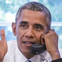
This crop is… awkward. The president’s head is popping up from the bottom of the frame like a turnip.
By default, Cloudinary crops in on an image’s center. But what if we want to crop in on a different focal point? For that, we need to use Cloudinary’s “gravity” parameter. Our last crop chopped off the president’s body. Let’s aim lower, anchoring our crop to the bottom of the image:
Oops! Now we’ve chopped off his head! If only we could center the new, cropped image right on his face…

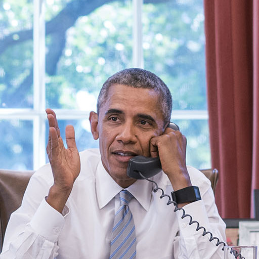
g_face finds a face in the image and centers the crop on it, ensuring that if there is a person in our photo, they’ll remain front and center.
So! Now we’ve seen how to mark up visually adaptable images using <picture> and generate alternate crops automatically using Cloudinary. We have everything we need to art direct our example’s giant header image:
<picture>

  <!-- wide crop -->
  <source
    media="(min-width: 600px)"
    srcset="https://res.cloudinary.com/eeeps/image/upload/c_fill,ar_2:1,g_face,f_auto,q_70,w_600/on_the_phone.jpg 600w,
    		https://res.cloudinary.com/eeeps/image/upload/c_fill,ar_2:1,g_face,f_auto,q_70,w_1200/on_the_phone.jpg 1200w"
    sizes="100vw" />

  <!-- standard crop -->
  <img
    srcset="https://res.cloudinary.com/eeeps/image/upload/f_auto,q_70,w_400/on_the_phone.jpg 400w,
    		https://res.cloudinary.com/eeeps/image/upload/f_auto,q_70,w_800/on_the_phone.jpg 800w"
    src="https://res.cloudinary.com/eeeps/image/upload/f_auto,q_70,w_400/on_the_phone.jpg"
    alt="President Obama on the phone in the Oval Office"
    sizes="100vw" />

</picture>
Code language: HTML, XML (xml)
This complex-looking example should now make some sense. We start with an un-cropped <img> (which includes a srcset and sizes so that it’ll look good across resolutions), wrap it in a <picture>, and give it a <source> sibling. This <source> represents the cropped version of our image, and will only send a resource to the <img> when its media attribute (min-width: 600px) matches the current environment.
That chunk of code gets us this:
The hero image in our example is a bit more complex than this, with more breakpoints, more srcset resources, and a couple of additional Cloudinary tricks which we’ll cover in our next section. View-source-ing it upon completion of the article is left as an exercise to the reader.
Let’s proceed to the thumbnails further down the page. Remember, they have the opposite problem — on small screens, they become too small. On small screens, we want to “zoom in” on their subjects.
In order to do so, we’ll use a new crop mode: c_thumb. When used with g_faces, c_thumb zooms all the way in on a face. Like this:
One gotcha with this technique: it will sometimes create a different crop, depending on the w specified. c_thumb will zoom in on the face as tightly as it can at the original image’s full resolution. If we specify a tiny w, it will happily scale the resulting, fully-zoomed face down:

But, with a large w, instead of resizing the tightly-cropped-face up, it will pad it with the surrounding image at it’s full resolution:
Put another way: c_thumb will never upscale your images.
In order to generate consistent crops for arbitrary ranges of w values, we need to crop first, and resize second. We need to learn a new trick: chained transformations:

If we split two sets of transformations with a forward slash, Cloudinary will apply the first set of transformations and treat the resulting image as input to the second set. Neat.
Finally—what if we don’t want such a tight crop? To zoom back out from the subject’s face, we need to learn one more parameter: z. z lets us zoom in or out via a multiplier. Values less than one zoom out, and values greater than one zoom in. So, to zoom out so that the cropped face ends up at a quarter of its original, tightly-cropped size, we specify z_0.25.

And with that, we can smartly zoom our example page’s thumbnails on small screens, using <picture>, <source>, and Cloudinary:
<picture>

  <!-- full image -->
  <source
    media="(min-width: 600px)"
    srcset="https://res.cloudinary.com/eeeps/image/upload/f_auto,q_70,w_150/ronny.jpg 150w,
    		https://res.cloudinary.com/eeeps/image/upload/f_auto,q_70,w_400/ronny.jpg 400w"
    sizes="calc(8em + 1vw)"
  />

  <!-- zoomed + square-cropped thumb for small screens -->
  <img
    srcset="https://res.cloudinary.com/eeeps/image/upload/c_thumb,g_face,ar_1:1,z_0.25,w_180/f_auto,q_70,w_90/ronny.jpg 90w,
    		https://res.cloudinary.com/eeeps/image/upload/c_thumb,g_face,ar_1:1,z_0.25,w_180/f_auto,q_70,w_180/ronny.jpg 180w"
    sizes="calc(4em + 3vw)"
    src="https://res.cloudinary.com/eeeps/image/upload/c_thumb,g_face,ar_1:1,z_0.25,w_180/f_auto,q_70,w_90/ronny.jpg"
    alt="President Obama speaking to Ronny Jackson"
  />

</picture>
Code language: HTML, XML (xml)
A giant chunk of code like this can be intimidating; the trick is to look at it like a cake – multiple layers, each one building off of the last. Let’s break it down from the bottom.
We start, as always, with an <img> and some alt text, describing the image.
For browsers that can display images (and users that can see them), we include an <img src> on top of it, which contains the mobile-first default version of our image.
Browsers that understand srcset and sizes (which, these days, is just about all of them) will use these attributes, instead of the src, to select a resource to load, giving our image the ability to adapt to fit a range of viewport sizes and display densities.
Finally, we wrap our <img> in a <picture> and give it a <source> sibling, which will, in supporting browsers and on larger screens, allow the image to visually adapt, zooming out at a breakpoint when the viewport is sufficiently large.
Put it all together, and in a modern browser, you get this:
So there you have it – visually-adaptive, art-directed images using <picture>, <source>, and Cloudinary. Art direction opens up new frontiers in responsive design; Cloudinary’s on-the-fly face-detection, cropping, resizing, and optimization capabilities make it easy. So: go forth! And mark up performant, adaptable, progressively enhanced images for all.