
Responsive design in the web development world has just become “design.” According to recent data, approximately 96.2% of global internet users access the web from mobile devices, with most using smartphones to go online. It makes sense to be sure your content renders well on mobile devices is a top priority. Mobile apps aren’t typically built this way because they are just mobile apps. In most cases your users will be accessing your app for the same type of devices. However, this pattern can still be useful for mobile apps since they might still support a wide range of devices from phones, tablets, and televisions.
So how do you build responsive native mobile apps? SwiftUI, for example, provides UI components that adapt based on the device. A menu might be a slide out on a mobile device or it can render as a sidebar menu on TvOS. We can build a similar adaptive component to make sure that the media content in our applications is optimized based on the device size or screen dimensions. For creating an adaptive media component in our application, Cloudinary has mobile SDKs for iOS, Android, React Native, and Flutter. In this post we will build a ResponsiveImage component for React Native that uses the Cloudinary SDK to serve optimized images to our users based on their device.
To get started with building a responsive image component in React Native, we’ll first create a new project using Expo. Expo is a powerful toolchain that simplifies the development process for React Native apps. It provides a set of services and libraries that streamline the setup and deployment of your application. To create a new Expo project, open your terminal and run the following command:
npx create-expo-app@latest
Code language: CSS (css)
It will prompt you for a project name. We used “responsive-images” for the demo application.
Here’s a quick overview of the relevant project files we will interact with:
-
app/. Contains the app routes/views-
app/(tabs)/index.tsx. This is the home view of the application
-
-
components/. A directory for our React components
For our responsive image component, we’ll focus on integrating the Cloudinary SDK to dynamically serve optimized images based on the device type. This involves setting up the Cloudinary instance and configuring the image transformations, which we’ll cover in the following sections. By leveraging Expo’s capabilities, we can easily test our app on different devices and ensure that our responsive design works seamlessly across various screen sizes.
To integrate Cloudinary into your React Native app, you’ll need to install the Cloudinary React Native SDK. This SDK allows you to generate URLs for your images and apply transformations directly within your app. Start by installing the SDK using npm:
npm install cloudinary-react-native @cloudinary/url-gen expo-device
Code language: CSS (css)
Next, create and configure a Cloudinary instance. You’ll need your Cloudinary cloud name, which you can find in your dashboard. Create a new file lib/cloudinary.ts:
export const cloudinary = new Cloudinary({
  cloud: {
    cloudName: 'your-cloud-name'
  }
});
Code language: JavaScript (javascript)
The Cloudinary React Native SDK allows you to leverage Cloudinary’s powerful image transformation capabilities, enabling you to serve optimized images tailored to the user’s device. In the next steps, we’ll explore how to apply specific transformations and render these images responsively in your React Native app.
Now that we have the Cloudinary SDK setup, we can get to work on our ResponsiveImage component. Create a new file components/ResponsiveImage.tsx.
Let’s first define the API for our responsive image component with our Prop type:
interface ResponsiveImageProps {
  publicId: string;
  width: number;
  height: number;
  quality?: number | 'auto';
  format?: string | 'auto';
  device?: {
    phone?: {
      width?: number;
      height?: number;
    };
    tablet?: {
      width?: number;
      height?: number;
    };
    desktop?: {
      width?: number;
      height?: number;
    };
    tv?: {
      width?: number;
      height?: number;
    };
  };
}
Code language: PHP (php)
Based on our props our ResponsiveImage component takes a width, height, format, and quality. We also have a device option that will allow us to override the default width and height based on the type of device the user is using.
Next, let’s add the base pieces of our component:
export const ResponsiveImage: React.FC<ResponsiveImageProps> = ({
  publicId,
}) => {
  return (
    <AdvancedImage
      cldImg={myImage}
    />
  );
};
Code language: JavaScript (javascript)
We now have the most basic Cloudinary image component in place. Now we’ll add the functionality to support our API.
To make our ResponsiveImage component truly responsive, we need to define breakpoints that determine how the image should be displayed on different device types. This involves using the device prop to specify custom dimensions for various devices, such as phones, tablets, desktops, and TVs. If no specific dimensions are provided for a device type, the component will fall back to using the default width and height.
We’re going to use DeviceType and fall back to reading the device dimensions if the device type is unknown. We’ll have an effect to read the device type, a function called getEffectiveDeviceType for returning a device type based on screen dimensions, and a getDimensions function for selecting the responsive dimensions based on the user’s device.
// /components/ResponsiveImage.tsx
import * as React from 'react';
import { useWindowDimensions } from 'react-native';
import * as Device from 'expo-device';

export const ResponsiveImage: React.FC<ResponsiveImageProps> = ({
  publicId,
  width: defaultWidth,
  height: defaultHeight,
  quality = 'auto',
  format = 'auto',
  device
}) => {
  const { width: screenWidth } = useWindowDimensions();
  const [deviceType, setDeviceType] = React.useState<Device.DeviceType | null>(null);

// Get the users DeviceType
  React.useEffect(() => {
    async function getDeviceType() {
      const type = await Device.getDeviceTypeAsync();
      setDeviceType(type);
    }
    getDeviceType();
  }, []);

// If the DeviceType is unknown, fall back define it based on screen dimensions
  const getEffectiveDeviceType = () => {
    if (deviceType !== null && deviceType !== Device.DeviceType.UNKNOWN) {
      return deviceType;
    }

    if (screenWidth < 768) {
      return Device.DeviceType.PHONE;
    } else if (screenWidth >= 768 && screenWidth < 1024) {
      return Device.DeviceType.TABLET;
    } else {
      return Device.DeviceType.TV;
    }
  };


// Define the Image dimensions based on the device type
const getDimensions = () => {
    const effectiveType = getEffectiveDeviceType();

    if (device) {
      switch (effectiveType) {
        case Device.DeviceType.PHONE:
          if (device.phone) {
            return {
              width: device.phone.width || defaultWidth,
              height: device.phone.height || defaultHeight
            };
          }
          break;
        case Device.DeviceType.TABLET:
          if (device.tablet) {
            return {
              width: device.tablet.width || defaultWidth,
              height: device.tablet.height || defaultHeight
            };
          }
          break;
        case Device.DeviceType.TV:
          if (device.tv) {
            return {
              width: device.tv.width || defaultWidth,
              height: device.tv.height || defaultHeight
            };
          }
          break;
        case Device.DeviceType.DESKTOP:
          if (device.desktop) {
            return {
              width: device.desktop.width || defaultWidth,
              height: device.desktop.height || defaultHeight
            };
          }
          break;
      }
    }

    return {
      width: defaultWidth,
      height: defaultHeight
    };
  };

// render the image
  return (
    <AdvancedImage
      cldImg={myImage}
    />
  );
}
Code language: JavaScript (javascript)
We now have all the logic in place to get the correct image dimensions based on the user’s device. Now we just need to use the Cloudinary SDKs to apply the proper transformations to our image.
Cloudinary provides a wide range of transformations that can be applied to images, such as resizing, cropping, adjusting quality, and changing formats. These transformations are performed in the cloud, ensuring that the images are optimized before being delivered to the end-user. This not only improves load times but also enhances the overall user experience.
In our ResponsiveImage component, we’ll use Cloudinary’s transformation capabilities to adjust the image’s size, quality, and format based on the device type. Here’s how we can implement these transformations:
-
Resizing. We’ll use the
fillaction to resize the image to the dimensions determined by our breakpoints. This ensures that the image fills the specified width and height while maintaining its aspect ratio. -
Quality. The
qualityprop allows us to specify the desired quality of the image. By default, we use ‘auto’, which lets Cloudinary automatically determine the optimal quality for the image. This helps in reducing file size without compromising on visual quality. -
Format. Similarly, the
formatprop can be set to ‘auto’, allowing Cloudinary to deliver the image in the most suitable format for the user’s browser or device. This often results in smaller file sizes and faster load times. Here’s how we can apply these transformations in our component:
// /components/ResponseImage.tsx
export const ResponsiveImage: React.FC<ResponsiveImageProps> = ({
  publicId,
  width: defaultWidth,
  height: defaultHeight,
  quality = 'auto',
  format = 'auto',
  device
}) => {
  // ... existing code for determining dimensions ...

  // Configure image transformations
  const myImage = cloudinary.image(publicId);
  myImage
    .resize(
      fill()
        .width(dimensions.width)
        .height(dimensions.height)
    )
    .quality(quality)
    .format(format);

  return (
    <AdvancedImage
      cldImg={myImage}
      style={{
        width: dimensions.width,
        height: dimensions.height,
        alignSelf: 'center',
        marginVertical: 20
      }}
    />
  );
};
Code language: JavaScript (javascript)
We now have a new ResponsiveImage component that we can use throughout our mobile application to provide optimized images for the various device types that our app supports. Next we can add an image to our demo app to see how it looks on different device simulators with expo.
Let’s add a test image to our home view with our new ResponsiveImage component. There will be some code for the default Expo application, in the code below I’ve removed most of it. Add the following code to app/(tabs)/index.tsx with an image id from your Cloudinary account:
import { Image, StyleSheet } from 'react-native';
import ParallaxScrollView from '@/components/ParallaxScrollView';
import { ThemedView } from '@/components/ThemedView';
import { ResponsiveImage } from '@/components/ResponsiveImage';
export default function HomeScreen() {
return (
// This component is part of the default Expo app. We left it in for the demo since it’s part of the layout. The ResponsiveImage will be rendered in the main content below it.
<ParallaxScrollView
headerBackgroundColor={{ light: '#A1CEDC', dark: '#1D3D47' }}
headerImage={
<Image
source={require('@/assets/images/partial-react-logo.png')}
style={styles.reactLogo}
/>
}>
<ThemedView style={styles.titleContainer}>
// Add our test image here in the main content area of our mobile app view
<ResponsiveImage
publicId="[id of the image in your Cloudinary account]"
width={300}
height={200}
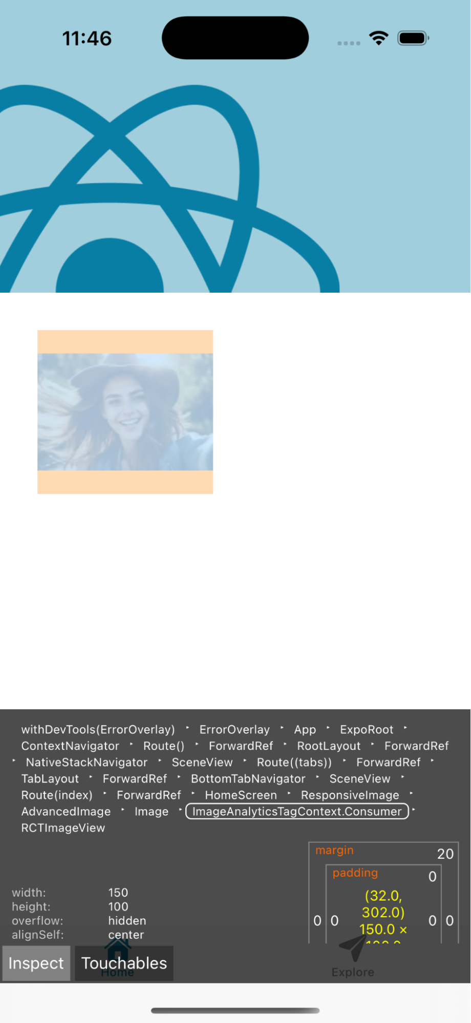
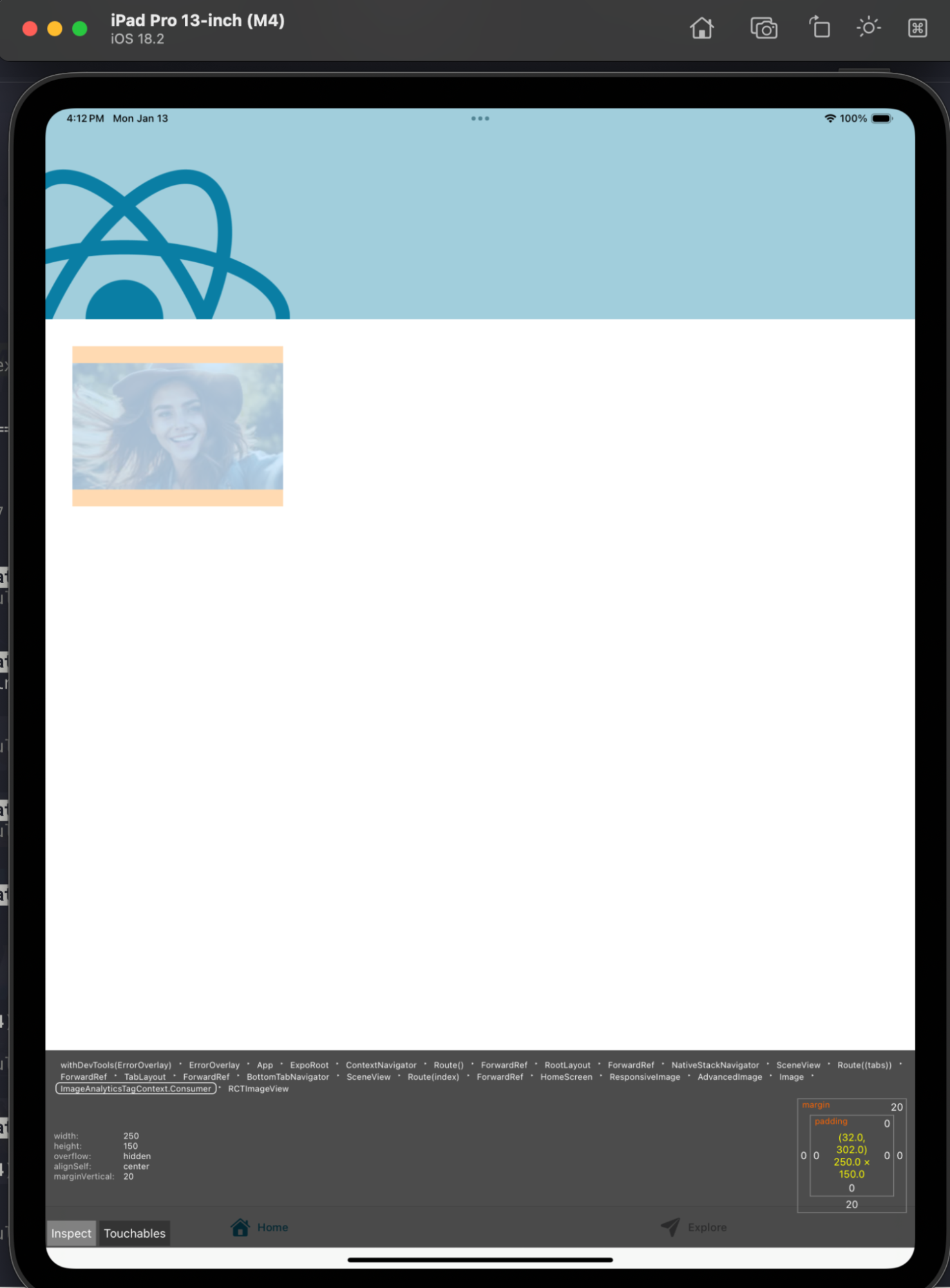
device={{
phone: { width: 150, height: 100 },
tablet: { width: 250, height: 150 },
desktop: { width: 300, height: 200 },
tv: { width: 400, height: 300 }
}}
/>
</ThemedView>
</ParallaxScrollView>
);
}
const styles = StyleSheet.create({
titleContainer: {
flexDirection: 'row',
alignItems: 'center',
gap: 8,
},
stepContainer: {
gap: 8,
marginBottom: 8,
},
reactLogo: {
height: 178,
width: 290,
bottom: 0,
left: 0,
position: 'absolute',
},
});
Code language: JavaScript (javascript)We can use expo to open our app in various iOS simulators. I’ve opened my demo app on iPhone 16 and iPad Pro. We can see if we inspect our images that the image is responding based on our device.
In this blog post, we explored how to build a responsive image component in React Native using the Cloudinary SDK. We started by setting up a new Expo project and configuring the Cloudinary SDK to handle image transformations. We then created a ResponsiveImage component that dynamically adjusts image dimensions based on the device type, ensuring optimal display across phones, tablets, desktops, and TVs. We were able to apply transformations such as resizing, quality adjustment, and format optimization, all of which contribute to a seamless and efficient user experience. Finally, we integrated our component into a demo app and tested it on various devices using Expo’s simulators, demonstrating the flexibility and effectiveness of our approach. Download a free Cloudinary account today and deliver high-quality, responsive images in your React Native applications.