
In the multi-device era, responsive design often just means cropping an image until it fits.
We’ve all been there. You upload a stunning landscape hero image and it looks great on desktop. But when the layout shifts to a vertical mobile view (9:16) or a square card (1:1), standard CSS takes over.
The fragmentation of modern screens makes fixed-ratio assets a liability.
The industry standard, object-fit: cover, is aggressive. It blindly chops off the edges to fill the container. If your subject isn’t dead center, they get decapitated. This isn’t just a layout bug; it’s a conversion killer.
- E-commerce. You crop out the heel of the shoe.
- Portrait. You crop the forehead of the CEO.
- Travel. You crop the landmark out of the skyline.
To fix this manually, developers write complex media queries or force content teams to upload three different versions of the same asset. That is unscalable technical debt.
You need a “zero-cut” architecture. With a single upload of a high-quality source image, your application will automatically:
- Detect the subject.
- Decide if it needs to crop (zoom) or expand (pad).
- Generate the perfect pixels to fill the gap.
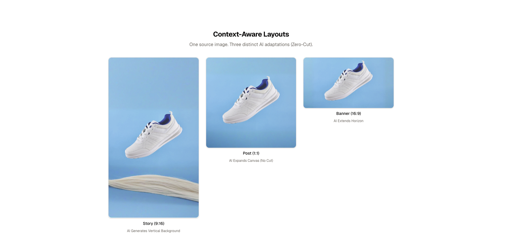
The result is one source asset intelligently expanded and focused across Story, Post, and Banner layouts.
To prevent the subjects in our images from awkward cropping, you’ll need more than just CSS. You’ll need a component that makes a content-aware decision before the image even loads.
This logic will be built into a smart component that evaluates the target aspect ratio against the source. It’ll choose between two distinct AI strategies:
- Strategy A: The Smart Crop (
g_auto)
- When to use it: When the aspect ratio change is minor (e.g., Landscape 4:3 to Square 1:1).
-
What it does: It zooms in slightly but keeps the most interesting part of the image (faces, products) centered using
gravity="auto". - Result: A tight, focused composition.
- Strategy B: The Generative Pad (
gen_fill)
- When to use it: When the change is extreme (e.g., Panoramic 16:9 to Vertical Story 9:16).
- The problem: Cropping here would destroy the image. You’d lose the scenery or the subject’s context.
- The solution: Don’t crop. Scale the image to fit inside the container and ask the AI to “paint” the missing pixels (sky, floor, walls) to fill the empty space.
- The result: The original subject is preserved 100%, and the layout is filled seamlessly.
Instead of relying on heavy client-side effects, you’ll calculate the aspect ratio delta directly in the render pass.
If the target is significantly taller than it is wide (like a mobile story), you’ll trigger Strategy B. For everything else, Strategy A usually suffices.
To build a “zero-cut” engine that’s fast, type-safe, and scalable, let’s go with a stack that enforces modern industry best practices.
The core components are:
- Next.js 16 (App Router) as the backbone. You’ll use server components for initial data fetching and client components only where interaction (like this responsive grid) is required.
- Cloudinary AI as the brain. Instead of resizing images in CSS, Cloudinary will generate new pixels on the fly.
-
@cloudinary/url-genas the builder. Instead of prone-to-error string concatenation (e.g.,image/upload/w_500...), you’ll use a type-safe SDK to construct transformations.
At the heart of this solution is SmartImage.tsx. This component wraps the Cloudinary image component (CldImage) and injects our layout logic.
A common mistake in React is to use useEffect to calculate derived state, like deciding whether to crop or pad based on props. This causes a “flash of wrong content” and unnecessary re-renders.
Instead, calculate your strategy directly in the render pass. This is faster, cleaner, and ensures the correct layout is sent to the server (or hydration) immediately.
Let’s determine strategy by comparing the requested width and height. If the image is requested in an “extreme” vertical format (like a Story), it’s time to switch strategies.
Here’s the logic inside your component:
// src/components/features/media/SmartImage.tsx

export default function SmartImage({ width, height, ...props }) {
  // 1. Calculate the Aspect Ratio
  const aspectRatio = width / height;

  // 2. Define "Extreme" (e.g., Stories are usually 0.56)
  const isExtremeVertical = aspectRatio < 0.6;

  return (
    <CldImage
      {...props}
      width={width}
      height={height}
      // 3. Conditional Strategy Switch
      {...(isExtremeVertical
        ? {
            // Strategy: Generative Fill (Zero-Cut)
            crop: "pad",
            fillBackground: true,
          }
        : {
            // Strategy: Smart Crop (Focus)
            crop: "fill",
            gravity: "auto",
          })}
    />
  );
}
Code language: PHP (php)
By simply passing fillBackground: true when crop="pad" is active, you’ll trigger Cloudinary’s generative AI, which will analyze the image content and extend it naturally to fill the 9:16 container.
Most developers rely on crop="fill" (CSS cover), which zooms in until the container is full. This is dangerous because it deletes pixels.
With a “zero-cut” strategy, instead of zooming in, you’ll effectively zoom out until the entire image fits inside the container. Then, you’ll ask Cloudinary’s generative AI to paint the empty space.
Here’s how this single strategy solves the three hardest layout challenges:
- The problem: You have a landscape photo of a sneaker on a table. If you crop it to 9:16, you lose the toes and the heel. You only see the laces.
- The solution: The image is scaled down to fit the width. The AI analyzes the texture of the table and the lighting of the room, then generates more “table” at the bottom and more “room” at the top.
- The result: A perfect mobile-first asset where the product is fully visible, surrounded by context that didn’t exist in the original photo.
- The problem: A wide group shot of five people. A center crop cuts off the two people on the edges.
- The solution: The system fits the width of the group into the square. This leaves empty space above and below (letterboxing).
- The result: The AI fills that “letterbox” space with convincing background extensions. You keep all five people in the frame, and the image looks like it was shot natively for Instagram.
- The problem: A tall portrait of a model. Cropping to 16:9 zooms in on just the eyes, losing the outfit.
- The solution: The model is centered. The AI extends the background horizontally, turning a portrait studio shot into a cinematic wide shot.
By flipping the logic from “Remove Pixels” to “Generate Pixels,” we guarantee that the subject is never lost.
You can see the “zero-cut” engine in action and explore the implementation details through the links below.
-
Live demo: Witness how a single source asset adapts to Story, Post, and Banner formats in real time. subject-aware-layouts.vercel.app
-
Explore the codebase: The project is built with a focus on high performance and long-term maintainability, utilizing several modern architectural patterns.
-
GitHub source code: github.com/musebe/subject-aware-layouts
This concludes our guide on scaling subject-aware layouts. By moving away from aggressive cropping and toward generative AI strategies, you can ensure your UI remains professional and your subjects remain the star of the show, regardless of the device.
Sign up for a free Cloudinary account today and start building your next project.


