RESOURCES / BLOG
Blog - Page: 175
Get the latest news on the Cloudinary platform, solutions, and showcases.
Solving the Rubik’s Cube of Retail Conversion Rates
Usually we spend a lot of time working with and talking to developers, helping them address the challenges of managing media on their websites. Last week, we got a different perspective when we met with marketing and product pros at eTail West, an annual event for ecommerce…

Read More ->
How to analyze image delivery issues
Updated (October 2019): Since this post was written, a new feature has been added that lets you export a day’s data into a .CSV file. Selecting the “Export to CSV” option will generate an email where you can download the file and import it into your favorite spreadsheet software, such…

Read More ->
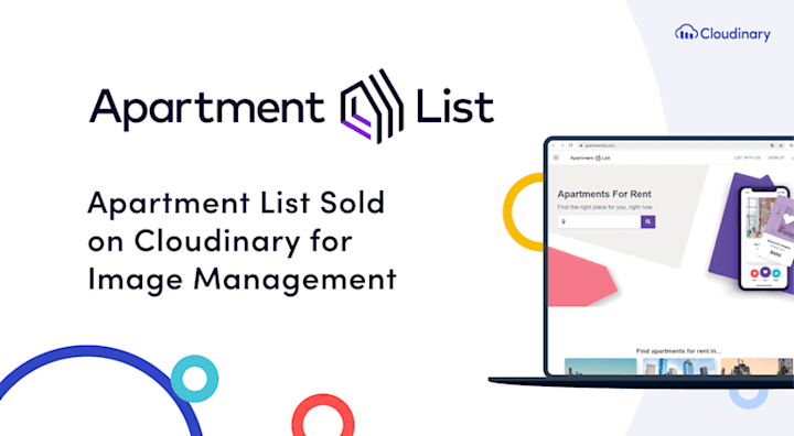
How Apartment List increased conversion and reduced development time
Apartment List is one of the fastest-growing online rental marketplaces in the world, helping its users with everything from searching for a new apartment to handling applications and payments. The company’s Webby-award winning site draws more than 2.5 million monthly visits, with mobile accounting for 70 percent…
Read More ->
The content dilemma – executing and scaling your campaigns
Robert Moseley is Cloudinary’s Senior Solutions Engineer, a technology and use-case expert with over a decade of experience in analytics, optimization, and personalization. Here he writes about his experience and reflections from the field. The concept of Content Personalization is to show a customized message to the right person with…

Read More ->
Automatically art-directed responsive images with Cloudinary
Previously, we saw how to mark up performant, adaptable <img>s using srcset and sizes in conjunction with Cloudinary’s image transformations. How far can we push that notion of “adaptability”? Last time, we learned how to offer up an image at a range of different resolutions. This allowed us to…

Read More ->
Introducing Intelligent Responsive Breakpoints Solutions
The number of different devices available and their potential screen resolutions keep increasing, and to support this wide range of resolutions and devices, responsive website design is now the standard. A website’s markup must adapt itself to look perfect on all the different devices and in various resolutions, pixel densities…

Read More ->
How to get media to load faster on your website
This is a guest post by Kasia Kramnik, Content Marketing Manager at Netguru, a full stack development house and one of Cloudinary’s Consulting partners. Take a look at your website. Are you happy with the way it looks? I bet you are, and that’s…

Read More ->
Happy New Year and a hat trick
As the end of 2015 approaches, we wanted to share a quick summary of Cloudinary’s accomplishment this year and some of our plans for next year. We couldn’t possibly do this without including an image transformation example! That’s our hat trick in the title 🙂 Looking back at 2015 2015…

Read More ->
Responsive Images: The `sizes` and `srcset` HTML Image Attributes
Five years ago, Ethan Marcotte [coined the term “responsive web design”][rwd] and gave it three defining ingredients: fluid grids, flexible media, and media queries. An essential part of this flexible media is the use of the srcset img attribute in HTML, which plays a crucial role in creating responsive images.

Read More ->
Start Using Cloudinary
Sign up for our free plan and start creating stunning visual experiences in minutes.
Sign Up for Free