Low-quality image placeholders (LQIPs) were originally introduced to enable webpages to load correctly in an orderly manner, displaying ultra small, blurry images while the actual version is loading, which works well with lazy loading in JavaScript. Then came a dilemma: should we add more JavaScript to help images load faster even though we must wait for the same JavaScript to run before they can load? It was a chicken-and-egg situation.
Only scant guidelines on LQIPs are available on the web. In this post, partly based on the feedback we’ve collected from the Cloudinary community, we’ll describe image-placeholder generators, use cases for LQIPs, and the ways in which to leverage LQIPs to accelerate page loads and optimize user experience through Cloudinary’s built-in capabilities.
This is part of a series of articles about Image Optimization.
An ongoing debate centers on the best way for delivering optimal image performance at scale and the role JavaScript could play. Here are the options:
- Leverage HTML5’s image attributes, such as
srcsetandsizes, to make images responsive. That is, trust the browser to make the right decision according to image densities. The result, however, is a complete lack of control over such elements as device pixel ratios (DPRs). Given that different browsers handlesrcsetdifferently, scaling and delivering a consistent cross-browser experience is tough to do. Also, applying inline HTML code to each and every image is a labor-intensive chore. - Implement on the server side Google’s HTTP Client Hints, which were at one time touted as the Holy Grail of automation for image-optimization strategies. However, Client Hints are currently supported by the Chrome and Opera browsers only. As soon as they work on other major browsers, Client Hints will most likely become the golden standard. We’re keeping an eye on the developments.
- Use a client-side, JavaScript-based, responsive library to capture all the pertinent details, such as an image’s width and height, DPR, viewport, and the browser’s user agent, subsequently passing them to Cloudinary. Cloudinary then transforms the master image on the fly to the perfect size and characteristics— irrespective of the device, window size, orientation, or resolution.
For more details, check out the free Cloudinary tool Responsive Image Breakpoints Generator.
Given the pros and cons of the above solutions, JavaScript is the best and most reliable option for enabling LQIPs to load while the actual images are preloading in the background. When preloading is complete, JavaScript swaps the placeholders with the actual images.
For responsive designs and images, do not display white space instead of placeholders during preloading because layout changes and content shifts make for poor user experience and performance. Generic image placeholders, which lack appeal and which do not alert the audience that content is still loading, are far from being ideal, too.
Instead, display either of the following as an LQIP:
- A simple, solid-color image (perhaps based on the predominant color in the discovered palette) with a gradient option to fill in the color during preloading. Note this handy tip: Cloudinary automatically detects and maps out (even for advanced search) the color palette and the predominant colors so that you can perform such transformations on the fly.
- A Scalable Vector Graphics (SVG) object, aka SVG image placeholders (SQIP), as defined in the following code:
<img src=“sample.jpg”
	style="background-size: cover; background-image:
	url(data:image/svg+xml;base64,<svg text>);"
Though an elegant approach with a great user experience and an accurate representation of the original image at infinitely smaller payloads, SQIPs are not scalable, requiring preparation work, numerous resources, and processing time. For more insight, read this : article.
Cloudinary offers an effortless and efficient way of generating LQIPs. All you need to do is upload an image to Cloudinary and add the f_auto parameter to the URL. Cloudinary would then transform the image through automation in real time.
For a scaled-up, tiny image compressed by Cloudinary for quality, potentially also chroma subsampled, blurred, or pixelated, Cloudinary also delivers color blending, such as that in WebP format. You can then apply color effects: grayscale, black and white, colorized, or various hues.
Give it a try: start by registering for a free account on Cloudinary.
Here is the original version of a JPEG with a width of 640 px. and a weight of 40 KB.
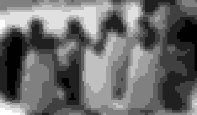
Below are three LQIPs generated by Cloudinary, compressed for quality and optimized for WebP, weighing only 2.17 KB in WebP and 1.46 KB in JPG in non-Chrome browsers. The top version shows the grayscale effect; the middle one, the black-and-white touch; and the bottom one, a cartoon-like look through the cartoonify parameter.

The possibilities are truly endless, promising a wide range of effects without sacrificing performance or image weight. An example is Instagram-like filters, which you can mix and match for the desired result. Let your imagination run wild with Cloudinary’s Neural Artwork Style Transfer add-on.
You can simplify and shorten those long, complex URLs generated by Cloudinary with named transformations, which are akin to CSS classes, by grouping together URL-based, chained transformations and converting them to templates. Follow these steps:
- Create an LQIP for an image in your Cloudinary account.
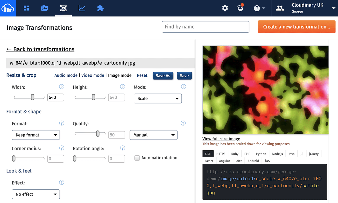
- Log in to your Cloudinary account and click the third icon from the left at the top for the Media Transformations screen.
- Click Edit in the box above your most recent transformation.
- In the next screen, click Save to save the template, i.e., the named transformation, with a name of your choice, e.g.,
lqip.
Alternatively, start from the Media Transformations screen (see below). Click Create a new transformation in the top-right corner and, in the next screen, click Save As or Save with a name you prefer.
The output shows the streamlined URL like this one:
http://res.cloudinary.com/demo/image/upload/w_640,f_auto/t_lqip/string_1.jpg
The t_lqip parameter encompasses most of the transformations performed on the image, hiding the settings for resizing, cropping, overlays, and so forth.
Regardless of your media strategies, we recommend that you adopt LQIPs, especially if you lazy-load images for your site. To accelerate workflows, leverage Cloudinary for its automated process of generating image placeholders. We welcome your feedback and would appreciate your sharing with us your experience, preferably with examples.
Additional Resources:

