
Flutter apps run on phones, tablets, desktops, and TVs. One image size doesn’t fit all of those screens. A photo that looks great on a phone wastes bandwidth at that same resolution on a tablet, and looks blurry when stretched to a desktop.
In this tutorial, you’ll build a ResponsiveImage widget in Flutter that uses the Cloudinary SDK to dynamically resize, reformat, and optimize images in the cloud before delivering them. The widget detects the device type, selects the right dimensions, and lets Cloudinary handle the transformation. Your app ships smaller images to phones, larger ones to desktops, and the best format for every device.
By the end of this tutorial, you’ll have a reusable ResponsiveImage widget that:
- Detects whether the app is running on a phone, tablet, desktop, or TV.
- Accepts custom width and height overrides for each device type.
- Uses Cloudinary to resize, crop, and optimize the image in the cloud.
- Delivers the image in the best format (WebP, AVIF, or JPEG) automatically.
- Drops into any Flutter screen with a single widget call.
Here’s the same image served at five different sizes across device simulators:
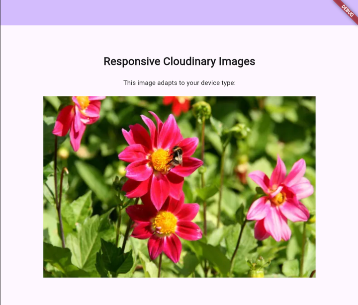
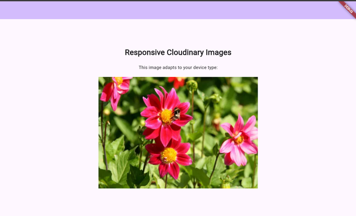

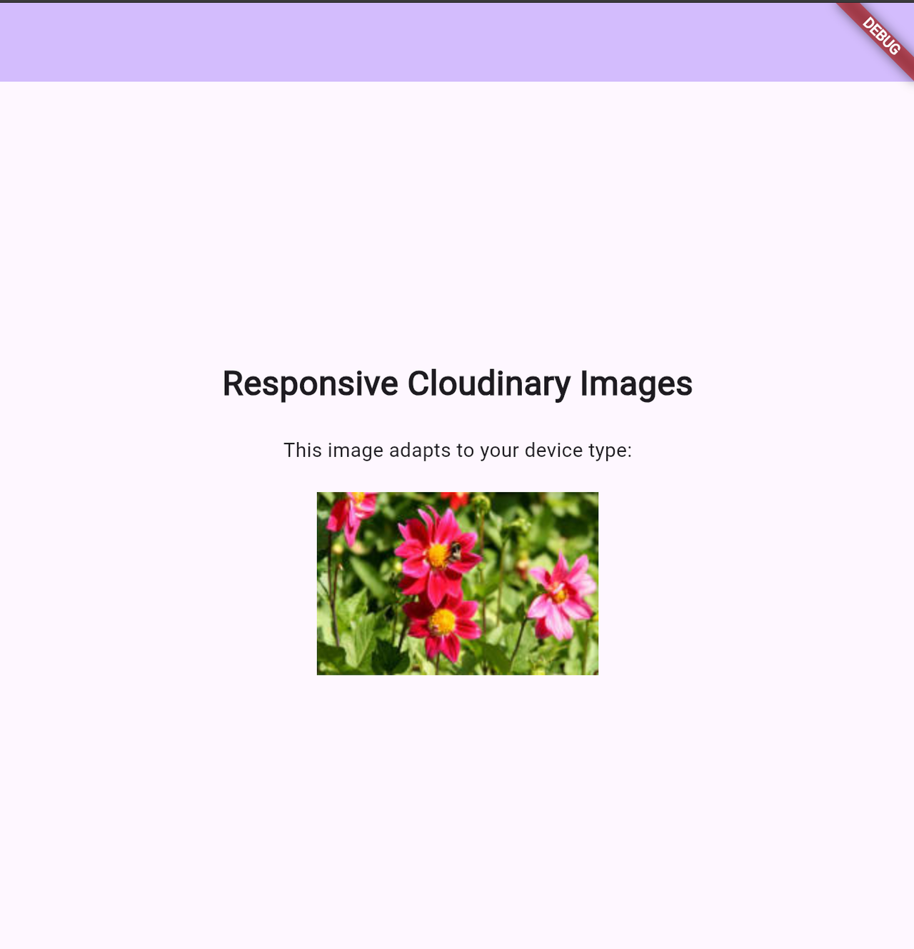
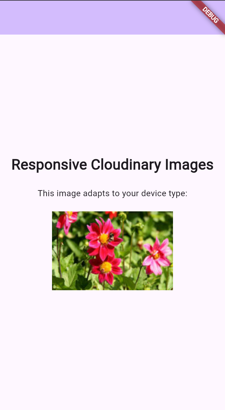
The above are screenshots of same Flutter app running on various simulators, including iPhone, and iPad Simulators, desktop and TV-sized windows.
Before you start, make sure you have:
- Flutter installed on your machine. If you need to set it up, follow the Flutter installation guide.
- A free Cloudinary account. (Note your cloud name from the dashboard.)
- Basic knowledge of Dart and Flutter widgets.
Open your terminal and create a new Flutter project:
flutter create responsive_images

cd responsive_images
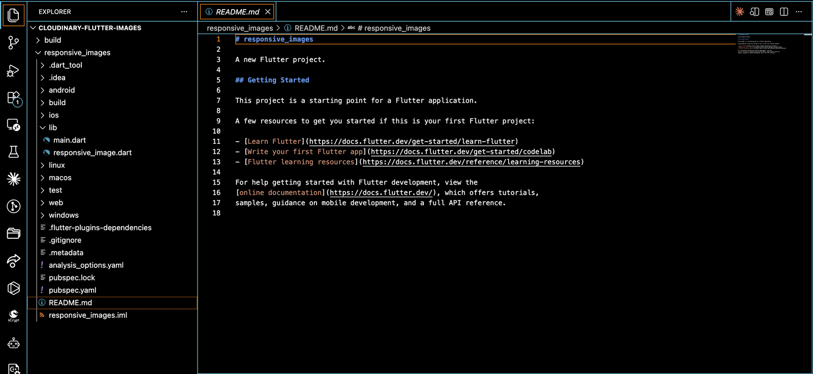
Here’s a quick overview of the files you’ll work with:
| File | Purpose |
| lib/main.dart | Main entry point of the app |
| lib/responsive_image.dart | The responsive image widget you’ll build |
Add the Cloudinary Flutter SDK and a device detection package to your pubspec.yaml:
dependencies:

  flutter:

    sdk: flutter

  cupertino_icons: ^1.0.8

  # Cloudinary dependencies

  cloudinary_flutter: ^1.3.0

  cloudinary_url_gen: ^1.6.0

  # Device detection for responsive images

  device_info_plus: ^10.1.2Code language: CSS (css)
Run flutter pub get to install the packages.
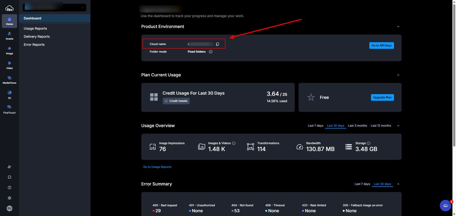
Next, configure the Cloudinary instance in your main.dart file. Replace the placeholder with your actual cloud name from the Cloudinary dashboard:
import 'package:flutter/material.dart';

import 'package:cloudinary_flutter/cloudinary_context.dart';

import 'package:cloudinary_url_gen/cloudinary.dart';

import 'responsive_image.dart';

void main() {

  CloudinaryContext.cloudinary = Cloudinary.fromStringUrl(

    "cloudinary://''@YOUR_CLOUD_NAME?analytics=false"

  );

  runApp(const MyApp());

}Code language: JavaScript (javascript)
If you’re not sure where to find your cloud name, check the Cloudinary credentials guide.
That covers the setup. Now you can start building the widget.
Create a new file at lib/responsive_image.dart. Start by defining the configuration classes that control how the widget behaves on each device type:
enum DeviceType {

  phone,

  tablet,

  desktop,

  tv,

}

class DeviceConfig {

  final int? width;

  final int? height;

  const DeviceConfig({this.width, this.height});

}

class ResponsiveImageConfig {

  final DeviceConfig? phone;

  final DeviceConfig? tablet;

  final DeviceConfig? desktop;

  final DeviceConfig? tv;

  const ResponsiveImageConfig({

    this.phone,

    this.tablet,

    this.desktop,

    this.tv,

  });

}Code language: JavaScript (javascript)
The ResponsiveImageConfig class lets you specify different width and height values for each device type. If you don’t provide a config for a particular device, the widget falls back to the default dimensions.
Now add the base widget structure:
class ResponsiveImage extends StatefulWidget {

  final String publicId;

  final int width;

  final int height;

  final ResponsiveImageConfig? deviceConfig;

  const ResponsiveImage({

    Key? key,

    required this.publicId,

    required this.width,

    required this.height,

    this.deviceConfig,

  }) : super(key: key);

  @override

  State<ResponsiveImage> createState() => _ResponsiveImageState();

}Code language: JavaScript (javascript)
The widget accepts a Cloudinary publicId, default width and height, and an optional deviceConfig for per-device overrides. In the next step, you’ll add the device detection logic that makes the widget responsive.
The widget needs to know what type of device it’s running on so it can select the right image dimensions. You’ll use two detection strategies: platform-specific APIs (through the device_info_plus package) and screen-size breakpoints as a fallback.
Add the state class with detection logic to lib/responsive_image.dart:
class _ResponsiveImageState extends State<ResponsiveImage> {

  DeviceType? _deviceType;

  @override

  void initState() {

    super.initState();

    _detectDeviceType();

  }

  Future<void> _detectDeviceType() async {

    final deviceInfo = DeviceInfoPlugin();

    try {

      if (Platform.isAndroid) {

        final androidInfo = await deviceInfo.androidInfo;

        _deviceType = _getDeviceTypeFromScreenSize();

      } else if (Platform.isIOS) {

        final iosInfo = await deviceInfo.iosInfo;

        if (iosInfo.model.toLowerCase().contains('ipad')) {

          _deviceType = DeviceType.tablet;

        } else {

          _deviceType = DeviceType.phone;

        }

      } else {

        _deviceType = DeviceType.desktop;

      }

    } catch (e) {

      _deviceType = _getDeviceTypeFromScreenSize();

    }

    if (mounted) {

      setState(() {});

    }

  }

  DeviceType _getDeviceTypeFromScreenSize() {

    final screenWidth = MediaQuery.of(context).size.width;

    if (screenWidth < 768) {

      return DeviceType.phone;

    } else if (screenWidth >= 768 && screenWidth < 1024) {

      return DeviceType.tablet;

    } else if (screenWidth >= 1024 && screenWidth < 1920) {

      return DeviceType.desktop;

    } else {

      return DeviceType.tv;

    }

  }

  DeviceType _getEffectiveDeviceType() {

    return _deviceType ?? _getDeviceTypeFromScreenSize();

  }Code language: JavaScript (javascript)
Here’s how the detection works. On iOS, the widget checks the device model directly. If it contains “iPad”, the device type is tablet. Otherwise, it’s a phone. On Android and all other platforms, the widget falls back to screen-size breakpoints:
| Screen Width | Device Type |
| Less than 768px | Phone |
| 768px to 1023px | Tablet |
| 1024px to 1919px | Desktop |
| 1920px and above | TV |
Now add the _getDimensions function that selects the right width and height based on the detected device type:
DeviceConfig _getDimensions() {

    final effectiveType = _getEffectiveDeviceType();

    if (widget.deviceConfig != null) {

      switch (effectiveType) {

        case DeviceType.phone:

          if (widget.deviceConfig!.phone != null) {

            return DeviceConfig(

              width: widget.deviceConfig!.phone!.width ?? widget.width,

              height: widget.deviceConfig!.phone!.height ?? widget.height,

            );

          }

          break;

        case DeviceType.tablet:

          if (widget.deviceConfig!.tablet != null) {

            return DeviceConfig(

              width: widget.deviceConfig!.tablet!.width ?? widget.width,

              height: widget.deviceConfig!.tablet!.height ?? widget.height,

            );

          }

          break;

        case DeviceType.desktop:

          if (widget.deviceConfig!.desktop != null) {

            return DeviceConfig(

              width: widget.deviceConfig!.desktop!.width ?? widget.width,

              height: widget.deviceConfig!.desktop!.height ?? widget.height,

            );

          }

          break;

        case DeviceType.tv:

          if (widget.deviceConfig!.tv != null) {

            return DeviceConfig(

              width: widget.deviceConfig!.tv!.width ?? widget.width,

              height: widget.deviceConfig!.tv!.height ?? widget.height,

            );

          }

          break;

      }

    }

    return DeviceConfig(width: widget.width, height: widget.height);

  }

}Code language: PHP (php)
If you pass a ResponsiveImageConfig with custom dimensions for a device type, the widget uses those. If not, it falls back to the default width and height. The detection and dimension logic is now complete. The last step is rendering the image with Cloudinary transformations.
Cloudinary applies transformations in the cloud before delivering the image. You don’t process anything on the client. The widget constructs a transformation request, and Cloudinary returns an optimized image at the exact dimensions you specified.
Three transformations matter here:
- Resize. The fill action crops and resizes the image to the dimensions from your breakpoints, maintaining aspect ratio.
- Quality. The auto setting lets Cloudinary pick the optimal compression level. This reduces file size without visible quality loss.
- Format. The auto setting delivers the image in the best format for the device (WebP, AVIF, or JPEG).
Add the build method to your state class:
@override

Widget build(BuildContext context) {

  final dimensions = _getDimensions();

  final effectiveWidth = dimensions.width ?? widget.width;

  final effectiveHeight = dimensions.height ?? widget.height;

  return SizedBox(

    width: effectiveWidth.toDouble(),

    height: effectiveHeight.toDouble(),

    child: CldImageWidget(

      publicId: widget.publicId,

      transformation: Transformation()

        ..resize(Resize.fill()

          ..width(effectiveWidth)

          ..height(effectiveHeight))

        ..delivery(Delivery.quality('auto'))

        ..delivery(Delivery.format('auto')),

    ),

  );

}Code language: PHP (php)
The CldImageWidget from the Cloudinary Flutter SDK takes the publicId of your image and the transformation chain. Cloudinary generates the optimized image URL, fetches the transformed image from its CDN, and delivers it to the widget.
Now you can use the ResponsiveImage widget in your app. Update your main.dart file with a test image from your Cloudinary account:
class MyApp extends StatelessWidget {

  const MyApp({super.key});

  @override

  Widget build(BuildContext context) {

    return MaterialApp(

      title: 'Flutter Demo',

      theme: ThemeData(

        colorScheme: ColorScheme.fromSeed(seedColor: Colors.deepPurple),

      ),

      home: const MyHomePage(title: 'Cloudinary Responsive Images Demo'),

    );

  }

}

class MyHomePage extends StatelessWidget {

  const MyHomePage({super.key, required this.title});

  final String title;

  @override

  Widget build(BuildContext context) {

    return Scaffold(

      appBar: AppBar(

        backgroundColor: Theme.of(context).colorScheme.inversePrimary,

        title: Text(title),

      ),

      body: const Center(

        child: Column(

          mainAxisAlignment: MainAxisAlignment.center,

          children: <Widget>[

            Text(

              'Responsive Cloudinary Images',

              style: TextStyle(fontSize: 24, fontWeight: FontWeight.bold),

            ),

            SizedBox(height: 20),

            Text('This image adapts to your device type:'),

            SizedBox(height: 20),

            ResponsiveImage(

              publicId: 'YOUR_IMAGE_PUBLIC_ID',

              width: 300,

              height: 200,

              deviceConfig: ResponsiveImageConfig(

                phone: DeviceConfig(width: 200, height: 130),

                tablet: DeviceConfig(width: 600, height: 400),

                desktop: DeviceConfig(width: 500, height: 350),

                tv: DeviceConfig(width: 800, height: 600),

              ),

            ),

          ],

        ),

      ),

    );

  }

}Code language: JavaScript (javascript)
Replace YOUR_IMAGE_PUBLIC_ID with the public ID of an image you’ve uploaded to your Cloudinary account.
Run your app to see the responsive widget in action:
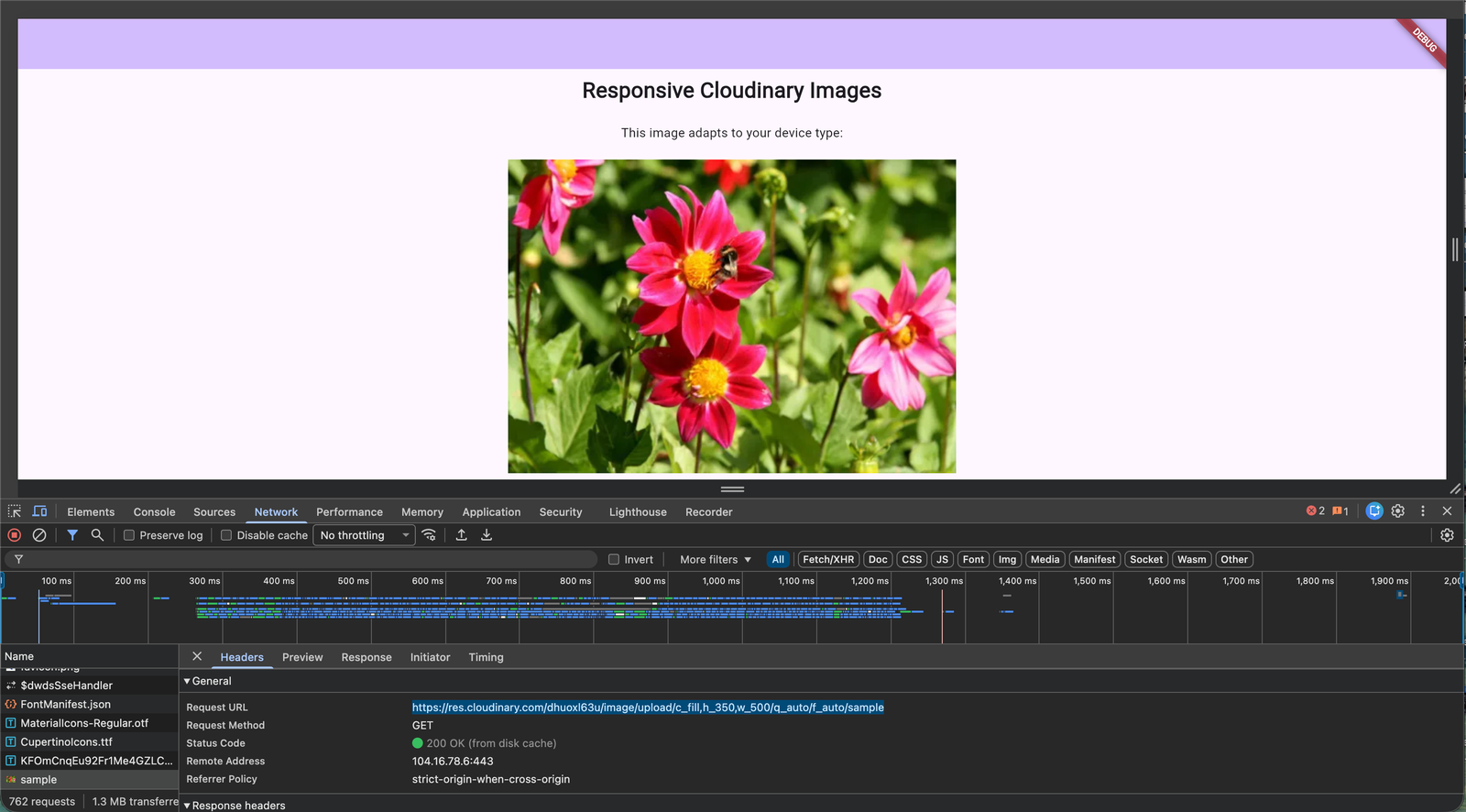
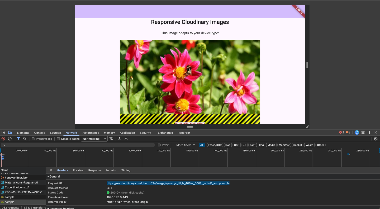
<code>flutter run</code>Code language: HTML, XML (xml)Flutter shows you the available devices to run on. Select different simulators to verify that the image adapts correctly. The ResponsiveImage widget detects the device type and applies the matching dimensions from your config:
| Device | Dimensions |
| iPhone | 200 x 130px |
| iPad | 600 x 400px |
| Desktop | 500 x 350px |
| TV | 800 x 600px |
Open the network inspector in your browser (for Flutter web) or check the Cloudinary console to confirm that different transformation URLs are generated for each device type. You should see different w_ and h_ parameters in the URLs.
You built a reusable ResponsiveImage widget for Flutter that detects the device type, selects the right dimensions, and uses Cloudinary to transform and deliver optimized images from the cloud. All image processing happens on Cloudinary’s servers, not on the client.
That means:
- No client-side processing. Images are optimized before delivery.
- Automatic format selection. Cloudinary picks WebP, AVIF, or JPEG based on device support.
- Dynamic quality optimization. The best balance of visual quality and file size, chosen automatically.
- CDN delivery. Images load from the location closest to your customer.
Here are a few ways to extend the widget:
- Add art direction. Use different Cloudinary crop modes (like thumb or auto) for different device types instead of just resizing.
- Support pixel density. Multiply dimensions by MediaQuery.of(context).devicePixelRatio to serve 2x or 3x images on high-DPI screens.
- Add placeholder images. Show a low-quality blurred placeholder while the full image loads.
- Cache locally. Combine Cloudinary’s CDN caching with Flutter’s CachedNetworkImage for offline support.
Sign up for a free Cloudinary account to try it yourself.
Resources:
- Full source code on GitHub
- Cloudinary Flutter SDK documentation
- Cloudinary image transformations
- Flutter device_info_plus package
- Flutter responsive design guide
Why should Flutter apps use responsive images?
Serving the same large image to every device wastes bandwidth on smaller screens while potentially reducing image quality on larger displays. Responsive images improve loading performance, reduce data usage, enhance user experience, and help applications scale across Android, iOS, desktop, web, and TV devices.
How does Cloudinary optimize images for Flutter applications?
Cloudinary performs image transformations in the cloud before delivery. Developers can automatically resize, crop, optimize quality, convert formats, and deliver images through Cloudinary’s global CDN. Using q_auto and f_auto, Cloudinary automatically selects the optimal compression level and image format for each user’s browser or device.
What image formats does Cloudinary automatically deliver?
Cloudinary serves modern formats such as AVIF or WebP when supported by the device and falls back to JPEG or PNG when necessary. This improves performance without requiring developers to manage multiple image versions.
Can Cloudinary automatically optimize image quality?
Yes. Using q_auto, Cloudinary analyzes each image and automatically selects an optimal quality level that balances visual fidelity and file size. This helps improve page load times while maintaining excellent image quality across devices.
What are the benefits of using a reusable ResponsiveImage widget?
A reusable widget centralizes image optimization logic, reduces duplicate code, improves maintainability, and ensures every screen delivers appropriately sized images. Developers can easily customize dimensions for different device classes while allowing Cloudinary to handle optimization, transformations, and CDN delivery automatically.


