What Is eCommerce Website Design?
eCommerce websites allow retailers to sell products online, and enable consumers to browse, evaluate, and purchase products from the comfort of their home.
Web design is crucial when creating a successful eCommerce website. eCommerce web design aims to encourage visitors to make purchases using the correct colors, fonts, images, text, and graphics.
In addition to design, building an eCommerce website involves development and technical considerations. This includes coding the website using HTML, CSS, or JavaScript, ensuring its scalability, performance, and security, and optimizing it for search engines to reach more potential customers. Aligning the design and development with your business goals and budget is equally critical.
An eCommerce website should be user-friendly, making it easy for users to navigate and find the products they are after. It should establish trust and create a strong brand identity. Finally, it should be optimized for conversion, encouraging users to make a purchase, register for the site, and return for additional purchases.
Additionally, an effective eCommerce website incorporates SEO optimization, persuasive design elements such as calls-to-action (CTAs) and social proof, and thoughtful platform selection to ensure smooth functionality. A focus on visual hierarchy, detailed product pages, and a secure, user-friendly checkout process further enhances the shopping experience.
This is part of our series of articles about eCommerce platforms.
In this article:
- eCommerce Website Design Principles
- eCommerce UI Design Tips
- 6 Examples of Effective eCommerce Design
eCommerce Website Design Principles
To optimize revenue, bear in mind the following nine principles while designing your eCommerce website.
User-Friendliness
eCommerce sites must be easy to navigate. One way to accomplish that is to group your products under specific categories with a menu at the top that shows all those categories.
Intuitive navigation includes implementing breadcrumb trails, mega menus for large catalogs, and persistent access to the shopping cart on every page. These features not only improve usability but also reduce friction during the shopping process.
Brand Identity
Ensure that your brand is prominently displayed throughout the website. Choose colors that reflect the brand and set a clear style representing your products. To foster a strong brand-customer relationship, ensure that the brand experience is consistent across all channels, whether online, in-store, or mobile.
Consistent branding goes beyond visuals; it should also extend to the platform’s functionality and messaging. Whether you choose a platform like Wix, BigCommerce, Adobe Commerce, or WooCommerce, ensure that it supports a seamless branding experience across devices.
Trust and Security
Design a site that shoppers can trust because privacy is paramount, i.e., ensure that transactions are secure and that personal data is protected. If shoppers feel your site is not trustworthy, they will shop elsewhere. Also, your payment gateway directly affects revenue; ensure that it’s safe and secure.
Technical considerations like robust encryption and scalable hosting are also essential for maintaining trust and ensuring smooth operations during peak traffic times.
Searchability
A clearly visible search field must be within reach at all times. That way, your visitors can quickly find what they’re looking for without having to navigate multiple times. This feature is particularly attractive to those who already know what products they are interested in.
An effective search feature should also integrate SEO principles. By structuring your product categories hierarchically and using breadcrumbs, you can improve not only navigation but also your site’s visibility on search engines.
Product Descriptions
Product descriptions on your site are crucial and can greatly influence purchasing decisions. The more alluring the fonts, the descriptions, the images, and the videos are, the better visitors can relate to their buying needs. Even though product descriptions are not part of the design, paying attention to them can definitely increase your ROI in the long run.
Optimize product descriptions for search engines by including relevant keywords in titles and meta tags. Additionally, use clean and descriptive URLs to improve navigation and search engine rankings.
Minimalistic Approach
Typically, eCommerce sites carry a lot of content and visitors must plow through numerous products and related information to pinpoint what they are after. A fancy design would only complicate the picture.
Therefore, opt for a minimalistic design with neutral colors, such as a white background. Minimalism is not simplism, however; your website must still reflect professionalism and polish in brand and design.
Calls to Action
Given that the ultimate goal of your site is to attract customers and generate revenue, calls to action play a vital role there. Make the CTAs as short and clear as possible to align with your visitors’ behavior, some of whom are probably browsing and making purchase decisions quickly.
Tailor CTAs to the user journey, using contextual prompts like “Buy Now” on product pages or “Explore More” on category pages. Use visually distinct buttons with contrasting colors to guide users effectively.
Customer Reviews
Customer reviews are one of the first things people look at before deciding whether to buy a product. Ensure that the reviews on your products are easy to find and follow. Since people spend a lot of time reading them, make that an enjoyable thing to do, for example, by featuring starred ratings, displaying reviews in an easily readable font, and presenting an average score for the products.
Consider integrating broader social proof elements, such as customer testimonials, purchase numbers, and real-time activity (e.g., “X people purchased this today”) to further build trust.
Optimization for Mobile
The mobile version of eCommerce sites must have the same effect on visitors as their desktop version. However, given the smaller screen size on mobile, it’s challenging to bring over the same look and feel and messaging from desktop to mobile and to keep visitors interested and aware of all the purchase options. Consider conducting regular testing for mobile usability and using data insights to optimize features and design for small screens. Testing and updating your mobile site can help ensure a positive user experience and boost conversion rates.
Learn about additional considerations in our detailed guide to eCommerce design
eCommerce UI Design Tips
Here are some tips to help you improve the user interface design for your eCommerce websites:
- Use visual hierarchy -ensure the most important content appears above the fold, especially on mobile devices. You might need to cut down on white space to fit more items above the fold rather than placing them below.
- Avoid over-designing the page—don’t use too many font sizes, colors, and formats. If the text is too visually complex, it can be overwhelming or look like an advertisement. Ensuring a sharp contrast between the text and the background is important to ensure the content is clear.
- Use recognized symbols—avoid using unknown symbols or icons that might confuse visitors. Using familiar symbols keeps your messaging clear. You can further reduce confusion by labeling your icons.
- Avoid pop-up windows—pop-ups distract and annoy website viewers, increasing the risk of shoppers dismissing the window. If a pop-up contains useful info, visitors might instinctively close the window and struggle to find it again.
- Cost Considerations—Designing and developing an eCommerce website is a significant investment. For 100–1,000 products, initial costs range from $5,000 to $55,000, and annual maintenance typically falls between $15,000 and $30,000. Budgeting for these costs upfront can help businesses plan effectively and avoid unexpected financial strain.
When designing your eCommerce website, make navigation as easy as possible. You can achieve this by including the following elements:
- Clear product categories—the top navigation level should display the site’s categories. Make sure you place products in logical categories with clear, preferably single-word labels to let visitors browse items easily. Conduct user tests to fine-tune your site’s navigation and ensure a positive user experience.
- Product search—provide an option for visitors to search for specific products they might miss in the catalog. This search function helps shoppers find items and increases the likelihood of a purchase.
- Filters—provide filtering options to help visitors narrow their search and choose from the most relevant products. Filters save time and improve the UX.
- Quick product views—quick views of products reduce the time it takes for a shopper to learn about relevant products without loading unnecessary pages.
- Special offers—many shoppers look for discounts and special offers. Providing exclusive offers can help attract visitors, especially if they are highly visible. Small discounts can have a significant psychological impact and convey the sense that the buyer is getting a good deal.
6 Examples of Effective eCommerce Design
Let’s have a look at several inspiring eCommerce sites with an excellent design.
Fashion
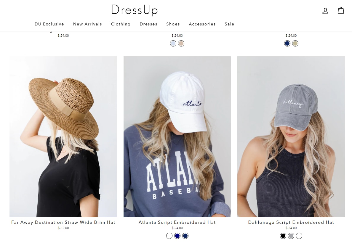
Dress Up sells women’s clothing online. The site highlights new arrivals, on-sale items, and seasonal promotions in large-font, boldfaced text. Also available is a “Chat with us” feature, which is a rare option for an eCommerce clothing store.

Hebe stands out through its superb photography, an especially important component for online clothing stores. The extra-thick font props up the design even more.


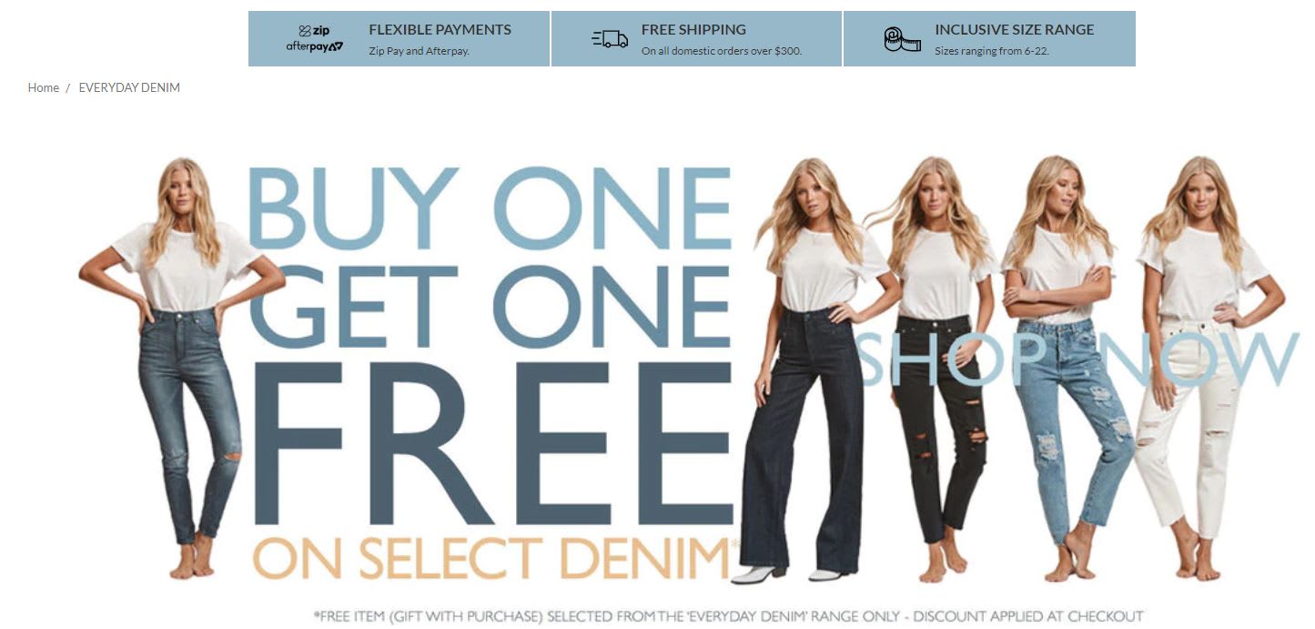
Visitors to Bohemian Traders can easily navigate by category: latest arrivals, occasions, accessories, or on-sale items.


Health and Beauty
Bliss gives off a cheerful feeling with bright colors. The photography is stellar, for example, the large photos on the homepage set the tone for the rest of the design.


Esquido is especially helpful if you’re looking for ideas on how to photograph makeup or beauty products for your eCommerce site. Besides offering a clear branding of its main product, eyelashes, the Esquido site is full of close-up photos of the product and its intricate packaging.


Sports and Fitness
Rusty Surfboards offers a consistent branding experience through outstanding photography and bold messaging. It’s an extremely well-designed site.


