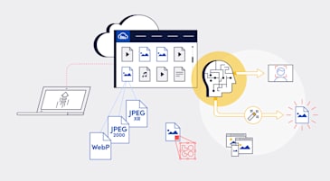
The goal of website image optimization is to efficiently serve them online. Properly optimized web images result in improved performance, which makes viewers happy. It also makes search engines happy since priority rankings are given to faster pages.
You can optimize web images in many ways. Some of them require manual configuration; others automate the process. This article explains four optimization techniques and offers best-practice tips for success. Here are the topics:
- What is image optimization?
- How do you optimize images for the web?
- What Are the best practices for image optimization?
- How do you optimize website images with Cloudinary?
- Want to learn more about image optimization?
Optimization of website images is the process of storing and delivering them efficiently through compression, a prudent choice of their formats, and delivery of images only when needed. Many plugins and tools are available for automation, eliminating the drudgery of manual tasks.
Here are the most common benefits of optimizing online images:
- Faster page loads
- A higher search-engine ranking
- An enhanced user experience that leads to higher conversion rates
- Reduced storage and bandwidth required for serving images
- Faster website backups
This is part of an extensive series of guides about front-end development.
Before diving into the specific techniques, it’s essential to understand some common uses of image optimization:
- Image Size and File Size: Smaller images, particularly those up to 2 megabytes, are generally more suitable for web use than larger images exceeding 20 megabytes. This balance ensures that images are of sufficient quality without being overly large, which can slow down page loads.
- Image Format Considerations: While PNG is known for its high-quality output, it tends to have a larger file size than other formats like JPG, GIF, SVG, and WebP. Choosing the proper format is essential based on the desired balance between image quality and file size.
- Compression for JPGs: For JPG images, achieving the right balance in compression is crucial. A compression quality between 70-90 percent is often optimal, reducing file size while maintaining reasonable image quality.
- Effective Image Naming and Use of Alt Text: Employing descriptive, plain language names and alt text for images not only improves accessibility but also enhances SEO.
- Optimal Image Dimensions and Angles: Selecting the correct dimensions and angles for your images can significantly impact how they are perceived and used on your website.
- Utilizing Image Sitemaps: Image sitemaps can effectively ensure that all your images are recognized and indexed by search engines, further optimizing your site.
- The “Blur Up” Technique: This involves initially loading a lower quality image, which can be progressively enhanced, thereby improving page load times.
- Replacing Animated GIFs with Video: Considering the replacement of animated GIFs with video formats can offer optimization benefits, particularly in reducing file size.
- Choosing Unique Over Stock Images: Where possible, using unique images instead of stock photos can provide a more personalized and engaging user experience.
You can optimize website images in many ways, including the option of combining multiple methods to achieve greater optimization.
To determine which way to opt for and its effect on your site, analyze the site’s current performance. Google PageSpeed Insights is a free tool that identifies the images to optimize and that offers recommendations for the process.
Perform one or more of the four following tasks to optimize your site’s images.
Learn more in our detailed guide to placeholder generator.
Compressing an image reduces its file size by eliminating or reformatting unnecessary data. You can do that in either of these two ways:
- Lossy compression: Delete unnecessary metadata or visual data that is typically not perceived by humans. However, this method downgrades the image quality to further reduce the file size. Also, the data deleted is permanently lost.
- Lossless compression: Eliminate duplicate data by replacing its patterns with variables or other indicators, which results in files that are larger than those generated by lossy compression. In this case, the compressed data is recoverable.
Cloudinary’s q_auto feature automatically compresses and tunes images for the smallest-possible image size without sacrificing image quality.
Here’s how q_auto works:
- You add the
q_autoparameter to the image URL. - Cloudinary’s intelligent quality and encoding algorithm assesses the image content, format, and viewing browser.
- The algorithm identifies the optimal quality-compression level and encoding settings, compressing and encoding the image accordingly.
This process ensures that websites, browsers, viewers, and devices are served with a compressed version of a superior-quality visual. Below is an example.
Learn more about
q_autoin this post: Compress an Image Automatically Without Losing Quality.
Next-generation image formats, e.g., the four described below, deliver more compression than older formats, such as JPEG, further reducing the size of your images without quality loss.
- WebP, an open-source format that supports both lossy and lossless compressions. Developed by Google, WebP works on Google, Samsung, Opera, and Firefox 65 and higher browsers. WebP files are typically about 25 percent smaller than those of comparable formats. This format could be an ideal replacement of GIF, JPEG, and PNG.
- JPEG-XR, a proprietary format, developed by Microsoft, that works on Internet Explorer and Edge browsers. JPEG-XR extends the current lossy-compression techniques for JPEG with support for lossless compression and transparency.
- SVG, an open-source format developed by W3C and a vector format that enables you to create images that smoothly scale in all modern browsers. Based on XML, SVG images can be easily edited with CSS or JavaScript, or in image editors. Best used for logos, iconography, animations, and graphs.
- JPEG2000 (JP2), an open-source format for lossless compression. This is a highly scalable ISO standard that enables individual parts of an image to be stored at different qualities. However, this format works only in Safari without a plugin.
For insights on what is in store for next-generation formats, check out Cloudinary’s 2020 State of the Visual Media Report
Cloudinary’s f_auto capability delivers the most appropriate image format to the viewer’s browser, completely automatically.
First, Cloudinary transforms media assets through dynamic HTTP or HTTPS URLs, assigning each media asset a unique URL and a public ID. When serving an asset, Cloudinary delivers the URL via a fast content delivery network (CDN).
Learn more in our detailed guide to https cdn.
See this example of an asset’s delivery URL on Cloudinary:
https://res.cloudinary.com/<cloud_name>/<resource_type>/<type>/<transformations>/<version>/<public_id>.<format>
To optimize media on Cloudinary, you simply add a parameter, in this case f_auto, to the URL, as in this example:
https://res.cloudinary.com/demo/image/upload/w_500,f_auto/sample.jpg
f_auto tells Cloudinary’s intelligent algorithm to automatically fetch formats after selecting the right format for each requesting browser. Below is an example.
Learn more about
f_autoin this post: Automatically Reduce Image Size Without Losing Quality.
Suppose you do not want to compress or reformat your images. Or, compression and reformatting do not meet your optimization requirements. In those cases, you can resize images to optimize them.
Often, you resize images by means of styling components when the images are displayed. That involves an upload of unnecessary data since the full size of the image is never visible. To resize images to the largest-possible display size, eliminate all that unused data.
By leveraging AI, Cloudinary can dynamically resize images and crop them for the most interesting parts. Dynamic cropping in Cloudinary is done by means of intelligent responsive breakpoints. You have two options:
- Automatic breakpoints: Cloudinary’s intelligent algorithm can calculate the settings for optimal breakpoints by accounting for the number of generated image versions and the file-size reduction that occurred with each version. The difference determines the actual image-file size for each width. For details, see our documentation on responsive images.
- Cloudinary API: You can programmatically request breakpoints for uploaded images through the Cloudinary API by specifying settings like width range and requesting a transformation. Furthermore, you can request multiple image transformations, including cropping, image effects, filters, and optimization. For details, see this post: Introducing Intelligent Responsive Breakpoints Solutions.
Regardless of what other image-optimization techniques you employ, always do lazy loading, which loads images only when your viewer wants to see them. Typically, to detect that desire on the viewer’s part, you load images as that individual scrolls through your site.
Lazy loading reduces the amount of data that must load upon site access. If the sections that contain images are never accessed, their data is never sent, saving bandwidth for you and your viewers.
With Cloudinary’s new lazy feature, you can lazy-load images, i.e., display them only if and when necessary, with only a few keystrokes. Simply add the attribute loading=“lazy” to your images’ cl-image tag.
For details, see this post: Advanced Image Component for Cloudinary’s Angular SDKs.
We strongly suggest that you also do the following to optimize your site’s images.
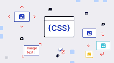
Before optimizing images, evaluate which ones are necessary. For example, many background images are simple gradients or patterns that you can render with CSS instead of displaying them. Since CSS is natively rendered, it requires no additional storage or bandwidth for transferring content, as images do.
Also, a good alternative for images is web fonts, with which you can lay text over images. You can use specialized fonts for text with no need to display it as images. Another benefit of leveraging web fonts is that viewers can search for, select, and resize text as they desire. What a win-win!
If you do need to display images for your site, you can choose between vector and raster images.
-
Vector images are scalable, being made up of points, lines, and polygons. Those images deliver the same degree of clarity and quality regardless of display size. Generally, vector images are ideal for simple visuals, such as text, logos, and icons.
To optimize vector graphics, you can minify them to remove unnecessary metadata, a process that promises to reduce their size by half or more.
-
Raster images, being defined by pixels, are limited in scalability. Those images are generally slated for photos or more complex graphics.
To optimize raster images, do one of the following:
- Reduce the bit depth. Reduce the color or shade palette available to images. Adopt this technique for simple images without fine gradients.
- Practice delta encoding. Eliminate redundant pixel information by storing the differences in a value between pixels. That way, you can store data for many similar pixels by referencing a source pixel, simultaneously saving bandwidth.
Besides conserving space and bandwidth, correctly sizing images leads to a better user experience. In addition to performing the resizing steps described earlier, you can also serve multiple image sizes to viewers. Even though such a practice requires more storage space on your web server, it limits the bandwidth for serving content.
An easy way to correctly resize images is with the HTML <picture> element, which defines multiple sources for images you can then serve according to browser specifications. Also, with this step, you can deliver different formats of images or different images altogether.
Cloudinary offers an extensive range of image optimization and management capabilities, such as automation of compression accompanied by a high level of quality. With Cloudinary, not only can you resize images without worrying about degradation, you can also lazy-load them to accelerate page loads.
All of those optimization features and many other nifty capabilities are part of Cloudinary’s digital asset management (DAM) solution. Sign up for Cloudinary pronto! We offer generous free plans to get you started.
Related content: Read our guide to image management.
Image optimization is the procedure of storing and delivering images efficiently through compression and a careful selection of their formats. The most common benefits of optimizing website images are faster page loads, reduced storage and bandwidth, higher search-engine ranking, an enhanced user experience, and faster website backups.
Related content: Read our guide to image optimization for wordpress.
Image optimization is a massive topic. Below are a few excellent tips and suggestions from our blog.
-
PHP Image Compression, Resize, and Optimization
Image compression is a mandatory step for delivering images of the smallest-possible size while maintaining visual quality. Since smaller images load faster, compressing images results in enhanced site performance.
You can optimize several aspects of PHP images, e.g., the built-in functions; the Image Optimizer library; PHP Image Cache class, which compresses images on the fly; and the Imagick extension.
-
Python Image Optimization and Transformation
You can optimize images in Python, notably the following components:
- The Pillow library, which builds on the Python Imaging Library (PIL) by adding more features and support for Python 3.
- The img4web script, which optimizes PNG, JPEG, and animated GIF images online.
- The smush.py command-line tool, a lossless image optimizer.
- The Tinify package for compressing and optimizing images.
- The scikit-image image-processing library.
This article explains how to enhance site performance and reduce bandwidth by optimizing and transforming images with Python.
Related content: Read our guide to transformation management .
-
Evolution of
: Gif without the GIF
Promising to be of help to developers, designers, and users alike, Safari Technology Preview is improving GIF-like experiences by enabling video content in
<img>tags with no performance and quality losses associated with GIF images. Besides the performance benefits, that capability unlocks many new use cases that have been on the wish list of media and e-commerce businesses for years. -
Top 10 Mistakes in Handling Website Images and How to Solve Them
As a major component of modern websites, images take up more than 60 percent of a site’s total bandwidth. That weighty issue is even more prominent in cutting-edge web designs. Unfortunately, bandwidth is a costly commodity: for high-traffic websites, bandwidth soaks up the majority of your IT budget, easily surpassing storage and hosting costs. This article identifies the top 10 mistakes you could make with website images and describes the solutions.
-
Three Popular and Efficient Ways for Loading Images
You can load your images in many ways, e.g., preload them before taking them live or lazy-load them only when needed, such as when the user scrolls down for them. You can also load a small preview version with progressive images first and then the full-size images later.
-
Introducing Cloudinary’s WordPress Plugin for Dynamic Images and Video
WordPress powers 34 percent of the Internet, which represents 60 percent of all CMS-built sites. From blogs to enterprise websites, WordPress is a popular choice for publishers and companies of all kinds. Media management within WordPress is an important component and one that, when done right, can significantly boost user engagement and overall site performance.
The enhanced Cloudinary for WordPress Plugin comprises robust features that make it easier than ever to manage and deliver optimized media assets.
Learn more in our detailed guide to wordpress image resize.
-
CDN for Images: Optimize and Deliver Images Faster
Most leading websites deliver digital assets like images, JS, and CSS through content delivery networks (CDNs) and resizing technologies. With CDNs, you can offer users faster, off-site access while reducing the load on the users’ servers. This article explains how to leverage a CDN to resize images for delivery.
-
Compress an Image Automatically Without Losing Quality
Compressed images usually come at the cost of lower quality, which, even though not always noticeable to the human eye, can make a difference visually, depending on the image.
Developers tend to shy away from aggressively compressing images for fear of degrading the visual quality. However, accurate adjustment of the compression level, complemented by fine-tuning of the encoding settings, can greatly reduce the file size without any noticeable degradation in quality.
-
Automatically Reduce Image Size Without Losing Quality
One of the main website optimization challenges for web developers is to display high-quality images while minimizing their size. Even though smaller images can reduce bandwidth costs, leading to faster load times and enhanced user experience, over-reducing the file size might cause quality loss and turn off users. This article explains how to reach the right balance between quality and size.
-
How to Automatically Adapt Website Images to Retina and HiDPI Devices
To meet the demands of the growing variety of devices, resolutions, pixel densities, and aspect ratios, mobile and web apps must deliver images that fit high-resolution devices but avoid unnecessary display of large images on lower-resolution devices. That’s because large images waste bandwidth, resulting in lengthy load times and a rotten user experience.
To support Retina and HiDPI as part of the responsive-design challenge, Cloudinary offers intuitive, simple features that make your sites and apps fully responsive.
Together with our content partners, we have authored in-depth guides on several other topics that can also be useful as you explore the world of front-end development.
Authored by Cloudinary
- [Guide] Image Optimization for Websites: Beautiful Pages That Load Quickly
- [Guide] Downloading Image from URL in Python: 5 Ways with Code Examples
- [Blog] Best Image Optimization Techniques: Expert Roundup
- [Product] Cloudinary Image | Automated Image Editing & Delivery
Authored by Cloudinary
- [Guide] Video Optimization: Why You Need It and 5 Critical Best Practices
- [Guide] Boost Your Workflow with Effective Image Rendering Methods
- [Blog] JPEG XL and the Pareto Front
- [Product] Cloudinary Video | Automated Video Editing & Delivery
Authored by Cloudinary


