More Products

Salesforce Commerce Cloud Page Designer Cartridge

Last updated: Sep-09-2024

Overview

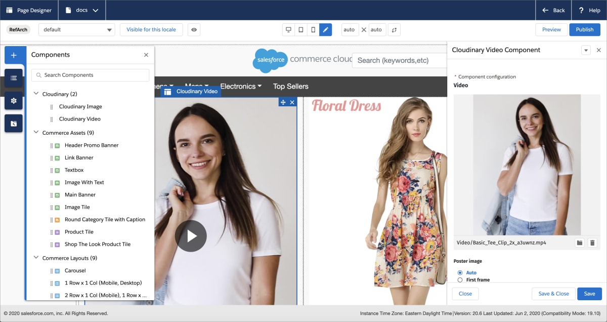
Salesforce Commerce Cloud (formerly Demandware) is one of the industry's most agile and scalable e-commerce platforms. Cloudinary offers a certified Salesforce Commerce Cloud (SFCC) Page Designer cartridge that enables you to embed images and videos from Cloudinary into pages created with Page Designer. The Cloudinary image and video components allow you to transform, optimize, and deliver your images and videos to meet the performance and design needs of your website.

Overview of the Page Designer and Cloudinary components

Tip
To see the latest updates, improvements and bug fixes, check out the Salesforce Commerce Cloud Page Designer Cartridge release notes.

Installation

You can download the certified Page Designer cartridge from the Cloudinary for Page Designer page on the SFCC Link Marketplace (requires SFCC login). Installation and basic usage instructions are provided in the download - see the Cloudinary LINK Page Designer Guide in the documentation folder. You can also get the most recent release from Cloudinary's GitHub repo.

Note
If you want to adhere to SFCC's TLS guidelines while using Page Designer, please contact support to enable specific settings for your Cloudinary account or product environment.

Page Designer cartridge video tutorial

This video demonstrates how to embed Cloudinary images and videos into your Page Designer layout, how to add branding overlays and how to customize the video player.

Important
  • Once you've published your page components, any changes you make to the global configuration are not applied to these components. You need to recreate your components for the configuration changes to take effect. This is a limitation of SFCC.
  • If you first publish to your SFCC staging environment and promote that to production, ensure that any media links are set to your production URLs, as these cannot be changed between the staging and production environments.

Responsive design with image breakpoints

You can customize breakpoints for image widths to align with your specific page layouts. While default breakpoints are [3840, 2560, 1200, 800] pixels, adjusting these based on your page design needs can enhance performance and user experience. Be sure to consider different screen DPRs. For example, a CSS width of 1,000px on a retina screen (DPR 2) would need a breakpoint of 2000 to display at its best.

To implement, set your desired breakpoints in pixels in the Cloudinary Page Designer Breakpoints setting located at Merchant Tools > Site Preferences > Custom Site Preference Groups > Cloudinary Page Designer. Once configured, images will automatically resize according to these specified widths, ensuring optimal display across all devices.

Integrating components into your custom attribute editor

If you are developing your own Page Designer components, you may wish to combine the functionality provided by Cloudinary's image and video components with your own functionality. See Integrating Cloudinary components into your custom attribute editor for details.

Commonly-used Media Library features

The SFCC Page Designer Cartridge embeds a compact version of the Cloudinary Media Library within each image and video component. You can access almost all of the same functionality that's available in the full Media Library in your Cloudinary Console. The Media Library opens when you click Choose Image or Choose Video in the Cloudinary Image or Video Component panel, or by clicking the folder icon if you have already selected your image or video, as shown here:

Accessing the Media library from the image/video component

Note
The Safari browser may require additional steps when logging in to the Media Library. If you encounter an issue, follow the prompts to log in separately and attempt to open the Media Library again. Alternatively, use one of the other recommended browsers when working with Cloudinary.

Advanced Search

The Advanced Search feature lets you search by filters such as tags, metadata, format, orientation, resolution, or (if supported for your account), even by image analysis characteristics, such as prominent colors, presence of faces, or image location.

Advanced Search

For more details, see Advanced Search in the Digital Asset Management guide.

Collections

Collections are ad-hoc groupings of assets. Assets can be added to and from collections without affecting or moving the asset itself, and assets can be included in multiple collections. You can create your own collections (assuming you have the required permissions) or other Cloudinary users can share collections with you. You can also share collections with external stakeholders by sending a URL to a dedicated collection webpage, which is available to those with a link during an optionally specified date range.

Collections can often be a convenient way to group all assets that you might want to use on a particular project or campaign.

Media Library collections

For more details, see Collection management in the Digital Asset Management guide.

Tagging and metadata

Assets that have tags and other metadata enable all Media Library users to better organize and search for assets in the Media Library.

In addition to the option to specify tags when you upload an image or video, you can also add or edit tags and other metadata after images and videos are uploaded via the embedded Media Library, and even set the same tags or metadata on multiple images and videos at once.

You can view and set this data using the Asset toolbar or in the Asset management page.

Asset toolbar

You can set tags and metadata for several selected assets at once from the Media Library using the Tag or Edit Structured Metadata options in the asset toolbar. You can Edit Contextual Metadata via the (3-dot) options menu. The type of metadata available for editing (contextual or structured) depends on the setup for your organization's account.

Media Library asset toolbar

Asset management page

You can view or edit tags and metadata as well as view embedded image metadata for a specific asset from the Summary and Metadata tabs of the Asset management page.

To open the Asset management page either double-click the asset or select Manage from the asset's context (right-click) menu.

Asset management

Tip
From the Asset management page, you can also select a pre-defined transformation of the original asset, view or activate a variety of image analysis options in the Analysis tab, and more. For details, see Asset management drill-down in the Digital Asset Management Guide.

Media Editor

The Media Editor is only applicable to images and is accessible from the Asset management page, by clicking the Edit Image button.

In the Media Editor, you can crop and resize your image to suit your design. If you save the modified image, your current asset will be overwritten. You can retrieve the original if you have backups enabled. Otherwise, you may prefer to download the modified image and upload it as a new asset.

Media library media editor

Transformation editor

The transformation editor is accessible from the Asset management page, by clicking the Transform button.

In the transformation editor you can apply, and preview various transformations, then click Insert to use this transformed asset as your media item. Unlike when using the Media Editor, your original asset remains unmodified.

Media library transformation editor

For more details, see Asset and transformation editing in the Digital Asset Management guide.

✔️ Feedback sent!

Rate this page: