As a developer, you know aspect ratio plays a vital role in delivering a crisp video. Changing the aspect ratio of a video is a frequent use case you likely face when working across applications.
However, changing and maintaining video aspect ratios can be a hassle. Today, users are browsing the internet with various devices, all with different aspect ratios. The cell phone one user might use can be entirely different from another user’s, or they may be on a tablet, desktop, or even their smart TV!
And beyond devices, the type of content matters too: you might need a cinematic 21:9 frame for film‑style projects, a classic 4:3 look for retro or creative pieces, or square/cinematic formats for ads and cover videos on platforms like Vimeo or Facebook. Considering both the content’s creative intent and the target device ensures the best viewing experience.

What is Video Aspect Ratio?
Video Aspect Ratio refers to the proportional relationship between the width and height of a video frame. It is expressed as a ratio of the width to the height, for example, 16:9 or 4:3. The aspect ratio affects the overall look and feel of the video, and different aspect ratios are better suited for different types of content and devices.
Cloudinary’s value proposition is centered around providing powerful image and video management solutions for developers, including tools for video manipulation and optimization. As part of this, Cloudinary offers a wide range of video aspect ratios that developers can use to create custom video experiences that meet their specific needs.
For example, Cloudinary’s video manipulation capabilities allow developers to change the aspect ratio of a video on the fly, which can be particularly useful for mobile devices, social media platforms, and other applications where different aspect ratios may be required. Additionally, Cloudinary’s AI-powered video optimization features can automatically detect the optimal aspect ratio for a given video and deliver it in the most efficient format possible, ensuring the best possible user experience.
When framing your shots, you can also leverage compositional guidelines like the rule of thirds: overlaying a 3×3 grid to keep important elements aligned even when you crop or pad for different ratios.
Standard Aspect Ratio
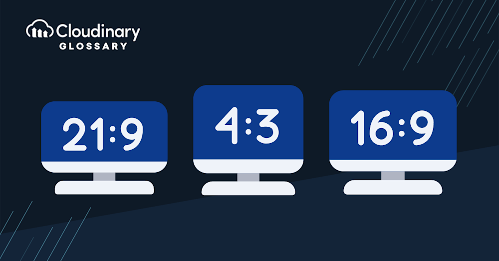
There are various types of devices, each with its own screen size and aspect ratio. Videos are usually recorded in 4:3, 16:9, or 21:9 aspect ratios. These numbers don’t necessarily represent the number of pixels; they only represent the width and height ratio.
- 4:3 (Classic): The traditional format used by older TVs and video cameras; still popular for nostalgic or creative projects, as well as some social media platforms.
- 21:9 (Cinematic): An ultra‑wide “movie” ratio that gives a film‑style, immersive look; ideal for fullscreen cinematic content.Closely related to aspect ratio is a concept called resolution. Resolution is the number of pixels contained by the video aspect ratio. Another important concept is pixel aspect ratio, which refers to the width-to-height ratio of individual pixels in a video. This affects how the video is displayed, especially on devices that use non-square pixels. The greater the resolution, the better the quality of the video.
Best Aspect Ratios for Social Media Videos
Choosing the right aspect ratio for video content on social media is essential for proper display and engagement. Each platform has specific guidelines to help your videos look their best in the designated player. Here’s a quick breakdown:
- Use a 1:1 or 16:9 ratio for regular posts.
- Opt for 9:16 when creating stories.
- For posts, go with 1:1, 4:5, 9:16, or 16:9.
- Use 9:16 for Instagram stories or reels to suit vertical formats.
TikTok
- Stick to 9:16, which works perfectly for both portrait and landscape videos.
Twitter/X
- The recommended aspect ratio is 16:9.
- Use 16:9 for regular videos and 9:16 for stories.
YouTube
- For standard videos, use 16:9.
- For YouTube Shorts, 9:16 is the ideal choice.
Instagram/Twitter/Facebook Advertisements
- Carousel ads often use a 1:1 square format to keep multiple images/videos consistent and scroll‑friendly in feeds.
By following these guidelines, your videos will align with platform-specific recommendations and provide a better viewing experience for your audience.
Changing Video Aspect Ratio with Cloudinary
Now that we know what video aspect ratios are let’s discuss how to change them. If you have an application that stores and streams videos, it’ll need a way to change the aspect ratio dynamically. Otherwise, your users will be upset if they can’t watch videos with the correct device aspect ratio.
When it comes to delivering the best aspect ratio for your video, Cloudinary is a platform that can help. Cloudinary is an end-to-end media platform allowing users to upload videos and provide them in the desired aspect ratios.
To use Cloudinary, you will need to create a free Cloudinary account. To follow along, you’ll also need to upload a sample video to Cloudinary. For this tutorial, we have already uploaded a video named: ‘sample_smmplc.’
Cropping To Fit Screen Size
Let’s say we have an uploaded video but need it to work on multiple devices. The solution here is to crop the video sides to make it fit, sacrificing some of the video in some cases. With Cloudinary, you can achieve this easily by running the code below:
    this.videoCrop = cld.video("sample_smmplc")
     .resize(fillPad().height(400).aspectRatio("9:16"));
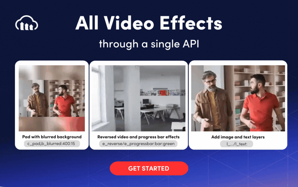
Blurring Sides
If the video is smaller than the device screen, the user will see empty spaces on the sides. Normally this isn’t ideal, but we can blur those empty spaces with Cloudinary by using this snippet:
    this.videoBlur = cld.video("sample_smmplc").resize(
    pad()
    .width(480)
    .height(320)
    .background(blurred().intensity(400).brightness(15))
);
You can also control the blurred areas’ intensity and brightness, as shown within the `.background` object.
Adding Color to the Background
Another option over blurring the sides is adding color to the empty space’s background. Check out this snippet:
    this.videoBgColor = cld.video("sample_smmplc")
     .resize(limitPad()
     .width(400)
     .height(150)
     .background(color("green"))
    );
Of course, you can adapt all the parameters in the code above to your needs and preferences. Not everyone likes green!
Resize the Video to Fit the Container
Cloudinary supports resizing the video while maintaining the aspect ratio. Here’s what it looks like with Cloudinary:
    this.videoResize = cld.video("sample_smmplc")
     .resize(scale().width(100).aspectRatio("1:2"));
In this snippet, we fixed the video with a width of 100 pixels and then resized it to maintain an aspect ratio of 1:2.
Closing the Book on Video Aspect Ratios
Video aspect ratios can be annoying but critical to your user experience. Without maintaining proper aspect ratios, your users will definitely be upset when trying to consume videos, whether it’s their videos or yours.
If you’re in need of a tool that can help transform and optimize your digital media, Cloudinary is the platform for you. Not only do we help with transforming video aspect ratios, but our API can apply all sorts of transformations and effects to your digital media.
You can check out the Cloudinary Documentation to see all the options and functionalities available for manipulating aspect ratios. And make sure to try it out (it’s free forever!) and unleash the full potential of your digital media.
More from Cloudinary:
Check Out Our Tools That You May Find Useful: