What is the CSS Width Property?
The CSS Width property is a fundamental aspect of Cascading Style Sheets (CSS), the language used for styling web pages. It determines the horizontal dimensions of an element, which could be anything from an image or a text block to a container housing other elements. It plays a key role in structuring and organising the design of a webpage, dictating how much horizontal space an element occupies within its container.
You can specify the width using a variety of units including pixels (px), percentages (%), viewport widths (vw), and more. For instance, width: 50% would make an element take up half the width of its parent container, while width: 200px would give it a fixed width regardless of the size of its containing environment.
Understanding how to leverage the CSS Width property effectively is integral to building responsive, dynamic, and user-friendly web designs. It allows you to bring creative design ideas to life while also ensuring that the resulting layout functions effectively across a multitude of platforms, browsers, and screen sizes.

How is the CSS Width Property Used in Web Design?
This property plays a pivotal role in shaping the visual appearance and layout of elements on a web page, contributing to a streamlined and user-friendly browsing experience. By assigning specific CSS Width property values to elements, developers can achieve precise control over their designs, optimize responsiveness, and create visually appealing layouts. Here’s a quick overview of the various ways the CSS Width property is utilized in web design:
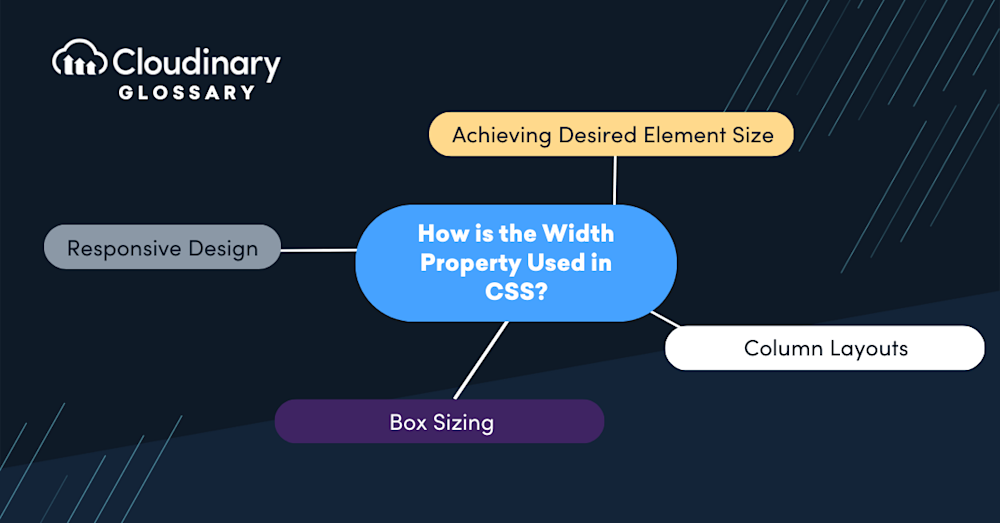
- Consistent layout – Setting fixed widths for elements, such as containers and images, helps maintain a clear and organized layout across different sections of your website.
- Responsive designs – Employing relative width values (e.g., percentages or viewport units) enables smoother resizing and adaptability across various devices and screen sizes.
- Grids and columns – Pairing the width property with elements like CSS Grid and Flexbox allows you to create flexible multi-column layouts that are easier to navigate and understand.
- Controlling text length – Applying width constraints to text elements can improve readability on your website by preventing excessively long lines or tightly condensed paragraphs.
- Visual hierarchy – Manipulating the width of elements helps to establish hierarchy and guide your user’s attention to key content on the page.
As you can see, the CSS Width property is a versatile and essential tool in web design, helping developers craft accessible and visually engaging user interfaces that cater to a range of devices and preferences.

Harness the Power of CSS Width Property with Cloudinary
Mastering the CSS Width property is an essential step towards creating web pages that are visually engaging, user-friendly, and responsive across an array of devices. This property, while simple at its core, unlocks a plethora of possibilities in defining the layout and structure of your web content.
By gaining a firm understanding of how to skillfully manipulate the width property in CSS, you not only elevate your designing prowess but also ensure web users can interact with your pages smoothly and efficiently.
However, the adventure doesn’t end here. If you want to leverage the power of the CSS Width property to its fullest extent and optimize your media content, consider incorporating an efficient and robust digital asset management system like Cloudinary.
With Cloudinary’s cloud-based solution, you can automate responsive design, manage and deliver all your visual media assets with ease, and free up valuable time to focus heavily on refining your understanding of CSS nuances.
So why wait? Kickstart your journey of mastering CSS and media management with Cloudinary today!