CSS transform is one of those foundational properties that shape how web pages feel. It controls movement, rotation, and scale without affecting the layout of elements around it. Buttons slide, icons spin, cards tilt, and images zoom thanks to this property.
The transform property works in two spaces: two-dimensional (2D) and three-dimensional (3D). Each space comes with its own set of functions, enabling everything from simple translations to depth and perspective effects.
This guide breaks down CSS transform from the ground up, explaining what it does, how each function behaves, and how to combine transforms without confusion.
Key takeaways:
- CSS3 transforms let you move, resize, rotate, or skew elements visually without changing the page layout. Because they don’t force the browser to recalculate positions of other elements, transforms are more efficient, work in 2D and 3D space, and are ideal for smooth animations and transitions.
- CSS transforms use functions like translate, scale, rotate, skew, and matrix to visually change elements without affecting layout. Translate is great for movement and animations, scale adjusts size for emphasis, rotate adds spinning effects, skew tilts elements for style, and matrix combines everything but is complex and usually avoided for readability.
- When combining CSS transform functions, the order matters because they are applied from right to left. Changing the order, such as rotating before translating versus translating before rotating, can create very different visual results.
In this article:
- What is the CSS Transform Property?
- CSS Transform Functions
- Order Matters: Combining Transforms
- Browser Support and Best Practices
- Skip Using CSS Transform with Cloudinary
What is the CSS Transform Property?
CSS3 introduced a new mechanism that made the visual manipulation of elements easier and more flexible. The transform property allows elements to be moved, resized, rotated, or skewed without affecting the entire layout.
When a transform is applied, the element still occupies its original space in the document flow, but its visual appearance changes. This behavior differs from properties like margin or width, which cause the browser to recalculate the layout and reposition surrounding elements.
Because transforms are handled by the browser’s rendering engine more efficiently than layout-based changes, they are especially well-suited for animations and transitions that need to feel smooth and responsive.
Transforms can operate in both two-dimensional (2D) and three-dimensional (3D) space. 2D transforms affect the X and Y axes, while 3D transforms introduce depth using the Z axis.
CSS Transform Functions
CSS transform works through functions. Each function describes a specific kind of change. You may choose to use a single function or combine several.
Translate
Translate moves an element from its original position. It doesn’t push other elements out of the way, making it useful when it comes to animations and hover effects.
You can move elements horizontally, vertically, or both. The translate function has various use cases, but it’s most commonly used for centering elements, sliding menus, or nudging icons into place. It performs better than adjusting top or left in many scenarios because it bypasses layout recalculations.
Scale
Scale changes the size of an element, allowing it to grow or shrink without affecting layout flow. This makes scale useful for hover effects, focus states, and subtle emphasis.
This happens from a transform origin point, which defaults to the center, but can be changed to control how the element grows or shrinks. Overusing scale can make interfaces feel jumpy, so small values usually work best.
Rotate
Rotate spins an element around a point, measured in degrees or turns. It’s commonly used for icons, loading indicators, and small visual cues.
This CSS transform method doesn’t affect layout, which makes it safe for animation. When combined with transitions, rotation feels smooth and predictable.
Skew
Skew tilts an element along the X or Y axis, creating an angled look rather than a rotation. Skew is less common in everyday UI, but you may find it in stylistic layouts or visual emphasis.
Because skew distorts the shape of elements, it should be used sparingly. Text inside skewed elements can become harder to read if the angle is too strong.
Matrix
Matrix combines all transform functions into a single declaration. It offers full control, but is difficult to read and maintain. Most developers avoid using the matrix function unless working with generated values or advanced graphics.
These transforms are powerful but fragile. Small changes are hard to reason about, and debugging becomes difficult. In most cases, using individual transform functions leads to cleaner code.
Order Matters: Combining Transforms
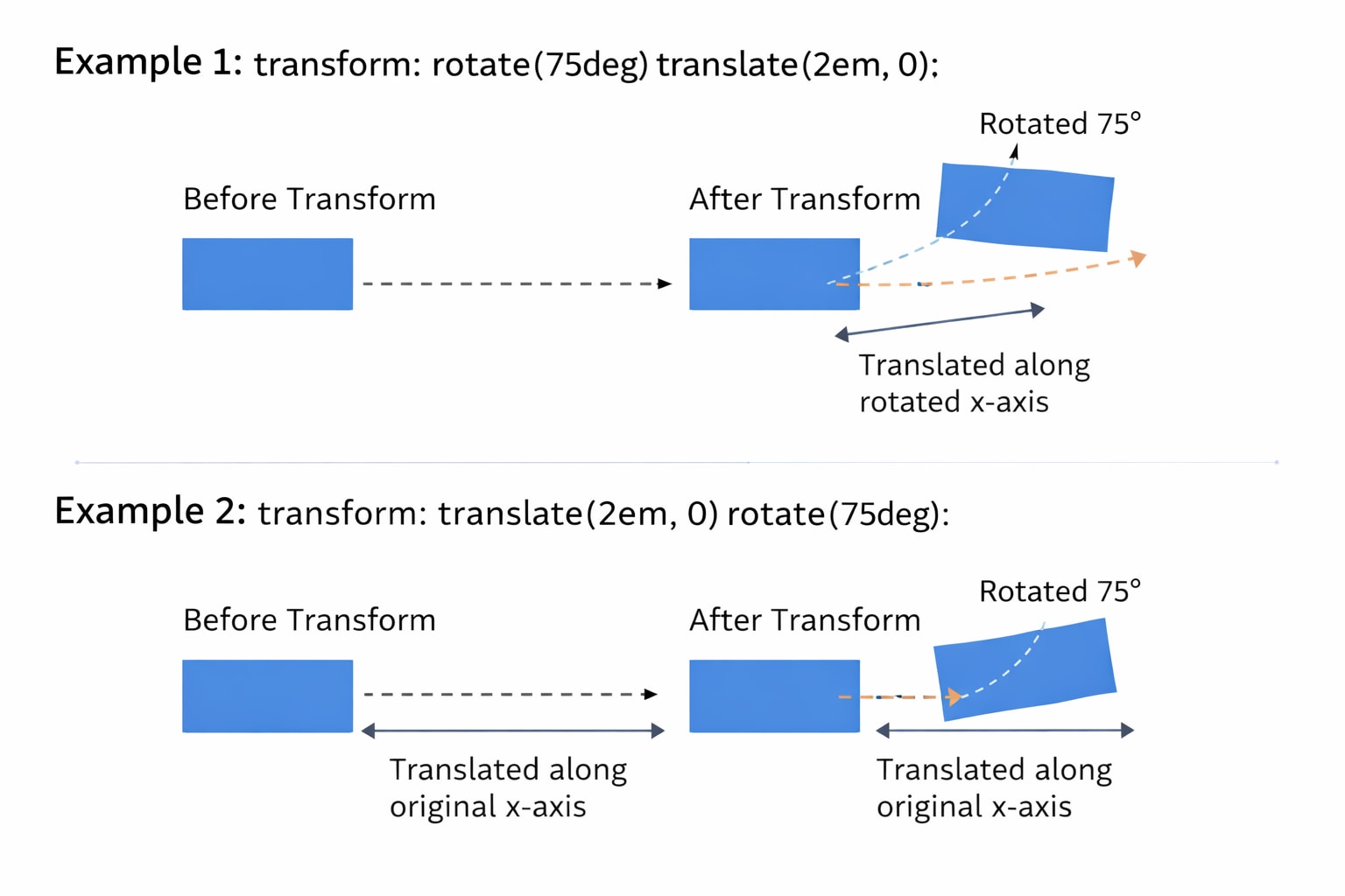
When you combine multiple CSS transform functions, the order matters. Transforms are applied from right to left. This means changing the order can significantly affect the result.
Firstly, rotating an element and then translating it produces a different visual result than translating first and then rotating. This behavior could take most new developers aback at first, but once they get the hang of it, it becomes light work.
For a better understanding, look at these examples:
In the first example:
- The element rotates first.
- After the rotation, the browser applies the translation.
- After the element rotates, the translation then moves along the newly rotated x-axis, rather than the original horizontal line of the page.
With this method, moving feels angled rather than straight.
Now, for the second example:
- The element moves first. The translation happens along the original x-axis of the document.
- After the element shifts position, it rotates in place at that new spot.
The movement stays horizontal, but the final orientation changes.
These two examples will produce visually different results, which is why it’s important to choose the right order and test accordingly. A good habit is to think in steps. Ask what should be moved first and what should change after. Keeping transforms readable and minimal helps avoid unexpected behavior and aids predictability.
Browser Support and Best Practices
CSS transform is well supported across modern browsers. Two-dimensional transforms are safe for almost all environments. Three-dimensional transforms are also widely supported but can behave differently depending on device and browser.
There are a few best practices worth following. Here are some you can find useful
- Use transform instead of layout properties for animations whenever possible.
- Keep transform values simple. Piling a lot of transforms on the same element can increase visual bugs.
- Test three-dimensional transforms on real devices, especially mobile.
- Keep accessibility in mind. Motion can cause discomfort for some users.
- Pair transforms with reduced motion preferences when appropriate.
Skip Using CSS Transform with Cloudinary
CSS transforms are useful for visual effects, but using them for image manipulation adds hidden overhead. When you rotate, scale, or skew an image with CSS, the browser still downloads the original file at full size. This increases page weight and shifts extra rendering work to the client, which can slow pages on image-heavy layouts.
For example, rotating an image with CSS still loads the original asset:
img {
  transform: rotate(15deg);
}
The browser applies the rotation after the full image has already been downloaded.
Cloudinary lets you apply the same types of transformations before delivery. Using a dynamic URL, you can rotate or skew the image on the server and send a smaller, optimized file to the browser:
https://res.cloudinary.com/demo/image/upload/a_15,c_scale,w_300,f_auto,q_auto/sample.jpg
This rotates the image, resizes it, and optimizes format and quality before it loads.
You can also apply more advanced transformations like skewing:
https://res.cloudinary.com/demo/image/upload/e_distort:0:0:300:20:300:300:20:280,f_auto,q_auto/sample.jpg
By moving visual transformations into Cloudinary URLs, you reduce client side processing, simplify CSS, and deliver images that are ready to display the moment they load.
Wrapping Up
CSS transform gives developers a powerful way to move and shape elements without disturbing layout. It works best when used with intention. Small movements, gentle scaling, and clear combinations create interfaces that feel polished rather than noisy.
Understanding how each transform function behaves makes it easier to choose the right tool. When combined with thoughtful media handling and accessibility awareness, transforms become a reliable part of modern CSS.
Transform and optimize your images and videos effortlessly with Cloudinary’s cloud-based solutions. Sign up for free today!
Frequently Asked Questions
What is CSS image transform used for?
CSS image transform is used to apply visual effects like scaling, rotating, translating (moving), or skewing images without altering their actual dimensions or layout in the document. These transformations are applied using the transform property.
How do you rotate or flip an image using CSS?
You can rotate an image with transform: rotate(90deg); and flip it using transform: scaleX(-1); for horizontal or scaleY(-1); for vertical flips. These effects can be combined for more complex image manipulation.
Can you animate image transforms with CSS?
Yes, you can animate image transforms by pairing them with the transition property. For example, using transition: transform 0.5s; allows smooth changes when a transform is applied, such as scaling or rotating on hover.

