In web development, images are essential for different use cases such as visual communication, user engagement, and branding. Today, there are several reasons why you may need to center an image in HTML. It could be to create visual balance, emphasize it as a focal point, or ensure a professional, consistent look in your webpages, especially for responsive designs across different screen sizes. In the past, there’s a popular joke in web development about how notoriously difficult centering a div or an image can be. But in recent years, modern CSS techniques like Flexbox and Grid have made centering an image straightforward and intuitive.
In this article, we’ll explore five methods to center an image, drawing from both basic HTML and more modern CSS techniques. We’ll break everything down step by step, with clear examples to help you apply these ideas right away. By the end, you’ll have a solid understanding of when and how to use each approach, plus some tips on optimizing your images for better performance.
In this article:
- HTML or CSS for Centering Images?
- Method 1: Using text-align: center
- Method 2: Using margin: auto
- Method 3: Using Flexbox
- Method 4: Using CSS Grid
- Method 5: Using Cloudinary
HTML or CSS for Centering Images?
Before diving into the methods, it’s worth taking a moment to clarify the roles of HTML and CSS in centering images. In the past before CSS became popular, web developers used hacky methods like HTML tables and the deprecated <center> tag or the align="center" attribute to center images.
Ideally, HTML is used to create the structure of web pages–it’s like the skeleton of your page that defines elements like paragraphs, headings, and images. CSS, on the other hand, is used to control the presentation and layout: colors, spacing, alignment, positioning, and responsiveness.
So, while HTML adds the image to the page, CSS is what should be used to center it. Modern, accessible websites rely on CSS-based approaches because they’re cleaner, more flexible, and work better across different devices and screen sizes.
Method 1: Using text-align: center
One of the easiest ways to center an image is by treating it like text and using the text-align property on its parent container. This works because images are inline elements by default in HTML, meaning they flow with the text around them. By applying text-align: center to a wrapping element, like a div or a paragraph, we can shift the image into the middle of its parent container.
In addition, this method is direct and less complicated for beginners because it doesn’t require changing the image’s display type or adding extra margins. However, it only centers the image horizontally, not vertically, which would require additional tweaks, like using flexbox, which we’ll cover later.
<!DOCTYPE html>
<html lang="en">
  <head>
    <meta charset="UTF-8" />
    <meta name="viewport" content="width=device-width, initial-scale=1.0" />
    <title>Centering Images</title>
    <style>
      .container {
        text-align: center;
      }
    </style>
  </head>
  <body>
    <div class="container">
      <img
        src="https://images.unsplash.com/photo-1743823132644-e818cf17f244?q=80&w=800&auto=format&fit=crop"
        alt="Cars driving along a scenic road near a canyon"
      />
    </div>
  </body>
</html>
This gives us the following output.
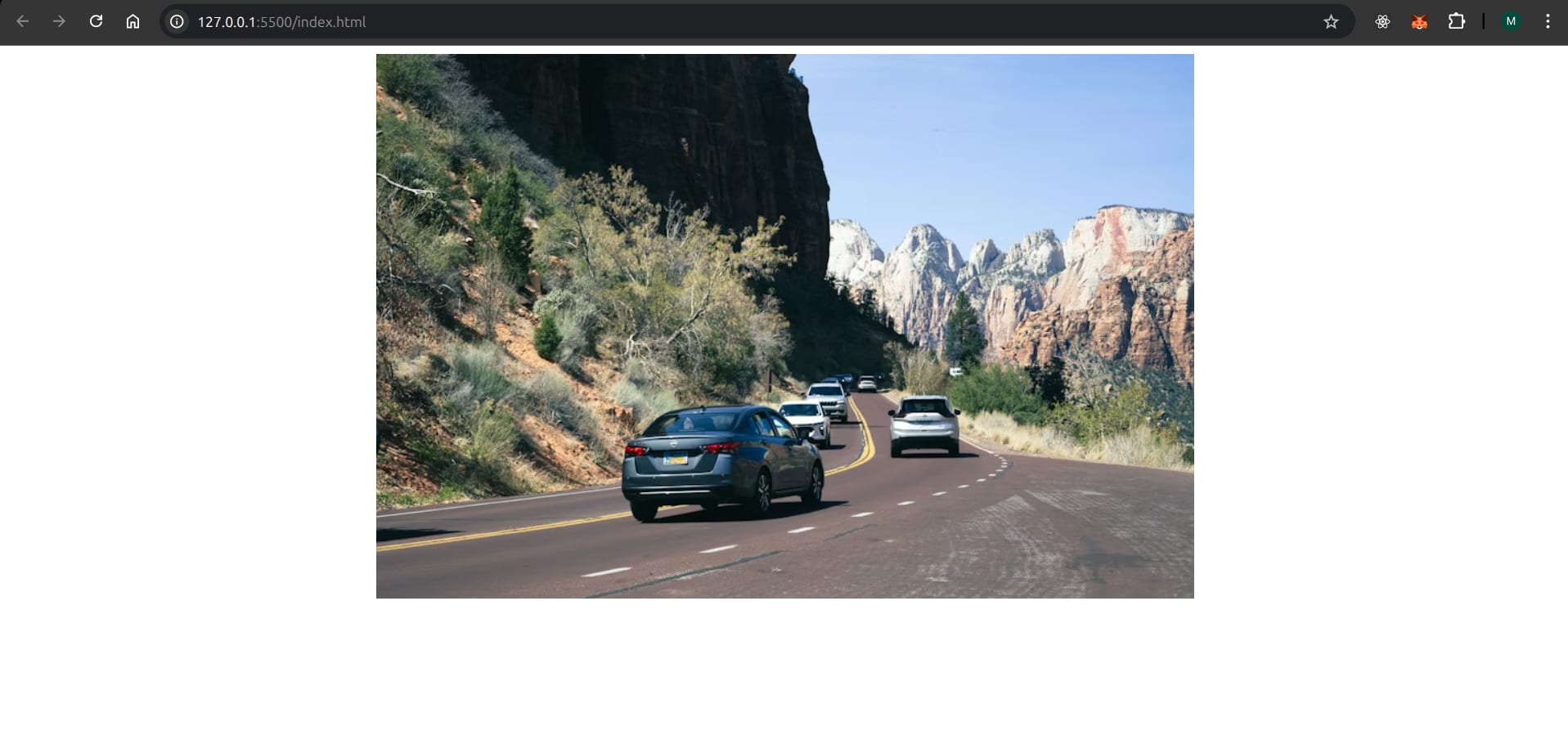
As you can see, centering an image with text-align: center is pretty straightforward, especially if you’re working with a simple layout.
Method 2: Using margin: auto
This technique involves setting the image to behave like a block-level element and then using automatic margins to center it. By default, images are inline, so we’ll first need to change that with display: block. Then, applying margin: auto tells the browser to evenly distribute the leftover space on the left and right sides, pushing the image to the center.
This approach is versatile and works well for images that need to stand alone, like a hero image on a landing page. Although it only helps us achieve horizontal centering, we can still combine it with other properties for vertical alignment if needed. One advantage of it is that it respects the image’s natural width, so if the image is smaller than its container, it won’t stretch awkwardly.
<!DOCTYPE html>
<html lang="en">
  <head>
    <meta charset="UTF-8" />
    <meta name="viewport" content="width=device-width, initial-scale=1.0" />
    <title>Centering Images</title>
    <style>
      .centered-image {
        display: block;
        margin: auto;
      }
    </style>
  </head>
  <body>
    <div class="container">
      <img
        class="centered-image"
        src="https://images.unsplash.com/photo-1743823132644-e818cf17f244?q=80&w=800&auto=format&fit=crop"
        alt="Cars driving along a scenic road near a canyon"
      />
    </div>
  </body>
</html>
Even if we wrap the image in a div with a specific width, like width: 100%; max-width: 600px;, the image will center within that bounded area, making this method handy in responsive designs because margin: auto adapts as the screen size changes.
Method 3: Using Flexbox
Flexbox is a modern CSS technique designed for one-dimensional layouts, making it perfect for centering items with minimal code. In this method, we set a container to display: flex and using justify-content: center, we can center the image horizontally. For vertical centering, we’d add align-items: center and give the container a height.
This method is also efficient for responsive designs because flexbox automatically adjusts to different screen sizes. It’s especially useful when you have multiple elements to align, like an image alongside text, but it works just as well for a single image.
For example, let’s say we’re creating a profile card with a centered avatar, our code could look something like this:
<!DOCTYPE html>
<html lang="en">
  <head>
    <meta charset="UTF-8" />
    <meta name="viewport" content="width=device-width, initial-scale=1.0" />
    <title>Centering Images</title>
    <style>
      .flex-container {
        display: flex;
        justify-content: center;
        align-items: center;
        height: 400px;
        max-width: 400px;
        border: 2px solid #000;
      }
      .avatar {
        width: 250px;
        height: 250px;
        border-radius: 50%;
      }
    </style>
  </head>
  <body>
    <div class="flex-container">
      <img class="avatar" src="avatar.png" alt="User avatar" />
    </div>
  </body>
</html>
In this example, you can see the image is centered both horizontally and vertically as shown in the following screenshot:

Method 4: Using CSS Grid
CSS Grid is another modern CSS technique that simplifies centering by allowing two-dimensional layouts, where we can position items in rows and columns. For a single image, we set the container to display: grid and use place-items: center to align it both horizontally and vertically in one go.
Grid is best used when your design involves multiple items, but for single images, it’s overkill unless you’re already using grid elsewhere. Still, its simplicity makes it worth knowing.
Using the example from the previous section, we can modify the HTML code as follows:
<div class="grid-container">
      <img class="avatar" src="avatar.png" alt="User avatar" />
</div>
And update the corresponding CSS:
.grid-container {
        display: grid;
        place-items: center;
        height: 400px;
        max-width: 400px;
        border: 2px solid #000;
}
You’ll notice that the image sits in the center of the container like before. Now if you need to add more elements later, CSS grid lets you expand without rewriting everything.
Method 5: Using Cloudinary
If you’re dealing with a lot of images on your site, especially user–generated content, you’d need a reliable way to ensure the images are placed where they need to be. Cloudinary helps you manage, optimize, and transform your images before they even reach your website. You can use Cloudinary’s powerful URL-based transformations to automatically resize, crop, and format images.
For instance, you can generate a perfectly square thumbnail from a larger image and then center it using one of the CSS methods. This separates the concern of image preparation from the concern of page layout.
<div style="text-align: center;">
  <img src="https://res.cloudinary.com/demo/image/upload/c_fill,g_auto,h_200,w_200/sample.jpg" alt="Optimized sample">
</div>
Here, Cloudinary handles the image using transformation parameters (c_fill,h_200,w_200 creates a 200×200 cropped image), and the simple text-align: center on the div handles the positioning.
Wrapping Up
Regardless of your experience, centering images in web pages doesn’t have to be complicated. And as we’ve shown in this article, centering an image in HTML and CSS can be achieved in several understandable ways. You can start with simpler methods like text-align and margin: auto, then transition to using modern approaches such as Flexbox and CSS Grid, depending on your use cases.
Use services like Cloudinary to handle the heavy lifting of image optimization and responsiveness if you’re working with a large number of images and user-generated content. Transform and optimize your images and videos effortlessly with Cloudinary’s cloud-based solutions. Sign up for free today!
Frequently Asked Questions
How can I center multiple images in a single row?
The easiest way is to put all the images inside a parent container and use Flexbox or CSS Grid. With Flexbox, you can set display: flex and justify-content: center on the container, and the images will line up in a single row and stay centered.
Can I center an image without any container div?
Yes. You can center an image by making it a block element and using margin: 0 auto, or by applying Flexbox or Grid directly to the body element.
Can I center an image without using CSS?
Not really in modern web development. There are older HTML-only methods like the <center> tag or alignment attributes, but they’re deprecated and shouldn’t be used on new projects. The clean and reliable way today is to use CSS.

