CSS offers various customization effects, and one that comes in handy is creating a transparent background. Transparent backgrounds are laid over images, sticky headers, modal overlays, buttons, dropdown menus, and even full-page layouts.
But, using CSS for transparent backgrounds can be tricky. When done right, transparency adds depth and polish. When done wrong, text becomes unreadable and layouts break across devices.
This guide explains transparent backgrounds in clear language. It also answers questions like when to use opacity, the best way to add transparency, and how to identify common mistakes that hurt usability and accessibility—taking into account modern browsers and current CSS standards.
Key takeaways:
- A transparent background lets underlying elements show through, and most HTML elements are transparent by default unless a background is set. CSS provides different ways to control transparency, with some methods affecting only the background and others affecting the entire element, including its content.
- The opacity property makes an entire element and its contents see-through, which can cause text and icons to fade. Using a semi-transparent background instead affects only the background color, keeping text clear and readable, which is better for overlays and content cards.
- CSS offers several ways to add transparency, including RGBA, HSLA, hex alpha colors, transparent gradients, and image alpha channels. These methods let designers control how much of the background shows through while keeping text readable, making them ideal for overlays, gradients, icons, and images.
In this article:
- What is a Transparent Background?
- Opacity Versus Background Transparency: When to Use Each
- Ways to Add Transparency in CSS
- Optimizing and Adding Transparency with Cloudinary
- Contrast, Accessibility, and Common Mistakes
What is a Transparent Background?
A transparent background is a visual element that allows you to see other elements beneath it.
The default format of HTML elements is transparent backgrounds. A div with no background color is transparent; the body element is transparent until you set a background on it.
Transparency in CSS is controlled in a few different ways. Some methods affect only the background. Others affect the entire element, including text, icons, and child elements.
Opacity Versus Background Transparency: When to Use Each
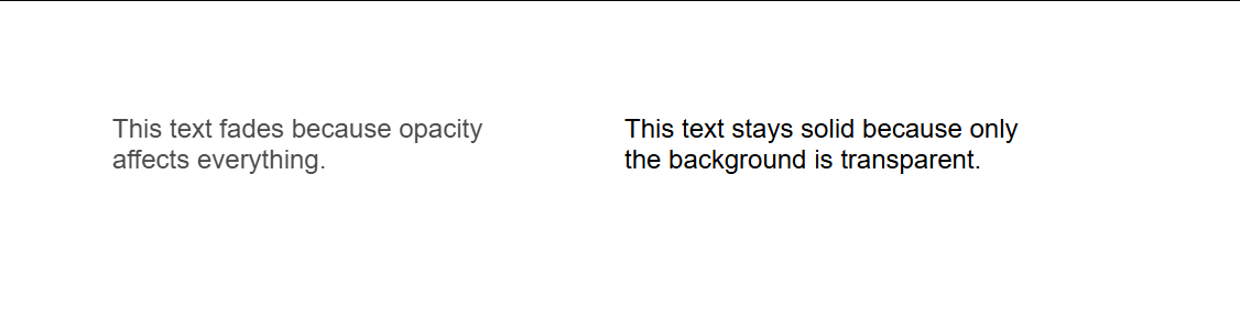
Opacity is usually the first property people try. It’s simple and works right away—but it has side effects. When you apply opacity to an element, everything inside it becomes less visible.
You can reduce opacity when you want to visually disable something, like a button or card. It’s not an ideal option when you only want the background to be see-through.
Background transparency works differently. You don’t fade the whole element with background transparency; it applies only to the background color, so the text stays sharp and readable. This is usually what you want for overlays, navigation bars, and content cards.
Imagine a white card on top of a photo. If you apply opacity, the text inside the card also fades and becomes harder to read. If you use a semi-transparent background color, the photo shows through slightly, but the text stays solid.
<div style="
  background: url('https://via.placeholder.com/800x400') center/cover;
  padding: 40px;
  display: flex;
  gap: 20px;
  font-family: sans-serif;
">
  <!-- Opacity example -->
  <div style="
    background: white;
    opacity: 0.7;
    padding: 20px;
    width: 250px;
  ">
    <p style="margin: 0;">
      This text fades because opacity affects everything.
    </p>
  </div>
  <!-- Background transparency example -->
  <div style="
    background: rgba(255, 255, 255, 0.7);
    padding: 20px;
    width: 250px;
  ">
    <p style="margin: 0;">
      This text stays solid because only the background is transparent.
    </p>
  </div>
</div>
Difference between applying opacity vs background transparency to an element
Rule of thumb: Use opacity when the entire element should fade. Use background transparency when only the background should soften.
Ways to Add Transparency in CSS
There are different ways to add transparency in a design, and choosing the right one depends on your use case and how the browser needs to interact with it.
Using RGBA, HSLA, and Hex Alpha Colors
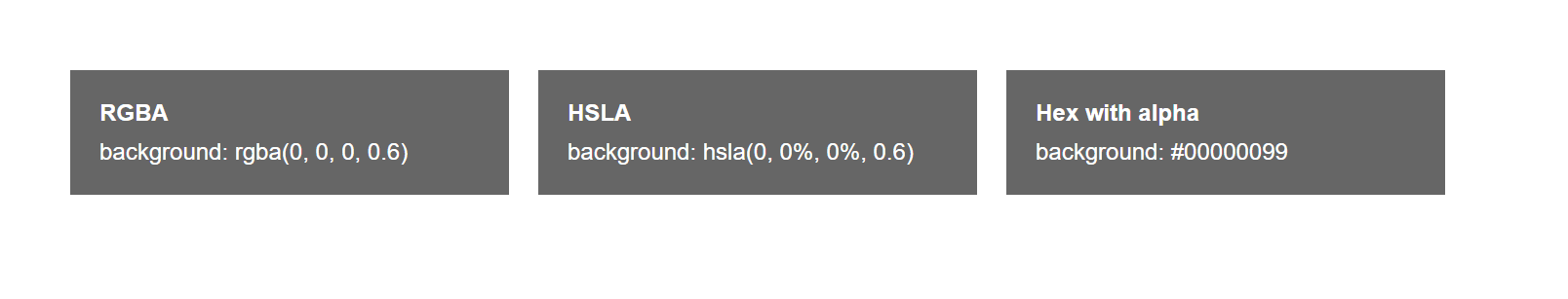
The most common and effective method is using color values that include an alpha channel. The alpha channel controls transparency.
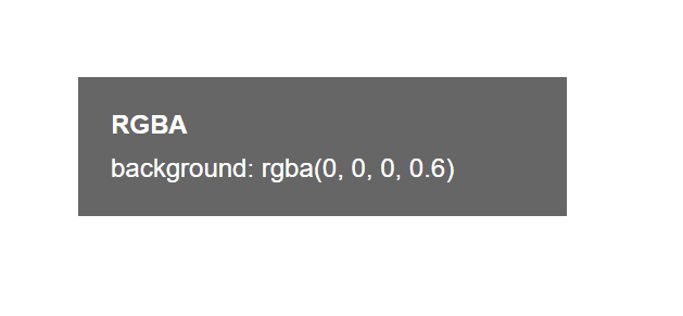
RGBA images use red, green, blue, and alpha color channels. Alpha controls the level of transparency for the image, with a value of one as fully opaque and zero being fully transparent.
For example, a black background with slight transparency might look like background color rgba 0,0,0,0.6. This creates a dark overlay without impacting readability.
HSLA works the same way but uses hue, saturation, lightness, and alpha. Designers often prefer HSLA because it makes it easier to tweak brightness and tone without recalculating color values. Alternatively, you can use hex codes to include transparency, as the last two digits of an eight-character hex code are for alpha channels.
Use RGBA or HSLA when you want clarity and easy adjustment. Use hex alpha if you want shorter code and consistent theme variables.
RGBA, HSLA, and Hex background transparency property side-by-side
Transparent Gradients and Images
Gradients can also include transparency, which makes them useful for overlays that fade smoothly instead of ending with a hard edge. A common pattern uses a gradient that transitions from transparent to semi transparent and then to black. This approach helps text stand out on top of images without fully covering the visual underneath, creating contrast while keeping the background visible and visually appealing.
Alpha transparency plays a similar role for image assets. Formats like PNG and WebP support transparent areas, which allows logos, icons, and decorative elements to blend naturally into different backgrounds. Modern CSS adds another option with background blend modes, which control how backgrounds interact with underlying images.
<div style="
  background:
    linear-gradient(
      to bottom,
      rgba(0,0,0,0),
      rgba(0,0,0,0.5),
      rgba(0,0,0,0.8)
    ),
    url('https://via.placeholder.com/800x300') center/cover;
  color: white;
  padding: 40px;
  font-family: sans-serif;
">
  <h2>Readable text on an image</h2>
  <p>The gradient fades in instead of stopping abruptly.</p>
</div>
Optimizing and Adding Transparency with Cloudinary
CSS transparency is useful for overlays, fades, and layered effects, but it can introduce hidden overhead.
When you rely on CSS opacity or gradients on top of large images, the browser still downloads the original asset at full size. The transparency effect is applied after the fact, which increases rendering work on the client and can slow pages on image-heavy layouts. This becomes more noticeable on mobile devices and lower-powered hardware.
For example, a transparent overlay applied with CSS does not reduce image weight:
.hero::after {
  background: rgba(0, 0, 0, 0.4);
}
The image underneath still loads at its original size and quality.
Cloudinary solves this by baking transparency directly into the image before delivery. Using dynamic URLs, you can add alpha channels, overlays, and gradients on the server and send a lighter, ready to display asset to the browser. For instance, you can apply a semi transparent overlay and optimize the image in one request:
https://res.cloudinary.com/demo/image/upload/e_colorize:40,co_black,f_auto,q_auto/sample.jpg
You can also layer transparent images such as logos or gradients using overlays:
https://res.cloudinary.com/demo/image/upload/l_logo,o_60,f_auto,q_auto/sample.jpg
Cloudinary supports formats like PNG and WebP with full alpha transparency, so icons and UI elements blend naturally into any background. By handling transparency at delivery time, you reduce file size, simplify CSS, and improve performance. The result is cleaner code, faster loads, and consistent visuals across devices without extra client side work.
Contrast, Accessibility, and Common Mistakes
Transparency can hurt readability if contrast is ignored. This is where many designs fail.
- Text placed on transparent backgrounds must meet contrast standards. Light text on a semi-transparent light background will disappear on bright images. Dark text on dark overlays can sink into the background.
- A safe approach is to test your design against worst-case backgrounds. If your overlay sits on images, assume those images will sometimes be bright, busy, or high contrast.
- Add enough opacity to maintain text clarity. Sometimes that means sacrificing aesthetics for usability.
- Avoid stacking transparent elements. Multiple layers of transparency combine and can create unexpected colors. This makes debugging harder and layouts unpredictable.
- Avoid using opacity on parent containers that hold interactive elements. This can affect click behavior and focus styles in some browsers.
- Don’t rely on transparency alone to communicate meaning. Disabled states, warnings, and errors should use more than faded visuals. Color, icons, and text cues matter.
Wrapping Up
Transparent backgrounds can come in handy for developers. With the right touch, they play an important aspect of the user interface; they shape how users read, scan, and interact with your page.
Distinguishing when to use opacity and background transparency all comes down to one question: Do I need my text and icons sharp? Focus on background transparency for clarity and reduce opacity when clarity is not the main concern of the element.
For readability and maintainability, you have to choose between RGBA, HSLA, or hex alpha. Remember to always make use of other tools reasonably. Also, make sure to test how your page displays on devices before shipping.
Transform and optimize your images and videos effortlessly with Cloudinary’s cloud-based solutions. Sign up for free today!
Frequently Asked Questions
How do you make a background transparent in CSS?
To make a background transparent in CSS, use background-color: transparent; or set an RGBA value with the alpha channel set to zero, like background-color: rgba(0, 0, 0, 0);. This allows underlying content or backgrounds to show through the element.
Can I set partial transparency on a background with CSS?
Yes, use RGBA or HSLA color values to set partial transparency, such as background-color: rgba(255, 255, 255, 0.5); for 50% white. This creates a semi-transparent background while keeping the content fully visible.
What’s the difference between opacity and transparent background in CSS?
Using opacity affects the entire element, including its content, making both the background and text semi-transparent. In contrast, background-color: transparent only affects the background, leaving the text or other content fully visible.

