Image effects play the role of capturing and retaining user interest. They are adjustments that can dictate the mood of a website, highlight key elements, and guide the user’s eye through the interface journey. They’re the subtle cues that signal what’s interactive, secondary, and imperative. From opacity to sepia, each effect holds the potential to turn a simple image into a communicative piece of art.
The need for dynamic and responsive image manipulation tools grows as technology progresses. In this guide, we will teach you techniques to set your website apart, engaging users with imagery.
In this article:
What Are Image Effects?
Image effects are modifications applied to images, altering how they’re rendered and perceived. These effects range from simple color adjustments to complex overlays that mimic artistic styles. They aren’t just about aesthetics, though. For developers, image effects can be a functional element that guides user interaction and enhances usability. By integrating image effects into your website, you’re essentially leveraging a more sophisticated form of visual communication.
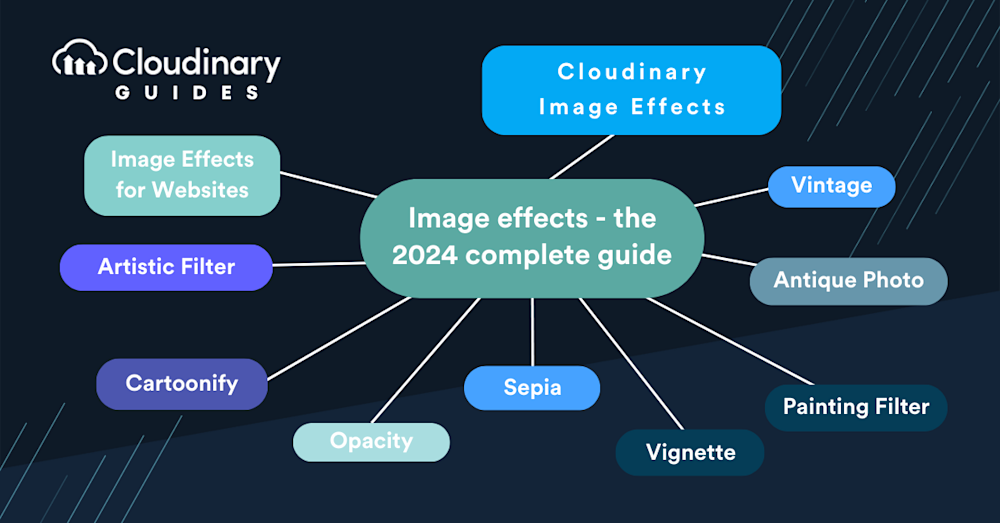
Image Effects for Websites
Your users expect a more than functional website–it should be visually engaging, too. Implementing image effects can make your site look more intuitive, content more engaging, and brands more memorable.
But it’s not just about throwing random effects onto a webpage. You need to consider the load times, browser compatibility, and overall impact on the user experience. The key is strategic application. A button that changes opacity on hover can guide users to click; a faded vintage look might evoke nostalgia. Use image effects wisely, and your website can become a functional, visually impressive art piece.
Artistic Filter
Ever wanted your website to showcase images that scream ‘art gallery’? The artistic filter can transform your ordinary photos into pieces of digital art. By applying an artistic filter, you can make your images look like watercolors, sketches, or impressionistic paintings. It’s a powerful way to add a layer of sophistication and uniqueness to your visuals.
These filters reimagine the pixels of your image, blending them to resemble strokes and textures of traditional art mediums. It’s about crafting visuals that communicate not just information but emotion and brand personality.
Cartoonify
Turning your images into cartoon graphics is an excellent choice to make them stand out. It’s like hitting a switch that can automatically make an image a cartoon.
The cool thing about cartoonifying is how flexible it is. It can make an interface more engaging or add a distinctive look to your site that grabs attention. When you cartoonify an image, you simplify the colors, bold the outlines, and give a little shout-out to the classic era of animation by hand.
Opacity
Opacity is a simple effect that plays a significant role in user interface design and interaction. Adjusting an image’s opacity allows you to control how much of the background seeps through, softening its impact and guiding the user’s eye.
In web design, manipulating the opacity of images can help you prioritize content, create a sense of hierarchy, and even direct user navigation. It’s like the difference between a shout and a whisper; each has its time and place on your webpage.
Imagine a call-to-action that becomes more pronounced as a user scrolls or a background that dims to draw attention to a modal window. Opacity can make these transitions smooth and visually engaging. It’s just a few lines of code, but for user experience, it can make a huge impact. When used with a keen eye for design, varying degrees of transparency can create a user interface that feels intuitive and alive.
Sepia
It’s a warm, brownish tone that gives images an antique feel. But it’s not just for nostalgia; it’s a smart way to unify the color palette of a website, reduce visual strain, and focus on content. Adding the sepia effect can define your design, providing a uniform backdrop against which other design elements can stand out. It’s an effect that’s easy on the eyes and can give your site a distinctive character or thematic consistency.
From a technical standpoint, implementing sepia is straightforward, but the challenge lies in knowing where and how much to apply it. Overusing might make your website feel dated, while a subtle touch can warm up a space and invite users in.
Vignette
This effect is like a spotlight in a dark theater; it naturally draws the eyes towards the center of the image. Vignetting can add depth and focus to photographs, guiding users’ attention to the most crucial part of the image. It’s particularly effective in hero images or feature banners where you want to create a focal point without using overt visual cues like arrows or borders.
The beauty of a vignette lies in its gradient—how it softly fades out towards the edges. It’s a tasteful touch that can improve the aesthetics of a website without distracting from the content. Whether for a photography portfolio or a product showcase, a well-placed vignette effect can add a layer of sophistication to your visuals.
Painting Filter
It’s an effect that can turn your visuals into brush-stroked masterpieces. Whether you’re going for the textured feel of an oil painting or the delicate touch of a watercolor, this filter can infuse your images with a handcrafted look.
Applying a painting filter requires a deft hand because you’re not just changing a picture but transforming its narrative. It’s not just about looking different; it’s about evoking emotion, perhaps a sense of craftsmanship, or invoking the human touch.
Antique Photo
This effect gives your images a brownish tint and some texture, making a new photo seem old and full of history, often stirring up feelings and memories. But you’ve got to be careful not to go overboard—too much texture or brown tint, and it looks fake. If you use it just right, this antique effect can make your website’s pictures look classic, like they’ve been around for a long time, making people see your site as dependable and established.
Vintage
A well-done vintage effect gives the picture some personality, like it’s got a history or comes from a different time. It’s about setting a mood that makes a brand-new photo seem like it was snapped on an old film camera years back. If you use vintage effects correctly, they can tie your brand’s look together, especially if you’re going for a throwback or classic feel.
Other Effects
Beyond these, there are a lot of other image effects at your disposal, each with its unique charm and function. A blur can convey movement or focus attention, while a sharpening filter can highlight details and make an image pop. Overlaying textures can add depth and tactile quality to flat graphics, and gradients can fill images with vibrancy or a sense of light.
The trick with these tools is to use them with purpose. Don’t just add an effect because you can; add it because it enhances the message or the user’s journey on your website. It’s about finding that balance between form and function, ensuring that every visual element serves a greater goal.
How to Apply Image Effects with Cloudinary
Using Cloudinary, you can easily add image effects like sepia, vintage, and more, all within one easy-to-use platform. When you use their tools, you’re not just tweaking how images look; you’re also making sure they load fast, appear clear on different screens, and don’t slow down your website.
For example, if you’re wondering how to apply image effects that you’d see on social media or in photography, it only takes a single line of code. Let’s take this picture of a house:
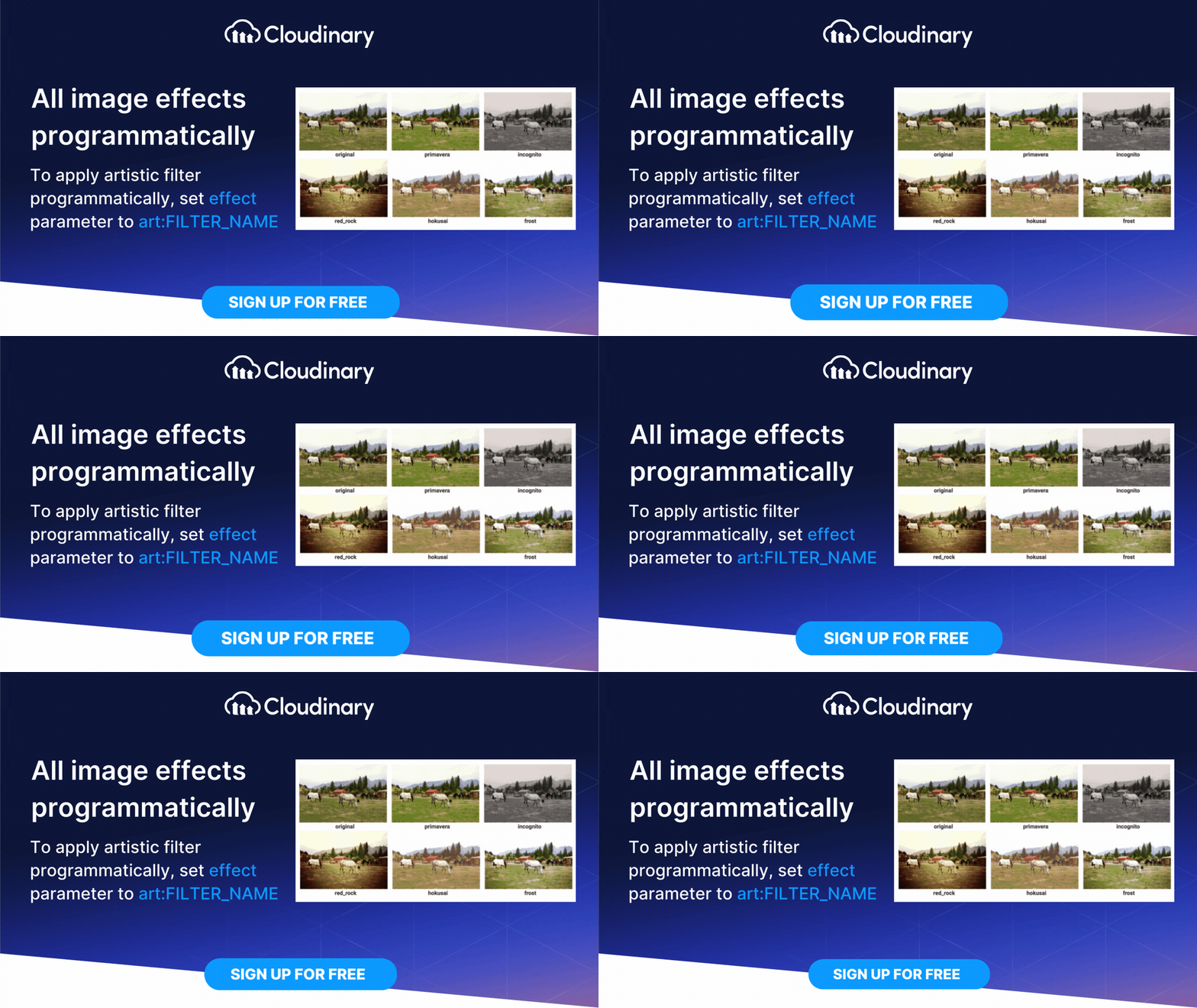
We can modify this image just by changing a single line of code. If we want to apply a greyscale image effect, we can simply add {effect: "art:audrey"} (with Audrey being the name of the filter), and we get this:
It doesn’t stop there, either. With Cloudinary, applying image effects of any kind can be just as easy. Whether you want to add sepia tones, vignette effects, or even more complex effects. For example, if you were curious about how to apply image effects to pixeleate faces, Cloudinary can do it automatically.
Final Thoughts
Image effects are not just filters and adjustments you apply to your photos; they’re a language. They communicate tone, context, and emotion. They can convey brand identity and improve user engagement. As a developer, your role is more than just building a site; it’s crafting an experience. And with tools like Cloudinary at your disposal, you’re equipped to do just that.
When selecting an image effect, consider the mood you want to evoke, the story you’re trying to tell, and how the image complements your overall design. Remember, the best effects are those that enhance, not distract. And always keep in mind performance and user experience—because the most beautiful image won’t matter if it doesn’t load.
Whether you’re going for an artistic brush-stroked flair with a painting filter, seeking to invoke nostalgia with a sepia touch, aiming for the dramatic with a vignette, or going retro with vintage, use these tools to create a seamless, engaging, and visually compelling user journey. Happy designing!


