Adding text over an image is a common practice in modern web design. It allows you to combine visuals and messaging in a way that feels cohesive, engaging, and easy to scan, without cluttering the page with too many separate elements. When done well, text overlays help draw attention to key information while letting the background image set the mood and context.
In this guide, you’ll learn how to use different CSS techniques to place text on top of images reliably and responsively. We’ll cover positioning with relative and absolute, layering with z-index, and modern layout approaches like Flexbox and Grid. You’ll also learn how to improve readability using contrast, overlays, and gradients, and how to ensure your text overlays remain accessible and responsive across different screen sizes.
In this article:
- Quickstart On Overlaying Text On an Image with CSS
- Positioning Text Using Relative, Absolute, and Z-index
- Making Text Overlays Responsive using Flexbox, Grid, and Aspect-Ratio
- Accessibility and SEO
- Streamline Text Overlays With Cloudinary
Quickstart On Overlaying Text On an Image with CSS
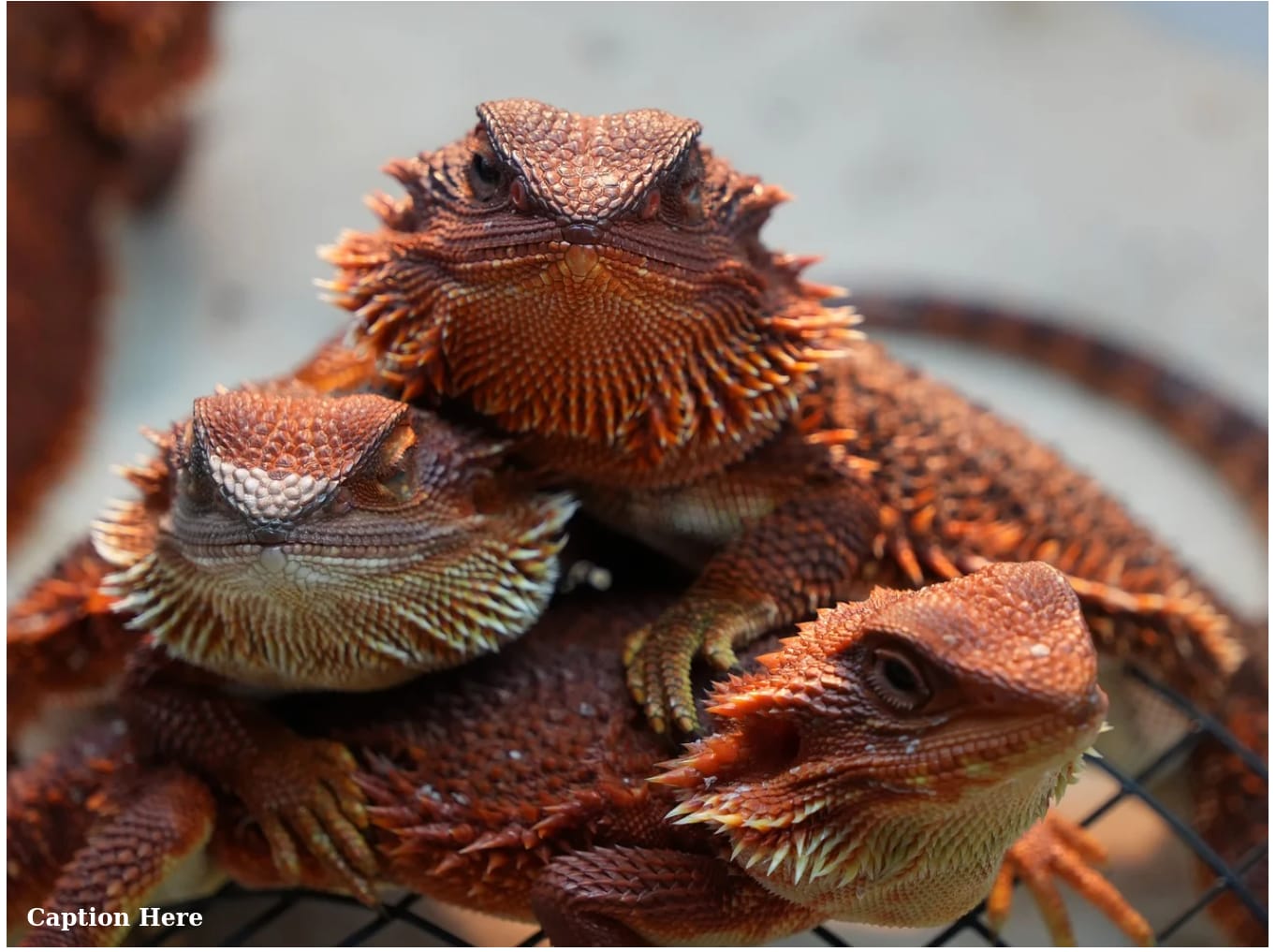
Getting started with overlaying text on images using CSS is straightforward. The core concept is to create a basic HTML structure where an image and text are nested within a common container, then we make the container a positioning context and position the text element on top of the image:
<!DOCTYPE html>
<html lang="en">
<head>
   <meta charset="UTF-8">
   <meta name="viewport" content="width=device-width, initial-scale=1.0">
   <title>Text Overlay With CSS</title>
   <link rel="stylesheet" href="index.css">
</head>
<body>
   <div class="image-container">
 <img src="https://cdn.pixabay.com/photo/2025/09/08/04/00/bearded-dragon-9821324_1280.jpg" alt="A descriptive alt text">
 <div class="image-text">Caption Here</div>
</div>
</body>
</html>
With the HTML in place, we can now apply a small amount of CSS to achieve the overlay effect:
.image-container {
  position: relative;
  display: inline-block;
}

.image-text {
  position: absolute;
  bottom: 20px;
  left: 20px;
  color: white;
  font-size: 1.5rem;
  font-weight: bold;
}
This is what the output looks like so far:
Positioning Text Using Relative, Absolute, and Z-index
When implementing text overlays, positioning is important to ensure the text is displayed correctly on the image container. This is achieved by applying position: relative to the container element that wraps both the image and the text, which defines the container as the reference point, or “origin,” for any child elements that are absolutely positioned.
Next, we add position: absolute to the text element itself. This takes the text completely out of the normal document flow, allowing it to sit on top of other elements like the image. We then use the offset properties: top, right, bottom, and left, to anchor the text to specific points within its relative container. For instance, bottom: 0 and left: 0 would pin the text to the bottom-left corner.
To ensure the text layer always sits above the image, the z-index property helps us to control the stacking order of positioned elements. An element with a higher z-index value appears in front of an element with a lower one. Since we want the text to be visible, giving it a positive z-index, like z-index: 10, is a good practice, especially if we need to add background effects to the text later.
Making Text Overlays Responsive using Flexbox, Grid, and Aspect-Ratio
CSS layout tools like Flexbox and CSS Grid can simplify the centering and alignment of text, even within an absolute positioning context. While the text itself is absolutely positioned, we can use Flexbox on the text element to center its content. For example, setting display: flex, justify-content: center, and align-items: center on the .image-text box will center the text horizontally and vertically within its own boundaries, which is especially useful if the text has a background or padding.
For more complex overlay layouts with multiple text elements, we could set the container to display: grid and place both the image and text elements into the same grid cell. This allows for better alignment control without always relying on absolute positioning offsets, though absolute positioning remains the simpler choice for single text blocks.
Maintaining consistent image proportions across devices is another important consideration to responsive overlays. For instance, applying aspect-ratio: 16 / 9 to the .image-container ensures it maintains a widescreen shape regardless of width, preventing awkward jumps in height that can displace the positioned text. Then we’d set the image to width: 100%; height: 100%; object-fit: cover; to fill the container.
Also, you can use media queries to handle different screen sizes, which might involve adjusting the font size, padding, or even the position of the text. For a hero section, you might use a large font-size: 3rem on desktop but scale it down to 1.75rem on mobile or shift text from the bottom on desktop to the center on mobile for a better visual balance, and so on.
Accessibility and SEO
When overlaying text with images, accessibility and SEO are important to ensure you create inclusive websites that perform well in search engines, as it ensures that all users, including those with disabilities, can interact with your content while also telling search algorithms that your site is well-structured and valuable.
The first step in developing accessible websites is to use semantic HTML elements. This means wrapping the overlay text in headings like h1 or h2 if it’s a title, or paragraphs for descriptive content, rather than generic divs. It’s also important to provide meaningful alt text for images, where you describe the image’s content and purpose in the alt attribute to aid both accessibility and SEO by giving search engines more context.
One of the most common accessibility issues when overlaying text on images is poor color contrast, which can make content difficult or impossible to read. Luckily, there are techniques you can use to improve text readability and ensure overlays remain accessible. Some of the most effective approaches are outlined below.
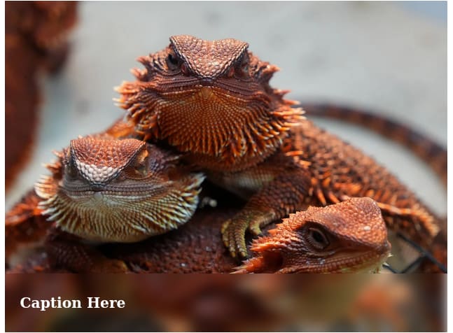
Blurring
This involves using the backdrop-filter: blur() CSS declaration to add a blur effect to the portion of the image where the text is placed on so it’s readable and well-defined. Let’s look at an example.
Using our previous HTML:
  <div class="image-container">
 <img src="https://cdn.pixabay.com/photo/2025/09/08/04/00/bearded-dragon-9821324_1280.jpg" alt="A descriptive alt text">
 <div class="image-text">Caption Here</div>
</div>
And the following CSS:
.image-container {
  position: relative;
  width: 100%;
  max-width: 600px;
  overflow: hidden;
}

.image-container img {
  width: 100%;
  display: block;
}

.image-text {
  position: absolute;
  bottom: 0;
  left: 0;
  width: 100%;
  height: 80px;
  display: flex;
  align-items: center;
  padding-left: 20px;
  color: white;
  font-size: 1.2rem;
  font-weight: 700;
  backdrop-filter: blur(8px);
  -webkit-backdrop-filter: blur(8px);
}
We have following image which gives a clear visual separation between the image and the text:
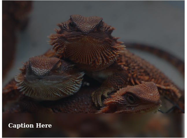
Tinting
Tinting involves adding a semi-transparent color overlay (using gradients or solid colors) over the image to create consistent contrast for text.
Let’s modify the CSS code from the previous example:
/* ... previous code */
.image-container:after {
    content: '';
    position: absolute;
    top: 0;
    left: 0;
    width: 100%;
    height: 100%;
    background: linear-gradient(135deg, rgba(17, 22, 27, 0.7) 0%, rgba(15, 18, 21, 0.5) 100%);
    z-index: 1;
}

.image-text {
  position: absolute;
  bottom: 0;
  left: 0;
  width: 100%;
  height: 80px;
  display: flex;
  align-items: center;
  padding-left: 20px;
  color: white;
  font-size: 1.2rem;
  font-weight: 700;
  z-index: 2;
}
The above code produces the following output:
Streamline Text Overlays With Cloudinary
If you’re looking to implement text overlay beyond pure CSS, especially when you need to automate things or when you’re working with a large number of images, integrating a service like Cloudinary simplifies your entire workflow. Cloudinary is a cloud-based image and video management platform that automates many aspects of image processing and delivery.
With Cloudinary, you can create dynamic text overlays directly through various methods including URL transformations, programmatically using Cloudinary APIs and SDKs or via the Cloudinary Console. Let’s look at an example.
Say we have the following image and we want to place the text “Coming soon” on it using Cloudinary:

First, you’d need to upload the image to your Cloudinary product environment. Once it’s uploaded, click on the ellipsis icon on the image, then go to Copy URL > Copy Original URL with options:
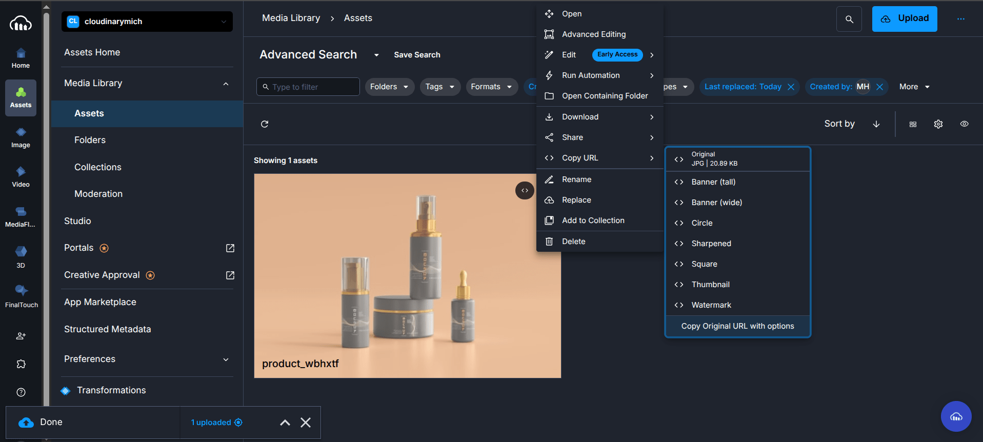
The URL should look something like this:
https://res.cloudinary.com/cloudinarymich/image/upload/product_wbhxtf.jpg
Then, using the text property of the layer parameter (l_text: in URLs) and specifying the font family and size, we can add text as an overlay on images.
For example, to overlay the text string “Coffee” in the Arial font with a size of 80 pixels, the transformation parameter will look like this: l_text:Arial_80:Coffee/fl_layer_apply.
To add “Coming soon” to our example image, we can change the URL to the following:
https://res.cloudinary.com/cloudinarymich/image/upload/g_south_east,l_text:Arial_30:Coming%20soon,fl_layer_apply/product_wbhxtf.jpg " />
Which gives us the following image:

In the URL, the g_south_east is a gravity parameter that determines the position of the text on the image, while the “Coming%20soon” in the URL is to ensure the text renders correctly due to the space character.
Cloudinary has several advantages over pure CSS by providing benefits such as automatic responsive image delivery. Cloudinary can also generate and serve the optimal image size and format for each user’s device and viewport, ensuring fast loading times without manual creation of multiple image assets. This includes automatically scaling the applied text to remain proportionate on each image version.
In addition, since the images are generated on the fly and then cached on Cloudinary’s global CDN, subsequent requests are delivered to the users faster. This offloads processing from your server and guarantees fast delivery worldwide.
Wrapping Up
While adding text over an image with CSS is seemingly straightforward, there are some dos and don’ts to consider to ensure you don’t sacrifice accessibility, performance, or SEO for visual appeal. After reading this article, we hope you have gained enough insight into using CSS overlays, the pitfalls to watch out for, and the alternatives available for automation and scalability.
Transform and optimize your images and videos effortlessly with Cloudinary’s cloud-based solutions. Sign up for free today!
Frequently Asked Questions
Can I animate text overlays?
Yes, you can add animations to overlays using CSS transitions or keyframes. For example, you can fade in the text with opacity: 0; to opacity: 1; over a duration or slide it into place with transform properties. However, keep them minimal to avoid distracting from the content.
Why is my text overlay not centered properly on all screen types?
This issue often stems from not using transform properties with absolute positioning or overlooking Flexbox for alignment. Ensure you double-check your CSS to include transform: translate(-50%, -50%); after setting top and left to 50%, and test on multiple screen sizes to confirm centering works as expected.
How do I handle overlays on background images?
The same logic applies here. Use a similar relative container with absolute text and ensure the container has a defined height or uses padding-bottom to maintain aspect ratio.

