
Repeating background images is a core CSS feature used to build patterns and structured layouts with small image assets. How a background repeats influences layout consistency, responsiveness, and overall visual output. Understanding repetition, alignment, and scaling provides control over how patterns behave across different screen sizes.
In this guide, we review how to repeat a background image in CSS, show how positioning and sizing affect tiling, and explain how to use shorthand and multi-layer backgrounds effectively. We also highlight how Cloudinary can optimize background assets by resizing tiles and generating tiled overlays through transformation URLs.
Key takeaways:
- CSS provides multiple repeat modes (repeat, repeat-x, repeat-y, space, round), each designed for specific layout needs.
- Tile size and alignment directly affect whether a pattern appears seamless or uneven.
- Multiple background layers can be combined, with each layer controlling its own repeat, size, and position.
In this article:
- Quick Answer: Using background-repeat
- All background-repeat Options Explained
- How to Repeat Images Horizontally and Vertically
- Aligning and Scaling Repeating Backgrounds
- Using the background Shorthand
- Multiple Background Layers and Patterns
- Common Mistakes and Best Practices
- Browser Support, Fallbacks, and Helpful Tools
- Background Images with Cloudinary
Quick Answer: Using background-repeat
The fastest way to repeat a background image in CSS is to set the background-image property for the div containing the image and control tiling with background-repeat. By default, browsers repeat the image in both directions.
Here’s an example:
<!DOCTYPE html>
<html lang="en">
<head>
<meta charset="UTF-8" />
<meta name="viewport" content="width=device-width, initial-scale=1.0" />
<title>Default Background Repeat Demo</title>
<style>
body {
margin: 0;
font-family: Arial, sans-serif;
background-color: #f4f4f4;
}
.demo-box {
width: 100%;
height: 700px;
/* Add your image here */
background-image: url("https://cdn.pixabay.com/photo/2022/10/22/17/00/gull-7539615_1280.jpg");
/* Default repeat behavior */
background-repeat: repeat;
background-size: 360px 240px; /* shrink tile so it can repeat */
}
.content {
padding: 20px;
}
</style>
</head>
<body>
<div class="demo-box"></div>
<div class="content">
<h2>Background Repeat Tutorial</h2>
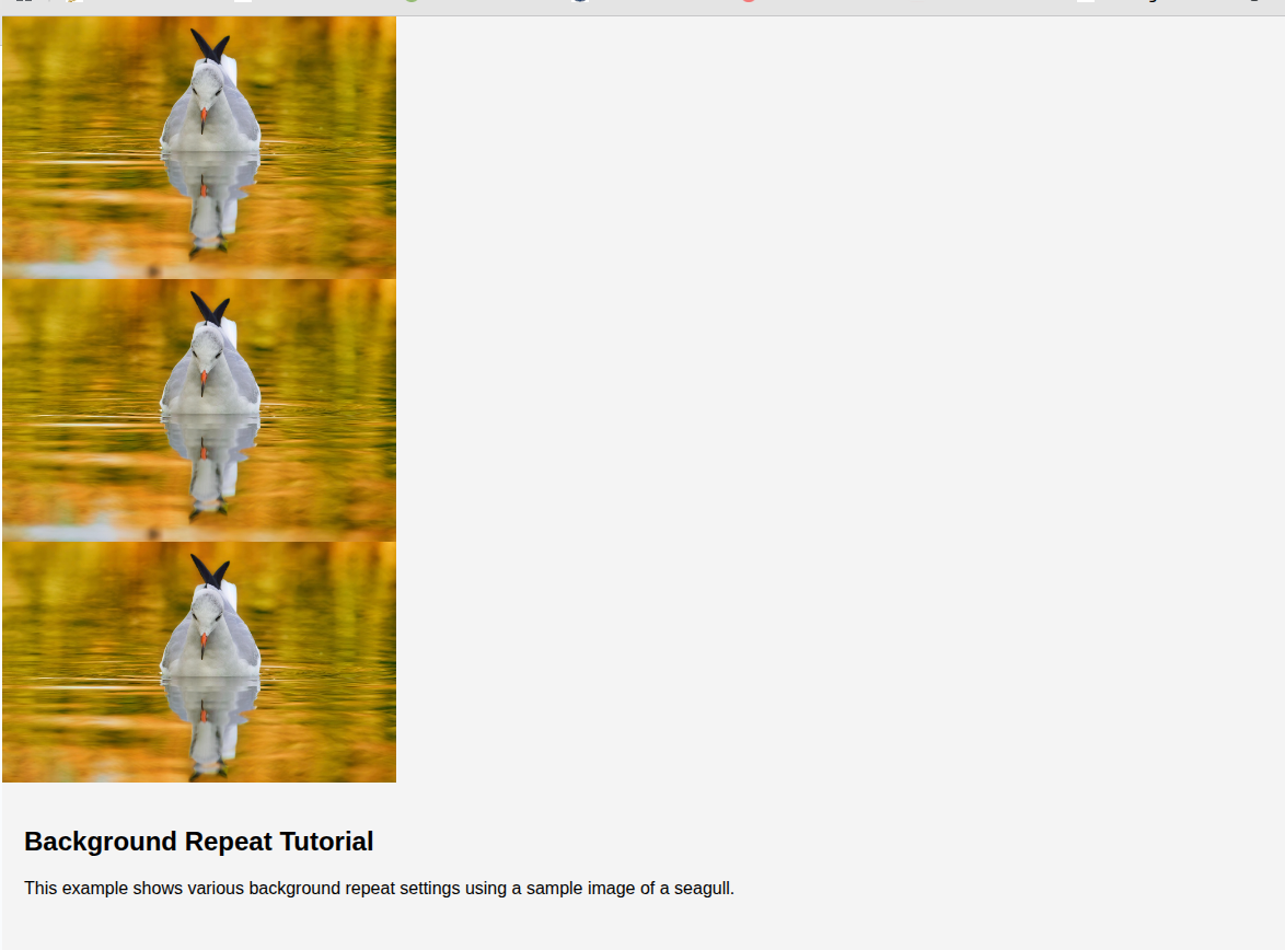
<p>
This example shows various background repeat settings using a sample image of a seagull.
</p>
</div>
</body>
</html>
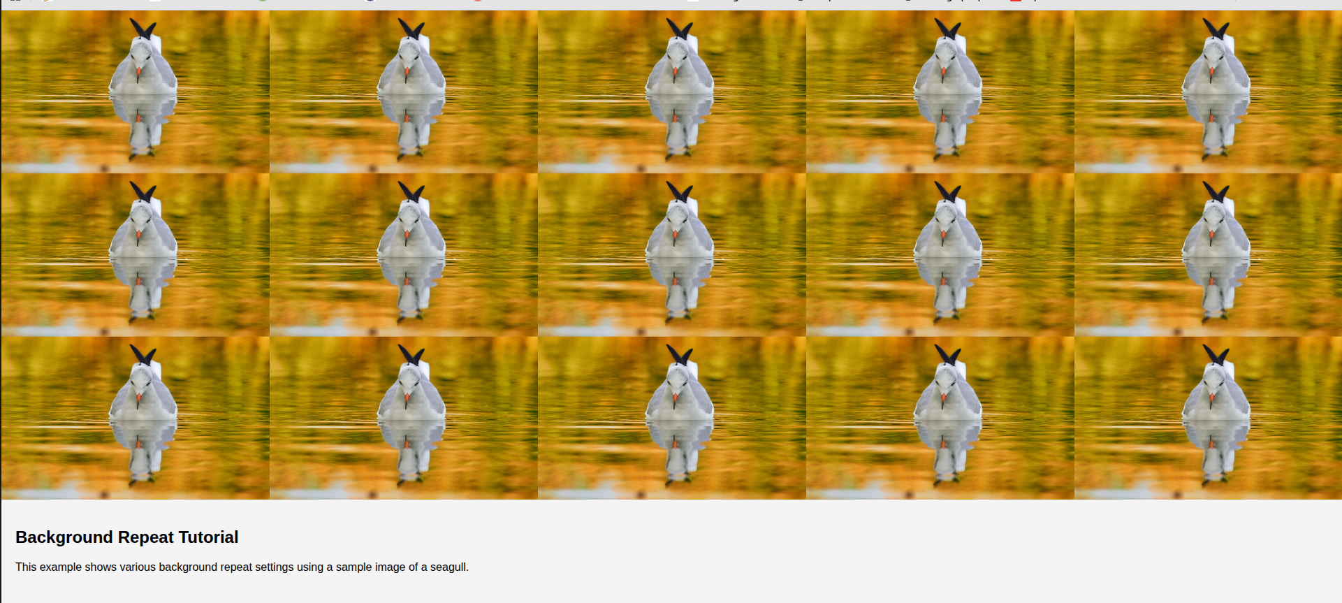
Here is how the output looks:

We can see the background repeated across the horizontal and vertical directions.
All background-repeat Options Explained
We can use several background-repeat options, each of which changes how a background image tiles within an element. Some values repeat the image on both axes, others limit repetition to one direction, and a few even control spacing or scaling automatically.
Repeat
background-repeat: repeat is the browser’s default behavior, and we saw this behaviour in the previous section. The image repeats in both horizontal and vertical directions, creating a seamless tiled pattern as long as the image is tile-friendly.
Even if we don’t specify background-repeat, some browsers repeat the image in both directions.
No Repeat
background-repeat: no-repeat only displays the background image once, instead of tiling or repeating it. No additional tiles are drawn, regardless of space. It’s useful for hero images, centered graphics, or decorative one-off assets.

Repeat a Specific Number of Times
background-repeat: repeat-x tiles the image horizontally only, producing a continuous band across the container’s width. It’s a common choice for header stripes, repeating dividers, or broad patterns.

Alternatively, background-repeat: repeat-y tiles the image vertically only, often used for sidebar textures or vertical decorative strips, like so:
Space
background-repeat: space repeats the image as many times as possible without cropping, and distributes equal spacing between each tile. If the image doesn’t divide evenly into the element’s size, CSS adds spacing between tiles to make everything fit cleanly. This is useful for evenly spaced icons or patterns with intentional gaps.

Round
background-repeat: round repeats the image while scaling the tiles so that an exact number fits inside the container. The browser adjusts the tile size as needed to avoid cropping or leaving gaps. This is ideal when we want a tiled pattern to always look clean, regardless of element size.
How to Repeat Images Horizontally and Vertically
As we saw in the previous section, we can use repeat-x and repeat-y to repeat an image horizontally and vertically, respectively.
In addition, we can treat horizontal and vertical repetition as two independent switches. The first value controls what happens from left to right, and the second value controls what happens from top to bottom. This makes the two-value syntax helpful when we want a particular behavior. Here are the values we can use:
background-repeat: repeat no-repeat;  /* repeat only horizontally */
background-repeat: no-repeat repeat;  /* repeat only vertically */
background-repeat: repeat repeat;     /* repeat on both axes */
Aligning and Scaling Repeating Backgrounds with background-Position and background-Size
Once we choose how our image repeats, we often need more control over where the pattern starts and how large each tile should appear. CSS gives us two properties that work alongside background-repeat to fine-tune repeating backgrounds: background-position and background-size.
Positioning the Repeating Background
The “background-position” defines the starting point for the first tile. This allows for shifting the entire pattern to the left, right, center, top, or any combination in between.
These are the most common values:
background-position: left top;
background-position: center center;
background-position: right bottom;
For example, if we use the following combination:
background-repeat: repeat;
background-position: right bottom;
We will see the first complete image in the bottom-right of the page and repeated across the horizontal and vertical dimensions.

We can also use pixels or percentages:
background-position: 20px 40px;
background-position: 50% 0;
This gives us precise control. For example, if the visual focus of our pattern sits off-center, or if we are trying to align a repeated stripe with another element on the page, adjusting the position ensures the tile falls exactly where we want it.
Scaling the Tiles with background-size
background-size controls the dimensions of each tile before it is repeated. This is especially helpful when our original image is too large or too small to create a clean tiling effect.
We can set fixed sizes with background-size: 120px 120px, or scale proportionally with background-size: 50% 50%. This example will reduce the image’s original width and height by 50%, as the following output shows:

We can also let the CSS pick the best fit using the following values.
background-size: contain;
background-size: cover;
When working with repeating backgrounds, the most common scenario is shrinking the original image so several copies fit visibly inside the container. This is precisely what we did earlier, reducing the seagull image to make the tiling easier to see.
Simplifying Your CSS Using the background Shorthand
As we start combining multiple CSS values, like background-image, background-repeat, background-position, background-size, etc, our CSS can get a bit long. To keep things cleaner, CSS allows us to group all these properties into a single shorthand declaration called “background.”
The background property lets us specify all background-related settings in one line, following this general structure:
background: <image> <repeat> <position> / <size> <other-options>;

/* An example */
background: url("https://cdn.pixabay.com/photo/2022/10/22/17/00/gull-7539615_1280.jpg") repeat-x center top / 360px 240px fixed border-box;
This single line sets:
- Image: A URL pointing to our image.
- Repeat behavior:
repeat-xto repeat horizontally only. - Position:
center topso it starts at the top middle. - Size:
180px 120pxto scale each tile before repeating. - Attachment:
fixedso the background stays fixed when we scroll. - Origin/Clip:
border-boxmakes the background painting start at the border edge.
This example shows how the shorthand can replace six separate background properties while maintaining the same behavior.
Working with Multiple Background Layers and Patterns
CSS allows us to apply multiple background images to the same element. Instead of using a single picture, we can stack multiple images, creating richer, more flexible visual effects. Each background layer can have its own repeat behavior, position, and size, and CSS will render them in the order we define.
background-image: url("https://res-console.cloudinary.com/dg8xfchav/thumbnails/v1/image/upload/v1762785328/c2FtcGxlcy9jbG91ZGluYXJ5LWxvZ28tdmVjdG9y/drilldown"), url("https://cdn.pixabay.com/photo/2022/10/22/17/00/gull-7539615_1280.jpg");
background-repeat: repeat, repeat;
background-position: left top, right bottom;
background-size: 450px 200px, 360px 240px;
In this example:
- The first image (the Cloudinary logo) is drawn on top of the stack because the first listed background always sits in the front layer.
- The second image (the seagull photo) is drawn behind the first one and serves as the lower background layer.
Each image also receives its own settings because we separated the values with commas:
- Both images repeat independently (
repeat, repeat). - The logo starts at the top left, while the seagull starts at the bottom right.
- Each image has its own tile size: 450 × 200px for the logo and 360 × 240px for the seagull.
- Each layer has its own
repeat,size, andpositionsettings.
Here is the output:

Just like we can simplify a single background using shorthand, we can also apply shorthand to multiple layers. We simply separate each shorthand layer with a comma:
background: url("https://res-console.cloudinary.com/dg8xfchav/thumbnails/v1/image/upload/v1762785328/c2FtcGxlcy9jbG91ZGluYXJ5LWxvZ28tdmVjdG9y/drilldown")
  repeat
  left top
  / 450px 200px,

  url("https://cdn.pixabay.com/photo/2022/10/22/17/00/gull-7539615_1280.jpg")
  repeat
  right bottom
  / 360px 240px;
Common Mistakes, Optimization Tips, and Best Practices
Working with repeating backgrounds is straightforward once we understand the available options, but several common mistakes can affect how the final result appears.
- Using images that don’t tile cleanly: Uneven edges, gradients, or non-square proportions can cause visible seams when repeated. A tile-friendly image should have clean, matching edges so it loops naturally. Seamless textures, small geometric icons, or vector patterns usually produce the best results.
- Forgetting layer order in multiple backgrounds: When we use multiple backgrounds, the first image in the list is always drawn on the top layer. If that image is fully opaque, it’ll hide everything underneath it. To make both layers visible, we may need transparency, blending modes, or a different stacking order.
- Making the tile size too large: If the
background-sizevalue is too large, the image may fit only once within the container, even with repeat applied, making it appear “broken.” Scaling the image down ensures multiple tiles fit both horizontally and vertically, making the repeat behavior visible. - Using heavy, high-resolution images for patterns: Repeating a high-resolution photo as a background pattern unnecessarily increases the page size. Even though the browser repeats the image visually, it still has to download the entire file. Using compressed versions or Cloudinary’s image optimizations helps us reduce bandwidth and improve rendering performance.
- Confusing repeat behavior with alignment: The
background-repeatvalue only decides if we repeat the image; it does not control where the first tile appears. When our pattern looks misaligned, the real fix is usually to adjustbackground-positionto shift the starting point, not to change the repeat value. - Not using shorthand for cleaner CSS: Maintaining separate background properties can quickly become verbose, especially when repeating patterns, size adjustments, and positioning are involved. Using the shorthand syntax groups everything into a single, readable line, making the CSS easier to maintain.
Browser Support, Fallbacks, and Helpful Tools
Repeating backgrounds with background-repeat is well supported across all major browsers, including Chrome, Firefox, Safari, Edge, and most mobile browsers.
Even older browsers such as Internet Explorer handle repeat, repeat-x, and repeat-y without issues. Only more advanced values, like space and round, may behave differently in legacy browsers, so it’s a good idea to test them if your audience still includes older platforms.
When a browser does not support a specific repeat mode, it typically falls back to a simpler behavior, often treating the pattern as a repeat or ignoring spacing adjustments. This makes repeating backgrounds relatively safe to use without worrying about breaking layout structure. Still, testing on different screen sizes helps ensure the pattern looks balanced and behaves as expected in responsive layouts.
Optimizing Image Backgrounds with Cloudinary
Cloudinary also provides helpful tools when working with repeated backgrounds. Instead of manually compressing or resizing pattern images, we can let Cloudinary handle optimization automatically.
Cloudinary can also resize the source tile (for example, generating a smaller 120×120px version of a larger photo) so the browser repeats a lightweight, performance-friendly asset. This reduces bandwidth usage, improves loading speed, and makes repeated backgrounds smoother across devices.
Finally, we can use Cloudinary to add title overlays on the background. Let’s see an example.
Step 1: Environment Setup
Cloudinary allows users to upload, optimize, and transform images using a wide range of front-end and back-end languages. You can choose the environment you prefer. We will use Python in the following example.

Next, sign up for Cloudinary and get your Cloudinary credentials.
Step 2: Set Up the code
The first step is to import the required libraries and set up Cloudinary configurations. For this example, you’ll need to install both the Cloudinary Python SDKand dotenv. Create a .env file with your Cloud Name, API key, and API secret, too. Here’s what it should look like:
from dotenv import load_dotenv
import os
import cloudinary
from cloudinary import CloudinaryImage
import cloudinary.uploader
from cloudinary.utils import cloudinary_url

load_dotenv()

cloudinary.config(
  cloud_name = os.getenv("CLOUD_NAME"),
  api_key = os.getenv("API_KEY"),
  api_secret = os.getenv("API_SECRET")
)
Next, we can add an overlay to a single image using this code. We first upload the images to Cloudinary cloud and then use various transformations, including overlay, to repeat the tiled overlay on the background image.
bg = cloudinary.uploader.upload("https://cdn.pixabay.com/photo/2025/11/30/11/55/11-55-24-701_1280.jpg", public_id="background")
tile = cloudinary.uploader.upload("../images/drilldown.png", public_id="logo")

url, _ = cloudinary.utils.cloudinary_url(
    "background",
    transformation=[
        {"overlay": "logo", "width": 200, "crop": "scale", "opacity": 30, "flags": ["layer_apply", "tiled"]}
    ]
)

print(url)
If you open the URL, you will see something like this:

Cloudinary SDKs make it easy to scale our image transformation tasks, allowing us to upload and process multiple images using a single script. For example, the following script adds overlays to multiple image backgrounds.
image_list = ["https://cdn.pixabay.com/photo/2025/11/30/11/55/11-55-24-701_1280.jpg",
              "https://cdn.pixabay.com/photo/2023/09/17/19/42/plane-8259204_1280.jpg",
              "https://cdn.pixabay.com/photo/2021/09/16/21/27/container-ship-6631117_1280.jpg"]

for idx, img in enumerate(image_list):
    img_name = f"image_{idx}"
    cloudinary.uploader.upload(img, public_id=img_name)


    url, _ = cloudinary.utils.cloudinary_url(
        img_name,
        transformation=[
            {"overlay": "logo", "width": 200, "crop": "scale", "opacity": 30, "flags": ["layer_apply", "tiled"]}
        ]
    )


    print(f"Transformed URL for {img_name}: {url}")
Frequently Asked Questions
Why does my background image not repeat, even when I use background-repeat: repeat?
This usually happens when the image is too large to tile. If a single tile already fills the container, repeating won’t be visible. Reduce the tile size using “background-size” so multiple copies fit within the element.
What is the difference between repeat-x and using two values like repeat no-repeat?
The “repeat-x” value is a shorthand for repeating only across the horizontal axis. Using two values: “repeat no-repeat” gives us more control because it separately defines horizontal and vertical behavior. Both approaches work, but the two-value syntax is more flexible.
When should we use space or round instead of the default repeat?
Use space when evenly spaced tiles are required without any cropping. Use round when tiles should scale so an exact number fits cleanly inside the container. Both values offer more controlled pattern layouts compared to the default repeat.

