
Images play a huge role in making websites look engaging and professional. They can tell stories, showcase products, or just add some visual flair. But sometimes, the colors in those images don’t quite match the rest of your design, or when you want to create a specific mood. That’s where image tinting comes in.
In this article, we’ll explore what image tinting is all about and showcase six straightforward methods using CSS to achieve it. Whether you’re a beginner or have some experience with styling, these techniques can help you enhance your images without needing complex tools or software.
In this article:
- What is Image Tinting and When Should You Use It?
- Method 1: Tint an image with filter + opacity
- Method 2: Tinting an Image Through Cloudinary
- Method 3: Add a Color Overlay with Pseudo-Elements
- Method 4: Tint Background Images with background-blend-mode
- Method 5: Use CSS Variables with mix-blend-mode
What is Image Tinting and When Should You Use It?
Image tinting is the process of overlaying a semi-transparent color on top of an image. Unlike completely changing an image’s colors, tinting subtly shifts the overall tone while preserving the underlying details, shadows, and highlights. Think of it like placing a colored gel or piece of transparent film over a photograph (which is how it’s done in real life).
There are several common scenarios where you might want to consider using image tinting: For instance, when you want to establish visual consistency across a set of images with different color palettes, a uniform tint can unify them. It’s also a great choice for creating hover states where an image gets a color overlay when a user interacts with it. Many websites use tinting to make text placed over images more readable, by darkening or coloring the background image.
Additionally, tinting is a simple way to adapt images to match different themes, like a dark mode, or to reinforce brand identity by washing images in a signature brand color. Plus, tinting can improve accessibility by adjusting contrast for better readability, especially in dark or light modes.
Method 1: Tint an image with filter + opacity
A straightforward way to tint an image in CSS is by combining the filter property with opacity. The filter property lets us tweak things like hue, saturation, or brightness, while opacity makes the image see-through enough for a color to show from behind, creating a natural tint effect.
To do this, we’ll wrap the image in a container element, set the container’s background to the color we want for the tint, then apply opacity and filter: brightness() to the image so the color bleeds through.
Here’s an example.
<!DOCTYPE html>
<html lang="en">
  <head>
    <meta charset="UTF-8" />
    <meta name="viewport" content="width=device-width, initial-scale=1.0" />
    <title>CSS Image Tinting</title>
    <style>
      .tint-wrapper {
        position: relative;
        width: 800px;
        background-color: rgba(255, 0, 174, 0.3);
        margin: auto;
      }

      .tint-wrapper img {
        width: 100%;
        height: 100%;
        object-fit: cover;
        opacity: 0.9;
        filter: brightness(0.3);
      }
    </style>
  </head>
  <body>
    <div class="tint-wrapper">
      <img
        src="https://pixabay.com/images/download/eriscolors-music-7101987_1920.jpg"
        alt="A man playing an acoustic guitar outside, sitting on a chair."
      />
    </div>
  </body>
</html>
The resulting image looks like this:

You can customize the brightness, opacity, and the background-color to find a balance if you wish for a desired tint effect.
Method 2: Tinting an Image Through Cloudinary
If you’re managing images on a larger scale or modifying images on the server-side, Cloudinary is a great option for applying tints to images. As a media management cloud service, Cloudinary handles image uploads, optimizations, and transformations, including tints, all through simple URL modifications or programmatically.
First, create a free Cloudinary account and upload your image (programmatically or via the web console). Then, using the e_tint transformation parameter, you can blend an image with one or more tint colors at a specified intensity. You can optionally equalize colors before tinting and specify gradient blend positioning per color.
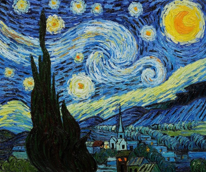
Take the following image for example:
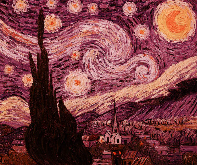
After applying e_tint in the image’s URL, we get the following:
https://res.cloudinary.com/demo/image/upload/e_tint/starry_night.jpg
Cloudinary offers unique advantages over traditional tinting methods. For instance, when managing user-generated content, users can easily revert to their original images. In addition, Cloudinary’s Generative Recolor extends beyond basic tinting by enabling precise adjustments such as recoloring specific elements, while preserving natural lighting and textures.
To learn more about tinting with Cloudinary, see Tinting in the Cloudinary docs.
Method 3: Add a Color Overlay with Pseudo-Elements
This is one of the most commonly used and reliable methods for tinting. Instead of modifying the image itself, we’ll place a colored layer on top of it using a pseudo-element like ::before or ::after. This gives us good control because the image remains untouched in the background, and the overlay is a separate element whose color and transparency can be adjusted independently.
It works perfectly for both regular <img> tags inside a container and for background images set with background-image. The key is to position the pseudo-element to cover its parent completely as shown in the following code:
<!DOCTYPE html>
<html lang="en">
  <head>
    <meta charset="UTF-8" />
    <meta name="viewport" content="width=device-width, initial-scale=1.0" />
    <title>CSS Image Tinting</title>
    <style>
      .overlay-tint {
        position: relative;
        display: inline-block;
      }

      .overlay-tint::after {
        content: "";
        position: absolute;
        top: 0;
        left: 0;
        width: 100%;
        height: 100%;
        background-color: rgba(84, 2, 69, 0.627);
      }

    </style>
  </head>
  <body>
    <div class="overlay-tint">
      <img
        src="https://images.unsplash.com/photo-1761839258568-fd466a93f68b?q=80&w=800&auto=format&fit=crop"
        alt="A man playing an acoustic guitar outside, sitting on a chair."
      />
    </div>
    <div class="bg-tint"></div>
  </body>
</html>
Method 4: Tint Background Images with background-blend-mode
If your image is applied as a CSS background-image, the background-blend-mode property is the best solution. With this method, we can define both a background color and a background image, and then tell the browser how to blend them together using modes like multiply, overlay, or screen.
With minimal code, this method is very performant. The multiply blend mode is frequently an excellent choice for darker tints, as it multiplies the image colors by your selected color, usually producing a darker hue.
In the following example, we have a div that has a background image attached to it, we then apply a tint to the image using the background-blend-mode: overlay declaration:
<!DOCTYPE html>
<html lang="en">
  <head>
    <meta charset="UTF-8" />
    <meta name="viewport" content="width=device-width, initial-scale=1.0" />
    <title>CSS Image Tinting</title>
    <style>
      .bg-tint {
        width: 800px;
        height: 500px;
        background: url("https://cdn.pixabay.com/photo/2022/03/31/00/31/music-7101987_1280.jpg")
            no-repeat center/cover,
          rgba(141, 1, 101, 0.5);
        background-blend-mode: multiply;
        margin: auto;
      }
    </style>
  </head>
  <body>
      <div class="bg-tint"></div>
  </body>
</html>

The background-blend-mode property accepts a few different values you can experiment with to see which one gives you your desired result.
Method 5: Use CSS Variables with mix-blend-mode
CSS variables combined with mix-blend-mode allows us to achieve dynamic control over tints. The mix-blend-mode: multiply declaration works similarly to background-blend-mode, but it blends an element with whatever is behind it. This allows us to create flexible, reusable components where the tint color can be easily changed via a CSS variable or a class.
Example use cases of this method is creating reusable card components or for theming where the tint color might change based on user preferences or site sections. Let’s see an example with code:
<!DOCTYPE html>
<html lang="en">
  <head>
    <meta charset="UTF-8" />
    <meta name="viewport" content="width=device-width, initial-scale=1.0" />
    <title>CSS Image Tinting</title>
    <style>
      :root {
        --tint: rgba(255, 255, 0, 0.4);
      }

      .variable-tint {
        position: relative;
        width: 800px;
        margin: auto;
      }

      .variable-tint img {
        width: 100%;
        height: 100%;
        object-fit: cover;
      }

      .tint-layer {
        position: absolute;
        top: 0;
        left: 0;
        width: 100%;
        height: 100%;
        background-color: var(--tint);
        mix-blend-mode: multiply;
      }
    </style>
  </head>
  <body>
    <div class="variable-tint">
      <img
        src="https://cdn.pixabay.com/photo/2022/03/31/00/31/music-7101987_1280.jpg"
        alt="A man playing an acoustic guitar outside, sitting on a chair."
      />
      <div class="tint-layer"></div>
    </div>
  </body>
</html>

Wrapping Up
With the flexibility of CSS, you can tint images in a way that perfectly aligns with your project’s goals – and there isn’t just one right way to do it. Different methods work better in different situations; filters and opacity are great for quick image effects, overlays with pseudo-elements are reliable and work well across browsers, while Cloudinary works best if you need automation and scalability. In the end, the method you choose really depends on your project, the kind of image you’re working with, and the level of interactivity you need.
By experimenting with the tinting methods outlined in this article, we hope you can easily achieve a consistent look for branding and visual depth across your website with minimal code and less overhead.
Optimize, transform, and manage your media assets like a pro with Cloudinary. Sign up for free today!
Frequently Asked Questions
Does tinting affect image performance?
Tinting methods that use CSS filters (like filter: grayscale()) can have a minor performance cost if applied to a very large number of images simultaneously, as they are processed by the GPU. However, the pseudo-element and background-blend-mode methods are generally very performant since they do not require the GPU to work.
Which tinting method has the best browser support?
The pseudo-element (::before/::after) overlay method has the widest and most stable browser support, working reliably even in older browsers. Methods using mix-blend-mode and background-blend-mode have very good modern browser support but may require fallbacks for some older browser versions.
Can I animate the tint effect?
Yes, you can animate the tint color or its opacity using CSS transitions or keyframe animations. But do so only when absolutely necessary, as animating a tint effect might be an overkill and can slow down performance.

