
Images break layouts more often than most developers like to admit. One minute, they fit perfectly; the next, they are spilling out of containers, looking small on one screen and huge on another. The problem usually lies with CSS’s handling of the image file, not the file itself.
An essential aspect of web development is optimizing images for different screen sizes and layouts to maintain visual quality and performance.
This article describes how CSS resizes images, which rules are important, and why using CSS alone is no longer the best option. You will see the basic techniques, common layout patterns, and when it makes sense to move resizing upstream with a service like Cloudinary.
Key takeaways:
- Images have natural dimensions, and browsers maintain their proportions when only one size (like width) is set. However, setting both width and height manually can distort the image by stretching or squashing it.
- CSS lets you control image size and layout using properties like width, height, max-width, and max-height. Using tools like object-fit helps maintain the image’s aspect ratio and prevents distortion, especially in responsive designs.
In this article:
- Understanding How CSS Handles Image Sizing
- Basic CSS Techniques for Resizing Images
- Using Object Fit for Better Control
- Responsive Image Resizing With CSS
- Common Layout Patterns That Rely on Image Resizing
- How Cloudinary Simplifies Resizing Beyond CSS
Understanding How CSS Handles Image Sizing
Images are handled differently by browsers than text or divs. An image has its own natural size based on the file dimensions and will appear at that size if you do nothing.
When you set only the width of an image, the browser automatically adjusts the height to keep its proportions correct. However, if you set both the width and height manually, the browser will follow those exact values—even if that stretches or squashes the image, turning circles into ovals.
<!DOCTYPE html>
<html>
<head>
  <title>Image Sizing Demo</title>
  <style>
    .box {
      margin-bottom: 30px;
    }

    // Example 1: Only width set
    .good img {
      width: 200px;
    }

    // Example 2: Width and height forced
    .bad img {
      width: 200px;
      height: 200px;
    }
  </style>
</head>
<body>
  <h2>Example 1: Only Width Set (No Distortion)</h2>
  <div class="box good">
    <img src="https://via.placeholder.com/400x200" alt="Rectangle image">
  </div>
  <h2>Example 2: Width and Height Set (Distortion Happens)</h2>
  <div class="box bad">
    <img src="https://via.placeholder.com/400x200" alt="Rectangle image">
  </div>
</body>
</html>
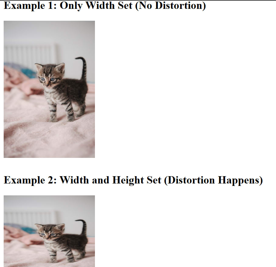
Distortion caused by manually adjusting image width and height
Images react to their container as well. An image will overflow if it is larger than its container and has no boundaries. This makes layouts break when photos are added without following any guidelines.
<!DOCTYPE html>
<html>
<head>
  <title>Image Overflow Demo</title>
  <style>
    .container {
      width: 300px;
      border: 3px solid black;
      margin-bottom: 40px;
      padding: 10px;
    }

    // Example 2: Proper boundary
    .fixed img {
      max-width: 100%;
    }
  </style>
</head>
<body>
  <h2>Example 1: Image Without Boundaries (Layout Breaks)</h2>
  <div class="container">
    <img src="https://via.placeholder.com/600x300" alt="Large image">
  </div>
  <h2>Example 2: Image With max-width: 100% (Fixed)</h2>
  <div class="container fixed">
    <img src="https://via.placeholder.com/600x300" alt="Large image">
  </div>
</body>
</html>
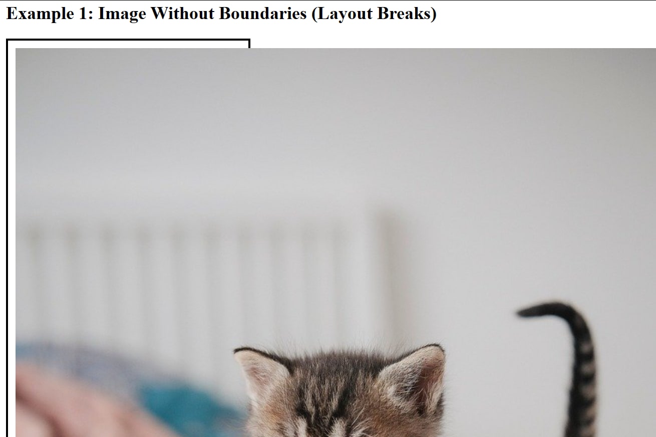
Image overflow due to lack of boundaries
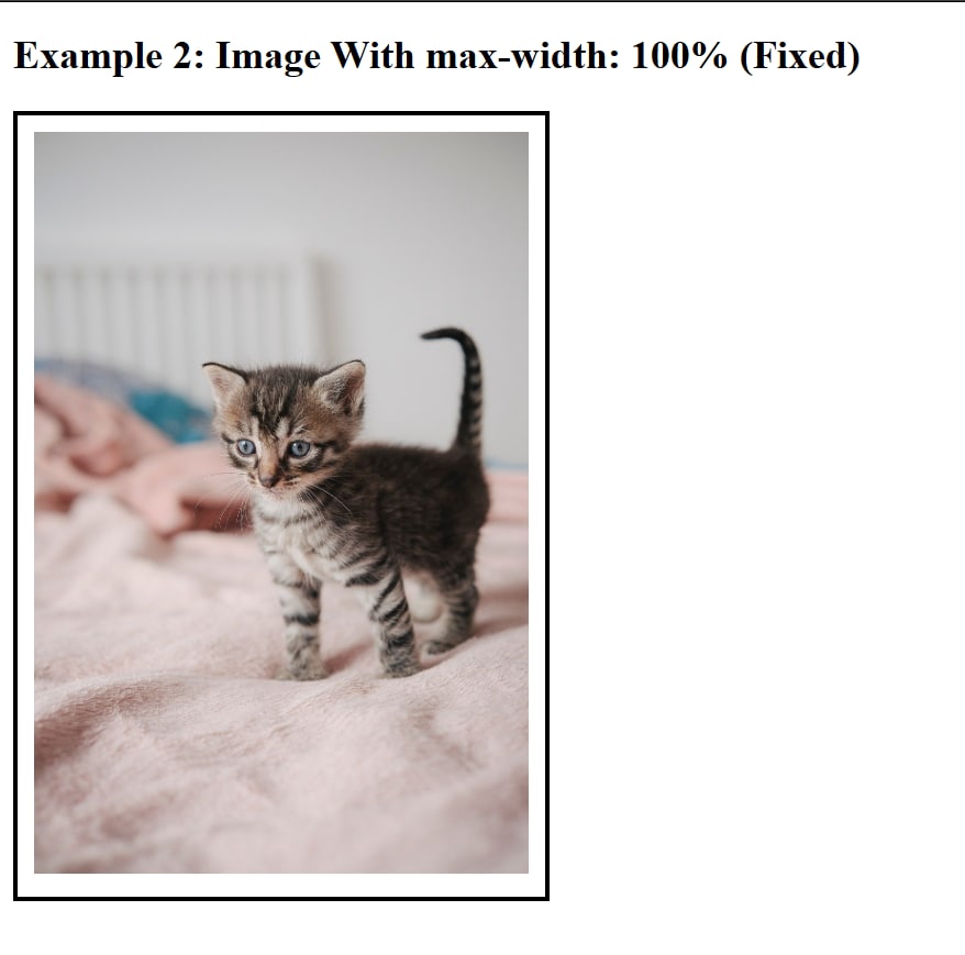
Image with boundaries
Proper image sizing has a significant impact on a webpage. Images of the right size use less bandwidth, load more quickly, and improve page UX across devices.
Basic CSS Techniques for Resizing Images
Using CSS to reduce image size is key to ensuring a clean layout. CSS provides several properties that allow you to take charge of images without modifying the original file. Let’s cover some fundamental CSS image scaling methods.
- Width and height: You can directly resize the image’s height and width properties using fixed dimensions. Size consistency is expected, but distortion may occur as the aspect ratio of the viewport changes.
max-widthandmax-height: Use themax-widthandmax-heightCSS properties to create scalable images that work well with a flexible layout.Object-fit: Theobject-fitproperty is used when there is a need to maintain the image’s original aspect ratio. It’s best for user-uploaded content where images with varying dimensions are uploaded.
Background Images
Instead of placing an image directly in HTML using the <img> tag, you can apply an image as a background using CSS. This approach is useful when the image is decorative or when you want to place text and other elements on top of it.
<!DOCTYPE html>
<html>
<head>
  <style>
    .image-box {
      width: 400px;
      border: 2px solid black;
    }

    .image-box img {
      width: 100%;
      height: auto;
    }
  </style>
</head>
<body>

  <div class="image-box">
    <img src="https://via.placeholder.com/800x400" alt="Sample image">
  </div>
</body>
</html>
Background images give you more control over how the image fits and behaves inside its container. You can control whether it covers the entire area, maintains proportions, stays centered, or repeats. This makes it especially useful for banners, hero sections, and layout backgrounds.
<!DOCTYPE html>
<html>
<head>
  <style>
    .hero {
      width: 400px;
      height: 200px;
      color: white;
      display: flex;
      align-items: center;
      justify-content: center;
      text-align: center;

      background-image: url("https://via.placeholder.com/800x400");
      background-size: cover;
      background-position: center;
      background-repeat: no-repeat;
    }
  </style>
</head>
<body>

  <div class="hero">
    <h2>Overlay Text Here</h2>
  </div>
</body>
</html>
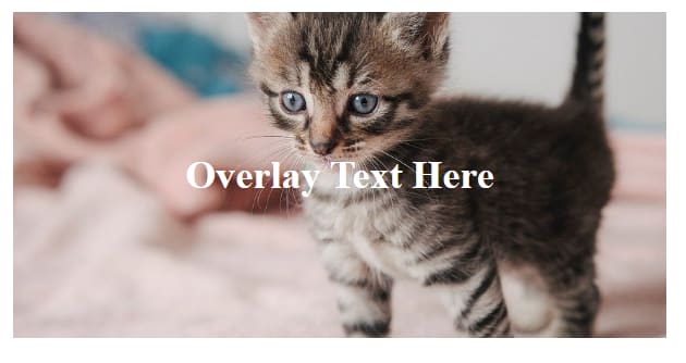
Using a Background Image
Using Object Fit for Better Control
You control how images and videos behave inside their containers with the object-fit property. It applies to replaced elements like image and video, and solves a problem every layout runs into sooner or later: image stretching. Sometimes, images overflow and refuse to sit neatly inside cards and grids.
Object-fit preserves the image’s proportions while allowing the browser to manage sizing. You instruct the browser on how the content should behave rather than imposing width and height and hoping nothing breaks.
In responsive layouts, where the same image must function inside galleries, cards, and grids without detracting from the design, this is really helpful.
<!DOCTYPE html>
<html>
<head>
  <style>
    .container {
      width: 300px;
      height: 200px;
      border: 3px solid black;
      margin-bottom: 30px;
    }
    .container img {
      width: 100%;
      height: 100%;
    }
  </style>
</head>
<body>
  <!-- Change the class below for each example -->
  <div class="container">
    <img src="https://pixabay.com/get/g76f48b67f1289652df820e08317a3c9adb04e0df897d85cf2f1dd8b56e76c2478efee786b3918bb16a9403f09f4eeb842d9755cc4640ef183439287e5319019c_1280.jpg" alt="Sample image">
  </div>
</body>
</html>
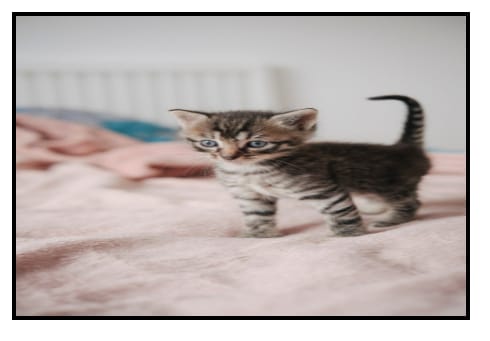
Image CSS resize without object-fit
With fill, the image is stretched to match the container’s width and height exactly: the default behavior. The browser doesn’t protect the aspect ratio, so distortion is expected. Use this only when the shape matters more than the image itself.
.container img {
  width: 100%;
  height: 100%;
  object-fit: fill;
}
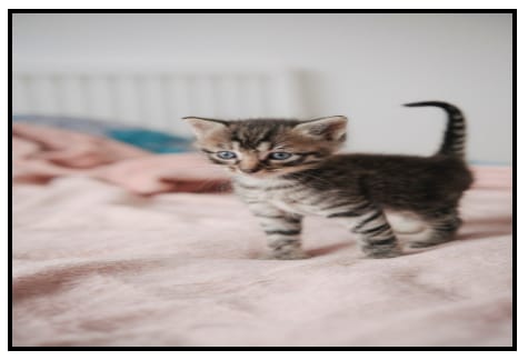
Image CSS resize with object-fit: fill property
contain forces the image to keep its proportions and fit entirely inside the container, so nothing is cropped. Space may appear if the aspect ratios don’t match. This works well for logos, product images, and any situation where the full image must stay visible.
.container img {
  width: 100%;
  height: 100%;
  object-fit: contain;
}
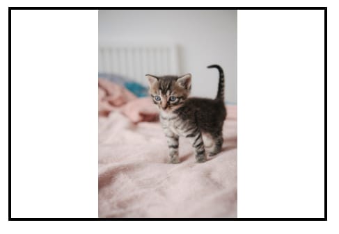
Image CSS resize with object-fit: contain property
With cover, the image keeps its proportions while filling the entire container. Parts of the image may be cropped to make that happen. There is no space. This is a common choice for profile photos, gallery thumbnails, and banners where consistent sizing matters more than showing every edge.
.container img {
  width: 100%;
  height: 100%;
  object-fit: cover;
}
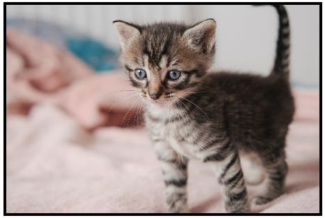
Image CSS resize with object-fit: contain property
With none, the image ignores the container’s dimensions and stays at its natural size. If the image is larger than the container, it will overflow.
.container img {
  width: 100%;
  height: 100%;
  object-fit: none;
}
Image CSS resize with object-fit: contain property
With scale-down, the browser chooses between none and contain, whichever produces the smaller result. Large images are reduced to fit. Smaller images are left alone.
.container img {
  width: 100%;
  height: 100%;
  object-fit: scale-down;
}
Image CSS resize with object-fit: scale-down property
Used properly, object-fit removes the need for extra wrappers and background image tricks. It keeps image behavior predictable and helps layouts stay clean as screen sizes change.
Responsive Image Resizing With CSS
Responsive resizing is about flexibility, not precision. Percent-based widths let images adapt as layouts shrink or grow. This works well when containers change size across breakpoints.
Media queries still have a place in creating a responsive section. Some images require different treatment on small screens. A wide hero image may need tighter cropping on mobile to keep the subject visible.
The rule stays the same: avoid forcing both dimensions unless you know the image shape ahead of time. Trying to control too much instead of letting the browser do its job could cause a lot of layout issues.
Common Layout Patterns That Rely on Image Resizing
Some common layout patterns depend heavily on image resizing; they include:
- Cards depend on predictable image heights. Without that, grids fall apart visually.
- Image grids need consistent ratios so rows align cleanly. One unusually tall image can break the rhythm of the entire section.
- Hero sections rely on images that scale without pushing text out of place. This is where object-fit and max-width rules usually work together.
Good image resizing makes layouts feel intentional. Bad resizing makes everything feel fragile.
How Cloudinary Simplifies Resizing Beyond CSS
CSS only changes how an image looks after it loads. The browser still downloads the full file. This is where Cloudinary changes the equation.
Cloudinary lets you request the image resized to your perfect specifications. With this feature, the browser downloads a smaller file right from the start, improving load time and reducing data usage. It also removes a lot of layout guesswork because the image already fits the design.
Cloudinary can also handle quality and format choices automatically, which is not possible with CSS. Adding Cloudinary to your stack not only helps your website’s responsiveness but also takes your website SEO from the ground to the top.
Integrating Cloudinary URLs for Resized Images
Using Cloudinary usually means swapping static image paths for transformation-based URLs. The URL defines the size, crop behavior, and format. CSS then only handles alignment and spacing. This approach keeps styles simpler.
With Cloudinary, you spend less time on oversized images and start working with assets that already match the layout.
You can even go as far as generating different image sizes for different contexts instead of stretching one file everywhere.
Make Image Resizing Smarter and Easier
Resizing images in CSS works when you respect proportions and container behavior. Width control, max-width rules, and object-fit solve most display problems.
When performance or consistency becomes an issue, resizing images before they reach the browser is the better move. Cloudinary makes that practical without adding complexity. Used together, CSS and Cloudinary keep layouts stable, images sharp, and workflows sane.
Join thousands of businesses transforming their digital asset management with Cloudinary. Sign up for free today!
Frequently Asked Questions
How do you resize an image using CSS?
You can resize an image in CSS by setting the width and height properties. For responsive layouts, it is common to use max-width: 100% and height: auto to ensure the image scales proportionally within its container. This approach maintains image quality while adapting to different screen sizes.
What is the difference between width, height, and max-width in CSS?
The width and height properties define the exact dimensions of an image, which can distort it if proportions are not maintained. max-width sets a limit on how large the image can grow while allowing it to shrink responsively. Using max-width with height set to auto helps preserve the original aspect ratio.
How can you make images responsive with CSS?
To make images responsive, use CSS rules like max-width: 100% and height: auto so they scale within their parent container. You can also use object-fit to control how images fill their containers without distortion. Media queries further enhance responsiveness by adjusting styles based on screen size.

