 Ask AI
Visual and audio clarity
Last updated: Jul-03-2026
Making content distinguishable means ensuring that users can perceive and differentiate important information regardless of their visual or auditory abilities. This includes providing sufficient color contrast, not relying solely on color to convey information, controlling audio levels, and allowing customization of visual and audio elements.
Users with color blindness, low vision, hearing impairments, or various sensitivities need content that can be perceived clearly in different ways. This section covers Cloudinary's tools for assisting color blind users, customizing text presentation, and managing audio levels amongst others.
Visual and audio clarity considerations
| Consideration | Cloudinary Image Techniques | Cloudinary Video Techniques | WCAG Reference |
|---|---|---|---|
|
Consider users who can't distinguish colors. If you're using color to convey important information, think about adding patterns, shapes, or text labels so everyone can understand the message. |
🔧 Assist people with color blind conditions | 1.4.1 Use of color | |
|
Think about users who unexpected audio may startle or distract. If your content plays sound automatically, consider giving users controls to pause, stop, or adjust the volume. |
🔧 Adjust audio volume 🔧 Cloudinary Video Player |
1.4.2 Audio control | |
|
Consider users with visual impairments who may have difficulty reading text with poor contrast. They'll need sufficient color contrast between text and backgrounds to read your content comfortably. |
🔧 Customizable caption styling 🔧 Text overlays on images and videos 🔧 Replacing colors for light/dark themes |
1.4.3 Contrast (minimum) 1.4.6 Contrast (enhanced) |
|
|
Consider whether users can resize, customize, or access your text content. Actual text is generally more flexible and accessible than text embedded in images. |
🔧 Customize text overlays in images 🔧 OCR text detection and extraction |
1.4.5 Images of text 1.4.9 Images of text (no exception) |
|
|
Think about users who have difficulty separating speech from background noise. They may need clear audio where the main content stands out from any background sounds. |
🔧 Mixing audio tracks | 1.4.7 Low or no background audio | |
|
Consider users who need sufficient contrast for non-text elements. Visual elements like icons, buttons, and graphics also need adequate contrast to be perceivable by users with visual impairments. |
🔧 Adjust contrast on images and videos | 🔧 Video visual adjustments | 1.4.11 Non-text contrast |
Assist people with color blind conditions
People with color blindness may have difficulty distinguishing between certain colors, particularly red and green. Cloudinary provides tools to help make your media more accessible by using both color and pattern to convey information.
 Original
 X-Ray Mode
 Striped Overlays
Simulate color blind conditions
You can experience how your images look to people with different color blind conditions. Apply the e_simulate_colorblind effect with parameters like deuteranopia, protanopia, tritanopia, or cone_monochromacy to preview your content (see all the options).

Analyze color accessibility
For a more objective approach to assessing the accessibility of your images, use Accessibility analysis (currently available to paid accounts only).
-
Upload your images with the
accessibility_analysisparameter set totrue: -
See the accessibility results in the response:
For more information see Accessibility analysis, and for an example of using the results, watch this video tutorial.
Apply stripes
Consider a chart that uses red and green colors to convey information. For someone with red-green color blindness, this information would be inaccessible.
 Original image
 Simulated deuteranopia
By adding patterns or symbols alongside colors, you can ensure the information is conveyed regardless of color perception.
 e_assist_colorblind:20
 e_assist_colorblind:20
/e_simulate_colorblind
To add the stripes, apply the assist_colorblind effect with a stripe strength from 1 to 100, e.g. e_assist_colorblind:20:
Apply color shifts
For an image where the problematic colors aren't isolated, it can be even harder to distinguish the content of the image.
 Original image
 Simulated deuteranopia
By shifting the colors, you can ensure the image is clear regardless of color perception.
 e_assist_colorblind:xray
 Simulated deuteranopia
after using e_assist_colorblind:xray
To shift the colors, apply the e_assist_colorblind effect with the xray effect, e.g. e_assist_colorblind:xray:
Consider implementing a toggle that adds the assist colorblind effects to your images on demand.
Interactive color blind accessibility demo
Use the controls below to test different color blind assistance techniques and simulate various color blind conditions. This helps you understand which techniques work best for different types of color vision deficiency.

Current Transformation URL:
https://res.cloudinary.com/demo/image/upload/w_400/bo_1px_solid_black/docs/piechart.png
Tips for Testing:
- Pie Chart: Notice how stripes help distinguish sections that may look similar with color blindness
- Red Flower: X-ray mode shifts colors to make the flower more visible against the green background
- Compare: Try different combinations to see which techniques work best for each condition
- Docs: Assist people with color blind conditions
- Docs: Accessibility analysis
- Blog: Open your Eyes to Color Accessibility
- Video tutorial: Color accessibility in JavaScript
Replacing colors for light/dark themes
For users who navigate websites with light and dark themes, consistency in visual presentation is crucial for both usability and accessibility. Light and dark themes can significantly impact users with visual sensitivities, light sensitivity conditions, or those who simply prefer one theme over another for better readability. Cloudinary provides powerful tools to automatically adapt image colors to match your application's theme, ensuring a cohesive visual experience.
Understanding the accessibility need
Different users have varying preferences and needs when it comes to visual themes:
- Light sensitivity: Users with photophobia, migraines, or certain medical conditions may find dark themes more comfortable
- Visual impairments: Some users with low vision find better contrast in a specific theme
- Environmental factors: Dark themes can be easier on the eyes in low-light environments
- Battery conservation: On OLED displays, dark themes can help conserve battery life
- Personal preference: Users may simply prefer one theme for better readability
Dynamic color replacement with replace_color
The replace_color effect allows you to dynamically swap colors in images based on the user's theme preference. This is particularly useful for logos, icons, and graphics that need to maintain brand consistency while adapting to different backgrounds. Try changing the theme at the top right of this page, and you'll see how the different icons look with light and dark themes.
This example replaces the predominant color with light gray (e_replace_color:e6e6e6:50) with a tolerance of 50 to ensure similar shades are also replaced:
Using the theme effect for comprehensive adaptation
For more sophisticated theme adaptation, use the theme effect which applies comprehensive color adjustments to the image based on a specific background color.
For example, change the screen capture to a dark theme with increased sensitivity to photographic elements (e_theme:color_black:photosensitivity_110):
 Original (Light Theme)
 Dark Theme Adaptation
e_theme:color_black:photosensitivity_110
The effect applies an algorithm that intelligently adjusts the color of illustrations, such as backgrounds, designs, texts, and logos, while keeping photographic elements in their original colors.
Interactive theme adaptation demo
Experience how Cloudinary can automatically adapt images for different themes. This demo shows how the same image can be dynamically modified to suit both light and dark themes using the replace_color transformation, in addition to smart color replacement using the theme effect:
https://res.cloudinary.com/demo/image/upload/c_scale,w_400/f_auto/q_auto/cloudinary_icon.png
- Video tutorial: Light and dark mode images in React
- Docs: Replace color effect
- Docs: Theme effect
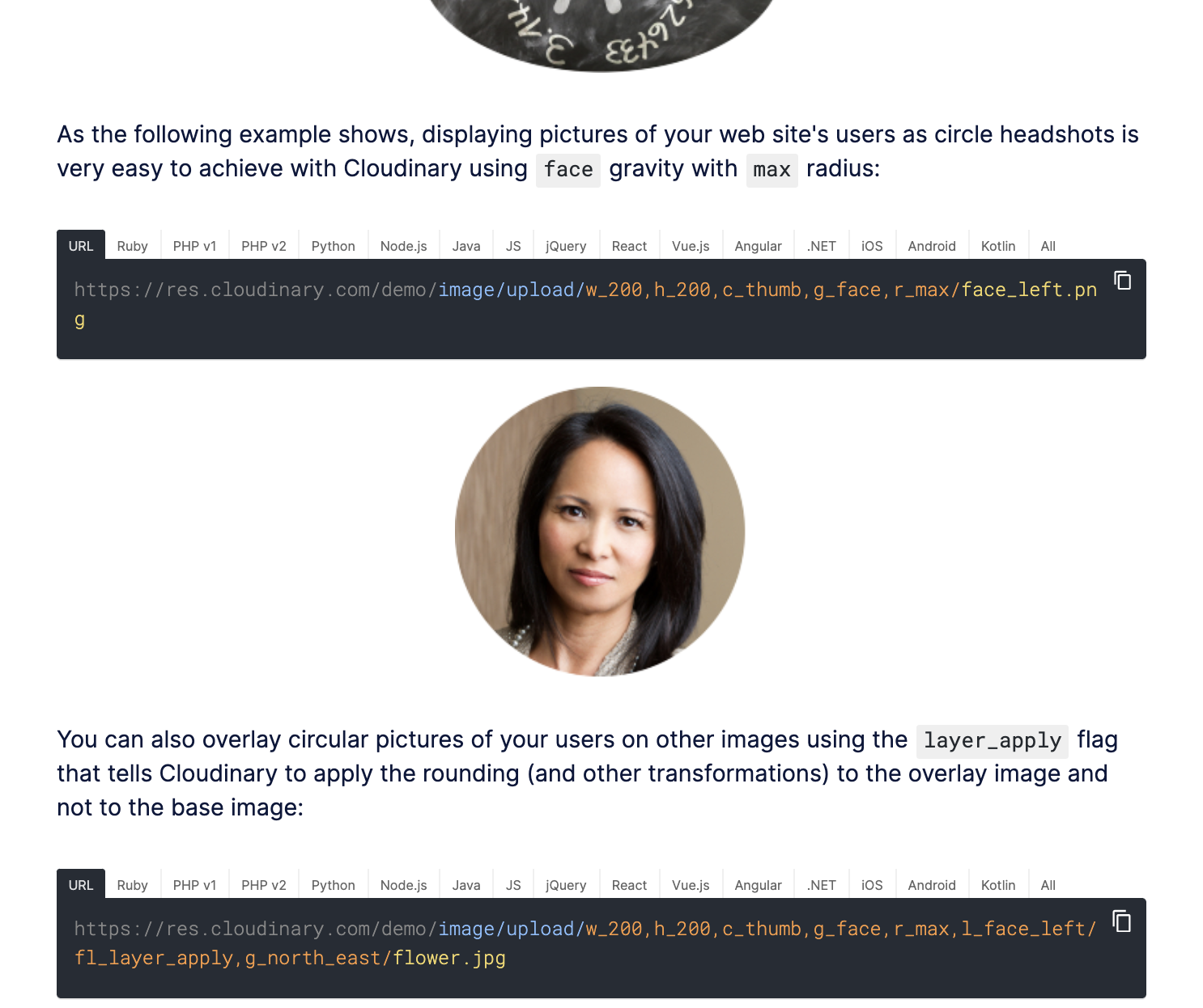
- Text, contrast, and color: Customizable caption styling, text overlays on images and videos, contrast and brightness adjustments, customizable text overlay parameters, and OCR text extraction.
- Audio controls and mixing: Adjust audio volume programmatically, use Video Player volume controls, and mix audio tracks to meet WCAG requirements.
Error
Rate this page:
