Programmable Media

React sample projects

Last updated: Feb-17-2025

We've created some sample projects to get you started with integrating Cloudinary into your React application.

Tip
Check out our collection of React code explorers too!

Photo Album

Adhering to React best practices, the Photo Album app demonstrates uploading and displaying images. See how to upload images to your product environment using the Upload widget and the REST API, automatically tagging them as they're uploaded. Then see how each of the tagged images is transformed on the fly and displayed on the site.

This is the Photo Album app in action:

Video Player is loading.
Current Time 0:00
Duration -:-
Loaded: 0%
Stream Type LIVE
Remaining Time 0:00
 
1x
  • descriptions off, selected
  • captions off, selected


    Here's an excerpt from the code showing the AdvancedImage component being used to deliver a square thumbnail image, automatically focused on the most interesting part of the image, and automatically optimized for format and quality. The placeholder plugin is used to load a low quality image initially, until the full image is downloaded, preserving the layout.

    CldImage.jsx
    React
    import { Cloudinary } from '@cloudinary/url-gen';
    import { thumbnail } from '@cloudinary/url-gen/actions/resize';
    import { autoGravity } from '@cloudinary/url-gen/qualifiers/gravity';
    import { format, quality } from '@cloudinary/url-gen/actions/delivery';
    import { AdvancedImage, placeholder } from '@cloudinary/react';
    
    const cld = new Cloudinary({
      cloud: {
        cloudName: import.meta.env.VITE_CLOUD_NAME,
      },
    });
    
    const CldImage = ({ publicId }) => {
      const myImage = cld
        .image(publicId)
        .resize(thumbnail().width(300).height(300).gravity(autoGravity()))
        .delivery(format('auto'))
        .delivery(quality('auto'));
      return (
        <AdvancedImage
          cldImg={myImage}
          style={{ maxWidth: '100%' }}
          plugins={[placeholder()]}
          className="rounded-lg shadow-lg"
        />
      );
    };
    export default CldImage;


    Image and video transformations

    See all the image and video transformations that are shown in the React SDK guide.

    This is the image and video transformations app in action:

    Video Player is loading.
    Current Time 0:00
    Duration -:-
    Loaded: 0%
    Stream Type LIVE
    Remaining Time 0:00
     
    1x
    • descriptions off, selected
    • captions off, selected


      Here's an excerpt from the code showing an image being cropped to 200 x 300 pixels, automatically focusing on the most interesting part of the image.

      autoGravity.js
      JS
      import {Cloudinary} from "@cloudinary/url-gen";
      import {fill} from "@cloudinary/url-gen/actions/resize";
      import {autoGravity} from "@cloudinary/url-gen/qualifiers/gravity";
      
      export function getAutoGravityImage() {
      
          // Create and configure your Cloudinary instance.
          const cld = new Cloudinary({
          cloud: {
              cloudName: 'demo'
          }
          }); 
      
          // Use the image with public ID, 'basketball_in_net'.
          const myImage = cld.image('basketball_in_net');
      
          // Apply the transformation.
          myImage.resize(fill().width(200).height(300).gravity(autoGravity()));
      
          return myImage;
      }


      Background removal and drop shadow

      This React app shows examples of image optimization, background removal and drop shadow applied to sets of product images. You can read more about it in this blog post.

      This is the background removal and drop shadow app in action:

      Video Player is loading.
      Current Time 0:00
      Duration -:-
      Loaded: 0%
      Stream Type LIVE
      Remaining Time 0:00
       
      1x
      • descriptions off, selected
      • captions off, selected


        Here's an excerpt from the code showing the background removal and drop shadow effects being applied to the image, after which it's scaled and optimized for delivery.

        RemoveBackgroundAddShadow.js
        JS
        import cld from "./cld";
        import { backgroundRemoval, dropShadow } from "@cloudinary/url-gen/actions/effect";
        import { scale } from "@cloudinary/url-gen/actions/resize";
        
        export function getBackgroundRemovedShadowUrl(publicID, width, height, az, el, spr) {
        
          const myImage = cld.image(publicID); 
        
          // Apply the background removal and drop shadow effects,
          // then scale the image to the specified dimensions
          // and optimize format and quality
          myImage
          .effect(backgroundRemoval())
          .effect(dropShadow().azimuth(az).elevation(el).spread(spr))
          .resize(scale().width(width).height(height))
          .format('auto')
          .quality('auto');
        
          // Return the URL of the image
          return myImage.toURL();
        }


        React plugins

        The Cloudinary React library provides plugins to render the media on your site in the optimal way and improve your user's experience. This app demonstrates how to implement:

        • Image accessibility to make your images more accessible to your users with visual disabilities.
        • Responsive images to resize your images automatically based on the viewport size.
        • Lazy loading to delay loading images if they are not yet visible on the screen.
        • Image placeholders to display a lightweight version of an image while the target image is downloading.

        This is the React plugins app in action:

        Video Player is loading.
        Current Time 0:00
        Duration -:-
        Loaded: 0%
        Stream Type LIVE
        Remaining Time 0:00
         
        1x
        • descriptions off, selected
        • captions off, selected


          Here's an excerpt from the code showing images being rendered with the different plugins.

          index.tsx
          React
          class App extends React.Component {
              render() {
                  return (
                      <div>
                          <h2>Render a Cloudinary image</h2>
                          <AdvancedImage cldImg={cloudinaryImage} />
                          <div style={{ height: "20px" }}></div>
                          <h2>Cloudinary image with default accessibility</h2>
                          <AdvancedImage cldImg={cloudinaryImage} plugins={[accessibility()]} />
                          <div style={{ height: "20px" }}></div>
                          <h2>Cloudinary image with colorblind accessibility</h2>
                          <AdvancedImage
                              cldImg={cloudinaryImage}
                              plugins={[accessibility({ mode: "colorblind" })]}
                          />
                          <h2>Cloudinary image with responsive</h2>
                          <div>Resize window to see changes (100 is the step size in px)</div>
                          <AdvancedImage cldImg={cloudinaryImage} plugins={[responsive({ steps: 100 })]} />
                          <h2>Scroll down to see images lazy load</h2>
                          <div style={{ height: "700px" }}>
                              You can open your network tab to see the images loading
                          </div>
                          <AdvancedImage cldImg={brownSheep} plugins={[lazyload()]} />
                          <div style={{ height: "400px" }} />
                          <AdvancedImage cldImg={woman} plugins={[lazyload()]} />
                          <div style={{ height: "400px" }} />
                          <AdvancedImage cldImg={cat} plugins={[lazyload()]} />
                          <div style={{ height: "50px" }} />
                          <div style={{ height: "700px" }}>
                              Scroll down for lazyloading a large image with a placeholder
                          </div>
                          <AdvancedImage
                              cldImg={largeImage}
                              plugins={[lazyload(), placeholder()]}
                          />
                      </div>
                  );
              }
          }


          User generated content: profile pictures and posts

          The UGC app for profile pictures and posts demonstrates a social media-style application that handles user-generated content using Cloudinary's advanced capabilities. The app features a Profile page where users can manage their personal information and upload a profile picture, along with a Posts page where they can share thoughts and images. Deep dive into the app's functionality.

          This is the app in action:

          Video Player is loading.
          Current Time 0:00
          Duration -:-
          Loaded: 0%
          Stream Type LIVE
          Remaining Time 0:00
           
          1x
          • descriptions off, selected
          • captions off, selected


            Here's an excerpt from the code showing transformations being applied to the profile image following a successful upload.

            page.tsx
            React
              const handleUploadSuccess = (publicId: string, poorQuality: boolean) => {
                setLoading(false)
                setUploadError('')
                setProfilePublicId(publicId)
                setProfileIsPoorQuality(poorQuality)
            
                // Create the delivery URL for the profile picture:
                const profileImage = cld.image(publicId)
            
                profileImage.resize(fill().width(300).height(300).gravity(
                  focusOn(face()).fallbackGravity(autoGravity())))
                  .format('auto').quality('auto')
            
                if (poorQuality) {
                  profileImage.effect(enhance()).effect(generativeRestore()).effect(upscale())
                }
            
                setProfileImage(profileImage)
              }


            Upload Widget

            This app shows an example of a React component for the Upload Widget. You can define the widget configuration to control the behavior.

            Here's an excerpt showing the component itself:

            React
            import { useEffect, useRef } from 'react';
            
            const CloudinaryUploadWidget = ({ uwConfig, setPublicId }) => {
              const uploadWidgetRef = useRef(null);
              const uploadButtonRef = useRef(null);
            
              useEffect(() => {
                const initializeUploadWidget = () => {
                  if (window.cloudinary && uploadButtonRef.current) {
                    // Create upload widget
                    uploadWidgetRef.current = window.cloudinary.createUploadWidget(
                      uwConfig,
                      (error, result) => {
                        if (!error && result && result.event === 'success') {
                          console.log('Upload successful:', result.info);
                          setPublicId(result.info.public_id);
                        }
                      }
                    );
            
                    // Add click event to open widget
                    const handleUploadClick = () => {
                      if (uploadWidgetRef.current) {
                        uploadWidgetRef.current.open();
                      }
                    };
            
                    const buttonElement = uploadButtonRef.current;
                    buttonElement.addEventListener('click', handleUploadClick);
            
                    // Cleanup
                    return () => {
                      buttonElement.removeEventListener('click', handleUploadClick);
                    };
                  }
                };
            
                initializeUploadWidget();
              }, [uwConfig, setPublicId]);
            
              return (
                <button
                  ref={uploadButtonRef}
                  id="upload_widget"
                  className="cloudinary-button"
                >
                  Upload
                </button>
              );
            };
            
            export default CloudinaryUploadWidget;

            And here's an example of the code to add that component with some config (defined separately) to control the behavior:

            React
            <CloudinaryUploadWidget uwConfig={uwConfig} setPublicId={setPublicId} />

            Note
            Due to CORS issues with StackBlitz, you may have errors opening the widget with the preview. Try opening the preview in a new tab to resolve this or use the GitHub link below to run locally.

            Product Gallery Widget

            This app shows an example of a React component for the Product Gallery Widget. You can define the assets to render as part of the gallery and any additional configuration to control the look and feel.

            Here's an excerpt showing the component itself:

            React
            import { useEffect, useRef } from 'react';
            
            const ProductGallery = ({ galleryConfig }) => {
              const galleryRef = useRef(null);
              const cloudName = import.meta.env.VITE_CLOUDINARY_CLOUD_NAME || 'demo';
            
              useEffect(() => {
                if (window && galleryRef.current) {
                  window.cloudinary
                    .galleryWidget({
                      container: galleryRef.current,
                      cloudName: cloudName,
                      ...galleryConfig,
                    })
                    .render();
                }
              }, [galleryConfig]);
            
              return (
                <div ref={galleryRef} style={{ width: '80%', margin: 'auto' }}>
                  <div>Loading...</div>
                </div>
              );
            };
            
            export default ProductGallery;

            And here's an example of the code to add that component with some props to define the media assets to render:

            React
            <ProductGallery
              galleryConfig={{
                mediaAssets: [
                  { tag: 'electric_car_product_gallery_demo' },
                  { tag: 'electric_car_product_gallery_demo', mediaType: 'video' },
                  { tag: 'electric_car_360_product_gallery_demo', mediaType: 'spin' },
                ],
              }}
            />


            Cloudinary Video Player

            This app shows an example of a basic React component for the Cloudinary Video Player. It includes the ability to define a public ID and optional config props.

            Here's an excerpt showing the component itself:

            React
            import { useEffect, useRef } from 'react';
            import cloudinary from 'cloudinary-video-player';
            import 'cloudinary-video-player/cld-video-player.min.css';
            
            const VideoPlayer = ({ id, publicId, ...props }) => {
              const cloudinaryRef = useRef();
              const playerRef = useRef();
            
              useEffect(() => {
                if (cloudinaryRef.current) return;
            
                cloudinaryRef.current = cloudinary;
            
                const player = cloudinaryRef.current.videoPlayer(playerRef.current, {
                  cloud_name: 'demo',
                  secure: true,
                  controls: true,
                });
                player.source(publicId);
              }, []);
            
              return (
                <video
                  ref={playerRef}
                  id={id}
                  className="cld-video-player cld-fluid"
                  {...props}
                />
              );
            };
            
            export default VideoPlayer;

            And here's an example of the code to add that component with some configuration props:

            React
            <VideoPlayer
              id="player"
              publicId="glide-over-coastal-beach"
              data-cld-source='{"info": {"title": "Glide Over Coastal Beach"}}'
              data-cld-transformation='{"effect": "blur"}'
              data-cld-poster-options='{"transformation": {"effect": "blur"}}'
            />


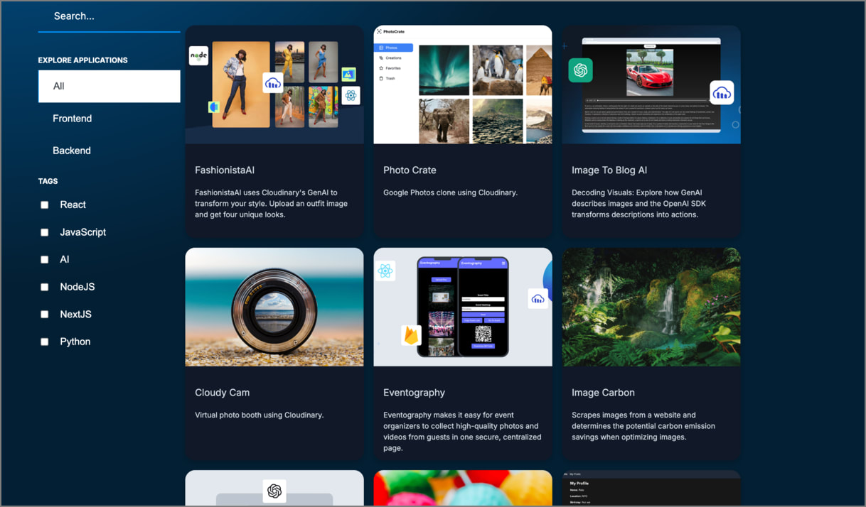
            App Gallery

            The Cloudinary app gallery provides a variety of fully working apps that incorporate Cloudinary as part of the tech stack, built in various popular programming languages.

            Each app in the gallery presents an overview of the functionality, a link to the open-source repo, and complete setup instructions, so that you can grab the code and easily build your own version.

            Cloudinary app gallery

            ✔️ Feedback sent!