 Ask AI
Media Editor
Last updated: May-28-2026
Cloudinary's Media Editor is an interactive user interface providing a set of common image editing actions to your users on your website or application. The Media Editor requires only native JavaScript to integrate, is easy to use within any web development framework, and eliminates the need to develop an in-house interactive media editor with just a few lines of code. The editor helps to scale internal operations by reducing dependency on designers for simple recurring tasks. Combined with AI for automating simple actions, this allows manual review / fixing of media assets when needed.
Quick example
To use Cloudinary's Media Editor widget in your site, include a remote JavaScript file, call the mediaEditor method to initialize the widget, and then specify the following required information when calling the update method:
- Your Cloudinary product environment cloud name.
- The public_id of the image to edit.
The show method is called to display the initialized widget:
- Internet Explorer 11 is not supported.
- Mobile devices are not supported.
- If you flip or rotate after an interactive crop, the crop resets to the selected preset's initial value, and you need to re-crop the image.
Workflow
To add Cloudinary's Media Editor widget to your site:
-
Include the JavaScript file:
https://media-editor.cloudinary.com/latest/all.js. -
Initialize the Media Editor widget with the
cloudinary.mediaEditor()method. -
Update the Media Editor configuration with the
update(options)method. -
Show the Media Editor widget with the
show()method.
Check out the Media Editor interactive demo and try out some of the configuration options. Although the demo does not cover every possible option, it generates the required code for implementing the options you select, making for an ideal playground for getting started with widget.
1. Include the JavaScript file
All the Media Editor functionality is included in the https://media-editor.cloudinary.com/latest/all.js JavaScript file. The file is optimized and delivered via a fast CDN.
For example:
2. Initialize the Media Editor widget
The JavaScript method for initializing the widget is publicly available after including the Media Editor's JavaScript file, which instantiates the cloudinary object and grants access to the cloudinary.mediaEditor(options) method. This method creates a Media Editor instance in memory.
For example:
If you want the widget to open within an existing containing element on the page, you can pass the mediaEditor method a target element using a selector or DOM element as an appendTo parameter, for example:
cld-media-editor-iframe stack order, for example:
3. Update the Media Editor widget
The update(options) method configures the Media Editor, where options is an object containing a map of configuration parameters to apply.
The options must include at least the following 2 required parameters:
- Your Cloudinary product environment
cloudNameparameter. - The
publicIdsparameter with the PublicID of the image to edit.
For a complete list of parameters available for configuring the Media Editor widget, see the Parameter tables.
For example, to update an instantiated widget with the "sample" image:
4. Show the Media Editor widget
The mediaEditor method creates and initializes the widget but does not display it until the show() method of the returned instance is called.
For example:
For a full listing of available methods, see the Instance methods section in the Media Editor API reference.
Use the Media Editor with other Cloudinary widgets
You can open the Media Editor with an asset selected or uploaded from another Cloudinary widget. Capture the asset's public_id from the other widget, pass it to the Media Editor using the publicIds parameter, and then call show().
- The Media Editor edits one asset at a time. If the Media Library widget or Upload widget allows multiple assets, select the public ID of the asset you want to edit before calling
update(). - For private or authenticated assets, pass an asset object to
publicIdsand use the Media Editor signing flow described in the Media Editor API reference.
Open the Media Editor from the Media Library widget
Use the Media Library widget's insertHandler callback to receive the selected asset data. Then pass the selected image's public_id to the Media Editor.
Open the Media Editor from the Upload widget
Use the Upload widget callback to store the uploaded asset's public_id when the success event is triggered. Then open the Media Editor when the Upload widget closes.
Image Configuration
The Media Editor has various options for editing images. All the image editing parameters are given within an image object parameter.
For example:
Image widget steps
Use the steps parameter to define which steps are included in the widget.
Possible values:
For example:
- By default, the
resizeAndCropandexportsteps are already included if you don't add thestepsparameter. - You can change the order of the steps. The
resizeAndCrop,textOverlaysandimageOverlaysteps are displayed in the widget in the same order given in thestepsparameter. Theexportstep should always be the last step.
Resize and crop

The resize and crop step of the widget enables your users to select a predefined option for resizing the image, to manually crop the image using the crop handles, and to flip or rotate the image.
Use the resizeAndCrop parameter to populate the Media Editor with an ordered array of presets that the user can choose from, in order to resize and crop the image. Each preset in the array can either be a predefined named shortcut, or can be defined as a custom preset with a label, width, height and/or aspectRatio. The guidelinesUrl property allows you to add an informative image (with cropping instructions for example) to the right-hand side of the display.
See the ResizeProps options for more details on the available options.
For example, to add the Twitter Ad and LinkedIn Ad predefined shortcuts, as well as a custom preset with the label "Cover Ad" and dimensions of 500 x 1000:
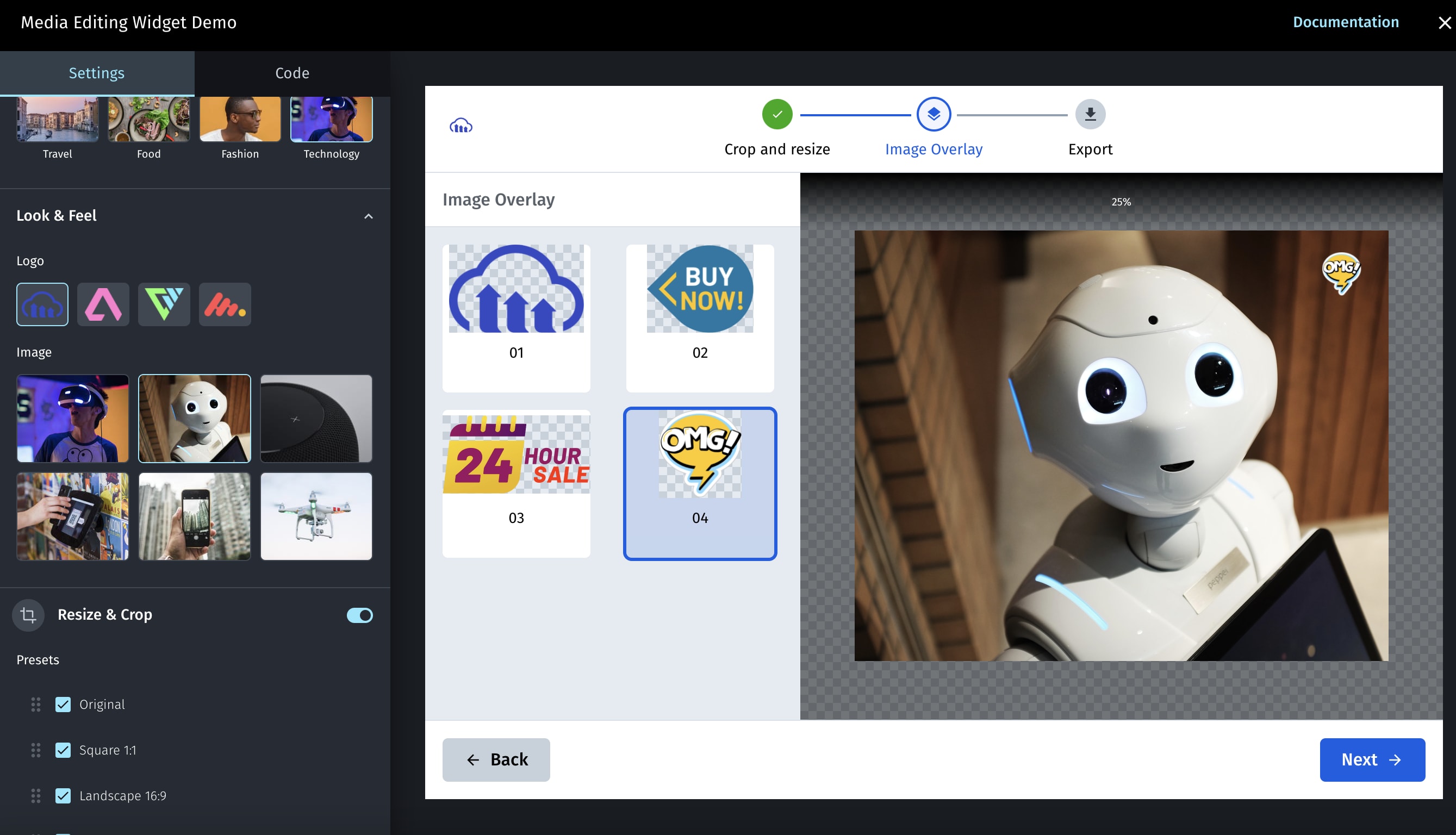
Image overlays

The image overlays step of the widget enables your users to choose an image overlay to add to the base image. Each of the overlay options is defined by a set of properties, including the size and allowed placements on the base image for the user to select.
- Use the
imageOverlayparameter to populate the Media Editor with an ordered array ofoverlaysthat the user can choose from. - Each overlay in the array is defined with a
publicId,label, anytransformationto apply, and an array of allowedplacementOptions, where each placementOption is defined by a bounding box (width and height), a location on the base image (gravity) and any offset from the selected location (x and y). - The
guidelinesUrlproperty allows you to add an informative image (with overlay instructions for example) to the right-hand side of the display.
See the ImageOverlayProps options for more details on the available options.
For example, to add 2 options for overlays as follows: The 'logo' image with a blackwhite effect applied and 2 placement options, and the 'logo_text' image with a negative effect applied and a single placement option:
Text overlays

The text overlays step of the widget enables your users to add text to the base image. Once placed on the image, the overlay can be resized, the text can be edited, the color, font and style can be updated, and the overlay can be dragged to any location within the image. The editor supports multi line text boxes and displays alignment grids to help position the text overlay within the image or for aligning 2 text boxes.
Use the textOverlays parameter to customize the text overlay step with the following properties:
- The
fontsproperty to define an array of allowed fonts. Default (all the built-in fonts):["Ariel", "Verdana", "Helvetica", "Trebuchet MS", "Times New Roman", "Georgia", "Courier New", "Open Sans", "Roboto", "Montserrat"] - The
presetsproperty to define an array of text overlay presets available for the user to select. Default:["heading", "body", "subtitle", "caption"] - The
guidelinesUrlproperty to add an informative image (with overlay instructions for example) to the right-hand side of the display. - The
initialColorsproperty to define an array of colors for the user to select. Default:["#ffffff", "#000000"] - The
showColorPickerboolean property to set whether the color picker is also available for the user to select a color.
- All custom fonts you want to use need to be first uploaded to Cloudinary as raw, authenticated files.
- Since the custom font is uploaded as an authenticated file, you will also need to implement the onSign method of the widget to return the signature needed to access a restricted asset.
- You need to specify the font's full
public_id(as a raw file this will include the extension).
See the TextOverlaysProps options for more details on the available options.
For example, to allow 3 possible font options (Arial, Times New Roman, and a custom font called MyFont), and predefine 4 presets (heading, body and 2 custom presets), and set some initial color options while hiding the color picker:
Export

The export step of the widget enables your users to select from provided exporting options.
Use the export parameter to populate the Media Editor with an ordered array of formats and quality to select from, and whether the HTTPS URL and Download options are displayed.
See the ExportProps options for more details on the available options.
For example:
Video configuration
The Media Editor can also be used for editing videos. Specify the PublicID of the video to edit, and include the resourceTypeproperty set to "video". The video editing parameters are given within a video object parameter.
For example:
Video widget steps
Use the steps parameter to define which video steps are included in the widget. Currently the widget only supports a single trim step.
For example:
Trim

The trim step of the widget enables your users to manually trim the length of the video using the trim handles. You can define the initial location of the trim handles by adding the startOffset and endOffset properties to the trim parameter object, and optionally define a maxDuration and minDuration for the trimmed video.
For example:
Editor events
You can register to a variety of Media Editor widget events in order to introduce custom behavior in your application, or for analytics tracking once your application is deployed. Use the on method with an initialized widget to register to a specific event. For example, to register the initialized myEditor Media Editor widget to the headerclick event:
export event, which is called when the user clicks on the Export button.For a full listing of available events, see the Events section in the Media Editor API reference.
Localization
The text used in the widget can be fully customized for different languages or locales by specifying a language object parameter. The strings for each language are specified using the messages parameter, which accepts a JSON structure defining the value to use for each text element in each language. The locale parameter sets which of the string options to use from those defined in the messages parameter (en-US by default). To override any of the default values, you only need to include the elements you want to override.
All the default values can be found at: https://media-editor.cloudinary.com/widget/messages.json.
For example, to only customize the header and the crop - presets - square texts:
Media Editor widget reference
For details on all the available methods, parameters and events, see the Media Editor reference.
Error
Rate this page:
