 Ask AI
Text, contrast, and color
Last updated: Jul-14-2026
Ensuring text and visual elements are readable and distinguishable is central to visual accessibility. This page covers caption styling, text overlays, contrast and brightness adjustments, color replacement for light and dark themes, customizable text overlay parameters, and OCR text extraction.
- Color accessibility: Simulate and assist color blind conditions, analyze color accessibility, and replace colors for light and dark themes.
- Audio controls and mixing: Adjust audio volume programmatically, use Video Player volume controls, and mix audio tracks to meet WCAG requirements.
Customizable caption styling
Captions and subtitles must meet specific contrast requirements to be accessible to people with visual impairments. The WCAG guidelines specify minimum contrast ratios between text and background colors to ensure readability.
Understanding contrast ratios
A contrast ratio measures the difference in brightness between text and its background, expressed as a ratio like 4.5:1 or 7:1. The higher the number, the more contrast there is.
WCAG Requirements:
- Level AA (minimum): 4.5:1 contrast ratio for normal text
-
Level AAA (enhanced): 7:1 contrast ratio for normal text
- Large text (18pt+ or 14pt+ bold): Lower ratios of 3:1 (AA) or 4.5:1 (AAA)
How to measure contrast ratios
You can measure contrast ratios using online tools such as WebAIM Contrast Checker.
How it works:
- Pick your colors: Select the text color and background color
- Get the ratio: The tool calculates the mathematical contrast ratio
- Check compliance: See if it meets WCAG AA (4.5:1) or AAA (7:1) standards
Example measurements:
- Black text (#000000) on white background (#FFFFFF) = 21:1 (excellent)
- White text (#FFFFFF) on blue background (#0066CC) = 5.74:1 (passes AA)
- Light gray text (#CCCCCC) on white background (#FFFFFF) = 1.61:1 (fails - too low)
Implementing accessible caption styling
The Cloudinary Video Player allows you to customize caption appearance to meet contrast requirements. The recommended approach is to use the built-in theme options which provide predefined backgrounds and styling.
The built-in themes are described in this table:
| Theme | Description | Best for |
|---|---|---|
default |
None | High contrast videos only |
videojs-default |
High contrast theme with a dark background and white text | General accessibility |
yellow-outlined |
Yellow text with a dark outline for visibility | Videos with varied backgrounds |
player-colors |
Uses the video player's custom color scheme for the text and background | Brand consistency + accessibility |
3d |
Text with a 3D shadow effect | Stylistic preference |
The example at the top of this section uses the videojs-default theme. Note that you can also override elements of the theme, for example, by setting the font size. Here's the Video Player configuration:
To set custom colors for the font and background you can use the player-colors theme. This theme uses the colors that you configure when customizing your Video Player.
Text overlays on images and videos
Before creating text overlays embedded in images or videos, consider whether the text could instead be placed in your HTML and visually positioned over the media using CSS. HTML text is inherently more accessible because it can be announced by screen readers, restyled by users, translated automatically, and scales with user preferences—all without requiring additional accessibility techniques.
When you do need embedded text overlays in images and videos, it's crucial to ensure sufficient contrast between the text and background for readability. People with visual impairments or those viewing content in bright environments need clear, high-contrast text. Adding background colors or effects to text overlays helps meet WCAG contrast requirements and improves accessibility for everyone.
Text overlays on images with background
Without proper contrast, text overlays can be difficult or impossible to read. Here's how to add accessible text overlays with background colors:
 Poor contrast - hard to read
 High contrast - accessible
The accessible version uses a semi transparent black background (b_rgb:00000080) behind white text (co_white) to achieve maximum contrast:
Text overlays on videos with background
Video text overlays face additional challenges as backgrounds change throughout the video. Consistent background colors ensure text remains readable regardless of the video content. This video uses white text (co_white) on a semi-transparent blue background (b_rgb:0000cc90) to create an overlay that remains visible throughout the video.
- Docs: Text overlays on images
- Docs: Text overlays on videos
Adjust contrast on images and videos
Proper contrast, brightness, and saturation adjustments are essential for making images and videos accessible to people with visual impairments, low vision, or those viewing content in challenging lighting conditions. These adjustments can help ensure content remains visible and legible across different viewing environments and for users with varying visual needs.
Contrast adjustments for images
Contrast adjustments can dramatically improve the readability and accessibility of images. Here are examples showing how different contrast levels affect image visibility:
 Low contrast
(-80)
 Original
(0)
 High contrast
(+80)
Use the contrast effect with a value between -100 and 100:
Interactive contrast, brightness, and saturation demo
In addition to contrast, you can also alter brightness and saturation to help improve image visibility.
Use the controls below to see how contrast, brightness, and saturation adjustments affect image accessibility in real-time. Notice how the transformation URL changes as you adjust the settings:
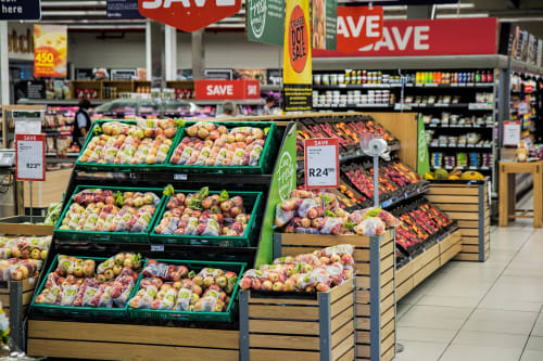
https://res.cloudinary.com/demo/image/upload/c_scale,w_500/f_auto/q_auto/docs/groceryshop.jpg
Video visual adjustments
Video content can also benefit from contrast, brightness, and saturation adjustments. These are especially important for users with visual impairments who may struggle with low-contrast video content.
This video uses enhanced contrast (e_contrast:50), increased brightness (e_brightness:10) and saturation (e_saturation:20) to improve visibility and accessibility.
- Docs: The contrast effect
- Docs: The brightness effect
- Docs: The saturation effect
Customize text overlays in images
Customizable text overlays are essential for accessibility because they allow you to adapt text presentation to meet diverse user needs. Users with visual impairments, dyslexia, or reading difficulties often benefit from specific font styles, sizes, and spacing adjustments. By providing flexibility in text overlay styling, you ensure your content remains accessible across different abilities and preferences.
The WCAG guidelines emphasize that text should be customizable to support users who need larger fonts, different font families, or modified spacing for better readability. Cloudinary's text overlay system provides extensive customization options that help you meet these accessibility requirements while maintaining visual appeal.

")
")
Understanding text overlay parameters
Cloudinary's text overlay transformation (l_text) supports numerous styling parameters that can be combined to create accessible and visually appealing text:
Core Parameters (Required):
-
Font: Any universally available font or custom font (e.g.,
Arial,Helvetica,Times) -
Size: Text size in pixels (e.g.,
50,100)
Styling Parameters (Optional):
-
Weight: Font thickness (
normal,bold,thin,light) -
Style: Font appearance (
normal,italic) -
Decoration: Text decoration (
normal,underline,strikethrough) -
Alignment: Text positioning (
left,center,right,justify) -
Stroke: Text outline (
none,stroke) -
Letter spacing: Space between characters (
letter_spacing_<value>) -
Line spacing: Space between lines (
line_spacing_<value>)
Visual Enhancement Parameters:
-
Color: Text color (
co_<color>) -
Background: Background color (
b_<color>) -
Border: Outline styling (
bo_<border>)
- Font Size: Use sizes of at least 16px for body text, larger for headers. Users with low vision may need even larger text.
- Font Choice: Sans-serif fonts like Arial and Helvetica are often easier to read, especially for users with dyslexia.
- Letter Spacing: Additional spacing between letters can improve readability for users with dyslexia or visual processing difficulties.
- Color Contrast: Ensure sufficient contrast between text and background colors (minimum 4.5:1 ratio for normal text).
- Background: Use solid background colors behind text when overlaying on complex images to ensure readability.
-
Font Weight: Bold text can improve readability, but avoid fonts that are too thin (like
lightorthinweights) for important content.
Interactive text overlay customization demo
Use the controls below to experiment with different text styling parameters and see how they affect accessibility and readability. Notice how the transformation URL updates as you adjust the settings:

https://res.cloudinary.com/demo/image/upload/c_fit,l_text:Arial_50:Sample%20Text,co_black,w_1800/fl_layer_apply,g_center/c_scale,w_600/f_auto/q_auto/docs/white-texture.jpg
Video text overlays
The same customization principles apply to video text overlays. Here's an example of accessible text styling on video content:
This example uses large, bold white text (Arial_60_bold) with a semi-transparent black background (b_rgb:000000cc) to ensure high contrast and readability across the entire video.
- Docs: Text overlays on images
- Docs: Text overlays on videos
- Docs: Create images from text
OCR text detection and extraction
For images containing text content, Optical Character Recognition (OCR) technology can extract that text and make it accessible to screen readers and other assistive technologies. This is particularly important for images of documents, signs, menus, handwritten notes, or any visual content where text is embedded within the image rather than provided as separate HTML text.
Cloudinary's OCR Text Detection and Extraction add-on can automatically extract text from images during upload, making the content available for accessibility purposes.
Here's an example showing an Italian restaurant menu and the text that Cloudinary's OCR add-on automatically extracted from it:
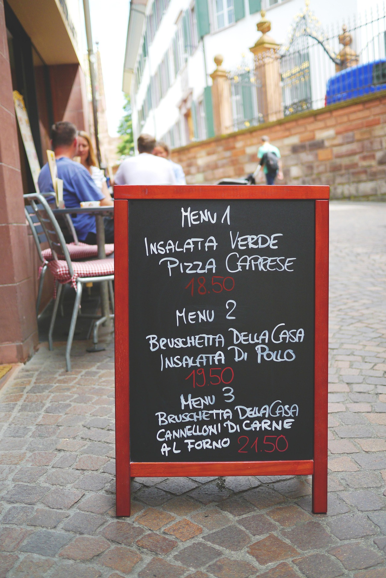
Extracted Text Content (Available to Screen Readers):
INSALATA VERDE
PIZZA CAPRESE
18.50
MENU 2
BRUSCHETTA DELLA CASA
INSALATA DI POLLO
19.50
MENU 3
BRUSCHETTA DELLA CASA
CANNELLONI DI CARNE
AL FORNO 21.50
This text content was automatically extracted using OCR and can be read by screen readers, making the Italian menu accessible to users with visual impairments. Note that the OCR detected the language as Italian (locale: "it") and extracted all menu items with their prices.
To extract text from an image:
Subscribe to the OCR add-on: Enable the OCR Text Detection and Extraction add-on in your Cloudinary account.
-
Extract text during upload: When uploading images that contain text, use the
ocrparameter to extract the text content: -
Use extracted text for accessibility: The OCR results are returned in the upload response and can be used to provide accessible alternatives:
Here's an example in React using the Italian restaurant menu response:
- You can invoke the OCR Text Detection and Extraction add-on for images already in your product environment using the Admin API update method.
- You can retrieve the response at a later date using the Admin API resource method.
- Consider using contextual or structured metadata to store the text.
Error
Rate this page:
